The latest installment of “Five Ways” is focused on mantels. Almost every home has one and yet they can be very challenging to style. I am hoping that you will find some inspiration in the following photos to either jump start your design or to encourage you to switch things up. 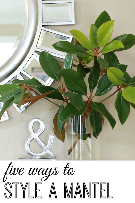

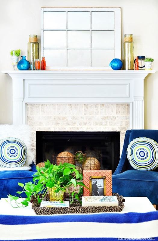 at the picket fence While a mirror can be pretty typical over the mantel {I am always a fan} leaning a mirror against the wall accomplishes a couple of things. First off, you don’t need to worry about hanging it. It also gives the space nice dimension. The other benefit is that you now only need to style the sides. Bonus. Above, I love the green jars that serve to balance out each side and then the colors were matched on each end with more accessories.
 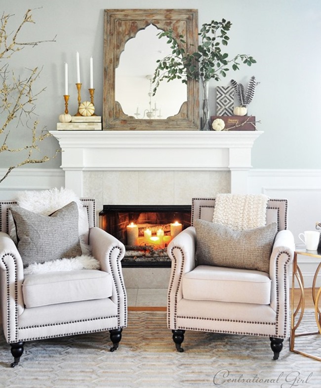 I love this mantel that Kate styled with the leaning mirror. The greenery is a nice contrast with the neutral mantel, but also softens and unites the mirror with the accessories. Always consider heavier objects on which to place candlesticks or other objects.
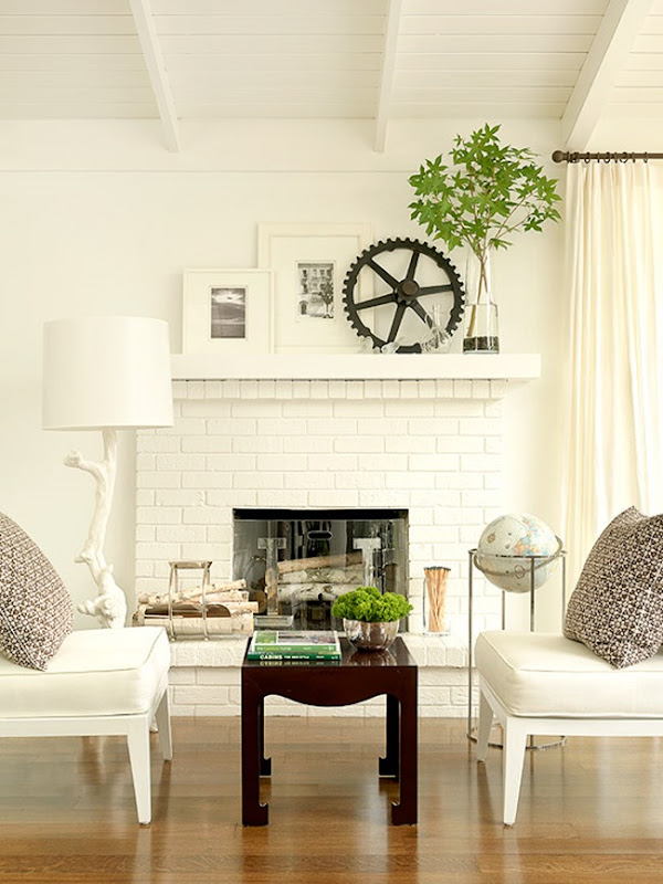 bhg I love the look of layering. In both of these examples, the rooms have a great deal of white and you can get away with a busier look of the layering effect. This is easy to play around with as you can move things and try again. Above, the greenery is a nice pop of color.
 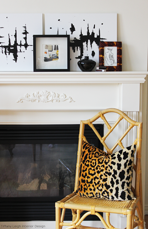 tiffany leigh interiors I adore this mantel styled by Tiffany. the artwork plays beautifully off of the leopard print and the smaller prints help to unify the space and give the mantel interest and dimension. It’s just plain awesome! This type of mantel is also easier to switch out for seasons or holidays with different art.
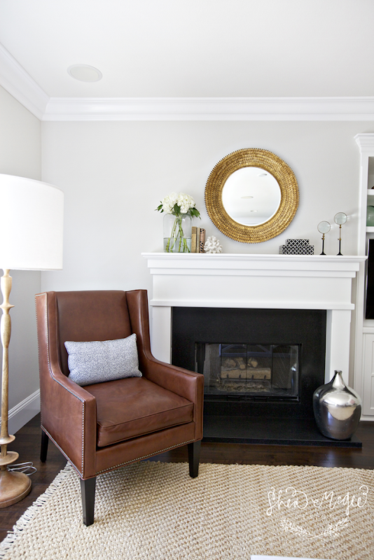 studio mcgee Asymmetrical balance is what I am drawn to most in my designs. Notice both sides of the mantel do not match, but they are equally balanced. A round mirror is a nice contrast with the square or rectangular shape of a fireplace. Shea styled this beautifully by keeping the center clear and clean and adding accessories to both ends. Notice that the objects are taller on the ends and taper down to the mantel. You could literally draw a slanted line showing this.
 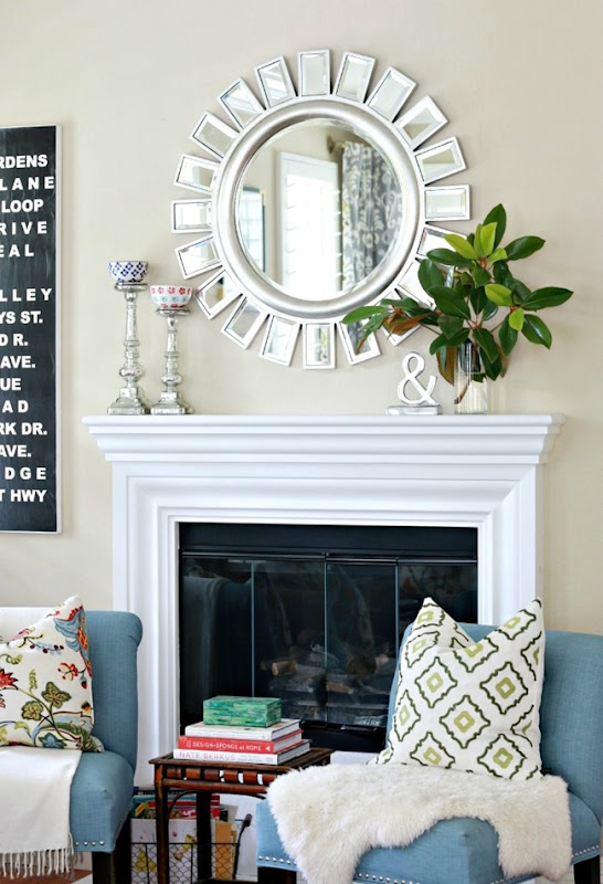 a thoughtful place Another example of the styling being different on each end of the mantel, but they balance one another. The candle holders are heavy looking so I needed something with some visual weight on the other side. The branches and “&” sign accomplish that.
 bhg You can always go with a clock over the mantel, but I prefer it be pretty darn unique. I am loving this. the clock is a decal. What a sweet idea especially if you are renting. And I love how they swapped out one candlestick for a grouping of books and fresh flowers. The bright yellow is a great dose of color.
 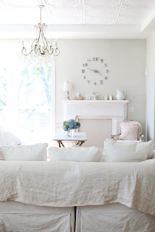 dreamy whites The clock here is fantastic. I love how it is built on the wall. I also like the neutral pieces along the mantel. If you do a large grouping of accessories like this, keep them all in the same color palet.
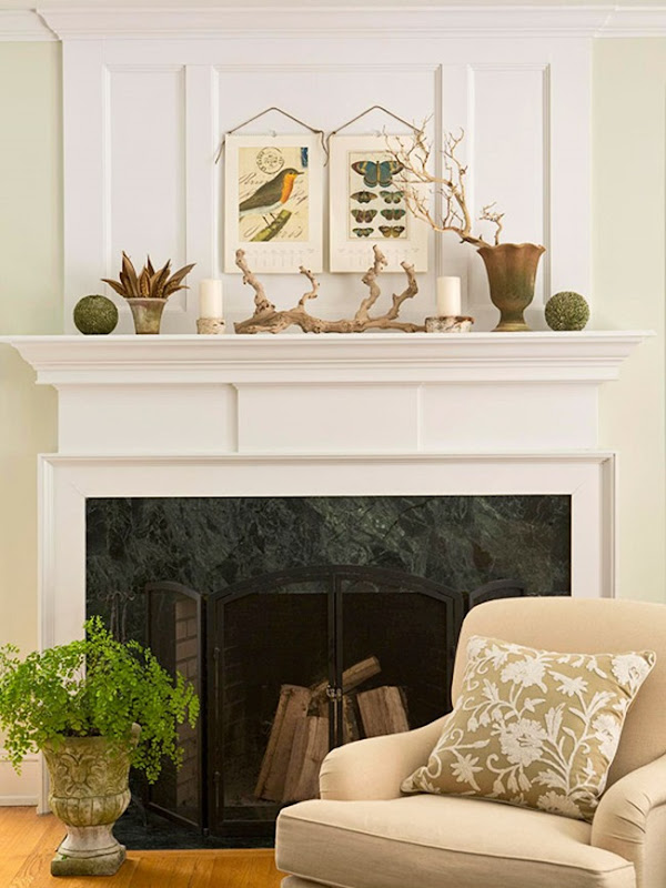 bhg Ok. So another trick is to work from the inside of the mantel and work your way out. Let me explain. In the image above, the driftwood is the main attraction. Once that I set, work your way out using similar items. They used candles, then a potted plant, followed by topiary spheres. So you are using items that mirror one another as you work your way out.
 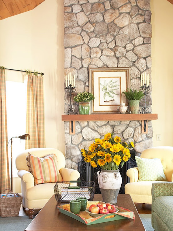 bhg Likewise, the artwork was the base and the worked their way out with potted plants and then candles. Just be sure you throw in something to offset the symmetry. Here it is a piece of white pottery. Above it was the taller branch in the pot. That creates more interest and energy. I hope these ideas spur some creativity and inspiration when looking at your mantel. Sometimes it’s just fun to try something new. To get caught up on the other Five Ways post click below:
This came at the perfect time! We finally have a mantel (just bought our first house) and I'm trying to style it. We bought a mirror and I have some vases and accessories but not sure how to do it. I also find I'm drawn to the assymmetrical balance designs. I feel I struggle with finding some other random items to put up in the right now. I think (or rather hope) I will have an easier time decorating at a specific holiday.
These are all so pretty. I love how they are all so different. Great post and inspiration.
Great tips, Courtney! I'm in love with that driftwood mantel.
xo Heidi
Have I said this before….Love this series! My clients always have trouble with styling their mantel. These are some great ideas to share for sure. Thanks girl!
I love your blog! And I love these tips! I have a tricky mantle as I love the look of a mirror over the mantle, but in my new home we have niches on either side of the fireplace that we hung mirrors in. As a result i have been rotating different art above the mantel…maybe I will try a huge clock next. http://www.designbyrobinsnest.blogspot.com
Love this series. Great tips as always Courtney!
I have the hardest time trying to decorate my mantel. I get so tired of artwork and I freak out when I lean a mirror up there. What if it falls? Candles are so predictable and boring. So here sits my bare and empty mantel. I hope to get some ideas from this post. Thanks