I thought it would be fun to take a look back at some of our before and after photos. Let me preface this by saying the before spaces are all lovely and we just put our own spin on them. We love this house and creating spaces that fit our family brings us so much joy. Whether it’s a fresh coat of paint or a different use of a room, I am a big proponent of designing each space to best fit your family. Come on in.
THE OFFICE
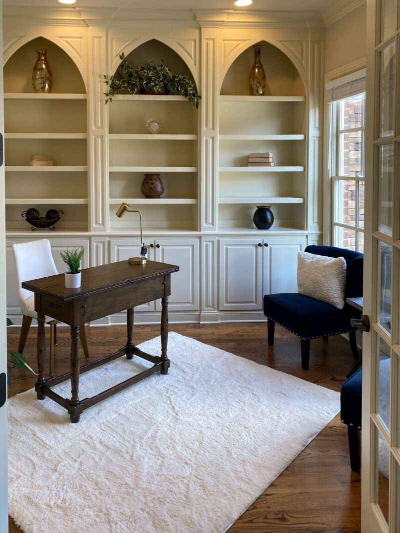
My husband and son were actually the first to walk through this house. They snapped photos for me and I fell in love. This room is directly off the front entry area and was used as an office. To be honest, I think the house was partially staged so I am not entirely sure how the rooms were used by the previous owner. These beautiful built ins had me at hello. The room itself isn’t large, but it sure has character. And it’s a beautiful space for an office with so much natural light.
TURNED MUSIC ROOM
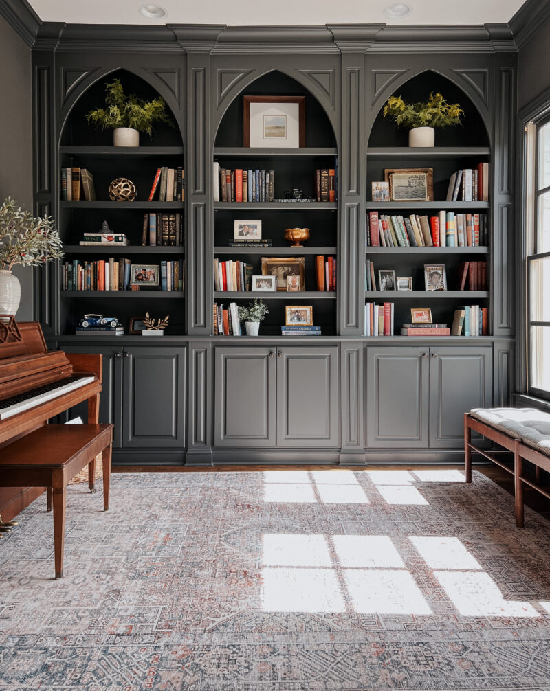
The second I saw this room, I knew it would be ideal for a dark and moody color. We went with Iron Ore by Sherwin Williams. I also knew it would be perfect for our piano (which belonged to my parents). The room is warm and cozy and I love sitting down to play in here.
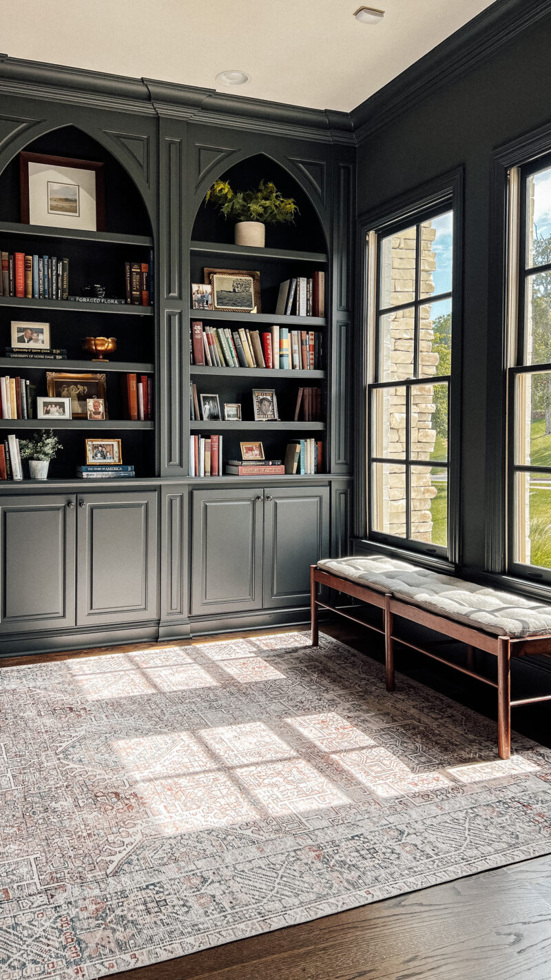
The thought crossed my mind to put a couple of chairs in here, but to be honest, the room is quite small. I would want them to be substantial and didn’t like the idea of them taking up so much space. We also have a sitting room directly across from this so it would have been redundant. But who knows . . . I’ve been known to change my mind quite often.
We also darkened the floors prior to moving in. They were quite orange so we sanded them and stained them in a dark walnut. I really like the richness of dark floors and the contrast with all of the trim work throughout the home.
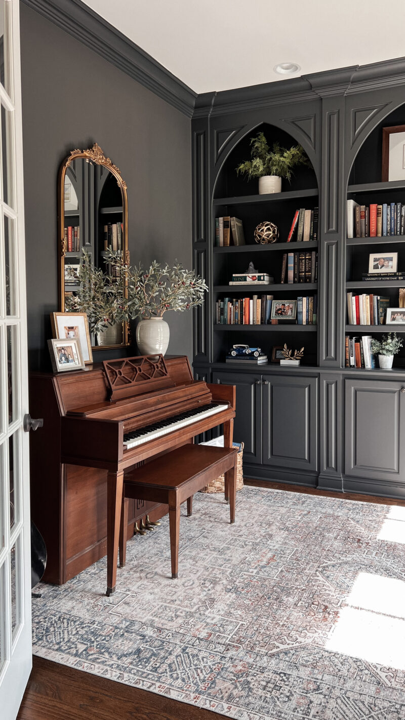
The best part about this room is that it holds so many special memories. Most of the books belonged to my parents (love seeing my dad’s signature in his old math textbooks) and special pieces from our family members. My daughter and I had so much fun styling these shelves. She has a fantastic design so I always appreciate her help.
- rug (on sale)
- bench – sold out McGee and Go.
- olive branches
- mirror
THE DINING ROOM
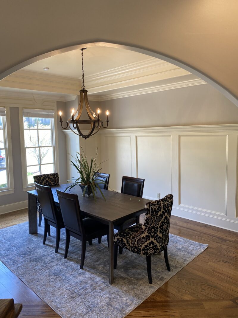
Across from the music room is the dining room. I couldn’t get over the pretty millwork. Just such great bones. The angle on one side makes this room a bit tricky and I think this setup accentuates that.
TURNED LIVING ROOM
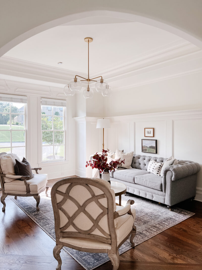
In here we painted all of the walls and trim Alabaster by Sherwin Williams. A formal living room works really well in this house and we use it all the time. Someone sits in here every day. We have had some of our best conversations in here curled up on the sofa while listening to music.
Placing a chair on the same angle as the arch makes it flow a bit better, I think.
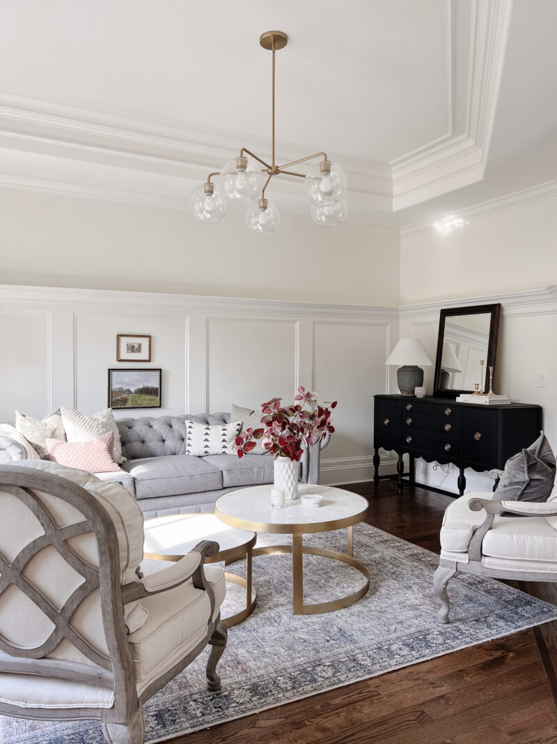
A formal living room certainly isn’t for everyone, but we have always enjoyed having one. Plus we were so fortunate that so many pieces from our California home worked in this one. It certainly saved us money and we were able to get settled very quickly.
- rug – grey/charcoal
- marble nesting tables (20% off)
- sofa – custom
- chairs – no longer sold
- chandelier
- velvet pillows
- ivory pillow
- floral pillows
- standing lamp
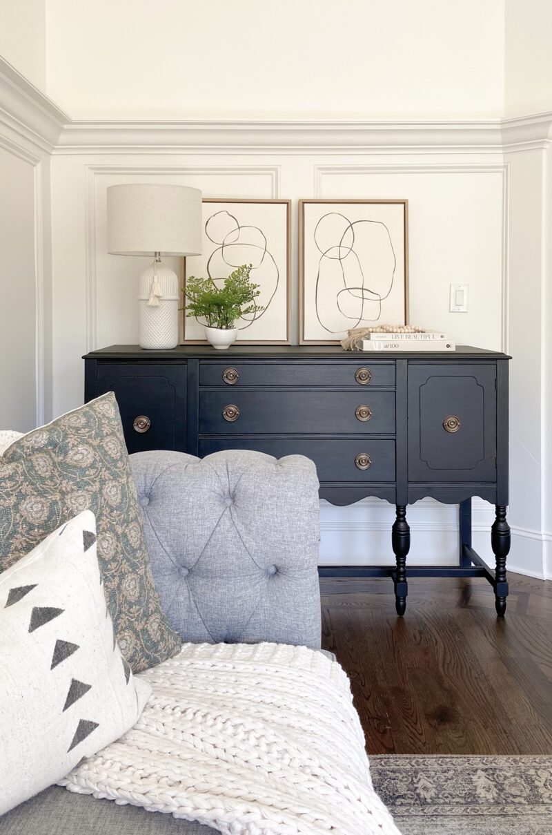
The sideboard was a Marketplace find (tips here) that I painted (details here). I’ve since moved the artwork to the guest room and the lamp to our family room.
In fall news, I am obsessed with these stems and would love to put them in this room.
THE SITTING ROOM
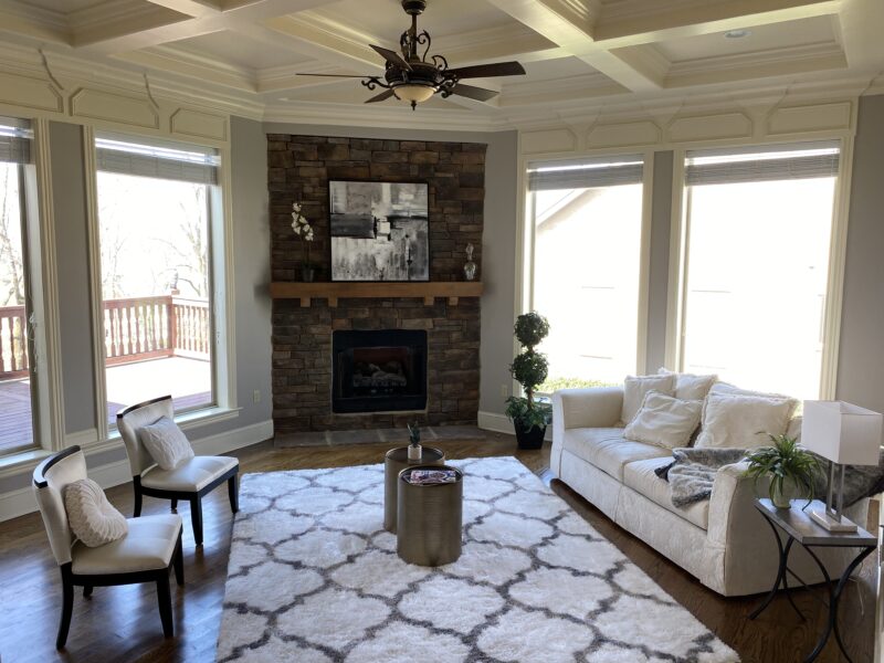
This room is part of the great room setup. It is just off of our kitchen and dining area. The way it was staged made it feel more like a sitting room. We were so drawn to the giant windows, natural light and incredible views. It feels like you are in a tree house. I also fell in love with the beautiful ceiling.
TURNED FAMILY ROOM
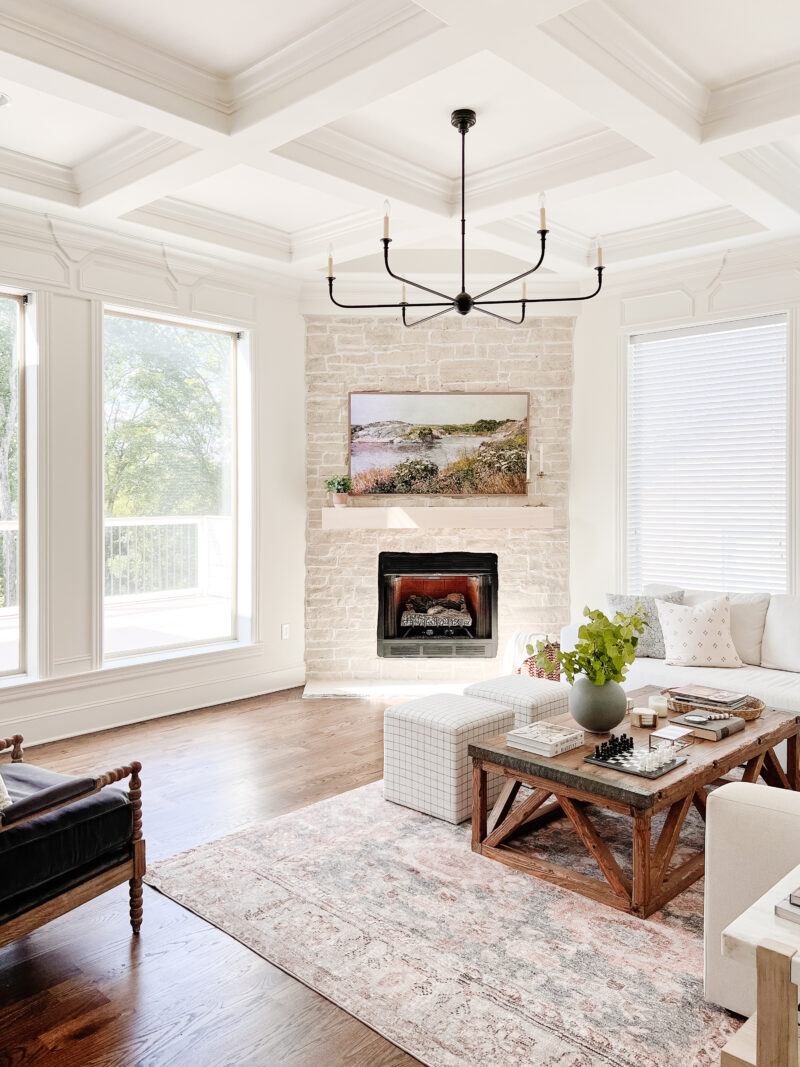
In here we painted everything Alabaster (let’s the trim become architectural detail) and limewashed the fireplace (one of our favorite projects to date). The Frame TV works really well in here. The box sits inside of the wood mantel (which I still need to stain).
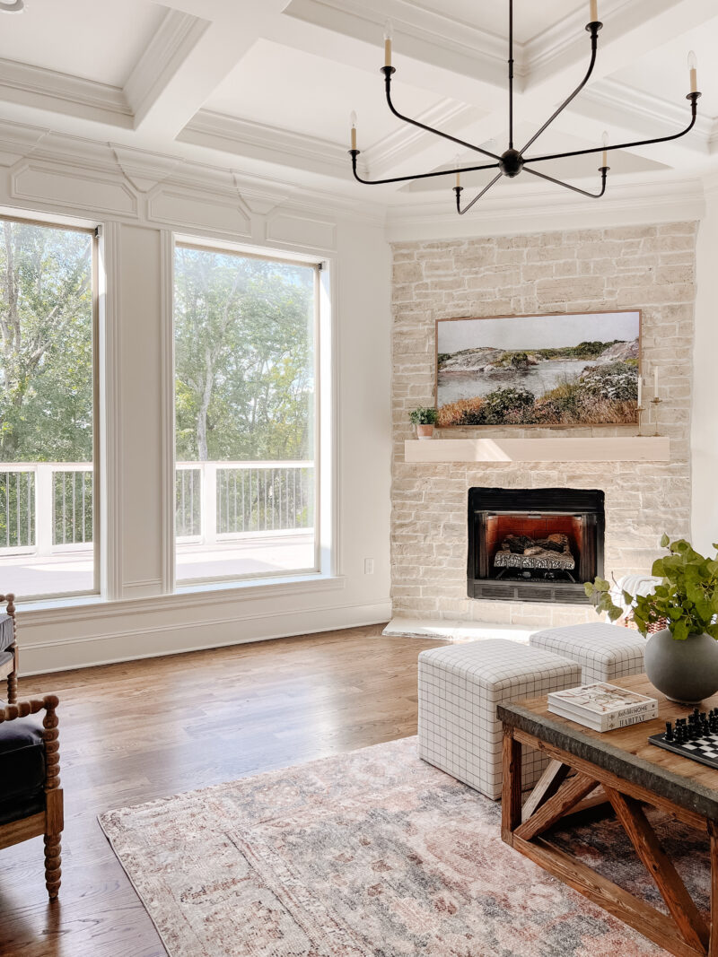
If you go back to the before photo you can see the deck and railing were quite dark. We painted the exterior of the home (White Dove) and recently replaced the deck (it had rotted) using composite decking.
- softest rug (ocean spice)
- ottomans
- similar sectional (ours was custom)
- chess board
- chairs (locally – Sara Sells)
- chandelier (20% off)
- coffee table – no longer sold
- frames
- pillows
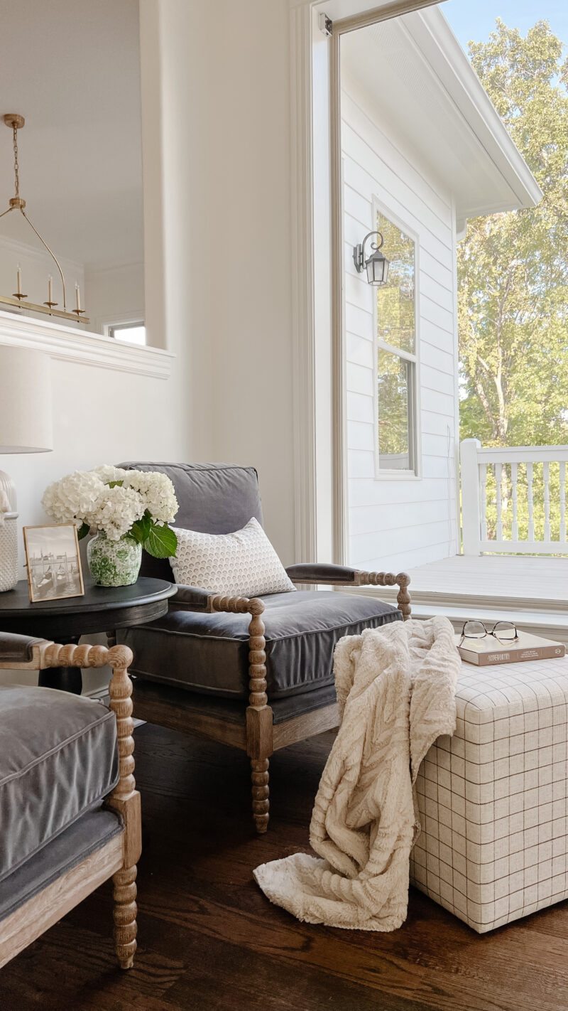
We tucked two chairs against this back wall and they work well for watching the TV or reading. And the ottomans are so easy to move around for a foot rest or extra seating. The room was a bit tricky to configure but we are happy with this setup.
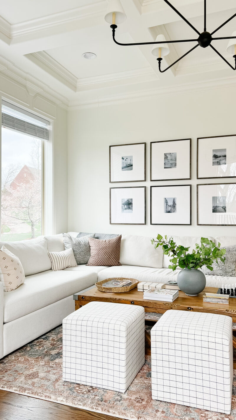
Placing a sectional in the corner not only opened up the room but allows us to enjoy the pretty tree view from the large windows. It was pretty amazing that the sectional we had purchased in California fit perfectly in this spot. It was the first measurement I took and I couldn’t believe our good fortune. This is where we watch TV and play games. It’s also where I get most of my work done (I’ve never been one to sit at a desk). I would love to add picture frame molding to the wall with the frames but each time I go to draw it out I get confused. Stay tuned on that one.
And there you have it. A few of our before and afters. I will be sharing more soon. If you have any questions about the projects, feel free to ask below. Thanks for taking the tour.
My next newsletter goes out this Thursday. If you would like to join us, we’d love to have you. Have a wonderful day.
The house was pretty when you bought it but is beautiful now! Pat yourselves on the back…a lot of hard work but it’s perfect and inspiring!
Thank you so much, Linda. I agree with you. So pretty to begin with which is why we loved it. I appreciate your kind words. It’s been fun to make it our own.
The dining turned sitting room looks so much bigger/taller with your paint!
The sitting/living room is also much bigger with the brighter tones and anchoring the sectional in the corner rather than floating at an angle in the room. I think you’ve done a great job of working with the somewhat harder or angled rooms to make them flow well!
Thank you, Jen. The angles give it so much character but can be tricky when decorating so I really appreciate that.
You have a talented eye and vision. Now we need to see the before and after of the outside.
Thank you! It’s been really fun to give it our spin. So grateful for the pretty woodwork and well thought out floor plan.
Love all the changes you made to make it your own. So timeless. Those views u have 😍
Your home was beautiful from the start but now it looks even better. In the room painted Alabaster, did you use this color in other rooms? I’m looking for a whole house paint color and I need a color that will look good in sunny rooms and lower light ones. This was a great post.
Thank you for the kind words. We appreciate this home so much and love making it feel more like us. Yes, we used Alabaster throughout the house and love it. It’s a warm/creamy white. I also love White Dove (no risk of looking too cream). I hope that helps.
Thank you for giving me so much inspiration. So fun to see the before and afters. Can’t wait for part 2! I also second the wish to see the exterior.
I love looking at the before and after. It’s so fun to see how your home as changed and how you have truly made it yours.
Popping over from your weekly newsletter which I’m really enjoying! I love the before and after photos of each space, and how you were able to incorporate pieces from your old house.
I love your house and your decorating style! How about your dining room? I would love to see it!