When styling vignettes, there always some tried and true rules that I seem to follow. While I am not a huge fan of design rules, I do find that no matter what space I am styling, it always ends up reflecting the same styling tips. I thought I would share a few today using a vignette from Casey Grace Design. I decided to show you how all five aspects are found in this one vignette . . . I think it’s more helpful than showing five different spaces for this particular five ways. Hope you agree! ![one[5] one[5]](http://lh3.ggpht.com/-KtDqn7IsXU0/U3LVVjMGxtI/AAAAAAAAWKU/pXwqIoxdpoU/one%25255B5%25255D_thumb.jpg?imgmax=800) think three
think three 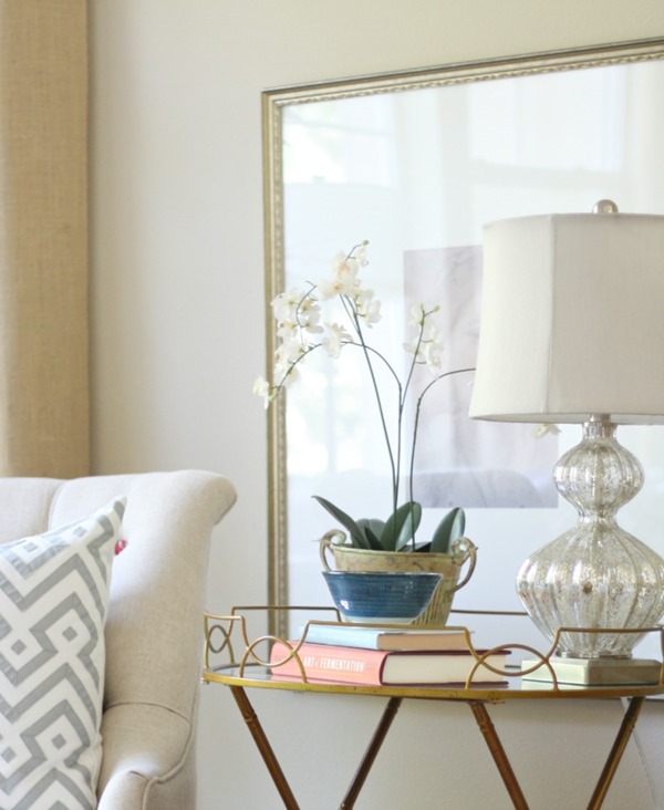 I always think in terms of three. While three is normally a crowd when you are on the playground, it’s the perfect number when styling vignettes. Here we have the lamp, the orchid and the book grouping. They act as there separate accessories grouped as one.
 ![two[5] two[5]](http://lh3.ggpht.com/-XUQ8E5tcb9c/U3LVZcjjoII/AAAAAAAAWK0/1fg2TidRsJM/two%25255B5%25255D_thumb%25255B2%25255D.jpg?imgmax=800) vary the finishes
vary the finishes 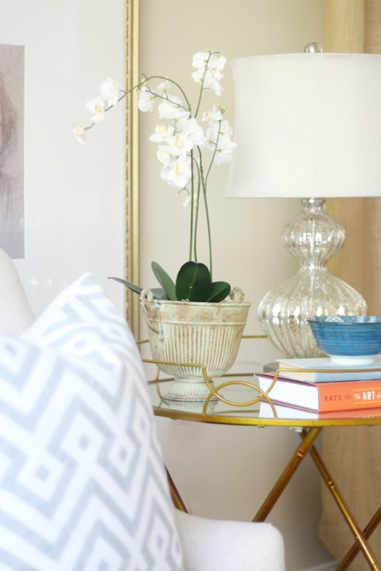 I can’t stress this one enough. I think one of the biggest missed opportunities in a room is varying the finishes used. When you mix and match finishes, you instantly gain warmth, interest, and more of a lived in quality. When all finishes match it reads flat and seems as though things were purchased together. If you have done this, never fear. Move things from room to room. In this vignette and corner of the room we have brass, colored ceramics, an aged rustic planter, mercury glass and gold {framed artwork}. There are also burlap drapes adding another texture to the space. The more the merrier when it comes to finishes.
 ![three[5] three[5]](http://lh4.ggpht.com/-Uxy1w3iJJVY/U3LVgq2fgLI/AAAAAAAAWLU/mzYF9I68KhU/three%25255B5%25255D_thumb%25255B3%25255D.jpg?imgmax=800) fill the visual space
fill the visual space 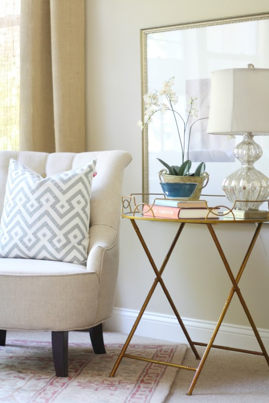 So in looking at this vignette again, you’ll see that the visual space is filled. Pretend for a minute that the orchid is gone. Without the orchid the visual gap between the lamp and the chair is just too much. Do you see that? It’s almost as if something is missing. To fill the gap between two heavy objects {lamp and chair} try to use a floral or something light in feel. It can be tall to fill the space, but should not be something that reads too heavy.
 ![four[4] four[4]](http://lh3.ggpht.com/-wQzZlQeVTQg/U3LVkXcjhuI/AAAAAAAAWL0/E72d2is7ws8/four%25255B4%25255D_thumb%25255B1%25255D.jpg?imgmax=800) infuse color
infuse color 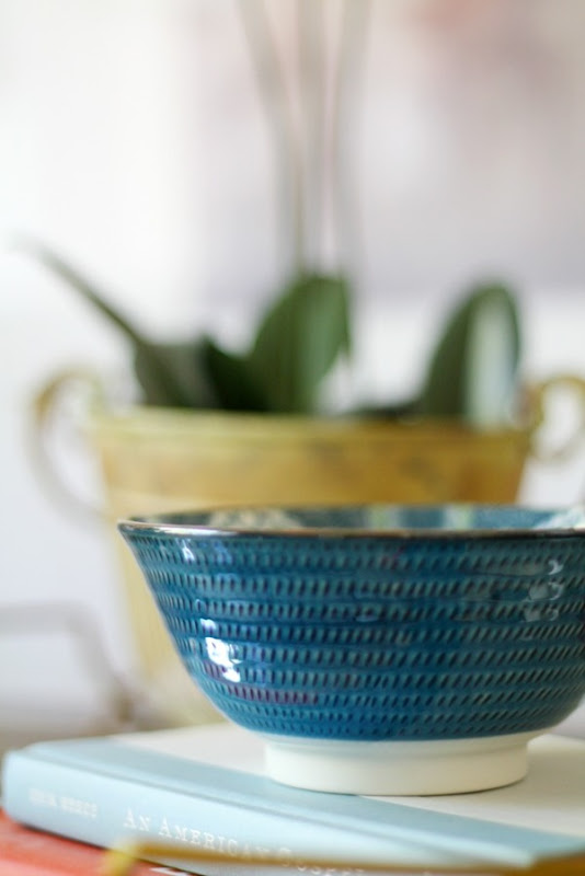 Always add an unexpected does of color. Even if the room reads neutral. Here the bold blue of the bowl catches the eye and gives the vignette some energy. We kept the color all in one accessory . . .remember the books and bowl serve as one accessory in our grouping of three. Adding color to all three would have lost the neutral and calm feel we are going for here.
 ![five[4] five[4]](http://lh6.ggpht.com/-zUDPKhiMxog/U3LVnjr5q4I/AAAAAAAAWMU/WSb9yD0z3rw/five%25255B4%25255D_thumb.jpg?imgmax=800) keep it tight
keep it tight 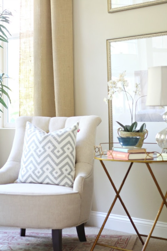 Keeping it tight means keep your vignettes and grouping cozy. They need to feel connected. A table next to a chair needs to be just that. Next to it. It should only be a couple of inches away or you risk the chance of it looking disjointed. If you think about it, table should be a natural place from which to grab a book or drink. If you are reaching to far than pull it closer. In this vignette, the chair, table and artwork on the wall are all working together as an arrangement.
 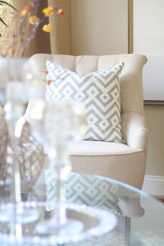 I hope these tips have helped. I really tried to stick to one vignette to show you what goes into styling a space like this. Let me know if these tips help the next time you are styling your own space. Sources: lamp | pillow | bowl | round table {HomeGoods} chair {world market} To see other Five Ways installments, just browse around below. Style An Outdoor Space Setting A Pretty Table | Make Neutral Spaces Shine | Style a Small Foyer | Style Bookcases Hang Art Above a Console | Decorate With Wreaths | Re-think The Closet … And lastly, Happy Birthday to my beautiful boy who is turning six today. He lights up this home with his zest for life and pure joy that oozes from his spirit. We are lucky. I wrote 10 Things I Really Want My Son To Know and you can read those here. *I have received product from HomeGoods in connection with my affiliation with Happy By Design. All styling, opinions, and ideas are 100% my own. Always.
Great tips Courtney! Thanks for showing all steps in one set, it's easier to understand what you're talking about.
Happy birthday to your boy!
Greetings,
Nice and Clean London
I'm so relieved you think so, Mia. That's great. And thank you!
Yes I agree, such great tips and the photos are beautiful
Thank you so much, Julia! I really appreciate that. Have a great day.
These are great tips Courtney! Definitely something to keep in mind when styling!
Beautiful styling and photos as always Courtney! And love your tips!
Thanks for sharing Courtney. I have a few areas I would like to change up/tweak in our home, and this is so helpful. Love the table as well. I have a tray similar that I purchased at Home Goods.
These are really great tips Courtney! My mom top me "the rule of 3" years ago, and while I'm not always good at following it, I try to as much as possible. Really like that table!
Love these tips!
These tips are perfection!!! Love them so much. Vignettes are my fave when done well!