Being snowed in has its advantages. One of which is allowing me some time to finally snap photos of spaces we have refreshed. Do you remember the guest bathroom plan? It’s not always realistic to gut a space or make major changes. When it comes to working on making this house our home, we are very cognizant of our budget and are keeping that in mind as we evaluate our projects. The bones of this bathroom are fantastic. And while it may not have been the finishes we might have chosen, it still had plenty of potential. In case you missed it, I shared a list of what we love about the guest bathroom and things we want to change in this initial post. With a few creative and inexpensive changes, we have a space we now love.
THE BEFORE
A look back at where we started. Like I said, great bones just not our style. I wanted it to feel updated and fresh.
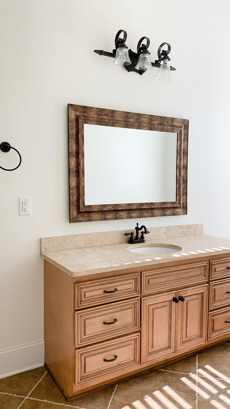
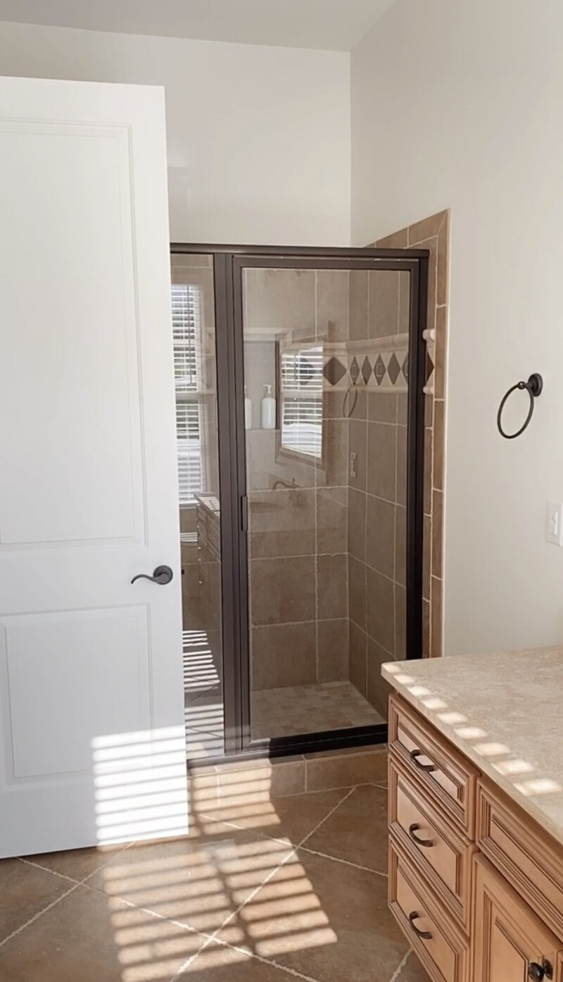
We didn’t make any changes to the shower (besides a new shower head we just installed) but it’s in great condition. We did remove that towel hook. It was in a bit of an an awkward spot and unnecessary.
THE TOP THREE SWAPS
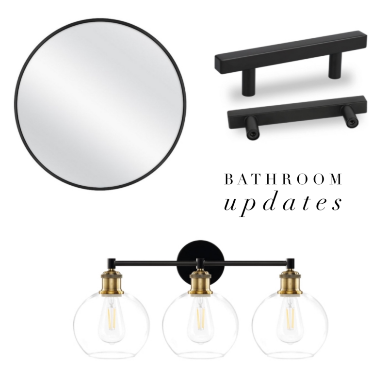
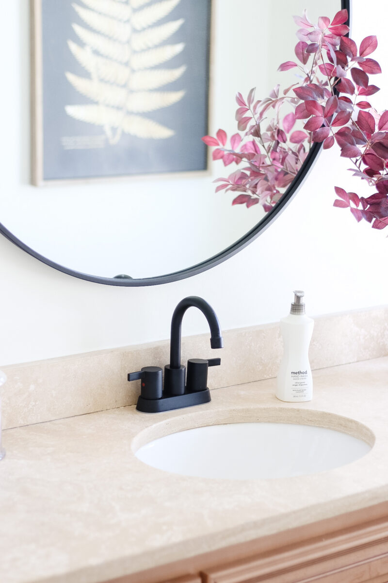
Without question, this is where the difference was made. Lighting, hardware and a new mirror. And non of it was expensive. Such simple changes to give it a more current vibe.
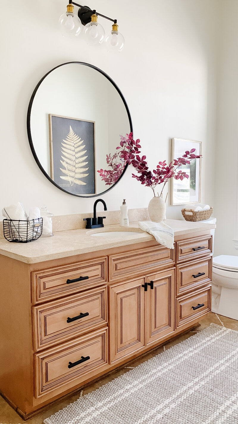
towel | basket | plant | rug | tp basket
This bathroom receives amazing natural light. In fact I often sneak in here to do my makeup because I love it so much. Ours needs a bit of a refresh but that is down the road. The rug is incredibly comfortable underfoot and helps to soften the space.
NEW LIGHTING
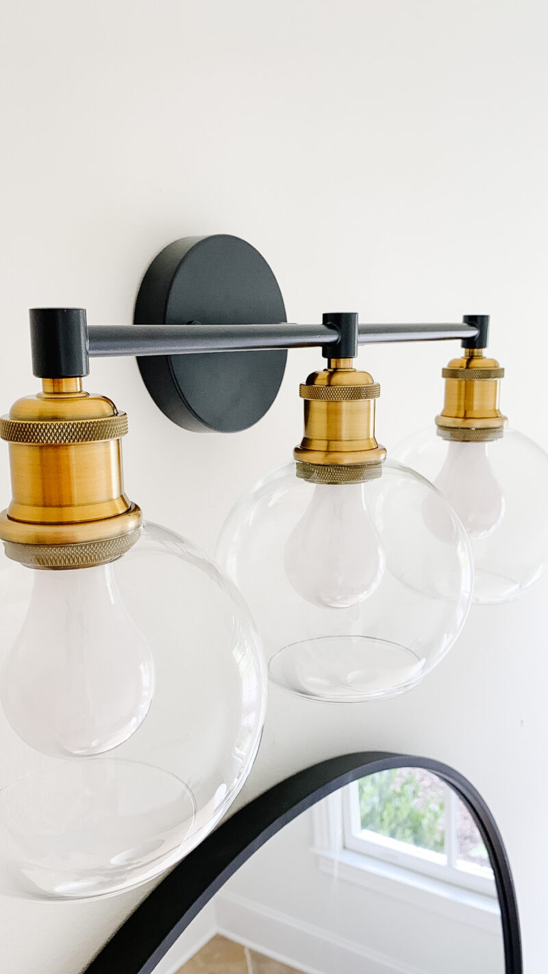
NEW HARDWARE
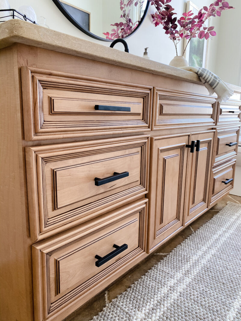
Changing up your hardware can be done in under an hour and it makes such an impact. I chose something very simple to go with the more detailed doors.
THE DETAILS
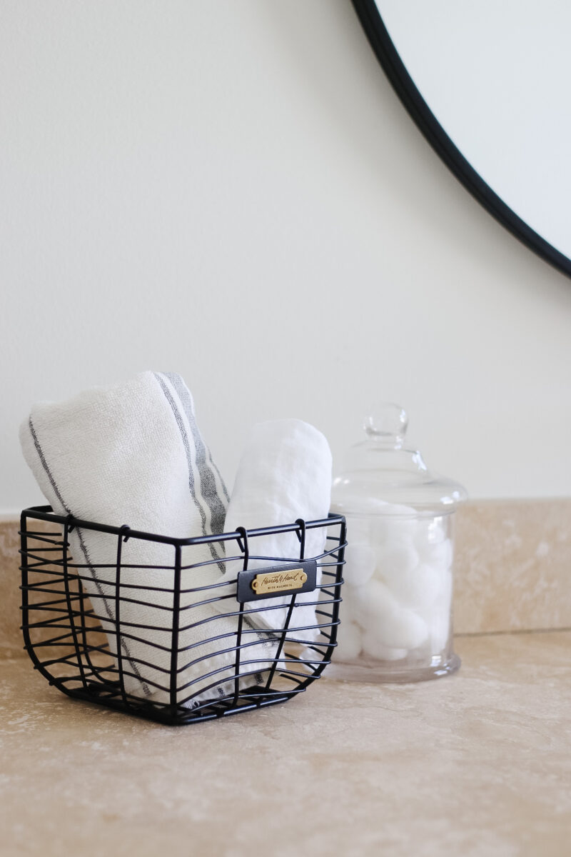
I always have extra towels available and the muslin makeup cloths. Do you have them? They are fantastic for removing makeup because the running water washes it all right out of the muslin. They save all of your petty towels from their demise.
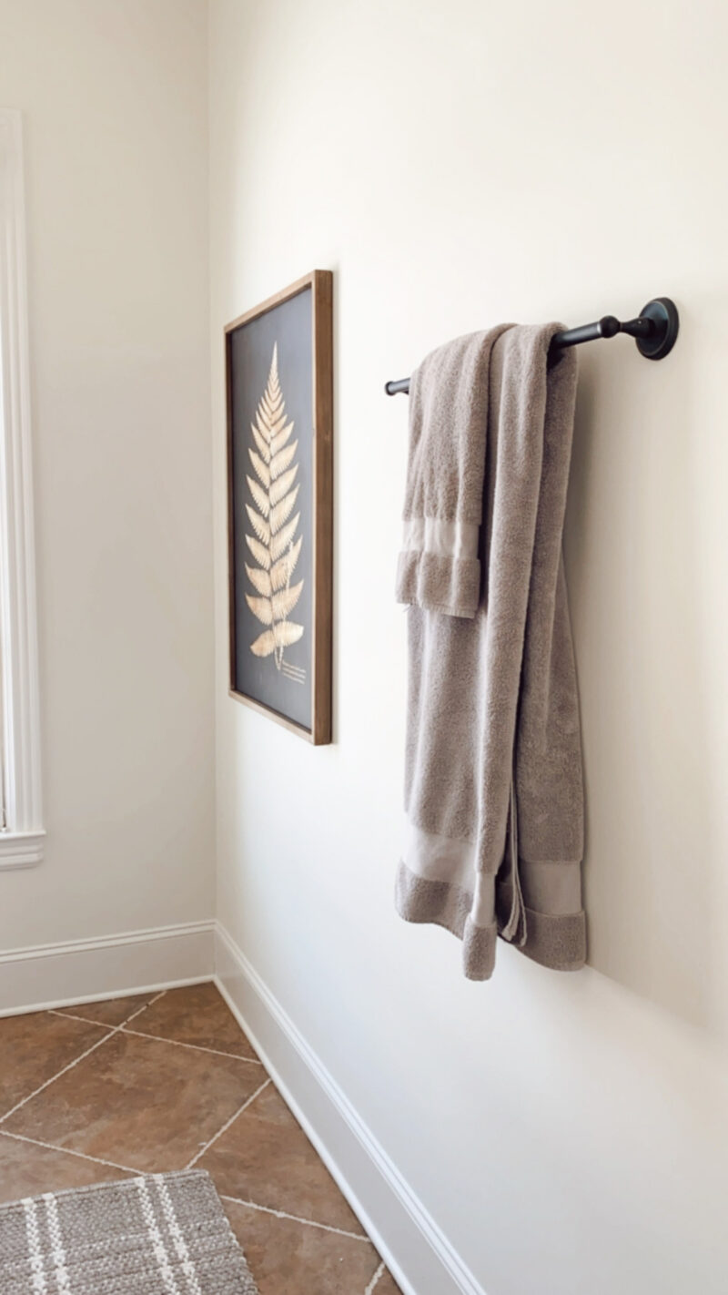
The towels are my favorite from Serena & Lily. Such a great weight and super soft.
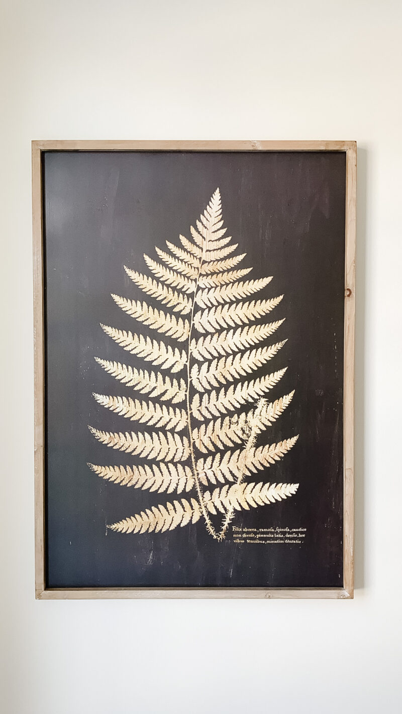
The pretty leaf print is from a local store, Sara Sells, but I found them here. I love them as a set but you can break them up for two rooms or split the set with a friend. It’s extremely striking in person.
*Update: They sold out above but I found them here!!!! This version is a nice option too (without the wood frame).
SMART STORAGE
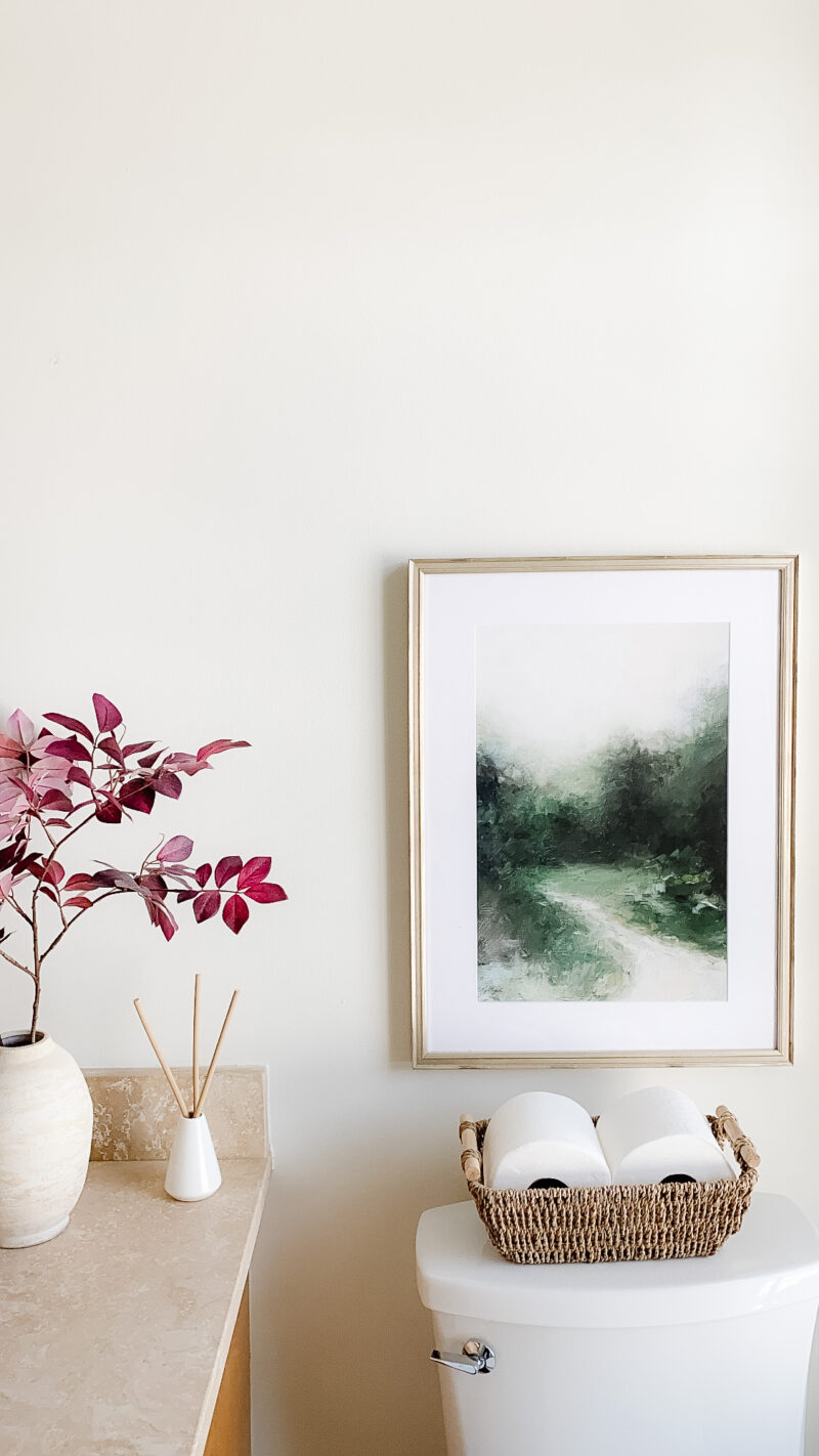
No surprise that I used one of these baskets in here, too. It’s the prettiest way to keep toilet paper and a great visual to see if you need more. We have one in every bathroom.
FROM THE GUEST ROOM
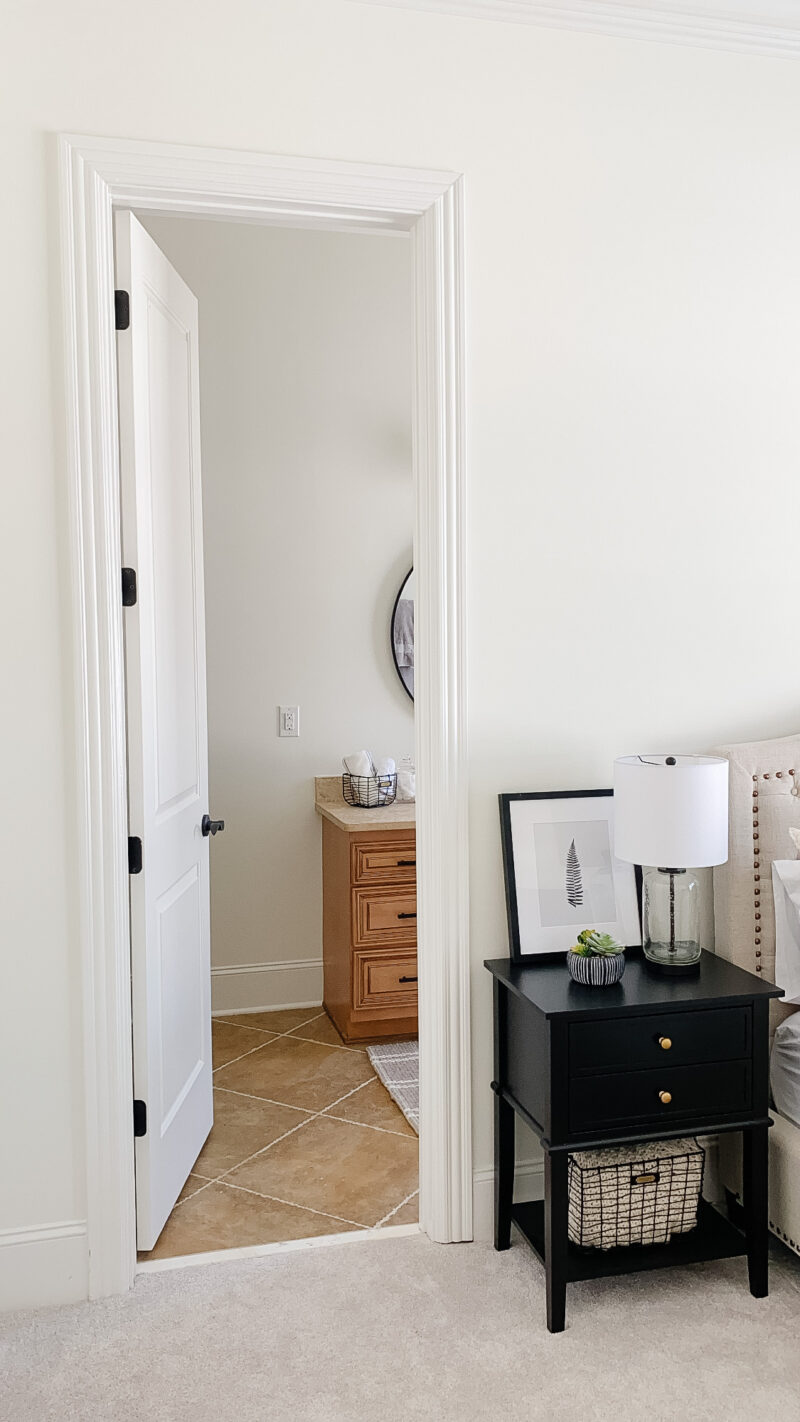
Here is a peek of how it flows from the guest room. The black nightstands with gold knobs tie together with the choices we made in the bathroom.
ONE LAST LOOK

I hope this inspires you to make a few changes in one of your spaces. My best advice is to keep it clean and simple. If you don’t love the finishes or they seem outdated, you’ll want the overall space to feel calm and fresh. Less can definitely be more.
Have a great weekend, my friends.
Love how these design choices updated the look and feel of the space!!
Thank you so much! It was definitely fun to work on. Have a wonderful weekend.
Love the updated look! Great tips! Do you know the name of the paint color?
Hi Jen. Thank you so much. Yes, it’s Alabaster by Sherwin Williams.
Lovely! So happy to see how simple and effective an update can be without having to completely renovate.