I can’t believe we are already upon the fourth week of Just Four Things. We are not letting you off the hook easy this week! You really need to jump in and use both your imagination and your visualization skills! In case you missed the last installments, each Wednesday I present you with two choices to help design a client’s room. In the end, I will reveal how the room came together and see if your design eye got it right. We are working with Brittany and her husband on their master bedroom.  Client Space
 They have a fresh coat of paint on the walls and have already chosen a bright white bedding from Pottery Barn and a gorgeous set of fabrics to use in the room. Bedding
 Last week you all weighed in on the lamps! Most of you felt that the turquoise lamp was best suited for the space. You can see those choices here. Here is a reminder of what we plan to do: the design plan
 Bedding Drapes New Lamps Artwork above Bed Item Number Four: Artwork I am counting on you being able to use your fantastic visual skills for this one! ") {how awesome are the shams our client made . . . things are coming together!!} DILEMMA: These gorgeous photos of Brittany’s daughter are just too precious. They are already on canvas but lack the proper scale for above the bed. We have come up with two options which need you to use your imagination! Option #1
{how awesome are the shams our client made . . . things are coming together!!} DILEMMA: These gorgeous photos of Brittany’s daughter are just too precious. They are already on canvas but lack the proper scale for above the bed. We have come up with two options which need you to use your imagination! Option #1  source Option number one would entail mounting each photo onto another larger canvas. They would then hang side by side. The larger canvas under each photo would be given a patterned paint treatment in a light tan {similar to below}
 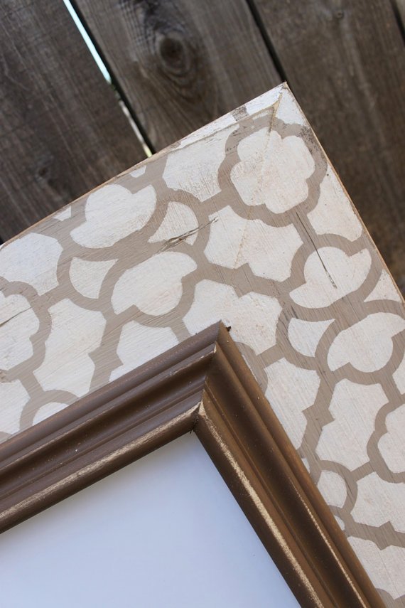 Source Option number one would entail mounting the two photos on another canvas. They would then hang side by side. The larger canvas under each photo would be given a quatrefoil paint treatment in a light tan. Option #2
  source Option number two would be to purchase two more canvases the exact size of the photos. We would then hang them in a grouping of four like above. The top right and bottom left would be the baby photos. The other two would be given a patterned paint treatment shown above. Most likely a light tan quatrefoil pattern. …………………………………………………. So please user your savvy visual skills and help our client decide which option would be best. Which one would you choose for our client? Number one or Number two. Please leave a comment below and cast your vote!
Comments
Leave a Reply
Just Four Things: Which One Wednesday
It was so much fun working on Melissa’s dining room project with Just Four Things so the series returns with a master bedroom makeover! In case you missed the last installment, each Wednesday I present you with two choices to help design a client’s room. In the end, I will reveal how the room came together and see if your design eye got it right. 
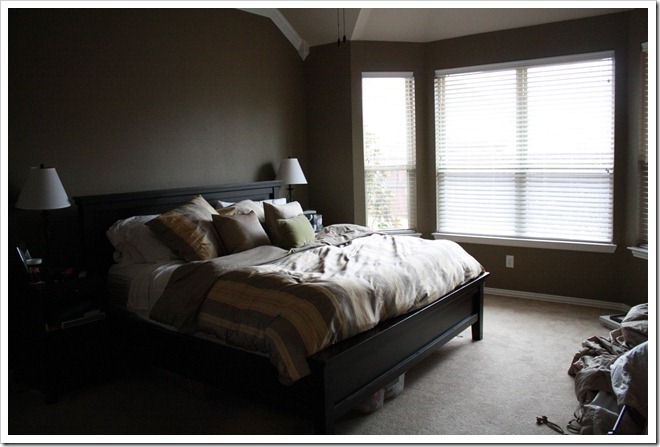
 As you can see, they have experimented with décor above the bed. Prior to beginning our project, the clients put a fresh coat of paint on the walls { Quiver Tan } and the drapes are down so you can better visualize the space. I love how rich the walls are. But this room needs our love. The clients are not opposed to some pops of color and gravitate towards graphic prints.
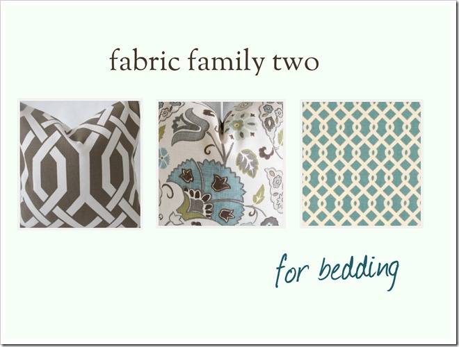
 I want this to be a place that they love walking into at the end of each day. A master bedroom should be one of your favorite spots in the house. So here is what I plan to do with Just Four Things: the design plan Bedding Drapes Artwork above Bed New Lamps Item Number One: New Bedding Our clients prefer a nice crisp white bedding {as do I}. What I love about a nice white duvet cover is that you can infuse personality and color with great fabrics. So the choice is yours. With their newly painted cocoa colored walls and crisp white bedding, what family of fabrics would you use? Choice #1
 ") Choice #2
Choice #2 ") Which one would you choose for this room? Please leave a comment on this post and let’s see which one of the fabric families you would select for Brittany and her husband. {Important to note: All choices presented fit within the client’s budget}. Is your vote for Choice #1 or Choice #2?
Which one would you choose for this room? Please leave a comment on this post and let’s see which one of the fabric families you would select for Brittany and her husband. {Important to note: All choices presented fit within the client’s budget}. Is your vote for Choice #1 or Choice #2?
Comments
-
says
I have to vote #2. I like that there are two geometric prints mixed with one pattern, and I love the color palette. They look soothing but still interesting and vibrant. This is a fun series!
-
At first I thought number 1 but no, I vote for #2, like it better! 😉
-
Definitely choice 1. Love the orange. Great series.
-
I love both but I think with the wall color fabrics #2 would compliment it better.
-
Num ber two, num ber two.
Both are beautiful but, I like the second one best. Can't wait to see it.
~Sarah -
Oh that's so hard b/c I love them both… there's something so catchy about the tangerine color but selection 2 is gorgeous, soft and timeless… I guess 2!
-
I vote with Jackie – No. 2 would be my preference.
-
Number 1! I like the brighter colors if they are going with all white bedding.
-
I pick choice # 2!!! I love the centre fabric! Hopefully you will post the details at some point. Love this series – so much fun!
-
I love both but I think number 2 would keep the color scheme soft and warm. It would also tie into the wall color much better.
-
Number 1
-
Holy cow–this is a tough choice–I love them both. BUT–I have to go with option #2. I love it!
-
I love both of them, but I'm partial to turquoise and orange, so I'm going with number 1.
-
#2 The orange and turquoise combo is too trendy..plus I think most people tire of orange too quickly.
-
tough choice, but i vote for #1. love the tangerine.
-
#2 definitely! I love cooler tones in a bedroom.
-
Number one!
-
Choice #2! I think it will look gorgeous against the walls.
-
No. 2!
-
Though I personally would chose number one, I think your description of your client would lead me to chose number two for them.
-
I like both! I think number one will infuse more energy with the orange and number 2 will set a more relaxing feel so maybe 2 since it's a bedroom.
Meg
-
I love both choices, but I think #1 is just a little more interesting.
-
#2
-
#2 for sure!
-
# 2 for sure!!
-
Great choices, but for the master I'd go with #2! It's more calming, which is what I would want in my bedroom. 🙂 Such a fun series!!
-
I like choice #2 because I think it lends itself to a more serene, cozy feeling that's nice to have in a bedroom!
-
Love them both but would opt for #2 for this project. I'm already brewing ideas to use these in our house!!
-
#2 – there are more creams in #2 which will flow better with the wall color.
Cant wait to see it finished! Im sure it will be awesome -
I would go with choice number 1 because the orange really would pop in the room, versus the blue.
I am a new follower to your blog & am loving it!
-
Choice #2
-
#2 for sure!
-
I love the colors in #1!
-
Love the colors in #2!! This is going to be another fun project!! 🙂
-
I love #2 – the colors just say "relax" to me! I can't wait to see the results of this project!
-
I think fabric family 2is where my heart lies. i love the mix of traditional prints (trellis) and more fun prints. I think the colors in one will give you leeway and will work nicely with the new room color.
On a side note, I would appreciate your help in spreading the word on my new give away for a $50 gift card from Pier One: https://courtneyoutloud.wordpress.com/2012/01/11/pier-1-imports-gift-card-give-away/
I can't wait to see the curtains!
-
I love both but I would say #2!!
-
oooh i pick # 1 just because of the bright pop of orange in there!
-
Choice #1!
-
Loving orange right now, so my vote is option 1!
-
Love both of them but going with #1
-
love the soothing colors of #2
-
#2!!
-
Choice #2 grabbed my attention instantly!
-
Oh, that is a hard choice. I really like #1, but I know that in my MB I like things to be a little more subdued, so I think #2.
-
Hmmm… my vote would have to be for #1. I love the bright pop of the orange!
-
Family 2!! So pretty and calming!
-
One. =)
-
#2!
-
#2! Love them both but prefer the calm, soothing colors of option 2 for a mb. Can't wait to see it all come together!
-
Two! Two! I feel like I'm on the Price is Right!
-
Both very pretty. I vote for option 2 with her cocoa colored walls.
-
#2 for me!!
-
I love #2 and also plan to use similar colors when I design our master bedroom soon! I love the 4 Things series!
-
My gut says color palette 2 but that would be a little safe. I choose #1 it is fun and fresh. Something great to wake up to each morning.
-
Another vote for #2
~Mandy
-
I love blue and brown!! I'm all about #2.
-
I love both choices… however I would definitely say #2 is my clear winner 😉 I can't wait to see what you come up with for numbers 2, 3 and 4!
-
Gotta go with #2! We just got rid of their former bedding (the Cole silk duvet from PB), and I do NOT miss how wrinkly it always got…I am sure Brittany and her husband will find the same to be true!
-
I really like them both, but I'm going with option #2 because I think those colors are more serene, which is desirable in a bedroom. Can't wait to see the next step! 🙂
-
I choose #2. I really like the teal with tans and whites.
-
I would pick number one. Tangerine is a big color for 2012, and I love it's warmth.
-
I think two is a good choice, but a safe choice. The fun of the orange and blue in number 1 would really make things pop…
-
Like the first combo a lot, but more for a living room, so definitely going with NUMBER TWO!!
-
Personally I would go with choice #2. What a fun series for us.
-
Loving the tangerine, but for some reason I'd go with #2! Both are beautiful though. Can't wait to see how this one turns out!
-
Hmmm…I'm usually a "the more the better" when it comes to color…but I'm really lovin' #2! This is an absolutely awesome series, girl! It's inspiring me to get some new stuff going because hey, I could do it in 4, right? (c:
-
#2 please!! I adore #1, but with the Quiver Tan paint color… gotta choose #2. Can't wait to check-in each Wednesday – what fun!
-
#2! I LOVE this 4 things series!
-
This is such a fun series! I think # 1 has a bright and cheerful feel about it. #2 felt a little more masculine.
-
I love both but I think #2 will better go with the wall colour!
-
I like number 2 better! Can't wait to see how this one turns out!
-
#2!! =)
-
I personally like #1, but maybe not for a bedroom. So I choose #2.
-
Definitely #2. Enough color without being too bold. I love more subdued colors in a Master.
-
Both are great choices but I love the pop of orange in #1. I hope you have an electronic tallier to help sort through the amazing response to your wonderful series!
Cathy -
I love choice #2, it would look great with the crisp white linens and warm cocoa walls.
-
I love choice #2, it would look great with the crisp white linens and warm cocoa walls.
-
I think #2, it is more relaxing. Can you share your sources for all the bedding choices? Thanks!
-
I think orange is going to be a little overdone this year, so I'd go with #2, so pretty!
-
I like the second one I'm not a huge fan of orange, even though it will be everywhere this year.
-
#2!!! I think you may tire of the orange in the bedding accents. You could add a pop of orange on the walls or w/a small pillow. #2 is so pleasing to the eye.
-
I vote 1, but based on the client's current room, i think they'd be most comfortable with 2. But you can't go wrong with either!
-
I like both choices but I love the colors for Choice #1. Going with 1.
-
I love the first choice but agree that choice 2 is best for that room. The browns and tans in the second pallet will look amazing with that wall color.
-
#2 – it's Beautiful!
-
Just the blues in one with those sheets…
-
Choice 1!!
-
#2. Fun series..looking forward to following along and seeing the process.
Maureen -
#2 is so calming and soothing, i don't know how you could not!!!
-
Oh how I love this series. It was a no-brainer for me. #2. GORGEOUS colors!
-
I vote number ONE!
-
For me, #2 just oozes peace and tranquility.
-
#2, love the blues & green in the middle pillow. And love this series! Reminds me how just a couple tweaks can make a huge difference.
-
Number 2!
-
#2 for sure.
-
Love both options, but #2 is my favorite! I think it will go best with the walls and is a look they won't tire of easily.
-
What is the floral fabric in choice 2? Love it! # 2 !
-
#2! Could you share details on these fabrics? I LOOOOOVE them.
Leave a Reply
Just Four Things: Which One Wednesday
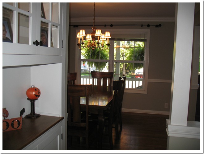
It’s the last installment of Which One Wednesday for our client, Melissa! One last decision to make. As always, a quick recap of the dining room space we are working with: 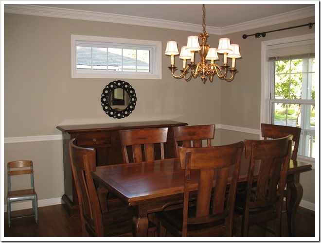
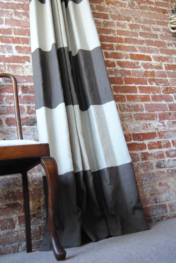
 You can check out the previous weeks design choices here {mirror}, here {chandy}, and here {drapes}.
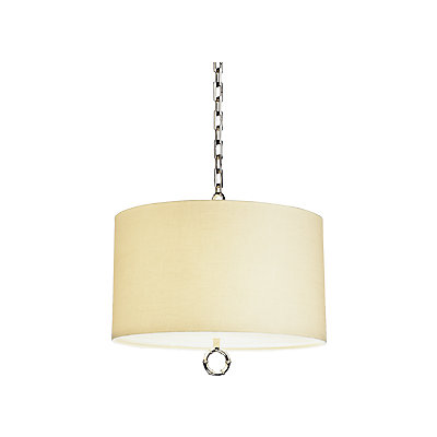
 the design plan
 Mirror Drapes New chandelier Accessorize the Buffet Item number four: buffet lamps 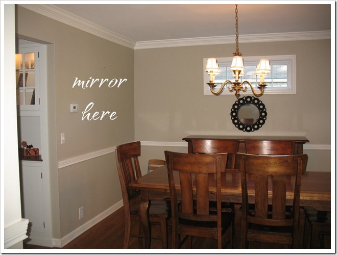 Last but not least, we need to accessorize the buffet. I have suggested that the client create a large chalkboard to place on top of the buffet and rest against the small window. Similar to this photo:
  miss mustard seed via pinterest So now we need you to make one last decision with the buffet lamps. What do you see as the best option: Choice #1 With Choice #1, we would use one lamp and place it on the left side of the buffet. The chalkboard would rest against the window on the right side of the buffet {much like the one pictured above}
 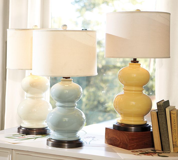 Choice #2 For choice #2, we would use two lamps {one on each side} with the chalkboard centered and resting against the window.
  Melissa and I look forward to seeing what you choose! And pretty soon, we will get to see Melissa’s dining room with a fresh new look. I can’t wait!
Comments
-
Given the other design choices that have been made, I'd go with Choice #2. I think having lamps on either side would balance out the buffet. Having the chalkboard to one side would make it seem heavy.
-
I would go with Choice #2. I am all about symmetry. 🙂
-
Choice #1 🙂
-
The first one fo' sho'!!!
I love, love the blue one. -
Oh man. I've missed out on voting until now! Okay…I think it depends on the chalkboard frame. If it's ornate like the picture, option 2. If it's a little more streamlined, option 1. However, option 1 is my favorite! Gorgeous lamps!
-
I'm with Chris….given the selections already made, use the gourd lamp and a more simple frame for the chalkboard.
Great series, can't wait for the final product!Cathy @ Room Rx
-
Can we choose #1 but use 2 of them instead of one?
-
Choice #1 !
-
How did I keep missing these weekly Wed. posts? I have to go back and see the rest, but I LOVE the choices so far.
The framed chalkboard? So great! Yet again, it's one of those things that makes me say "why didn't I think of that?" Lol.
I am loving choice #1. Choice #2 is more traditional and expected, but especially considering the other design choices, #1 would look great as long as items are in the correct esthetic proportion to the space and each other. I know you won't steer her wrong either way. You know you're awesome…but it's fun to "be a designer". What a fun series!
-
Choice #1!
-
This is a toughie! I love the look of Lamp #1 but the idea of two lamps in #2. I think it will look great either way!
-
Choice #1, I like the unexpected surprise of the traditional frame mixed in with the other modern choices. Can't wait for the reveal!
-
#1 to break up the traditional feel.
-
Choice number 1! I've been eyeing those lamps!
-
Choice number 1 for me!
-
I can't decide! They're both great choices!
-
Oh, man! This is tough! I LOVE the first lamps, but… I also think the symmetry of two identical lamps would be nice, and a bit more formal, which might be good for the space. BUT… I so love those first lamps. If I were choosing for my own home, I would go with what I love, and that would be #1! 🙂
-
If you're going with more of a traditional look then I would suggestion #1, but if you would rather go more trendy and hip go with #2.
I personally would pick #2. I like the pop of color.
-
This is a tough one! Either will look great! You know my love of a blue lamp so I am drawn to #1! But, I do think either choice will work well. It'll be fun to see the room all put together.
-
I am usually all about symmetry, but I say this time go with something unexpected and go with one lamp.
-
I love, love, love those curtains (just stumbled onto this blog). I vote for choice number 1!
-
Oh my gosh I cant wait to see this all completed! I have a similar long rectangular window in my dining room(on the back wall, similar placement to this one) but its a lot larger and looks out into my laundry room! UGH. This 1860 home is amazing but sometimes I think theres too much character!
When we moved in, there was a huge buffet cabinet in front of the window, covering it up. -
Great chalkboard menu on the buffet. How elegant!
-
Choice #1, I think the asymmetry would be great!
-
Choice one! So fun.
-
I'm terrible at this! Both would look great, but I'm gonna go with #1 because I love the shape of those lamps!
-
Number 1!! I'm a sucker for asymmetry. I think it feels more homey and casual =)
-
I'm gonna have to vote for number one! Huge fan of those lamp bases (:
-
Oops, I said mine all backwards. I meant I choose #1 because #2 is more traditional.
-
For me, I prefer #2 but I think #1 would look best with the other styles picked by everyone. So my vote for the room is #1
-
I'm all about option 1. I love the lamp, and I think one lamp is unique.
-
Ok, I'm going to be the odd-ball here. 🙂 I say choice #2. The other lamp is very modern and would maybe match the rest of the room better but I like having a "surprize" item in a room as a focal point. I think lamp #2 with the chalkboard would make a eye catching piece.:)
-
Choice #2! I like the antique look in both the lamp and frame of the chalkboard.
Leave a Reply
Just Four Things: Which One Wednesday?
I am soooo excited to kick off Just Four Things. If you are new to my blog and missed the explanation of this online project you can read about it here. Thank you to all the readers who took time to send photos and share their space with me. I was blown away by all of your pretty homes. Sweet Melissa will be our first Just Four Things client. Her dining room is in need of some warmth and personality and I love the sentimental story of her home as well. This is what she had to say: Hi Courtney! I’d love for you to consider our dining room for your "just four things" online project! My husband and I and our three crazy boys (ages 12, 6, and 3) live in "The House that Dad Built" for us 14 years ago. My father is truly a master craftsman and has added so many special touches to our cozy home. But 14 years later, it’s time to redecorate and give it some new energy. Over the past 6 months, we have begun to update and redecorate the first floor. We recently completed a kitchen remodel and are ready to move on to the dining room and family room. I find myself jumping from one room to the other, and even upstairs temporarily to switch my boys bedrooms!, and I’m having trouble focusing on one room to get it done. We have our dining room pretty much down to the bare bones at this point and would love some suggestions to get this room completed and transformed into a warm, inviting, comfortable, fun place to eat, do art projects, and play games together! Thanks for taking the time to consider our space! Melissa Here is a look at Melissa’s dining room. The family spends every day in this room and I am looking forward to making it a space that inspires wonderful family moments together. 

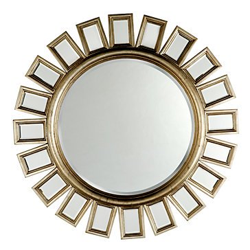
 the design plan Mirror Drapes Accessorize the Buffet New Chandelier The client wants the room to coordinate with the first floor which hosts green and blue accent colors. The mirror will be a perfect way to reflect the outdoors. The drapes will add richness and warmth with texture and pattern. A quick way to update the space will be via a new chandelier. Accessorizing the buffet will blend the gap between it and the window, while adding height and interest to the space. Item Number One: A Round Mirror I want to open up the space with a beautiful mirror. The back wall is a natural spot for a mirror as it will reflect the outdoors beautifully. Melissa and her family have a pretty front porch with lush greenery that will look just gorgeous in a mirror. Keep in mind we will be removing the current mirror from under the window.
  Choice #1
 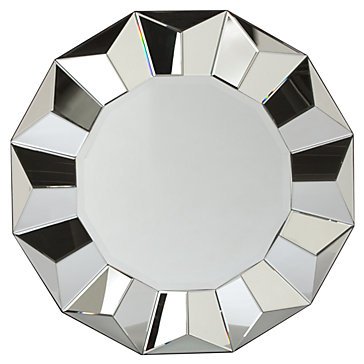 Choice #2
  Which one would you choose for this room? Please leave a comment on this post and let’s see which one of the mirrors all of you select for Melissa! {Important to note: All choices presented fit within the client’s budg}. Is your vote for Choice #1 or Choice #2?
Comments
-
Love number 2! What a great space!
-
I would go with number 2 also.
-
I think #2 is beautiful!
-
I love both mirrors, but vote for #1! Can't wait to see how this room changes!
-
I love both—but #2 is perfect I think!!
-
#2 seems to fit the style of the room better.
-
#2- it goes with the chandelier better.
-
Love this ~ I like choice #2 as the shape of the sunrays seem to work well with the room, not to mention it's a very beautiful piece!
-
My vote is for #2!
-
hmmmmmm, what's the light fixture going to look like? I'd go with the larger of the two, that wall can take it.
and oh geez, that's my chandy…except mine has TWELVE lovely lights. i sprayed it black and recovered the sleevie thingies, but still didn't do it for me. It's sitting on the floor now! I think I need to enter my Dining room in this series!
-
I vote for #2! Love the gold.
-
I am a big fan of #2! Love the gold and the old world look and feel.
-
Choice #2. The first, bevelled one will not quite tie-in to her decor. Both great mirrors though.
-
Choice #2 – I like the finish…this room is going to look great!
-
I love #1!
-
I choose choice #2 b/c it's champagne coloring gives you the option to mix metals in the accessories….
-
I like #2 better.
-
I vote for choice # 2. What a fun series!
-
I vote for choice 1. I don't love either, but I like 1 better.
-
I love choice one, but I love for #2 because the table is staying and I think it will go better with the table. This is so fun!
-
#2 is the best and the rectangles around the circle fit in better with the table and buffet shape!
-
#2 is my choice. Love this series! I can't wait to see how everything turns out!
-
I love No 2! so cute!
-
I love your blog! 🙂 I became a new follower! Erin
-
It looks like I'm in the minority, but I like mirror #1. I think it adds some femininity next to the table.
-
#1 – it's totally gorg!! Can't wait to see how it turns out!!
-
Love both but I think number two is great because of the gold accent. Amazing placement of he mirror…will open the space up by reflecting light from the window (: You're so good (:
xo -
I'm in the #1 camp….but both would be great on that wall!
-
I also like #1
-
I'd say # 2.
-
#2
-
I love #2 but #1 might look better in the space and reflect the outside more – #2 seems like too much gold/brown in the room. Can't wait to see what she chooses!
-
For this particular space I'd choose #1. This is a fun series.
-
I love number 2. I have it my own home and every time I pass it, I am so glad I purchased it!
-
I love #1! I like how theres no added color, it can always moved to another space and match!
My vote is option #1! I think it is different than what you would normally expect with photos – very original and creative! Love your blog!
I like option 1.
My vote is for #1. What a creative idea to re-scale the photos. And those baby pictures are beyond adorable!
#1 – love the unique idea! She did a great job on the shams!
Option 1. You have to make those gorgeous pictures pop rather than fade into the wall with 2 other patterned prints.
Option number 1! Great idea!
Option number 1 is very creative, but I'm also loving option number 2. So hard to choose. What about creating a panel with molding and then painting it a differemt color and hanging the pictures within the molding? Just a thought.
Number 1, for sure! Looking good so far!
#1, I love the idea of the patterned piece behind the smaller canvas. It's going to be great!
I say number one for the same reasons…LOVE the patterned fabric you would mount on (although in love with groupings of photos, too)
Stacy
Option 1
Yes Option 1! So unique. You are so creative, Courtney. I can't wait to see the results!
This one is hard…love the idea of creative more of a gallery wall effect…but also love the patterns in the first choice! Hmmmmm…!
number one! and I love that idea, I may have to use it in the future!
Meg
I like the first option, and love the quatrefoil idea!
I'm going to be different and say option number 2. I love photo groupings. They look sophisticated.
love #1
I like option number one, but I'd leave the canvas plain.
OPTION 1. LOOOOOOVE
I like option #1 the best. I wouldn't want too many pics hung above the bed.
I vote for option #1…it is a great way to add scale to a piece.
Definitely going with option 1. The layers and the pattern will add a lot visually.
I vote for option 2 (the group of 4). I think putting the two side by side would emphasize the width of the bed, but putting four above the bed would emphasize the height of the room (which I think is more desirable).
I vote option 1 — I think only two items would look more streamlined than 4
I like option #1 – very unique!! I think it would look great!
I would love to see how option one turns out! It sounds like such a fab idea!
xoxo!
Jen
Option #1 is what I was thinking of before I even saw the picture…so Im sticking with that:)
1! Layering canvases? What a great idea!
I like option #1. Interesting solution to re-size the prints.
Option #1 for sure!! Love this idea. I also love the gilt frame in the picture of the quatrafoil…could the canvases been framed then put on the other canvas? Gives it even more dimension and may not appear so linear???
I think, although the baby pics are cute, it's best to keep kids out of the bedroom because it's the one adult place in a house of children. I think I like hanging pics of the couple in the bedroom is more appropriate and inviting for the space to remain a kid-free zone. They already get the rest of the house! (In our house, anyway.) I like the idea though of mounting smaller pics on a larger background canvas painted to give more color/visual interest, but if they don't have any couples pics and don't want to get any made, I'd go with the quatrefoil. Great ideas so far. Keep it up! I love your blog.
…And also, if they have another baby (or more)it will be a chore to duplicate and display the pics above the master bed. Just my opinion! Keep those beautiful baby pics for the nursery.
Okay, last one I swear. If you paint just the sides of the canvases black/dark brown it gives depth and dimension without the visual weight (and price) of a frame. I do that for my canvases and it works great. 🙂
I vote option #1 as well.
option 1!
Option 1 is really unique, but I like #2 also. I'm no help:)
I think I like option 1 best.
I vote for option #1. But I have to agree with Moss Flight I would keep the baby photos out of the master bedroom if possible. That's the one place we keep to ourselves, my daughter owns the rest of the house.
Option 1.
I love option 1! The quatrefoil is pretty, but do you think it would be too much small scale pattern? What about a pretty grosgrain ribbon trim between the photo and the edge of the larger canvas? With the canvas painted a nice complimentary color for the room. The ribbon could be neutral, or a pop of the teal
#1 for sure!!!
Oooh I think #1- so different!
I agree with pretty much all of the above… an overwhelming vote for #1
Definitely like Option #1, and love, love the shams on the bed!
I just "stumbled upon" this but love it! I would choose Option #1. That bedroom is gorgeous so far…..I cannot wait to see more!
You can't imagine how thrilled I am that my 'would this just be weird to use that canvas I have stashed in the closet with a thumbtack to make this artwork a little bigger' idea has resonated with your awesome readers! What a delight! Thanks for included me in your options!
Blessings!
I love option 1. I have the exact same problem w/my bedroom right now. the mirror I have is too small for my large wall and I tend to have a problem with things going "over" the drapery hardware (like you have in Option 2).