We are back with the third part of Just Four Things. In case you missed the last installments, each Wednesday I present you with two choices to help design a client’s room. In the end, I will reveal how the room came together and see if your design eye got it right. We are working with Brittany and her husband on their master bedroom. I love that Brittany is enthusiastic and so ready to jump in to make the changes. That makes for a dream client.  Client Space
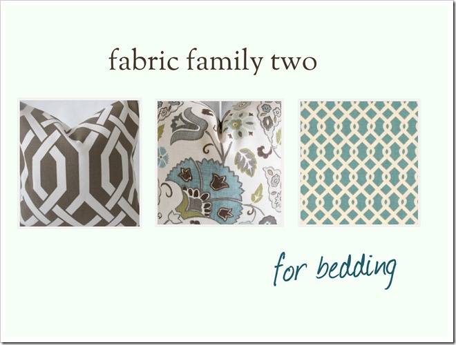
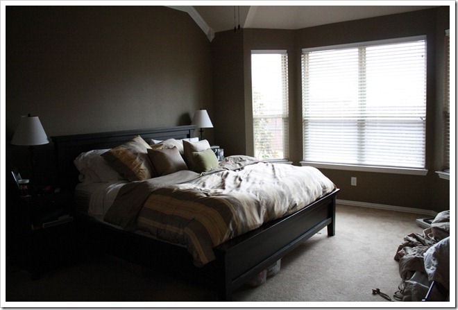 They have a fresh coat of paint on the walls and have already chosen a bright white bedding from Pottery Barn and a gorgeous set of fabrics to use in the room. Bedding
 Last week you all weighed in on the drapes! It was very much split. Some of you felt we should do a print at the top of the drape while others voted for the bottom. And a few of you threw in a third suggestion of trimming the edges. You can click here to read more about the drapery decision! It will be fun to see what Brittany and her husband decide to go with. Here is a reminder of what we plan to do: the design plan
 Bedding Drapes Artwork above Bed New Lamps Item Number Three: Lamps Do you like the idea of adding a bit of glam with the glass lamp or infusing a pop of color with the turquoise lamp?  Which one would you choose for our client? Number one or Number two. Please leave a comment below and cast your vote!
#2 for sure. But great choices either way ♥
I say #2 also.
I would go with number one, but just because I don't like things to be too much coordinated. Nevertheless option two is gorgeous.
Definitely #2! I think the glass lamps would get lost in that large a room.
#2. They're both beautiful, but I like the idea of some color and the more interesting shape.
#2 all the way!
I'm going with #2 but I do really like #1 too! Tough call!
I also say #2 but do like #1 also.
I vote #2! I think the weight of them balances out the bed nicely!
Number 2 because of it's weight. However I really like glass lamps. a glass gourd lamp would be perfect!
Meg
#2 for sure!!
Absolutely #2
#2 would be my pick
#2 for sure – nice bright colour 🙂
Lamp number two for sure. It is much more substantial than lamp number one and ties in nicely with the color scheme! 🙂
Jen
I am jumping on the #2 bandwagon, for sure. Can't go wrong with that great color!
#2! The room needs a little more weight with the lightness of the bedding.
I like lamp number two as well – it's a perfect match to the room's color story, and has a good amount of visual weight!
Oh I love lamp #2! The pop of color would look fabulous!
In thinking about the whole picture, I think that Lamp Option #1 is the best choice. I feel that you want to keep your pop of colour as an accent, you do not have to have it everywhere. I think that the bling of Option #1 would be an elegant enhancement.
Monique
Both are lovely…the glass is a nice "texture" to add to the room, but I have to agree with the others, #2 has a visual weight that works. If your client prefers the look of glass, go for something with a bigger glass base.
Cathy
Well I have lamps similar to #1 in my bedroom, so naturally I love those. However, I have dark blue walls, so I had to have something more nuetral to not contrast with the wall. Since her walls are a nuetral color to start with, the splash of color on lamps #2 might make them pop!
I feel like you can never go wrong with a little glam in the bedroom so I vote for #1.
Love the pop of color so #2!
I think I have lamp #1 (yay that I actually have something you would like!), but in this room, my vote is #2. Love the shape and pop of color!
COLOR – Lamp #2!
I like option two. Love the color and shape as well
Option 2!
Option 2!!
With all of the white bedding, I vote for #2, color!
Numero dos for me! So so pretty! 🙂
I really love both lamps so it's hard to choose. I guess for this room, I would choose lamp #2. With the wall color and the bedding, I would choose color.
#2… I'm a little over the glass bead look in lamps.
Lamp #2, I've been in search for something similar in a purple hue for my own bedroom redo!
number #1 🙂
2. LOVE
Number 2! Number one may get lost in the space- #2 makes more of an impact.
color!
I like Number 2. Pretty pop of aqua for their room and will look nice with the white bedding.
#2!
Number #2 for sure! Love!
Both are beautiful, but I love #1~
This is looking ahead, but I would want to know if the wall art was going to have some color. If the wall art is colorful I would not want to draw attention away from it with a colorful lamp. So I vote #1 if the wall art has pop and #2 if it doesn't. Personally, I would take the opportunity to draw the eye more to beautiful artwork than lamps.
I think #2 is a wonderful choice.
They both look great, but would go with #1 as to not add too much blue to the room. The glass lamps will last them through any color changes that they may make one day.
I love glam–so I love option 1, but I have to go with option 2 for this room. I think the pop of color will be beautiful!
#2- I am obsessed with the look of #1- but knock-offs often look cheap.
#2 definitely – just beautiful
Number 2!!!
love love love #2. I wanted to tell you I passed on a blog award to you, check out my latest post!! xoxoxox
Love the blue ones! (where are they from?!?!?)
I want to say blue, because I love love love it, but I think the glass one is the right choice.
TWO! I love this series, Court 🙂
#1!!
Definitely choice #2. LOVE the turquoise lamp! 🙂
#2! Love them!
I think colorful choice #2! This is fun!!
Go for the glass lamp!
I like them both, but I'd go with #2. Love the color!
#2 – just like everyone else, apparently! =)
#2 – love the pop of color!
2!
#2, the scale and color would be lovely!
Haley @thedistractedblogger
Okay, now that I have seen that the artwork is in neutral colors…I vote number two for some added color.
I know this post is from a while ago, but do you know the name of the middle floral fabric? Can't find it on the website the picture links to…Thanks,I love the whole look!!