We have all seen a million subway signs floating around. They are still hanging on the walls of great stores like Z Gallerie. On a trip to Restoration Hardware I spied this {for nearly $800!} If you have been with me for quite some time, then feel free to ignore this post! I have been receiving a number of emails lately on this project, so I thought I would re-post it with a few clarifications below. Hope this helps! 
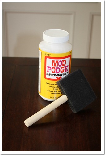
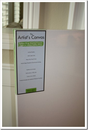
matte mod podge a foam brush place to print your sign coffee { yes, coffee . . . or tea} one rag canvas { i used 24″ x 48″}
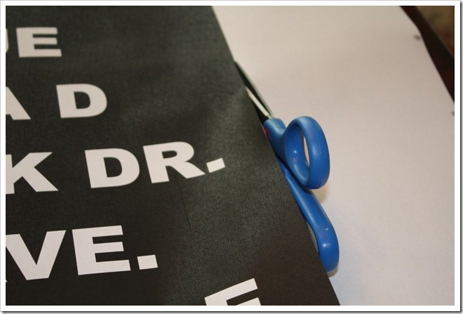
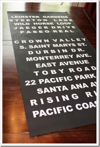
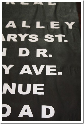
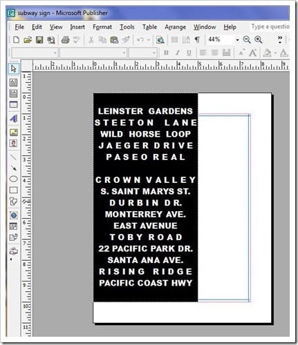 I took mine to Staples to have it printed. The key is keeping it black and white. It is far cheaper to print. The poster cost me a whopping $4.00! Next step is to cut it out very carefully.
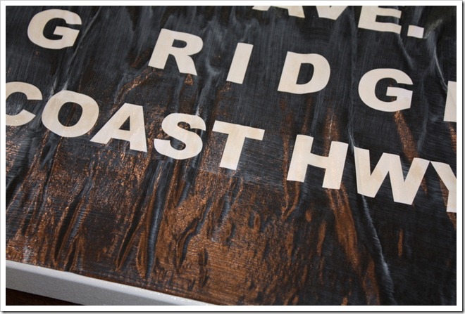
 The coffee gave it a nice creamy aged look. So there you have it. Simple, meaningful, and inexpensive! I would like to paint the sides of the canvas black . . . will get to that in my spare time.
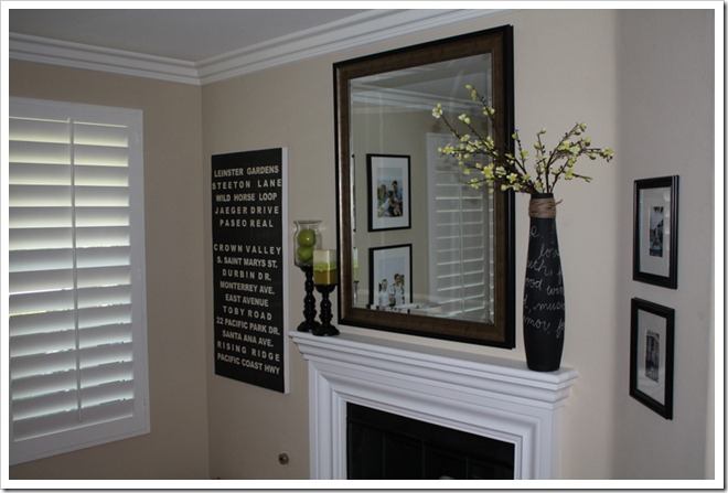
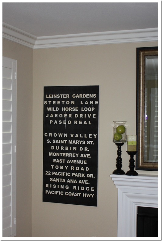
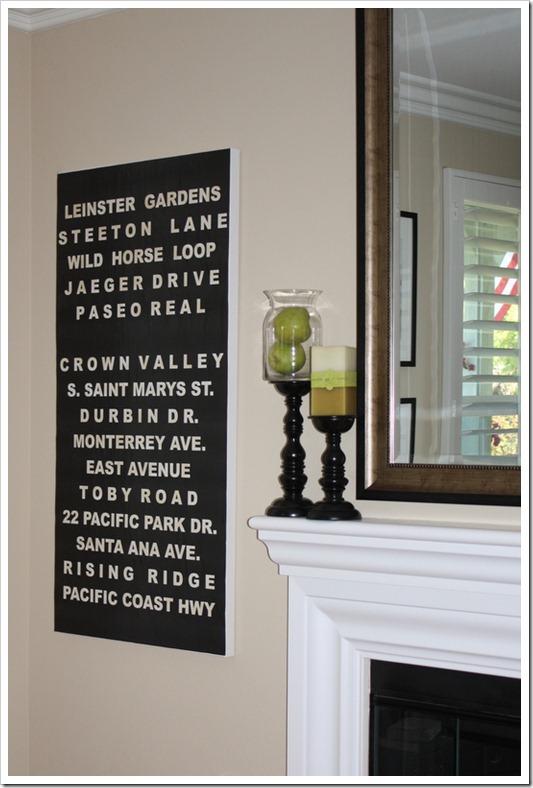

Gorgeous! I am so going to try this! You did a great job! 🙂
love this, thanks for reposting the tutorial! 🙂
I LOVE subway signs as well!!!
WOW!!! That is SOO amazing!!! I will definitely have to try this!!! You are so creative for putting the names of the streets you both grew up on! Wow!! I would of never though of that! Oh the names are so beautiful! Seems like a lot of the streets where I grew up on are numbered. lol
LOVE YOUR BLOG!
Funny, I had just gone back to look at this post as I was thinking of making one!! Great idea. My dad works at Office Depot, so I can get him to print it for me.
Well, this is *still* on my craft to-do list! lol (Since we are still waiting to buy our next home, I want to wait for the new address.) Would you mind sharing what font you used? Thanks!
thanks for the tips. love the result you got, and love that you used place names that meant something to you!
Beautiful!!! I love that you made it sentimental by using the street names you guys grew up on, so cute!
This is wonderful! I love that it holds personal meaning. Really beautifully done, Courtney.
Wow! What a terrific project! You are one clever chick!!! Love it!! Angie xo
I forgot to say that I also *love* the meaning behind the street names!
What a great project, Courtney! Luv it!!! I'm definitely going to try this! What font style did you use? And I'm your newest follower, too. Looking forward to more creative ideas! 🙂
xoxo laurie
Fantasic…thanks for reposting this, I've been trying to think of what to put on a wall in my diningroom and when I saw this I new it was what I was looking for. I would use Pittsburgh quotes and of course the Steelers would certainly have to be on there, we are all a little bummed here right now after last night.
I'm your newest follower BTW.
Rondell
Wow!! I love it! I've been thinking about trying some Subway art.
Ok I promise I'll stop commenting on your blog now (lunch is almost over anyways!) but this is SO cute. I've got to try this! And I love that you used street names. Brilliant brilliant brilliant.
Nice job! I sell Subway Signs on Etsy for those who feel they can't do as good of a job as you've done here http://www.etsy.com/shop/wordology
Love this! I've been inspired to create something similar for our entryway. I have a question: when you had it printed at Staples, did you have to request a certain kind of paper?
I just found your blog and LOVE it!!! Do you mind sharing what font & font size you used?
Thanks!
Stacey
Hi Stacey! I tried to respond back to you but your email does not pop up. I used Arial Black size 28! Hope that helps. Let me know if you have any other questions about it . . . happy to help!
Thanks so much for this! I made my own and linked back to you here http://mamawithadashofdiydrama.blogspot.com/2011/10/my-take-on-subway-art.html.
I'd love it if you'd visit my site! Thanks again for such a clear, concise tutorial!!
WOW! I am obsessed with Subway signs too – and I have been wanting one for the longest – I am definatley trying this – this weekend as a matter of fact! Thanks again, yours looks great!!
I did my layout but I ma having trouble with it cutting off the words on eht left side, how do i fix this?
Hmm, Kyla, I am not sure. Perhaps a smaller font? Is it a problem with it being cut off at the printer or on your screen?
Hi Courtney! I love this tutorial but I'm having trouble getting it printed at my local staples. My text box is 5"x10" as you suggested ( i have the same size canvas) but it's not allowing them to enlarge it at all.
Any suggestions?
Love the sign. I made one up and sent it Office Depot to be enlarged. They told me to save it as a jpeg file. My text box was 6 x 9 and I'm enlarging it to 24 X 36. I haven't seen it yet but they told me it may be pixelly. because of the size.. Did you have this problem?
This is great! Way easier than vinyl letters!
What size poster did you order from staples?
I loved this idea so much that I typed one up, ran out, got it printed and picked up all the supplies I needed. Came home and whipped it up so I can give it to my husband for Valentine's Day. Unfortunately, I do have quite a few bubbles and wrinkes:( I 'kept the faith' and let it dry, but I think once it's dry there's very little you can do to remove the bubbles/wrinkles. If I were to do this again, I would cut the paper into 6-8 in strips before mod podging them down…then you can push out any bubbles easier. If the seams of the strips show, just run a permanent marker over them. Thanks for the idea!!!
What file type did u save this as to have printed at staples?? Jpeg, pdf..ect?? Also do u take it in saved on cd, memory card ??
Courtney. What size of font did you used for this project and what type of font?
Font style I used was Arial Black. Baskerville Old Face is kinda neat too. When done your file, save as a .pdf and transfer to a memory stick to take to Staples. Other tips: Make a New Page and go with a custom size – make that size the same as the canvas you plan to enlarge to. In my case 24×48. Insert your text box and type your first line of Text. It will be super teeny tiny. Double click on the word and then click on Text Box Tools in the tool bar above. Click on Format and then at the far left there is a Text Fit option. Click the drop down and pick Best Fit. From there you can play with the font size by clicking on the large A and smaller A in the toolbar. You can also click on the AV<-> to change the spacing of the letters in your word. This yields a very cool "look". The reason to do best fit and to do your page the size of your actual enlargement is so that you don't get a pixelated look after enlarging at Staples. Trust me, I'm on my third try here haha. My Staples had to send it out, 1 day service. 49cents per square foot. very cheap to get a giant poster! Definitely paint the sides of your canvas black first and onto the front of the canvas a bit too. Mod Podge your your poster on a bit at a time to reduce wrinkles. Some wrinkles looks very cool. Take a sander to it after (carefully) to rough it up and make it look more authentic and antique/rustic. A brown glaze (or coffee) rubbed over the white lettering tones down that stark white. Do this AFTER you've applied the poster to your canvas. Hope this all helps.
Ok, one other thing I just added once I put my top coat of mod podge on was Distress Ink in the color "Frayed Burlap" Gave a very nice antique look. I just rubbed the ink pad all over and then rubbed it and dabbed at it all with a tissue. I wasn't sure if it was going to dry but it did and now I will put another mod podge coat on top for good measure. Haven't tried "sanding" the edges yet – which I probably should because then any exposed white I can cover with the Distress Ink again. Btw, I got the ink at Michaels (here in Canada). About $8 but of course used a coupon 🙂