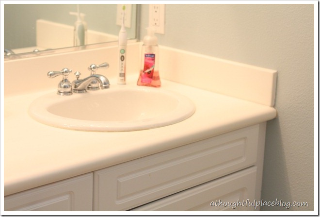
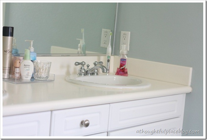
Do you all remember the Just Four Things series that I have done on here? If you are new to the blog and have missed them, I chose readers’ spaces to transform with just four things. Each Wednesday, I gave you all a choice of two different items to help our client with their space. You can see the reveal of the last installment here. Well guess what? This time it’s my space! We are doing a little overhaul of our master bathroom. We are certainly not gutting it and will need to work with what we have. But I am convinced that with Just Four Things we can give it a lot more personality and charm.  ……………………………………..master bathroom Here she is in all her glory. Now I know it isn’t awful, but it is a bit builder grade boring and we are starting to feel the desire to really try and make it more of a sanctuary. The white countertops are what we really want to replace. They are very porous and a pain to keep sparkly white.
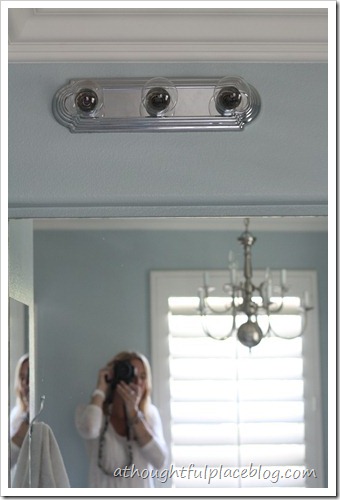
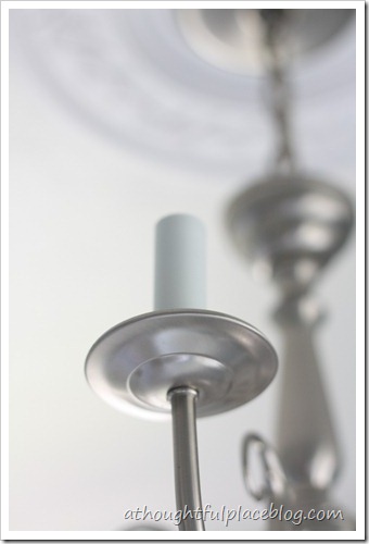
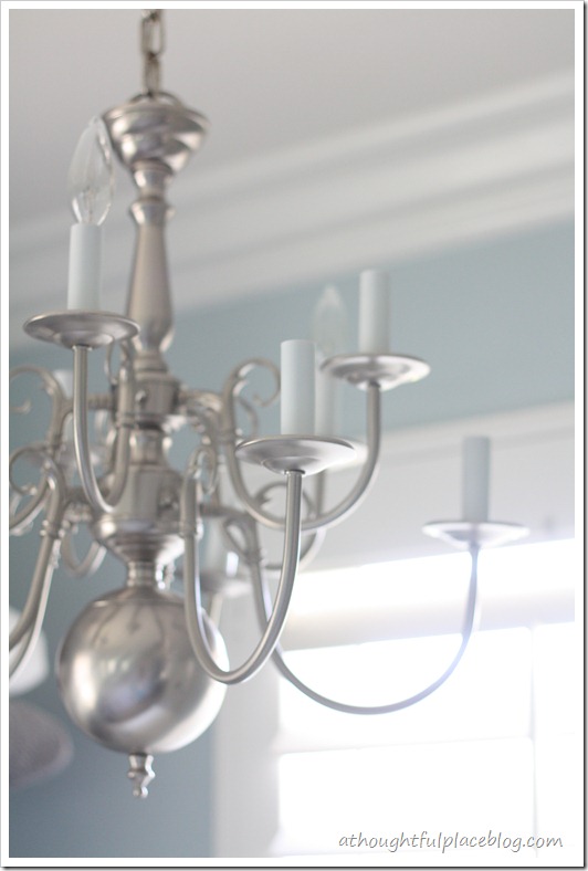
  Then there are the fantastic lights. I am ready for an upgrade. The chandy over the tub was actually brought in from our dining room when we replaced it. I think I like it in here. But do you see that there are bulbs missing. Well, that’s because we can only get three to light up. Clearly, we are in need of a good electrician.
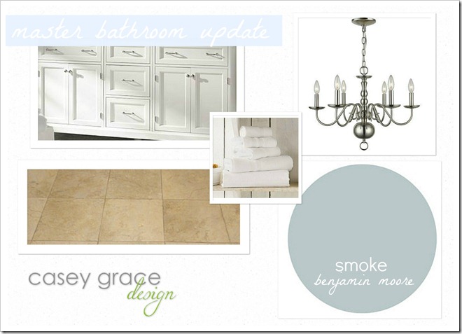
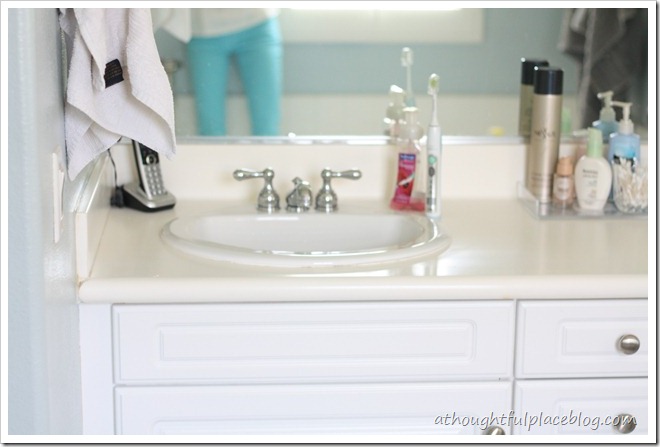 Don’t mind me as I stand in the bath to snap some photos. The space isn’t huge so there is nowhere to hide. We will keep the white cabinets to not only cut down on cost, but because I have zero interest in ripping anything out and switching up the tile. It is actually quite pretty and you can see it in the mood board below.
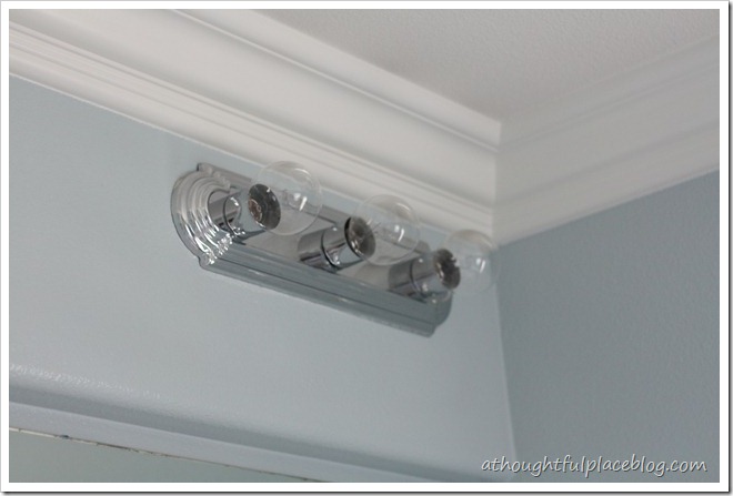
  There are two of these jazzy light fixtures. Double the fun to replace!
 I am planning to change the following four things: Countertops Frame the Mirror Lighting Faucets Here is a little mood board of what is already going on in the space so you can get a better idea of what will be staying. …………………………….…here’s what’s staying
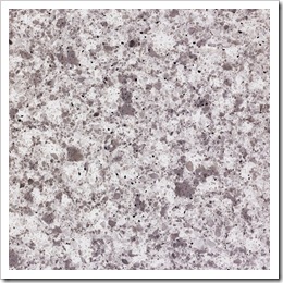
  Will you stick around to give me your opinion on each of those for the next four weeks? I am not so secretly hoping this pushes me along. This as been on our radar, but it seems our bathroom always falls to the bottom of the to-do list. A little pressure never hurt anyone so I am laying it all out there! This week’s Which One Wednesday is all about the countertops. I have narrowed it down to two choices. Please weigh in with which one you would go with. Here are the two and a little bit of reasoning behind them: Countertop Choice #1 caesarstone atlantic salt {quartz}
Countertop Choice #2 cambria torquay {quartz} Of course, my very first choice would be marble. But I am not down with the expense nor could I deal with trying to keep myself from staining it. It’s just not in me. Having said that, I adore the look of marble. It’s gorgeous. We all know that. This product is a quartz and is the closest thing that I have seen that can resemble marble. It would be the same price as granite. I considered granite, but it is almost impossible to find one that I like in the gray family {most granite seems to be warm in color or much too dark}. 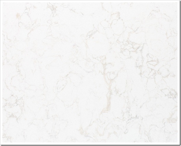 Here it is in action in a beautiful kitchen over at Seventh House on the Left.
 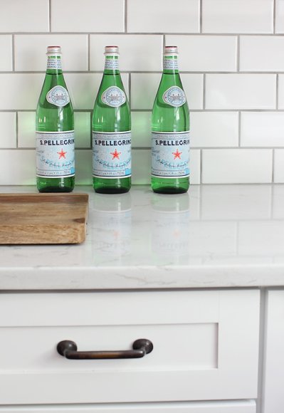 Seventh House on the Left Would you go for the look of marble even thought it’s not the real thing? Or would you add color and texture to the white cabinets with the atlantic salt? Ahhh, what to do????
  So cast your vote! Please leave a comment telling me whether you would go with choice #1 or choice #2!
Choice #2 for sure! I love white marble looking countertops. Your bathroom is going to be beautiful.
Love the cambria torquay {quartz},
and the cabinets? I always favor white.
#2 for sure. Love the look of the marble and it is so much more versatile than choice #1. #1 sort of looks builder grade to me. Hugs, Marty
I, too, like the quartz – more soothing to my mind and I think of the bathroom as a sanctuary. 🙂
Overwhelmingly choice #2 🙂 LOVE them!
I'm glad you brought back this series – it's so much fun! I would go with the quartz. I like the look of the veining and that it looks like marble.
Definitely #2. Your master is so similar to ours… smoke is on the walls, with a white counter top and builder grade cabinets. Our cabinets, however, are a hideous orangey wood tone, and I can't wait to paint them!
I like choice #2. I'm with you on loving marble but I know I would not do well with it either. I always enjoy this series form you..looking forward to the updates.
Maureen
Be thankful marble is out…it is much too porous and would stain with makeup…so go with the quartz. If you can't rewire your chandy, they make tiny glass sconces that fit into the sockets for candles. Good luck!!!
#2!!!
No. 2!!! It looks so close to the real deal, people would think it was!
#2… hands down. Wow… your bathroom is going to be one AMAZING retreat… want to come over and do mine? lol
Love #2.
Although choice 1 is gorgeous, I'd go with Choice 2.
Yes! Number 2 is gorgeous! Go for it! I love seeing your cute self in those aqua pants!
Love #2! I am so ready to change out our faux marble countertops!!
Lovin #2. Can't wait to see it!!!
Well golly geez…I don't even really get to make an argument for #2 (c; But really I think the white goes a lot better with the existing tile…it's gonna be gorge!
totally agree – #2 will definitely give you a "sanctuary" feel and will really make your inevitable pops of color even more dramatic. however, i am now coveting #1 for my kitchen.
I like #2 best – mainly because I think it will work with any color combo – so if you or another homeowner want to repaint or change the look # 2 will fit in with anything a little easier than #1. That's my 2 cents for ya! 😉 AND ps – I love your pants!
I can't focus on anything but your skinny thighs!!! but i say #2
I think you'd be so happy with the Cambria choice. I'm a kitchen designer, and recommend Cambria to many clients who appreciate a lighter look without all of the maintenance. Torquay is beautiful, and has a crisp, airy feel that you won't tire of. I had the privilege of touring the plant where they manufacture Cambria (in Minnesota), and am beyond impressed with the process, quality control and purity of the quartz material they use. You won't be disappointed with this choice!
I'm not a marble girl, so I'm all for choice 1! LOVE IT!
Choice #2-I think the look of marble is so classic and you could put any color with this choice if you were to change your mind on the color scheme.
I LOVE choice #2. Very spa-like! I'm new around here & I just love this series! Sarah
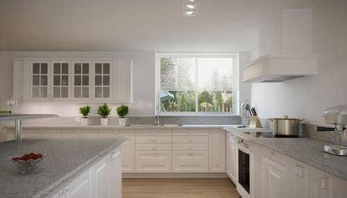
Choice #1 because a) it's really pretty and ties in the other colors and b) because it will hide toothpaste drops, makeup or anything on the day you don't clean. I think choice 2 is also great but now that you've shown the example photo of the kitchen, I think it would look best in the kitchen. Good luck!
Choice 2 . I have Choice 1 in my kitchen and really don't like 🙁
Choice #2!! And love your pants! they look great with your white shirt and necklace…yes I got a little sidetracked and was also paying attention to your fashion! 🙂
I'll buck the trend and say go with #1 – it'll really make the cabinets look lovely.
Choice #2…It's beautiful. I think it'll give your bathroom the sanctuary look you are after. Can't wait to see the finished look.
http://houseofclark.blogspot.com
#2 for sure!
Choice #2! I thought number one was pretty, and then I saw number two–it's gorgeous!
#2 Love it!
1. I like your light blue jeans. 2. I'd choose #2!! LOVE the airy spa like feel it will add 🙂
Choice #2.
Choice 2!! Love those counters!
#2…#1 seems much too busy for the space. Besides #2 is just to die for!!
LOVING #2! So clean and fresh and totally looks like marble!
Definitely Choice #2! I love it! Not a fan of #1. 🙂
#2. Very timeless and classic.
#2 all the way. 🙂 great mood and nice light color will feel fresh and clean. 🙂 can't wait to watch it all come together!
First off, as a new follower, I love this series! Looking forward to more "which one" topics to decide between. Second, I'll have to say ditto to all the others that went with choice #2. It's so pretty I've pinned it as a potential for our current remodel. 🙂
Choice #2 – it's gorgeous!!
Choice #2! I think it best fits with the "sanctuary" feeling you're going for.
#2 Will be great
Love #2 for sure!!!!
I love both—but definitely #2 is my favorite!!
#2 for sure! It's lighter and brighter and has more of a spa feel to it, which would help with making it feel like a sanctuary like you want. #1 is nice too, but I love #2!
I love both but number two had me at hello! <3
xoxo,
Jen
I love both, but I'm going with the crowd and saying #2 as well! Good luck!
Kathleen @ projectsatthepicketts.blogspot.com
#2