Phew. At long last, we have a bedroom post for my son’s room. Thank you for being patient. While we finished it a few months ago, we took time off during the holidays and finally wrapped up the finishing touches. I wish you could walk into the room with me. It’s a sun-filled, joyful space and we are very thankful with how it all turned out. Come on in.
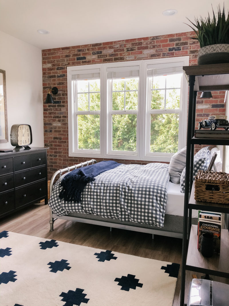
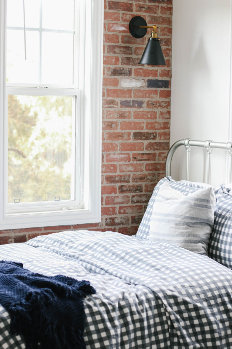
Our son requested a brick wall. I forget where we were but he saw one at a restaurant or hotel and said, “Can I have that in my room?” I’ve always wanted one, too, so it was the perfect jumping off point for the design of the room. I wanted to infuse a bit of an urban feel while keeping it very clean and simple. The view from this room is beautiful and adds so much life and color in person.
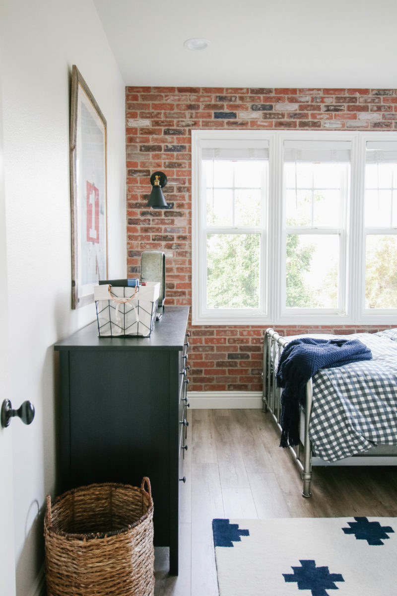
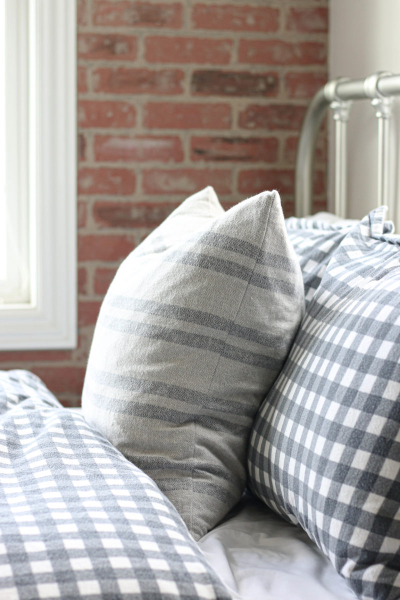
The checkered duvet was one had in his former room and loved. We bought it again in the full size. Can’t recommend it enough. His twin duvet lasted beautifully for years and withstood all of the washes beautifully. It’s a really soft flannel that gets better over time.
LOFT TURNED BEDROOM
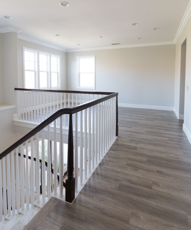
Do you remember where we started with all of this? You can get a full recap of our upstairs renovation but in a nutshell, this loft space wasn’t working for our family. The open space you see is now enclosed giving our son his new room and walk-in closet. You can see the concept for the other two rooms here.
THE DESIGN BOARD
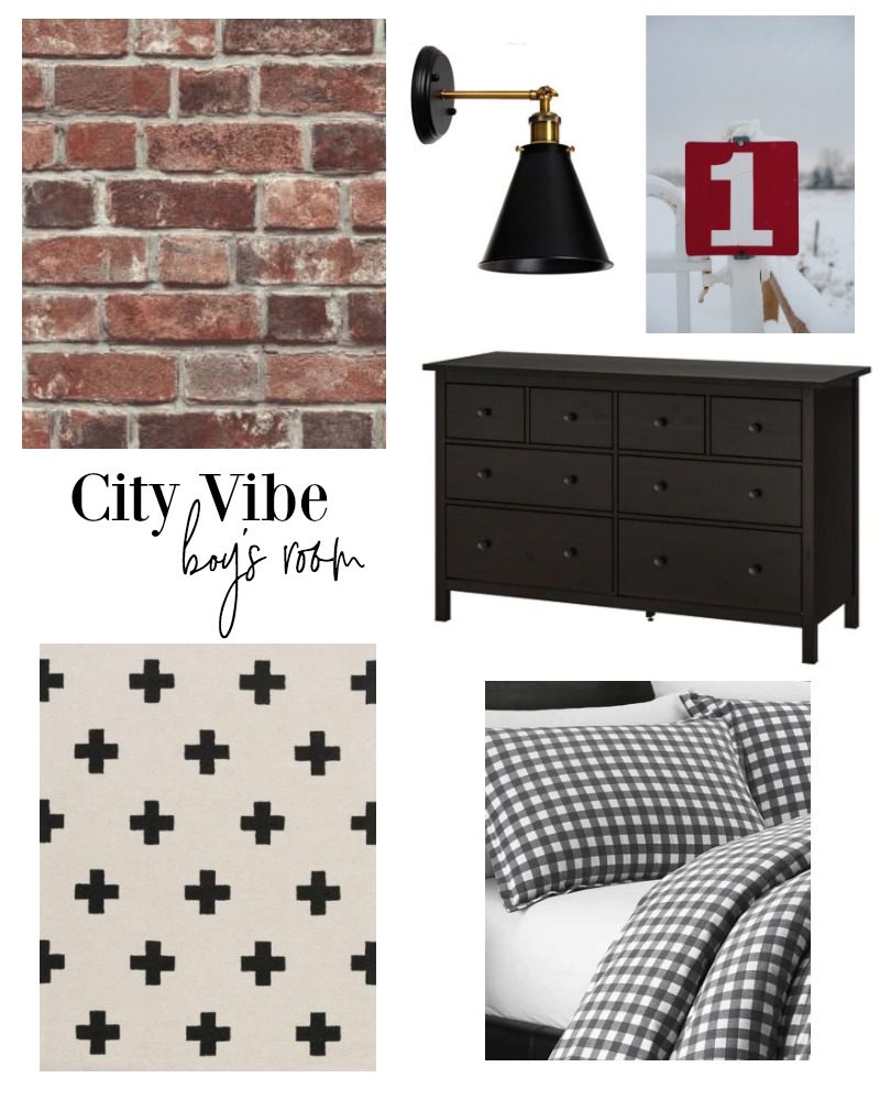
rug | rug option 2 | duvet | light
I’ve learned that I need to create design boards for my spaces. While I used to do that for clients, I would skip it entirely for myself. Huge mistake. In fact, if you are jumping into a design project I highly recommend you do the same. They really allow you to see how everything works together and keeps you focussed. You can keep a copy on your phone so when you are out shopping it’s easy to pull up and get a sense for whether an item will work. Happy to say we stuck to the plan 100%.
*The artwork (he has had for years) is from Minted but no longer sold.
MIXING FINISHES
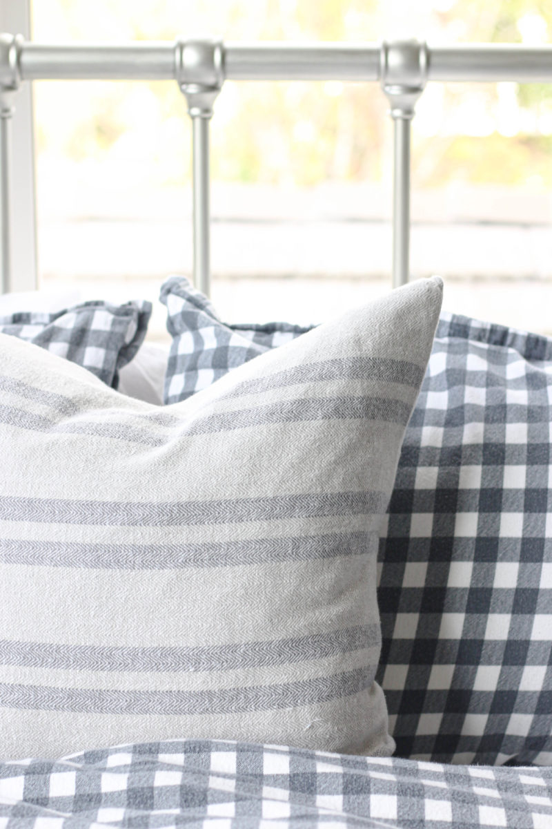
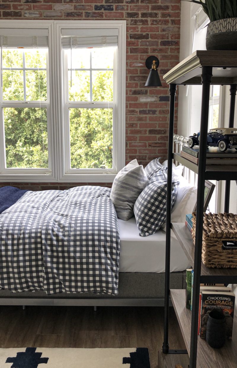
This accent pillow was a HomeGoods find and the silver bed is a major score. It is only $200 and so far we love it. It’s nice and sturdy but I can also move it away from the wall when changing the sheets. Of course it being on a hard surface allows us to do that. I like the way the silver plays off of the darker elements in the room. Plus I think it gives the space more of that urban feel we were after.
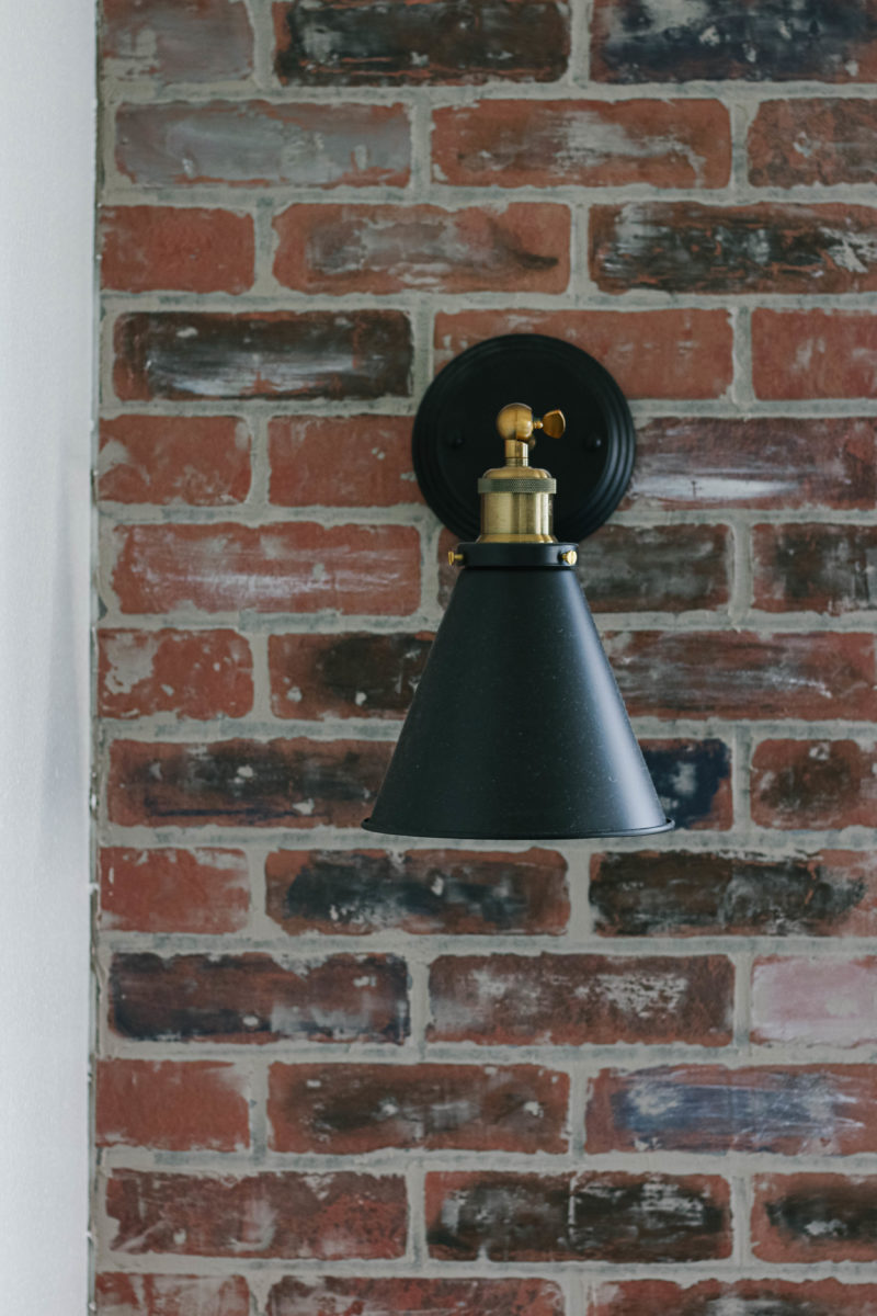
These sconces were a major steal and we couldn’t be happier with them. I love to mix finishes and these look incredible at night.
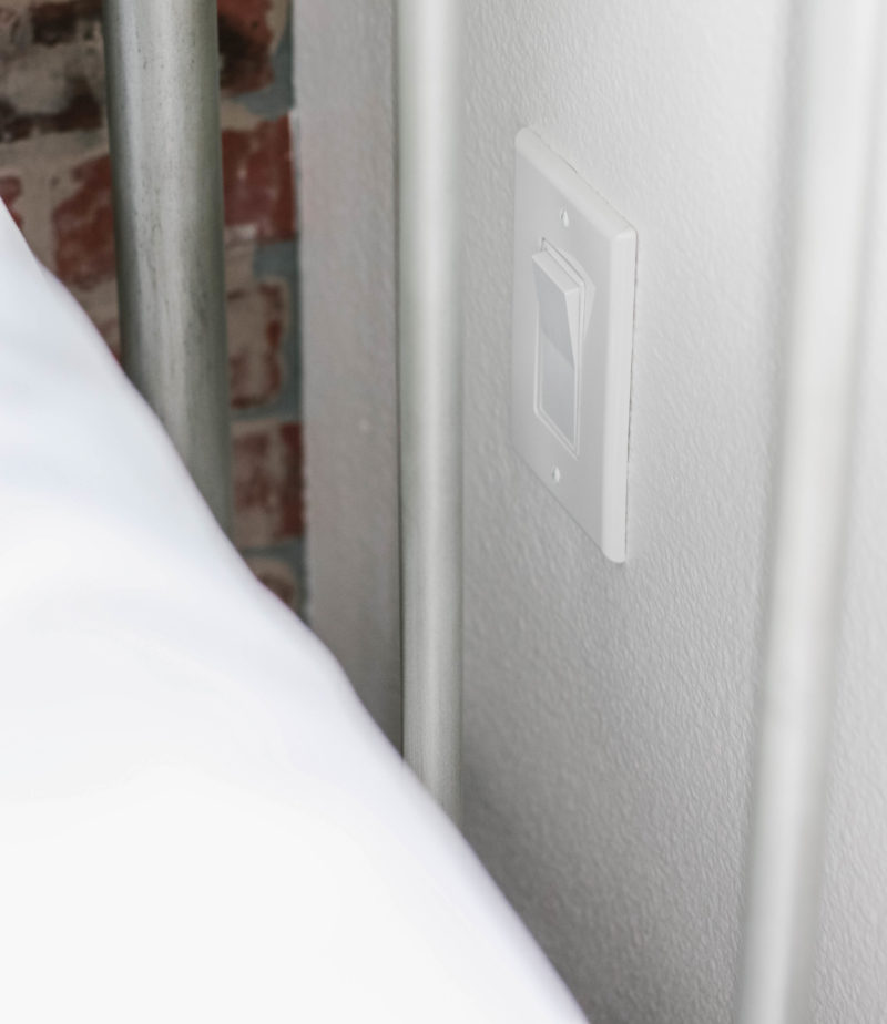
The nice thing about building this room from scratch was that we were able to choose where the outlets and lights would go. I knew that these would be my son’s reading lights so I had a switch placed right between his bed slats. This allows him to easily reach through and turn them off when he goes to sleep.
ADDING HEIGHT
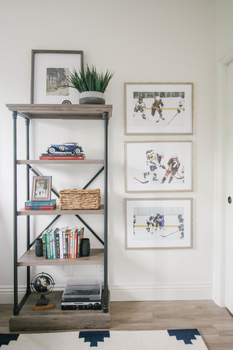
The bookshelf (also quite affordable) enables him to display many of his special pieces. Is not huge in scale so it works well in this space. His closet allows him the ability to store more of his hockey memorabilia and “stuff” that kids have. I will share the closet in a separate post as we have yet to truly organize it.
Deign wise I like to vary the heights of the furniture pieces in the room. That allows they eye to move around and creates more interest.
PART OF THE STORY
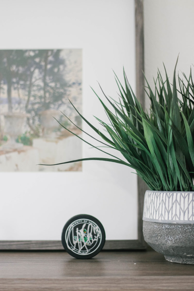
He received this signed hockey puck from a Notre Dame player for Christmas.
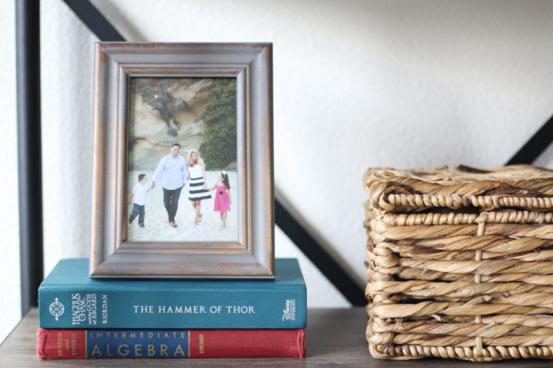

Papa is well represented in this room. My dad collected model cars. In fact he had an extensive collection. The children each chose one and I love that he has it on the bookcase. One of papa’s Algebra books, dating back to college, is on the shelf above. We all say our son got his math skills from my dad.
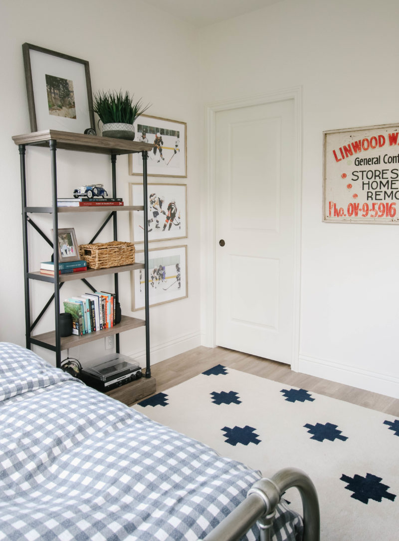
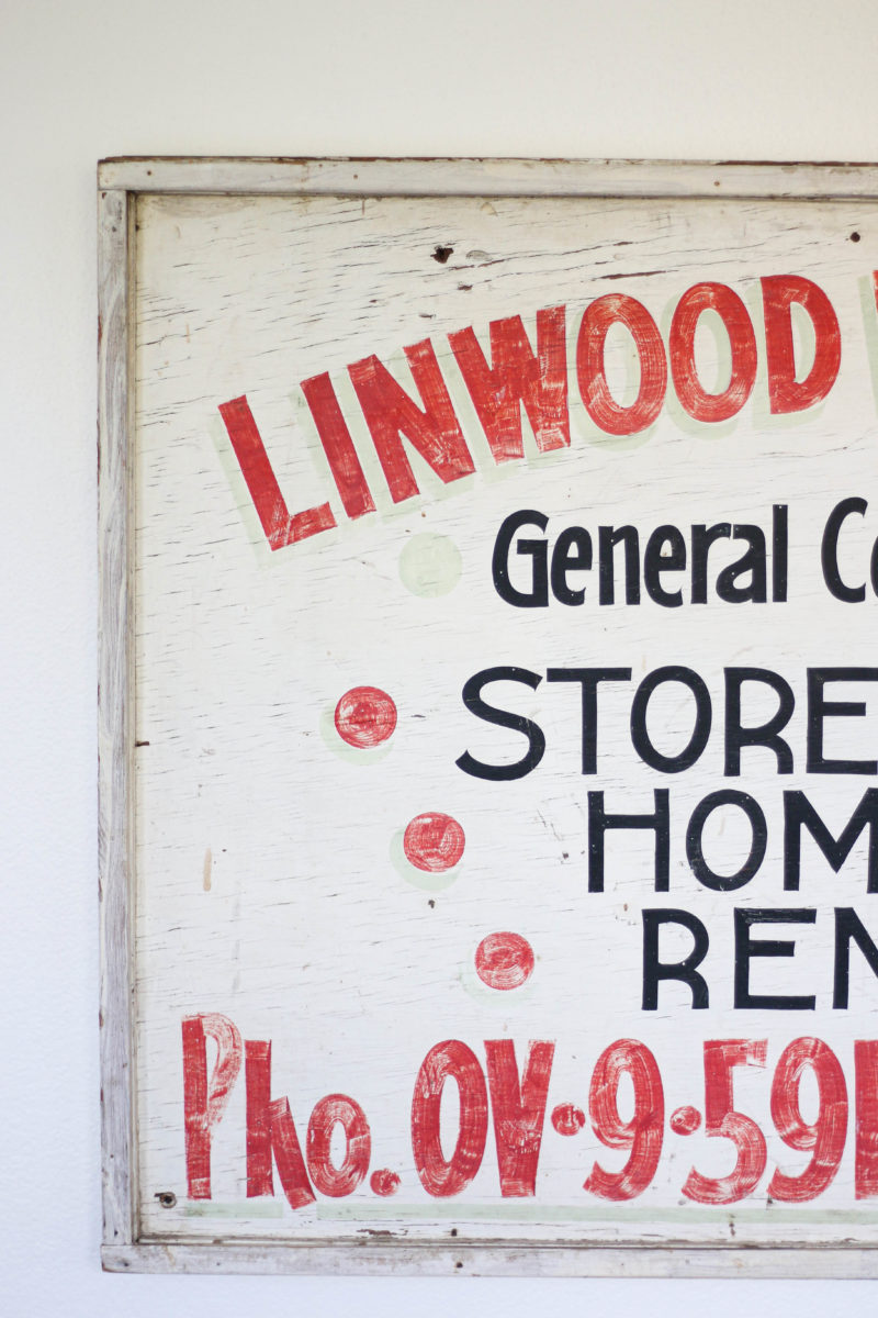
We chose a pocket door for the walk-in closet which really saves on space. The sign on the wall is also near and dear to our hearts. My grandfather was a general contractor and made this sign to advertise many moons ago. My parents had it hanging in their garage and my son was thrilled when we said great-grandpa’s sign could go in his room.
AMPLE STORAGE
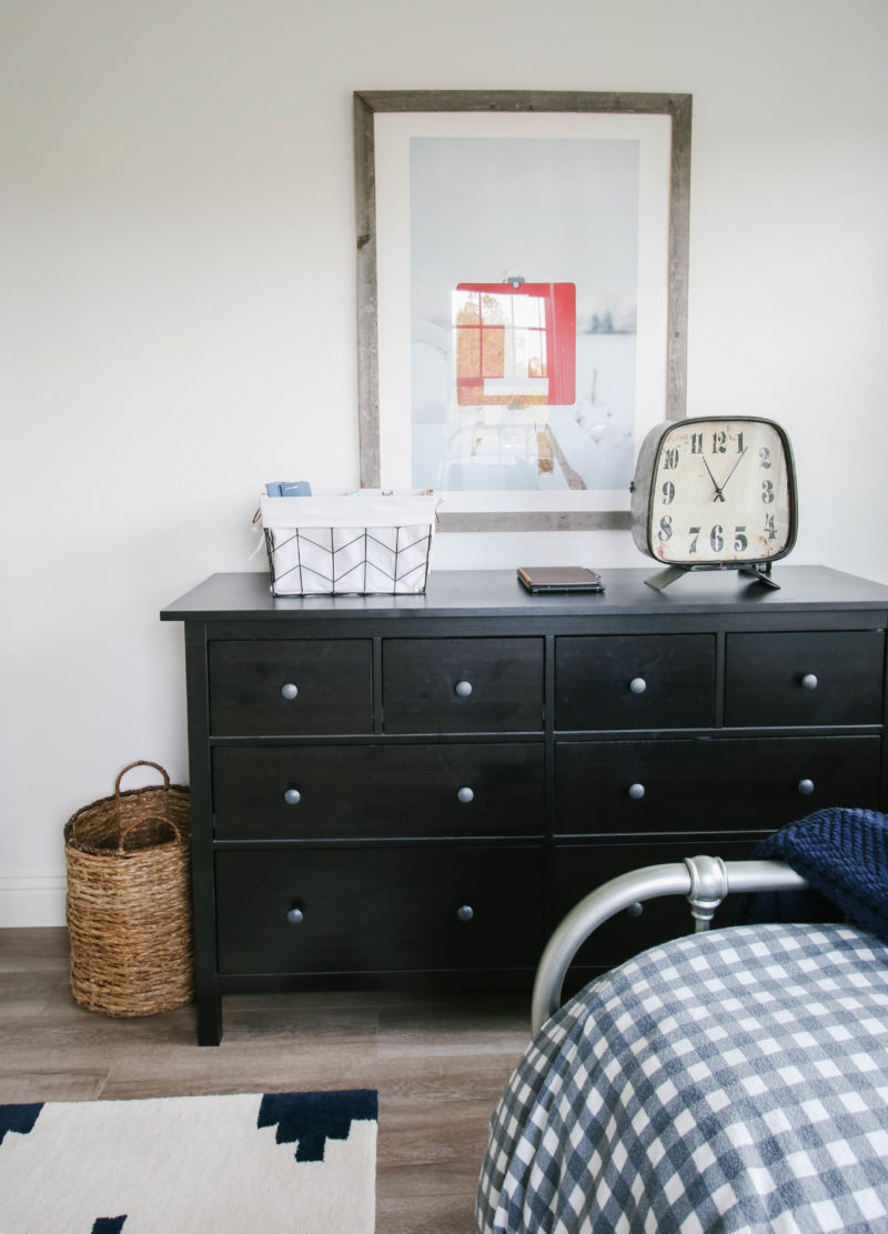
The dresser is from Ikea. We are huge fans. Both kids have them because they store so much. Highly recommend. If you don’t have an Ikea nearby, this one is very similar. The display items are HomeGoods finds. A large basket on the floor is great for a quick clean up if friends are coming over.
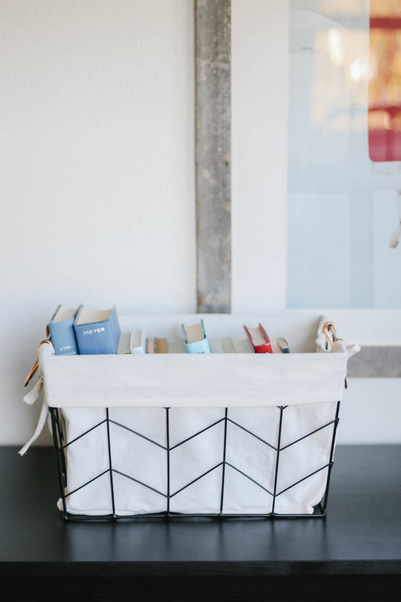
Love the idea of keeping books in a basket. Keeps them organized and yet he can still see what is in there.

ROOM TO GROW
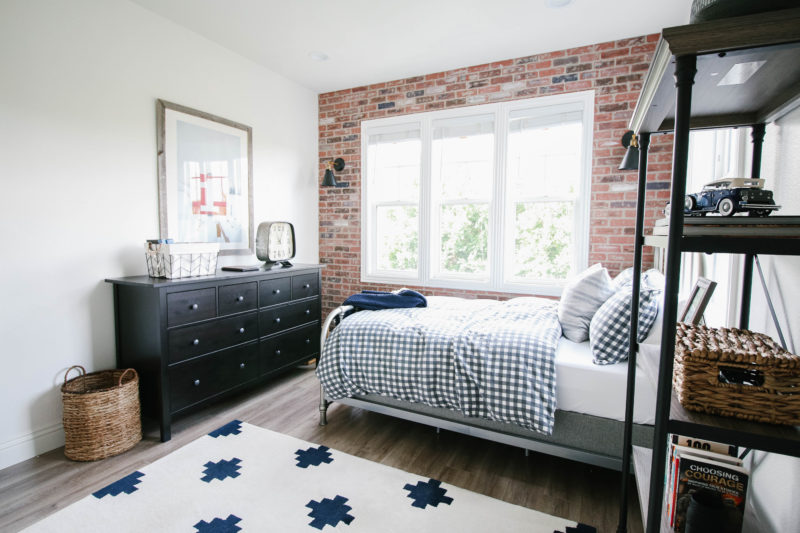
A little known story about this room is that I completely panicked at the eleventh hour. The framing was up and I sat on the floor and freaked out. I was absolutely sure the room would be too small and he would be so upset. My husband kept assuring me I was wrong and that it would be great. Despite knowing the dimensions all along, I still had doubt. Happy to report I was wrong but I share in case you have these moments of panic along the way. It happens and is all part of the design process.
THE BRICK WALL
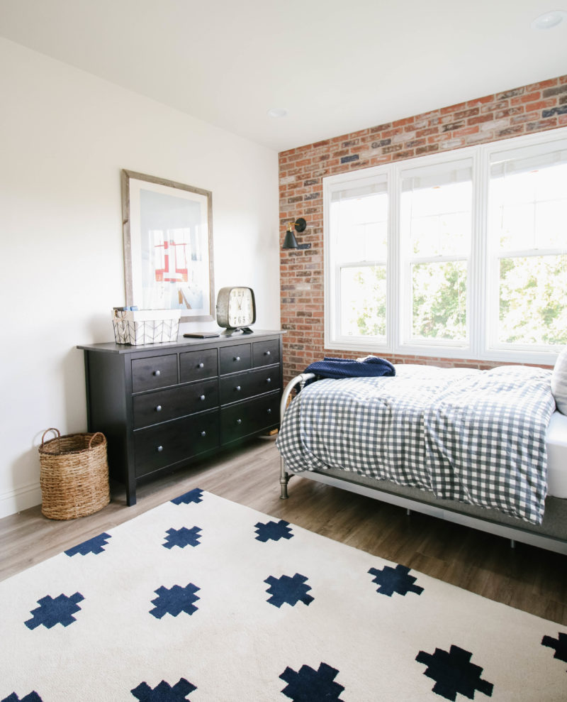
I promise to put together a tutorial on the brick wall soon. We used the basic brick panels from Home Depot. With a little bit of paint and spackel they took on more of an aged look. The brick wall took us one day to install and a couple of days to paint. It completely transformed the look and feel of this room.
shop this room
Thank you for checking out his new room. He loves being in here and so do we. I think it’s a space that will grow with him through the years. Reconfiguring the upstairs was a leap of faith but one that we are so happy we took. The floor plan feels so much more like us now and that is all we can ask for.

LOVE everything about this room! From the cheerful, bright light to the amazing brick wall, it is gorgeous. And I love all the special touches from your family…gone from earth, but not forgotten. Isn’t it funny how we stress about things like room size for our kiddos? Our 14 yr old son has the smallest room in the house, but now that we recently updated it and he has a QUEEN sized bed…he absolutely loves it…his little sanctuary! I’m sure your son feels the same!
Oh I love that story. Yes! Completely silly how we worry about those things. Sounds like his room is the perfect place to relax and unwind. That’s what it’s all about. Thank you for the kind words about the room.
I pinned so many images for my son’s room.
Where does your son do his homework? Did you keep the desk that you built from the One Room Challenge?
Oh that makes me happy. Great question! So both of my children do homework at the kitchen island. It’s a habit we have been in forever. I like to have them near me in case they need any help. Tt’s been a good system for us. My husband is actually using that desk in his office space. Worked out really well since we wanted to keep that. Thank you for remembering.
I just love every space you design. We have very similar taste, but I don’t have your talent for execution : ) Love the way you always add personalized, meaningful touches. Lucky boy!!
Thank you so much. That is such a kind compliment. I really appreciate that. It was a fun room to work on.
Such a great room! Our 14 year old needs an updated bedroom and this is giving me so many ideas. One question. What is covering the box spring?
I love this space! It’s perfect for a boy and definitely will fit him as he grows. It’s just perfect. I love the mix of finishes you chose. Well done, mama!
His room turned out so great! I like your idea about creating a mood board. I’d love to do that for our master bedroom…but how do you do that? Have you ever shared or plan to? 😉
So many great elements in one space! I love the brick wall with those sconces! What a great project for your son.
This is a great room, love the brick wall! I am planning to update our guest room and it’s quite narrow so was looking to put the bed against one wall like you have here, people keep telling me I can’t do that but you have proved them wrong 🙂
Gorgeous room! Can you tell me the name of the IKEA dresser? Thank you!
Love the room! And that brick wall is so cool. Great job but I’m not surprised.
Nancy xo
His room looks so good!
I remember having a similar freak out moment when building our first house; there’s something about that framing stage that makes rooms feel small. I felt like I would be able to stand in the center of the room and touch all the walls in our dining room. Luckily that all changed once the sheetrock went up!
The room looks great! Love how you incorporated family mementos as well.
Such a fantastic room! It looks so inviting and cozy ~ plus it will absolutely grow with him in the coming years! You did a fabulous job!
The sign is amazing. What a treasure!
Looks beautiful Courtney! Such an inspiration. I love the checker sheet set. You really have an eye for design. I was thinking about this brick wall another day when I was at Home Depot to install it in my kitchen. You really inspired me with it. Really great work.
Room looks great! I do have one question- why did you decide to place the bed on that wall vs under on the brick wall? LOL, that would have been my natural inclination.
One more question… the clock on the dresser. Where is that from? I love it.