Good morning. Today I am taking you into our angled living room. It’s still very much a work in progress but I wanted to share what we’ve done so far and the plans we have for the rest of the room. Do you have any challenging layouts in your home? Whether it’s an awkward angle or anything else, I hope some of what we’ve done might inspire you to look at your room in a whole new light.
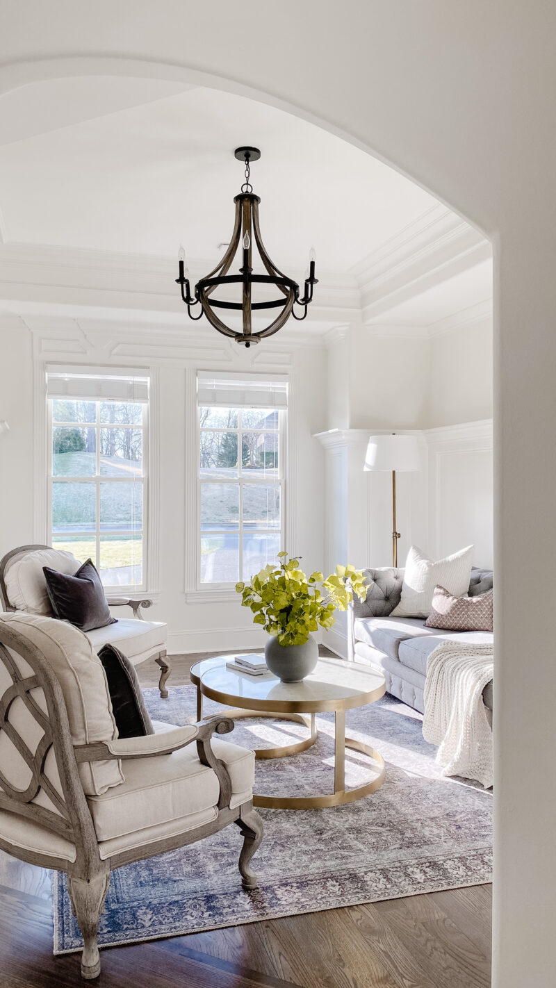
This room was originally designed as a dining room. Because we were able to fit a very large table in our kitchen area, we didn’t feel the need for a second dining space. We also loved our living room in our previous home and have always appreciated a room that receives morning light. That is exactly where I want to be. If you look at the dark inlay in the floor (bottom of the photo) you can start to understand the main challenge in this space.
ANGLED POINT OF ENTRY
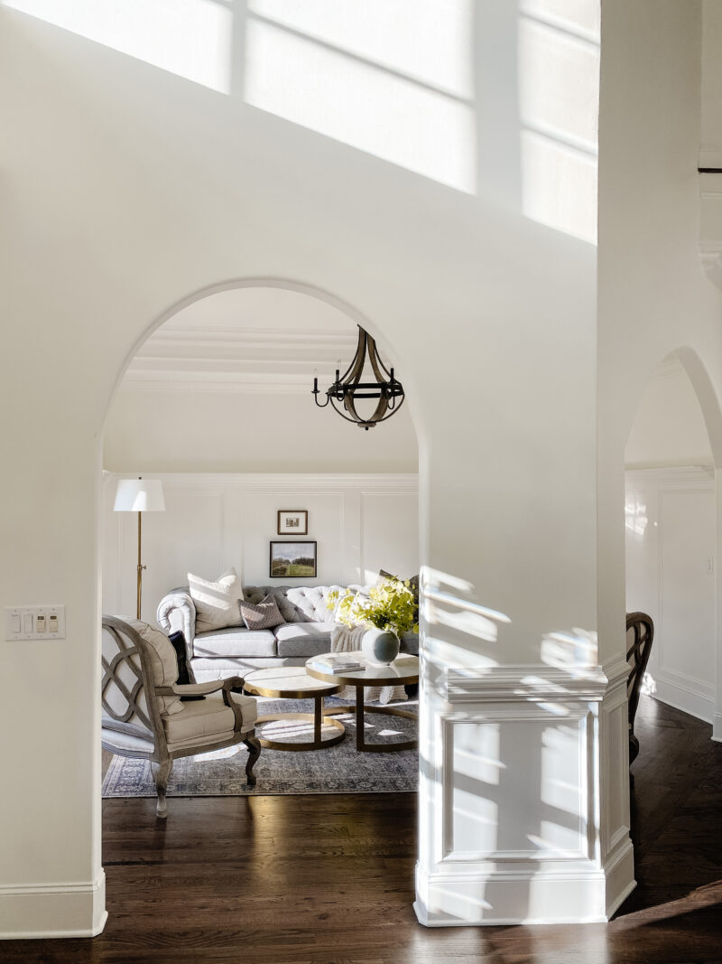
This room is right off of our foyer and has two points of entry. You can see that the arch to the right is on an angle. I will say that part of the draw to this home was that it has character and plenty of unique qualities. Having said that, it can also be challenging when it comes to design. In a perfect world, the sitting area would be centered under the chandelier. In other words we would shift the sitting area about a foot to the right. But if we did that, the chair on the right and the rug would literally be in our walkway.
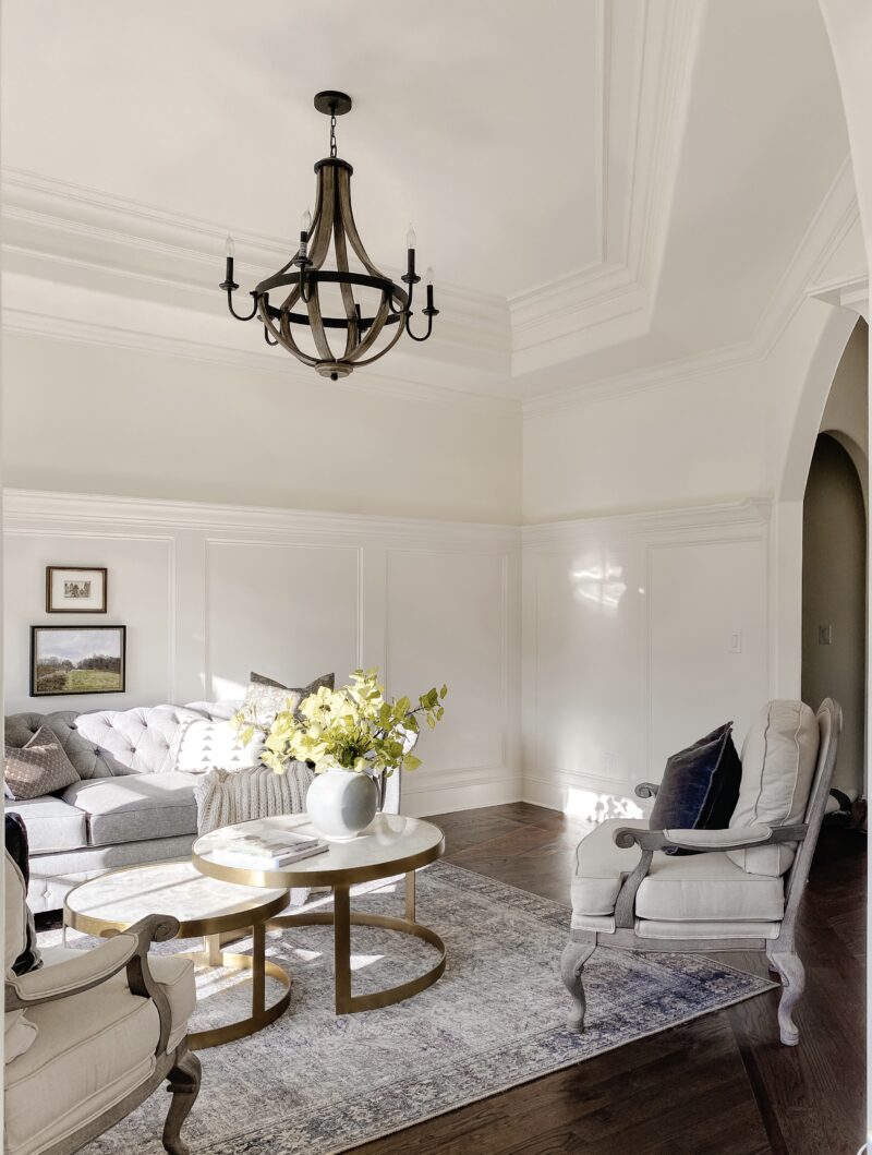
It made more sense to have the siting area closer to the window. But then you have a chandelier issue. We definitely don’t want to move it as we want it centered in the room. So how do you account for the light not being centered over the sitting area? You bring in nesting tables.
MAGIC OF NESTING TABLES
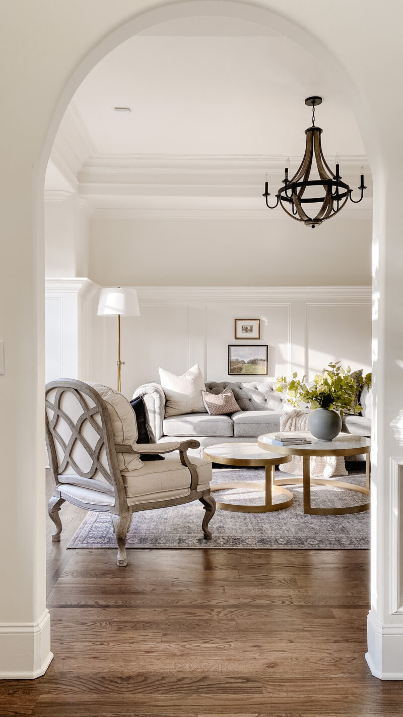
By brining in two tables you essentially can establish a new center point. The chandelier is visually centered over the larger table giving the room more balance. And thank you to my sister for suggesting this as I had them swapped at first.
SO MUCH FLEXIBILITY
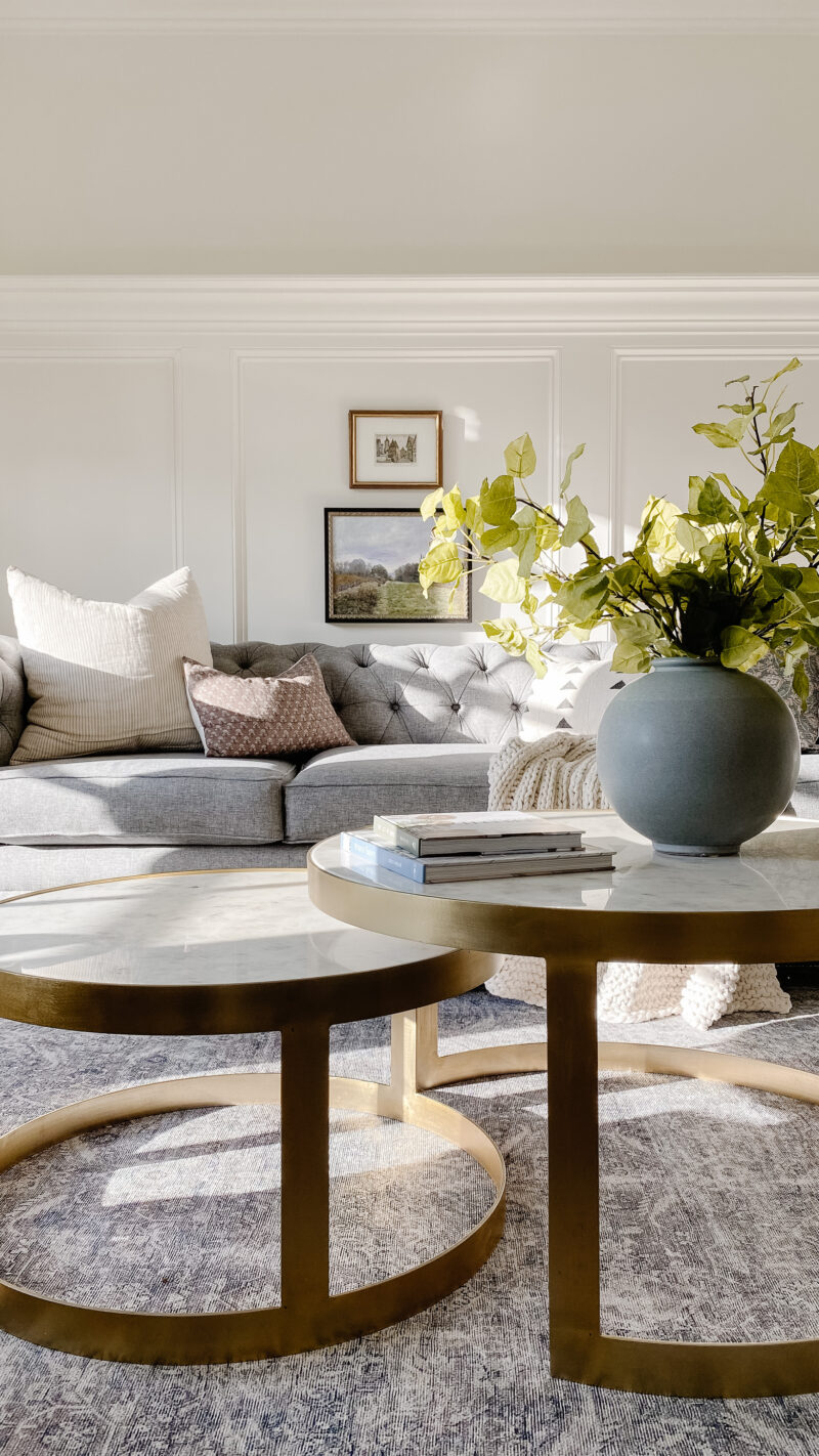
sofa | tables | rug | lamp | pillows | painting | similar stems | vase | similar chair
Two tables give you much more flexibility with layout and awkward angles, too. A rectangular table would never have worked in here.
FILLING THE EXTRA SPACE
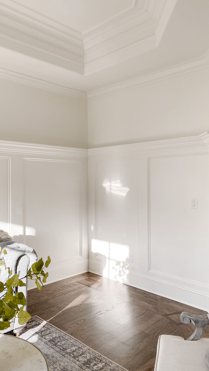
Because we shifted things down, there is an open space here and I plan to add a sideboard. That will also bring more balance to the room. It’s also a nice spot to rest a lamp, some personal items and flowers. I have been scouring stores but think that Facebook Marketplace may be the way to go. I would love a piece that feels like it has a history.
A LOOK BACK
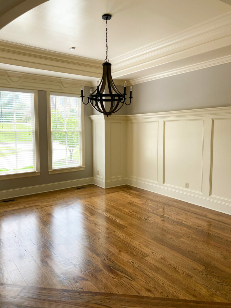
It’s always fun to look back. This was the room when we first bought our home (before tour).
LIVING ROOM PLANS
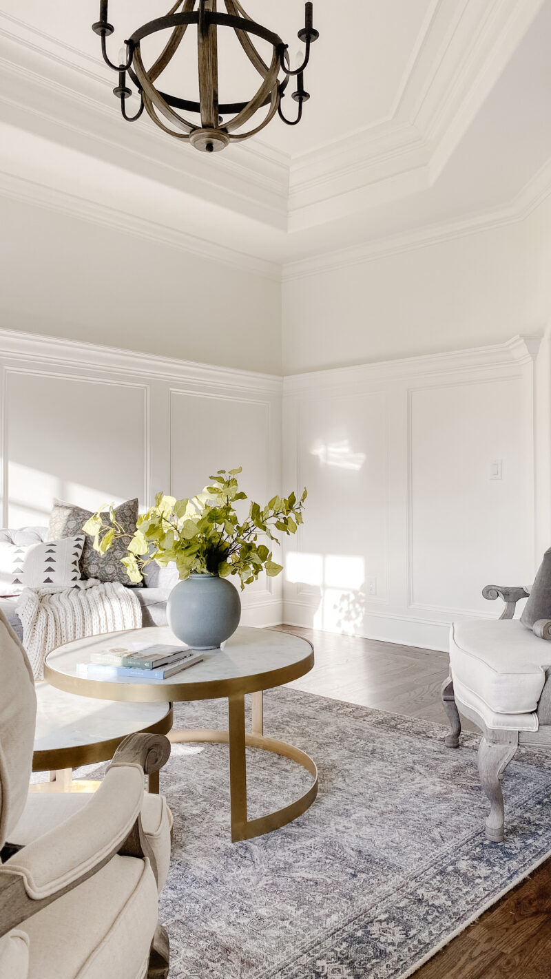
Because this was originally a dining room, the chandelier was far too low. My sweet husband raised it but I had him raise it too high. Oops. You win some you lose some. Next up in this space:
- Swap out the chandelier
- Add pretty window treatments (Roman shades)
- Find a sideboard
If you have an awkward angle or confusing layout, don’t be afraid to shift things around. Play with the furniture. Ultimately, a room needs to work for you and sometimes that means getting creative.
I always enjoy your posts. Great resources and ideas.
Thank you, Jen. I appreciate that so much.
The nesting table idea is so smart! I wouldn’t have thought of that, but it really does work. Your moldings and the light that you get are beautiful.
Thank you, Jamie. The moldings and natural light definitely won us over in here. Thankful to the previous owners for all of the millwork.
I have a similar dilemma in our living room, which includes two large doorways and a large window!
I’m a bit confused! If you use the formal dining room as a ‘living/sitting room’ what did you use the original LR now? I have kind of the same situation with a formal LR and DR that we barely use as we have a much used family room. I DO enjoy sitting in my formal LR ( it’d always neat !) on Sunday afternoons when I just want to sit and listen to music. The DR is the real issue since we don’t entertain in there much at all. Usually meals are around a smaller kitchen table (it’s just hub and me now) and if we do need a larger space we can use the dining area in our lanai as we live in south Florida. I’be actually thought of getting rid of my dated DR furniture and leaving the room empty! Maybe having an empty room will inspire me to come up with an alternative idea! Open to suggestions!