Thank you for your patience on this post. This was one of the number one requested topics when I asked about upcoming blog posts. “How do you create your Instastories?” It has taken a minute to put together because it’s not a simple answer. Having said that, these apps will change the look and feel of your Instastories in no time. Here is how to make your stories stand out.

PIC MONKEY
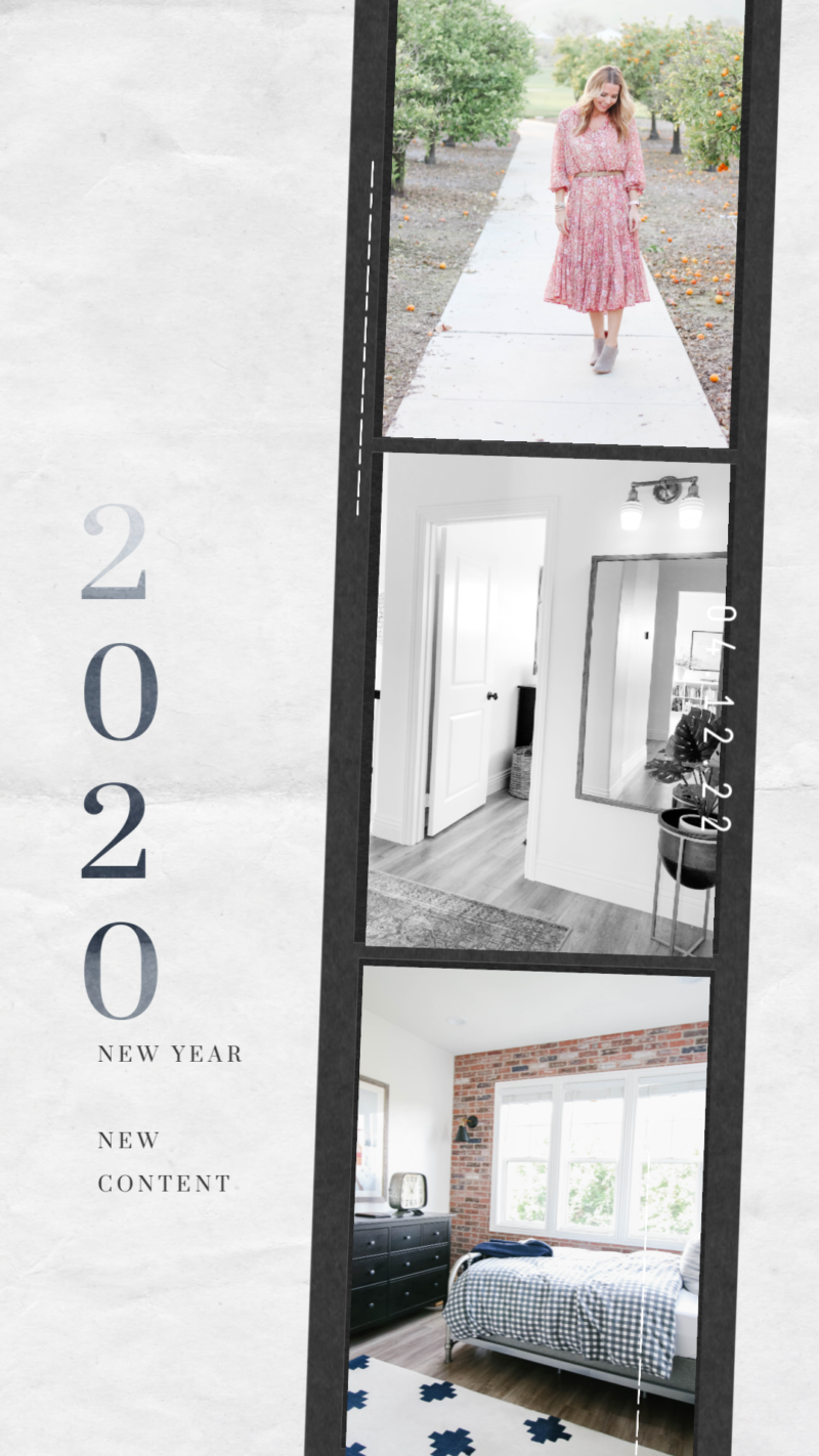
PicMonkey is still one of my all time favorite editing tools ever. I have been using it for years. It definitely has some limitations so if you are used to something like Lightroom, it may fall short when it comes to editing an actual photo. But for graphics, design and ease of use it gets fives stars from me. To create stories, you’ll want to select the “Templates” and from there you can look through the featured sets. The sets comes with four or five story frames that all look similar with the same color palette and feel. This is the Photobooth template. Once selected, you can add your own photos and pretty much edit everything. I find it easier to use PicMonkey on my laptop and send the photos to my phone once they are created.

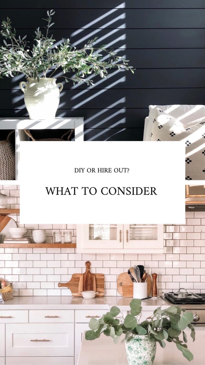
Here is another example of a template from PicMonkey, This was a stock photo and I just had to edit the words. You can adjust placement, fonts, sizing, etc. It’s pretty awesome.
UNFOLD
Unfold is my other go-to App. I use this one on my phone and love it. This is an app where you can select any layout you want. That means you can add more than one photo, choose fonts and edit your copy. I have a couple of layouts that I use consistently. It’s either this one where I can show two photos at once with a clean text box or one where I have plenty of border around my single photo.

These are also nice for using in a blog post as they create clean and lovely images for readers to pin to Pinterest.
WORD SWAG
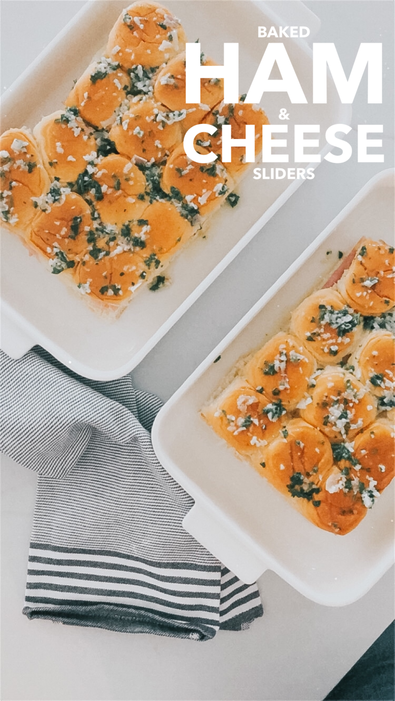
Word Swag is fantastic and so easy to use. Once you get the hang of it you’ll be adding your favorite fonts to all of your photos. I often create my story slides in Unfold (so that the layout is clean) and then open the photo in the Word Swag app to add fonts. If I am showing five things that are on sale, I will want the slides to look consistent and this is a great app for that.
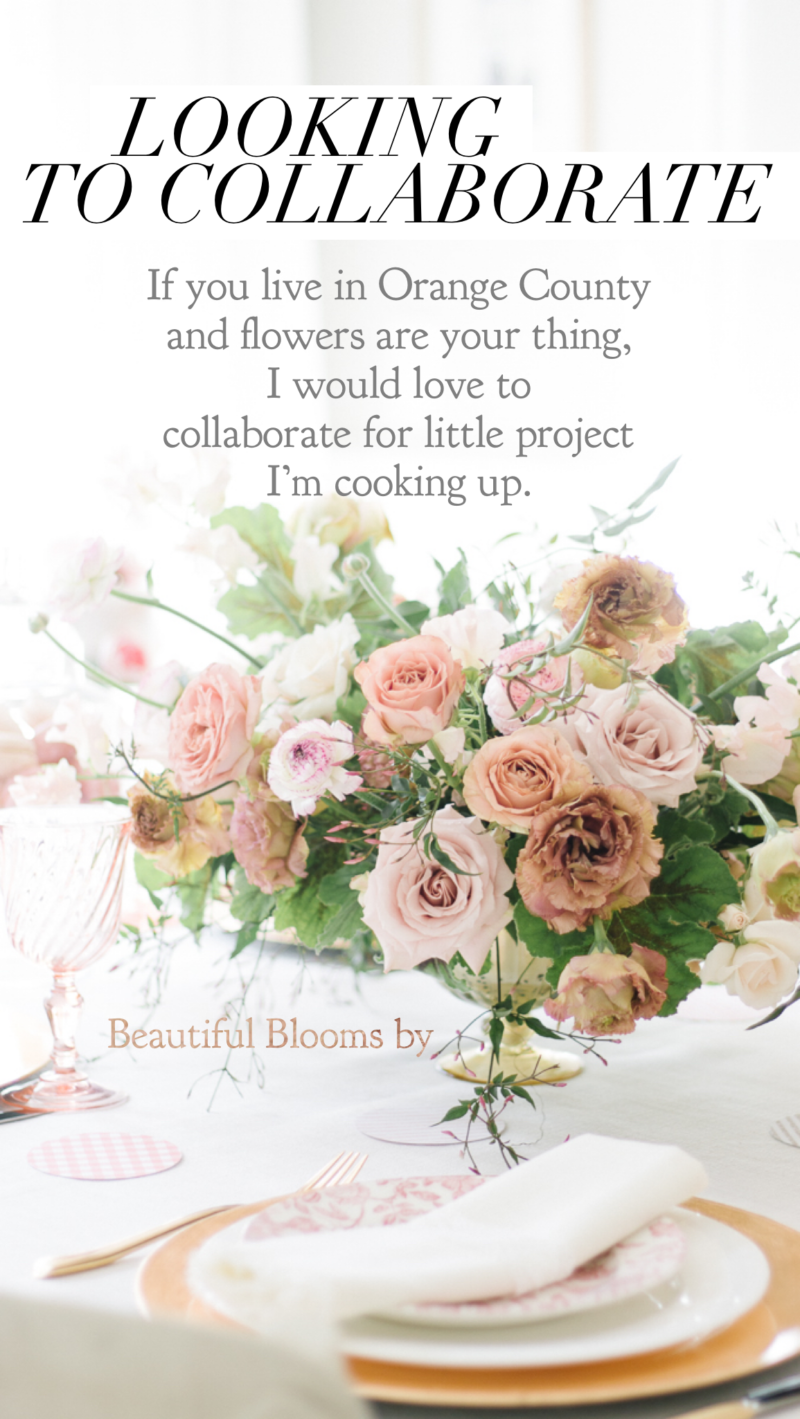
I appreciate that Word Swag allows me to add as many text boxes as I like and they give you five options for how the font will be shown each time. Plus you can move things around as much as you like. In this case, I added “Looking to collaborate” and save it. Then I added the next text box and saved it, and so forth. Then when I posted in stories, the same photo appeared in four slide but new writing popped up each time.

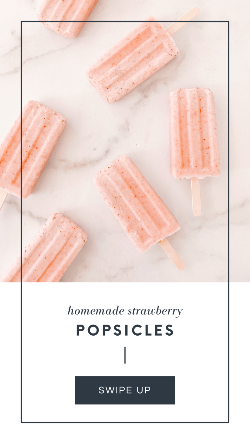
When I am shooting photos, I often keep in mind where my font will go. You can see her that my popsicles were left justified through my lens so that when I went to edit in an App, I could easily fit a title in the white space. I don’t do this for all of my photos, but for at least one or two in a shoot so that I can add text for stories or Pinterest.
In this slide, I first used Unfold to create border around the photo and then I added text in Word Swag.
OVER
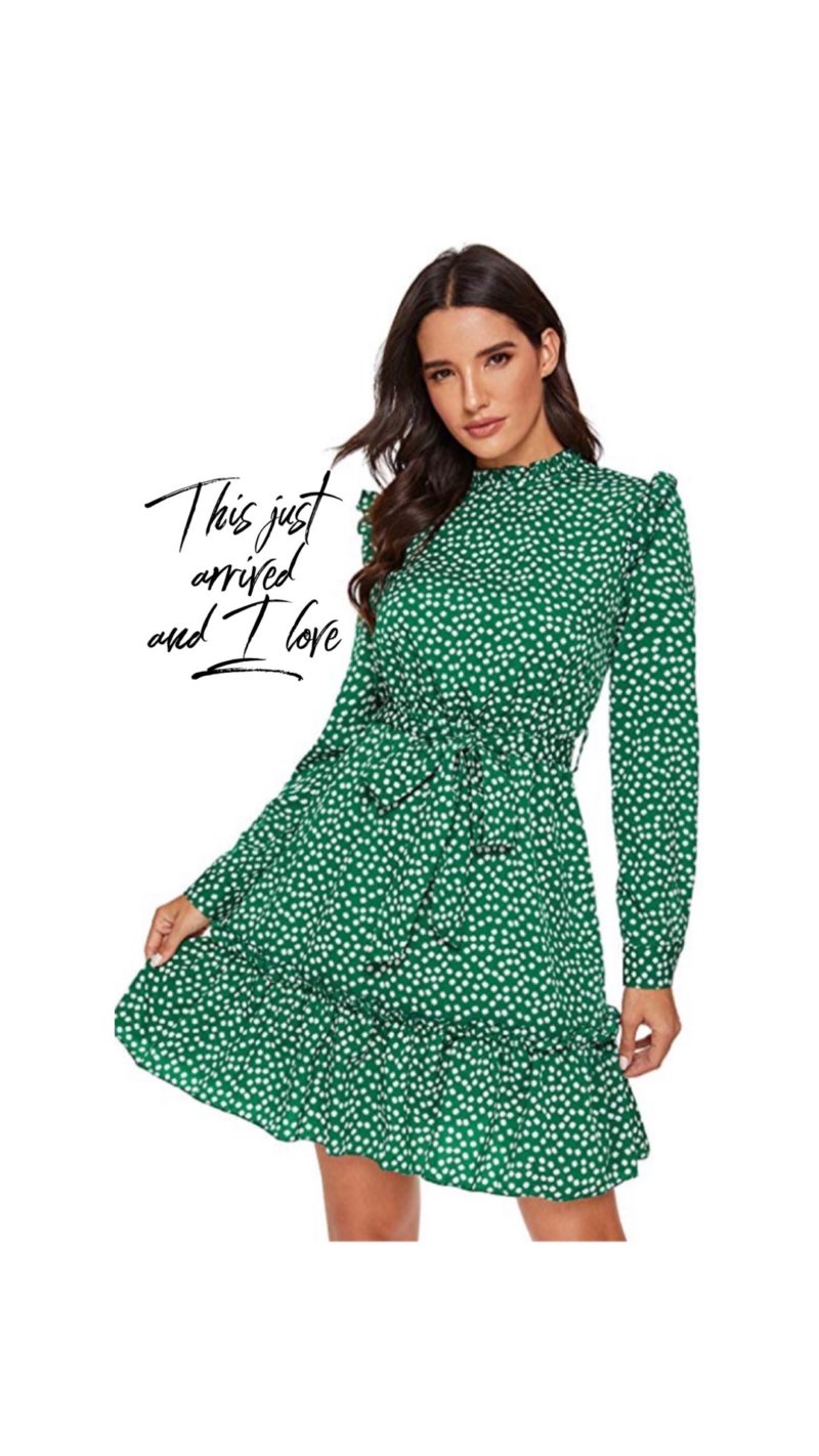
Over is a new App for me and I love it. I am still learning all of the ins and outs but the sky is the limit. It has plenty of free functions that will help you create beautiful stories via the templates. You can also design from scratch but that is far time consuming for me.
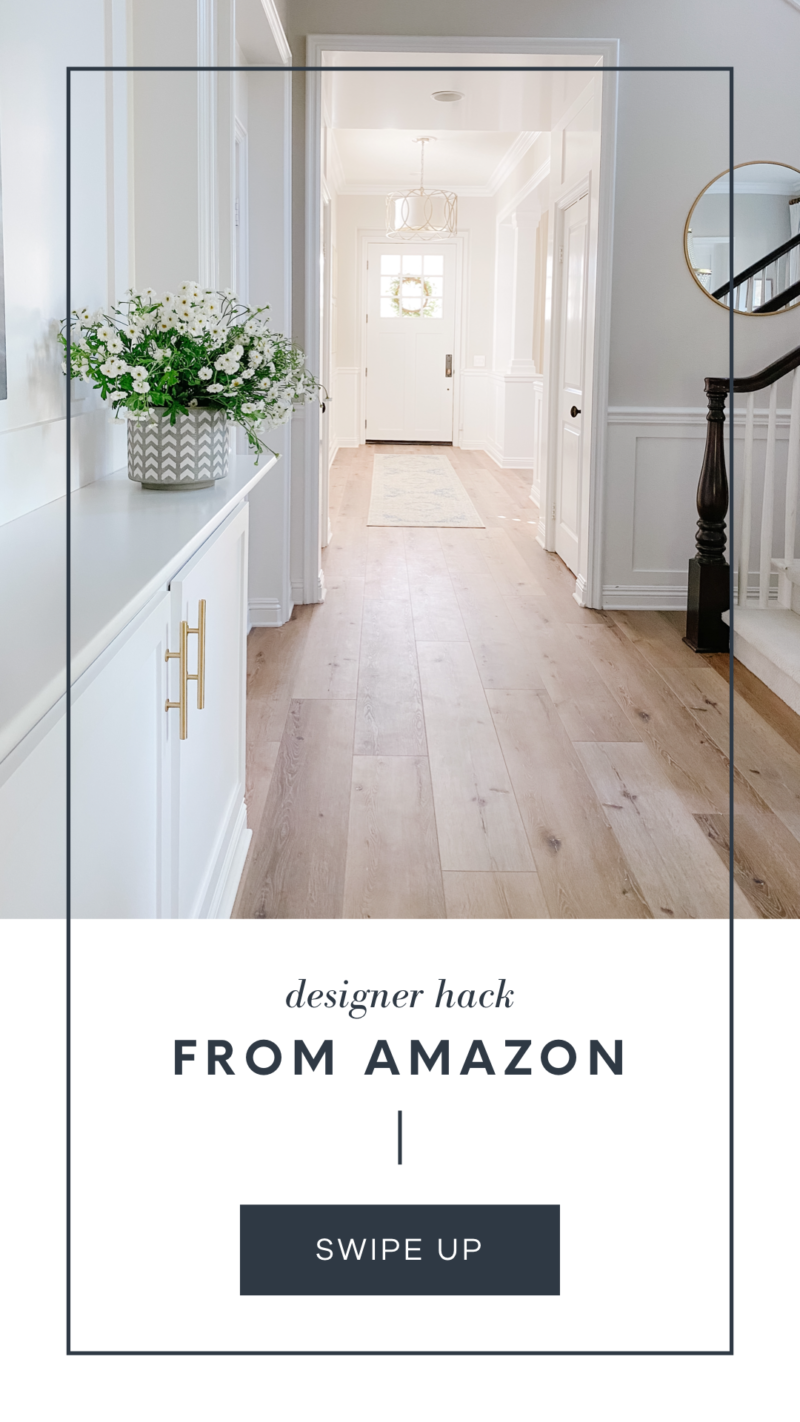
What I love about Over is that you can literally change every layer of the template. And you can adjust the color palette which is incredible. You can even save a color palette for later. If you sign up for a pro edition it will cost you $99 for a year. But if you are creating stories on a daily basis for your brand it may be well worth the investment.

These were all created to have a cohesive feel so that I could recap what recent blog posts. I think consistency can be more appealing to the eye depending on what you are posting and the outcome you are hoping for.

One more example of an Over template I used to create this. It just gives it a more polished and artistic look than anything you can create in Instagram.
LIGHTROOM

Don’t under estimate the power of a great photo editing app. To create stories that stand out, the photos have to be strong to begin with. This was snapped when it was cloudy outside. That translated to the photo looking much darker and the colors not representative of what you normally see. Plus it just reads blah.

Lightroom is my go-to editing tool on both my laptop and my phone. I absolutely love it. It does take some time to get to know and learn, but once you do it is extremely quick. In this case I just brightened the photo a bit. In doing that, colors can often become enhanced (in a bad way) so I took the saturation back down to what the eye normally sees.
COLOR STORY
If Lightroom is beyond anything you want to jump into, Color Story is perfect. It allows you to select and buy presets, has most editing functions and is so easy to use. You’ll photos will look professional in no time.
WRAPPING IT UP
All in all, there are a ton of apps out there to help up your Instastory game. I have barely scratched the surface, but these are my go-to. If you are posting just for fun, enjoy playing around with these and wowing your friends. If you are posting for your brand or someone else’s brand, you’ll want to consider using a consistent color palette and font selection. It will be more identifiable and therefore more effective.
Good luck and let me know if you have any questions. Happy posting. Be sure to tag me so I can see your creations.
MORE TECH HELP
Another popular post around here is how to save photos to Instagram. When you are scrolling through your beautiful feed and see photo you want to reference later, it’s super easy to save and catalog them into folders. Read all about how to do it here.
Thank you for such an informative post!
Thank you so much for this! I have been following you for years loving your blog, never thinking I would venture into this myself. Our family has recently started a new venture where I have taken the helm, so now must be more of a social media presence than just my personal accounts. This is so helpful to a sixty year old trying to be socially savvy.
This is a great post! Thanks for all the info, Courtney. I’m still finding my feet in the world of blogging (+Insta) and this is SO helpful! I love the look and feel of your work and am off to check out these apps!