We are back with the second part of Just Four Things. In case you missed the last installment, each Wednesday I present you with two choices to help design a client’s room. In the end, I will reveal how the room came together and see if your design eye got it right. We are working with Brittany and her husband on their master bedroom. I love that Brittany is enthusiastic and so ready to jump in to make the changes. That makes for a dream client. 
 Item Number One: Bedding Last week I showed you how she and her husband wanted to switch things up and infuse crisp white bedding. They chose a fantastic duvet from Pottery Barn.
  Overwhelming Choice! If you missed last week’s edition, you can see the two fabric choices right here. It seemed to be an overwhelming decision to go with fabric family number two. Normally, I wouldn’t reveal this until the end, but the fabric choices will make a huge impact on what comes next in the space!
 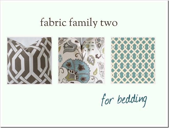 Client Space
  Here is a reminder of what we plan to do: the design plan
 Bedding Drapes Artwork above Bed New Lamps Item Number Two: Drapes So now it’s time to freshen up those windows with a more current and updated look. The fabrics chosen by you and the client are fantastic. My thinking is that white panels will look really beautiful against the newly painted cocoa walls and be very restful. At the same time, I would like to infuse color without going overboard here. So the options are to add the Waverly Ellis fabric to the top or to the bottom to achieve that look. Here are two choices for the drapes.  Which one would you choose for our client? Number one or Number two. Do your prefer the color block at the bottom or the top? Please leave a comment below and cast your vote!
Option 1, color on bottom… love the pop of color!
Hmmm not sure. I'll go for bottom.
I'm going with the bottom also!
Bottom. I always feel like top cuts the room off and makes the ceilings lower.
Maxwellhouseinteriors.Blogspot.Com
Bottom for sure!
I like the top! Guess I'm weird. : )
Option 1!
Option 1 – at the bottom.
Bottom. This is such a fun series!
When I saw it, I liked it on the top…think the eye will see it more there.
Bottom.
Option 1 – bottom!
I'd do option 1, and maybe a grosgrain trim on the edge to tie it together and finish it off!
Option 1 – I think putting it at the top would make the room appear darker and with the dark color on the walls you want to keep it as bright as possible.
Option #1!!
I like option 1, with the fabric panel on the bottom!
I also think option 1 – adding it to the bottom. I LOVE that color and pattern. Great choice of fabric.
Option no.1! This is my new favorite game!
I vote for option 2 (color at the top). I think it will help draw your eye around the room (I'm assuming these colors/patterns might be repeated in some pillows on the bed). If the color were at the bottom of the curtains, it might be hidden behind the bed, depending on where you were standing in the room, or be hidden behind some other piece of furniture that might get placed in front of the window.
I think option 1 will help anchor the curtains.
I like it on the bottom.
Option #1
I vote bottom – the extra visual weight looks funny to me at the top!
Bottom! Number 1
I think Option 1…bottom! Looks like the overwhelming choice too! 🙂
Option 1!!
bottom!
Option 1, bottom.
Pretty accent fabric! I like the blue on the bottom.
Definitely the bottom! More visually pleasing down there I think! Such a great idea.
I actually like it at the top.
Okay, neither??? At the bottom it gets lost, and makes the lighter drapes feel bottom heavy. At the top it does the opposite. I like the idea of it either being a foot of so down from the top to draw the eye, or used as an edging. Yes, I have to be difficult!
I like the blue at the bottom but think as a border it would look really nice.
I prefer the bottom.
Option 1! Love the fabric choice too!
Of the 2, I like option #1. I wonder how it would look just done as a band along the inside opening of the curtains where they meet in the middle? Just a thought.
Bottoms up for me.
I think I'm in the minority here, but I prefer the color "pop" at the top.
Option 2 here.
🙂
I have the same thoughts as Simply LKJ. It'll be fun to see what you all decide!
bottom!
Option 1 – at the bottom!
on the bottom!
Definitely the bottom!! I love the choice of bedding too. Exciting for them. It is going to be great!
The bottom for sure… I think it will look too cluttered with the fabric at the top in addition to the curtain rods, etc.
Option 1 – the bottom
I am going to go with Simply LKJ and Allison. I will go with Simply LKJ's suggestions too! It seems too heavy with the suggestions given.
The above, was my first comment on your blog, and I do want you to know that I really like your design style. I feel bad that my first comment was to do something different than your suggestion. Thank you for sharing all your wonderful ideas! You really are an inspiring designer and mother!
I like option #1!
Option 1, the bottom!
I'm totally in the minority! I like #2, at the top, because I think it draws your eye up to the pretty fabric.
I'm voting for #1 (I misspelled a word before 😉 )
I prefer the look of #1! Good luck!
I like Option 1- but may I offer a 3rd option? trimming just the edges in a band of that fabric (just a thought) like this: http://pinterest.com/pin/274930752221714048/
I like the color on top but in this case, it will look great either way! – Karen
Number 2 is my choice
I also like the idea of trimming the edges, I think it looks heavy at the top and might be lost at the bottom. Love all the beautiful choices so far!
I like option #1 the best.
Option number 2 – at the top please!
Love the fabric choices. I agree with the idea of trimming the edge. You could do just the leading edge or the leading and bottom edges. This would give a nice visual for elongating the more square windows.
Option 2 at the top……….for sure.
I am liking option 1!
#1. but, kinda wish there was option #3… a band of Ellis fabric running up/down the interior edge of each panel 🙂
Option #2. At the top the effect is more like a valance. I think at the bottom it would just weigh them down (visually).
I like option 1!
Top! Wherever the pattern goes is where your eye will linger. Do we want our eye to linger at the floor? Look at those awesome ceilings. Top, baby, TOP! 🙂