I am thrilled to bring you our completed bathroom project today. This makeover might be one of our favorite spaces to date which I never imagined saying. It’s certainly not the bathroom of our dreams, but we took a space that we very much disliked, spent wisely (and conservatively) and created a room we love walking into. I still can’t believe how different this space feels with just a few changes. It’s my hope that this makeover inspires you to transform an outdated space without breaking the bank.
THE BEFORE
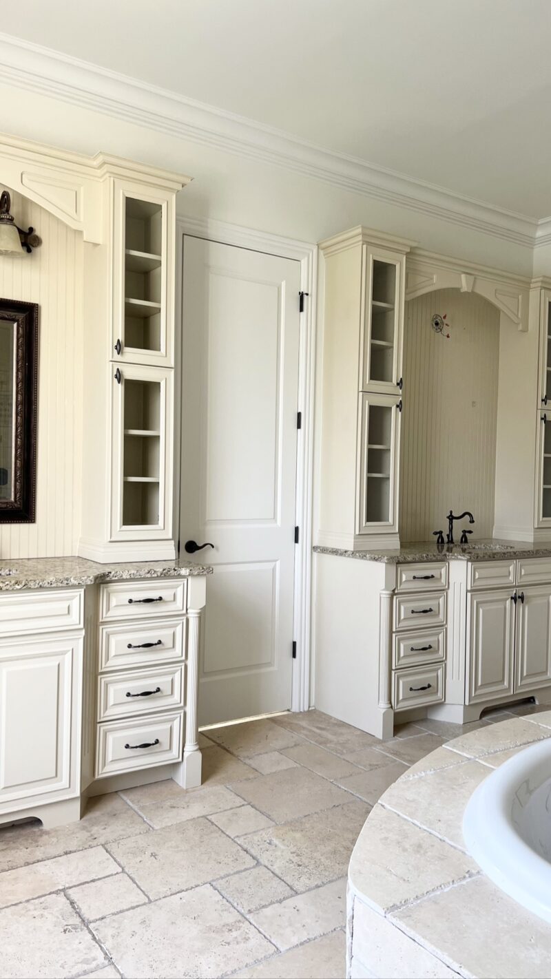
There is no question this bathroom is an amazing size with great bones. While the tile choice isn’t my favorite, it’s neutral enough to work around. It just felt dated and tired and it wasn’t consistent with the design style we’ve chosen in the rest of the home.
THE TOUGH CHOICES
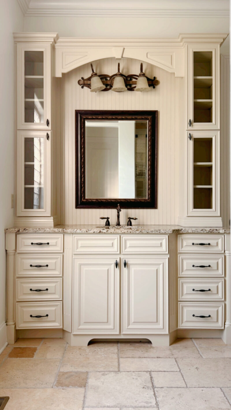
For a split second we considered a full renovation. Because it’s so large and there is an immense amount of tile work, a full renovation would have been pushing 60-70K. No thank you. Not happening. Home ownership is all about making choices that best suit your family. For us, creating a backyard space definitely won when it came to deciding where to spend our money. I don’t regret our decision for a second. Once we made the decision to give this room a facelift, it was fun to get creative and see what we could accomplish without spending very much money.
THE AFTER
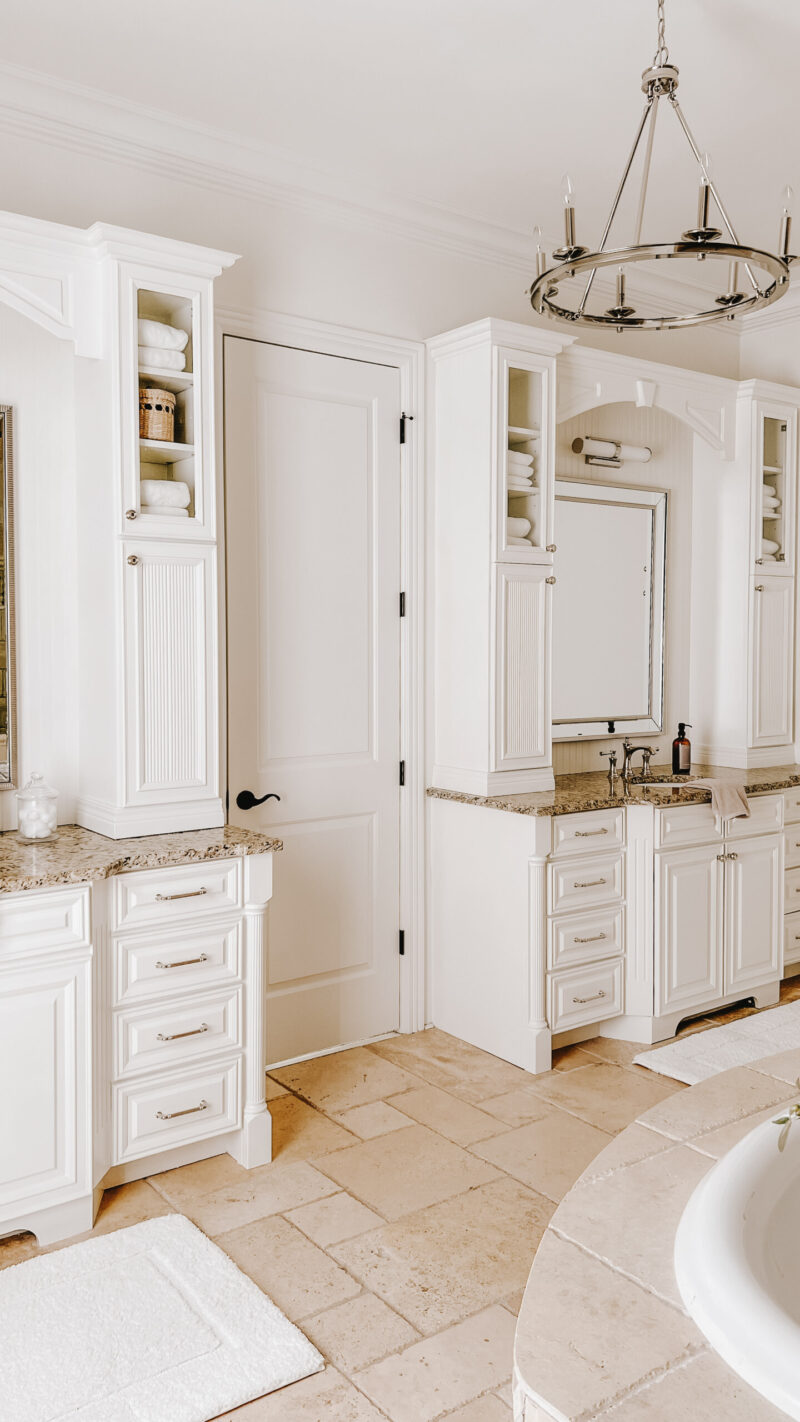
I wish the camera could capture how light and bright the space feels. It’s far more inviting in person and we are thrilled with the outcome. Working around the tile, I wanted the room to feel like a pretty hotel. We’ve all been in hotel bathrooms where they might not be what we would have chosen, but they sure feel pretty and luxurious. The main goal was to lighten it all up and add a bit of sparkle.
MIXING METALS
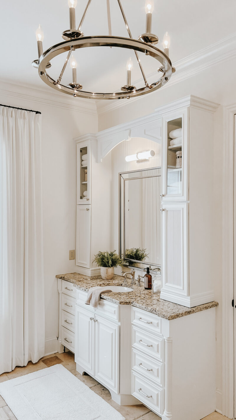
The shower and bath hardware are style a bronze color (which works well with the tile) but I chose polished nickel for the hardware and faucets. I also used this polished nickel chandelier. Never under estimate the power of both paint and hardware. They can accomplish a massive shift in style.
NEW FLUTED DOORS
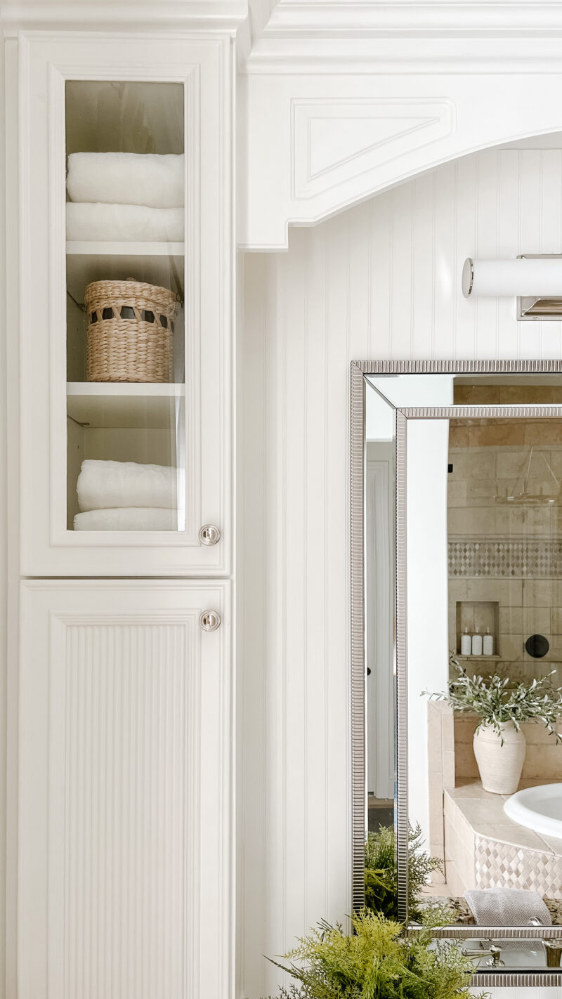
What we are most proud of are the new doors. After chatting with a couple of my designer friends, we opted to switch out just the lower vanity doors. It drove me crazy that you could see all of our products through the glass. The storage is fantastic and I love them so we just need a simple solution. We removed the glass and replaced it with fluted trim. It not only solves the privacy problem, but gives it an update look and mimics the fluting used on the bottom of the vanity.
*The walls, trim and vanities are painted Alabaster by Sherwin Williams.
Goodbye, Glass Block Window
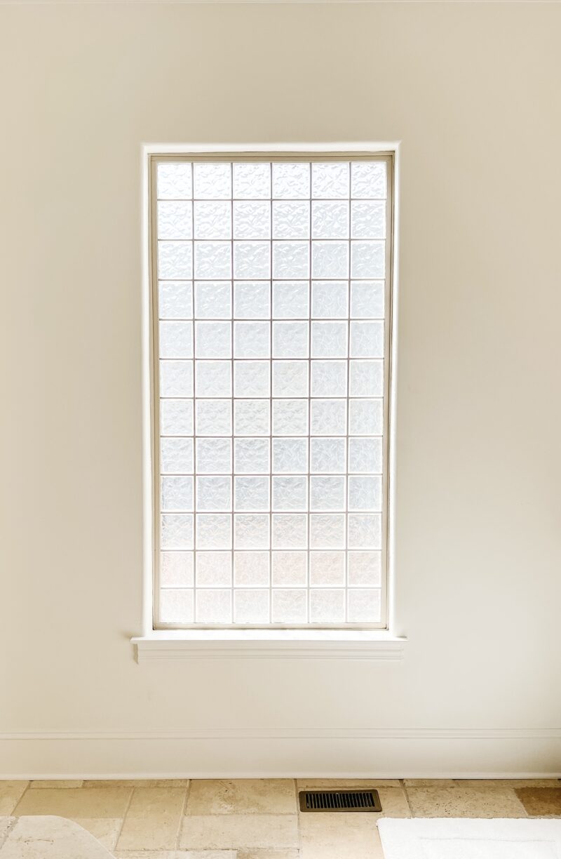
Another pain point was this glass block window. While it’s needed for privacy from our neighbors, the dated block wasn’t doing us any favors in this space. I was determined to disguise it while still allowing light to filter in.
A WHOLE NEW LOOK
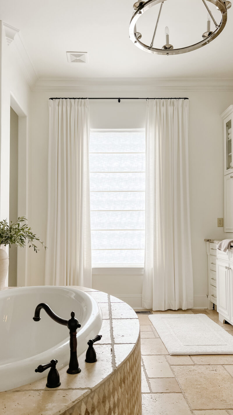
By adding drapery panels and a roman shade, the glass block wall is now the focal point for the room. The window treatment also provides drama and warmth. This was a relatively inexpensive solution to something that really bothered us.
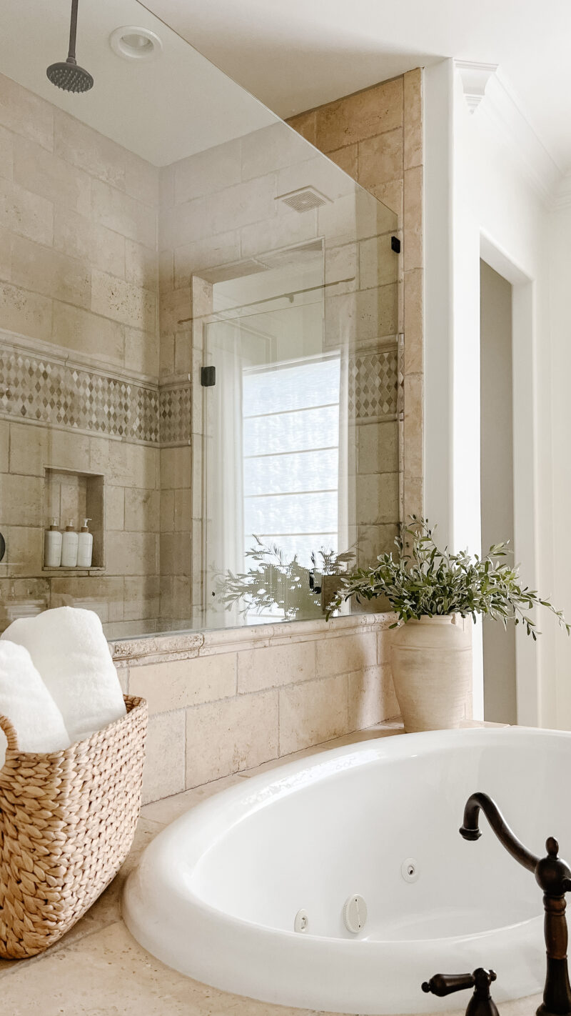
I purposely kept the decor very neutral with white towels and a textured vase. The idea was to keep it feeling as spa like as possible.
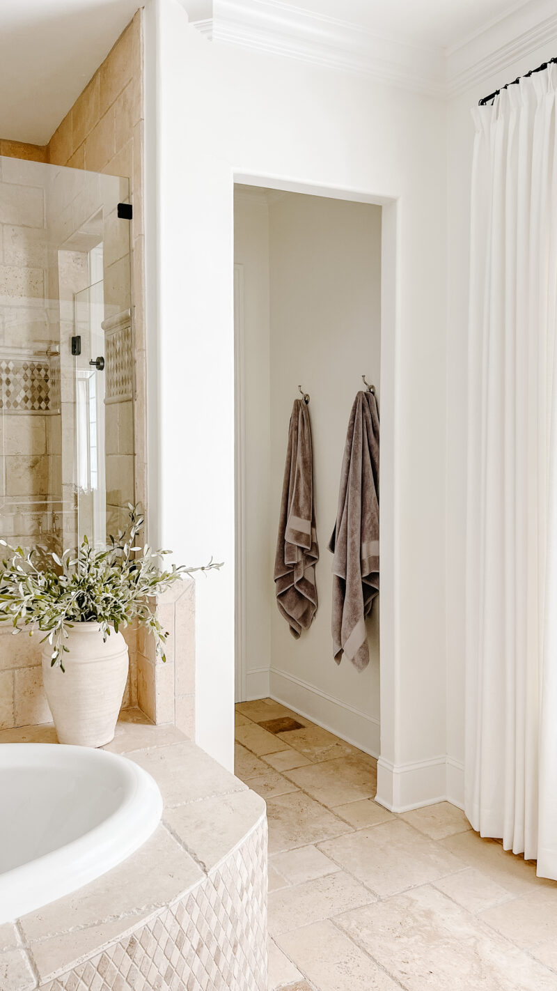
The robe hooks (more substantial than towel hooks) tie in nicely with the faucets we chose.
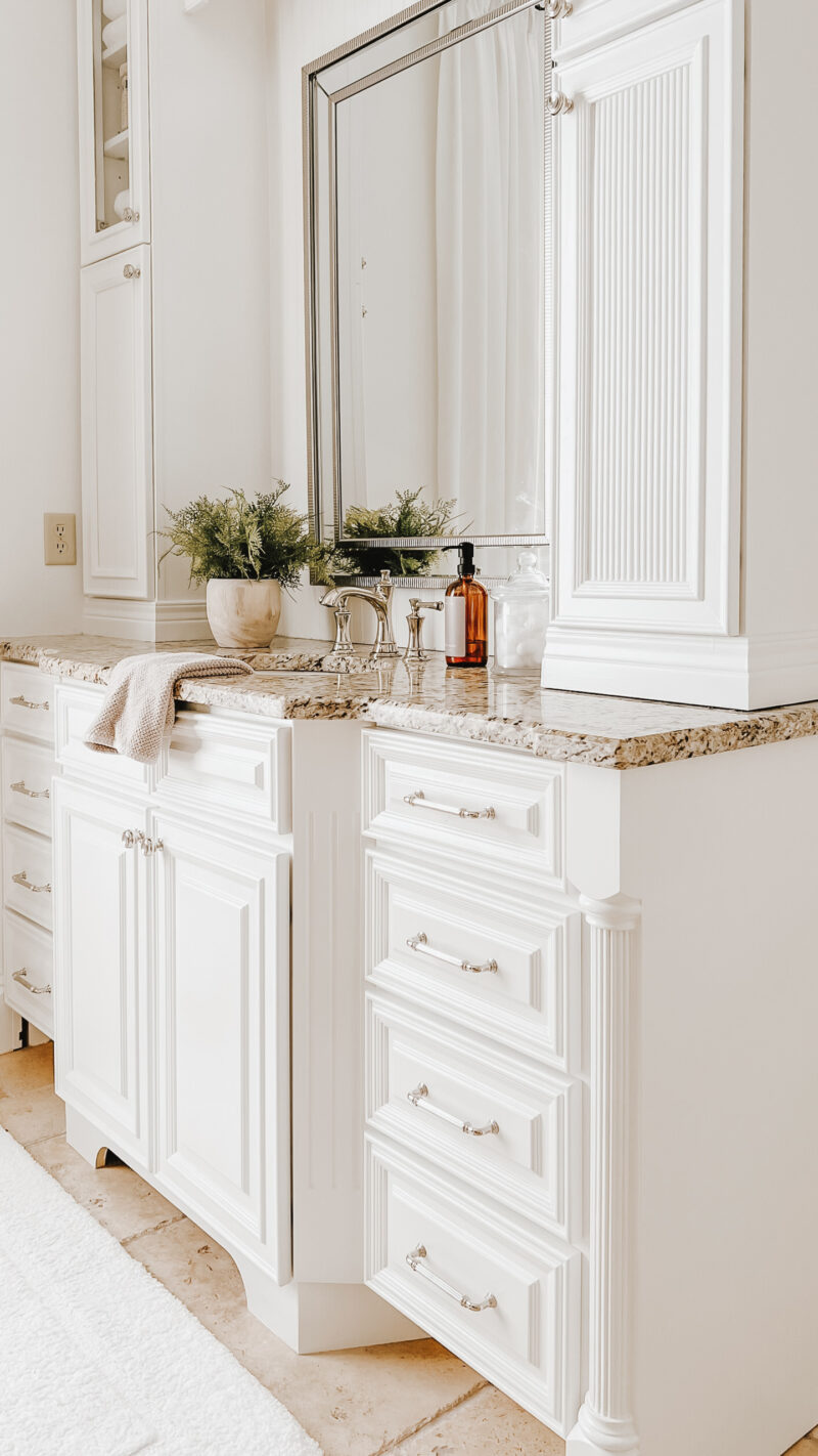
Here is a closer look at how the fluted trim on the doors ties in with the fluting used on the edge of the vanity.
BATHROOM SOURCES
- faucets – polished nickel
- robe hooks
- chandelier
- vanity lights
- hardware knobs and handles
- fluted trim
- bath mats
- hand towels
- textured vase
- soap bottles
- woven canisters
- mirrors
- towel basket (similar)
- drapery rod (under $20) and rings
- drapery panels(beige white) | roman shade – paper white
A LOOK AT THE LAYOUT

And for those who are curious about the layout, that door leads into our bedroom.
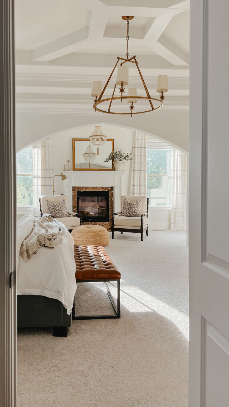
Here is a peek into our bedroom from the bathroom. There is something about transforming a room with very little money that just feels so good. I hope these mini renovations are helpful and encouraging. We’ve got another fun one just around the corner so more ideas to come. Let me know if you have any questions in the comment section below.
I love your mini makeover! I really appreciate ideas for inexpensively sprucing up what we already have. I have been thinking a lot lately about our societal need to make everything perfect and brand new. It’s wasteful, and I also think that so many Americans live beyond their means. Just because we can do something, doesn’t mean that we should. You freshened your bathroom up beautifully!
Jamie! Yes, to this. I can remember my parents saying that word for word. “Just because we can, doesn’t mean we should.” Applicable in so many areas of life. Thank you for the kind words. So excited to have it feel fresh and new. Appreciate your stopping by.
Beautiful!
It’s inspiring to see what is possible with paint, hardware, accessories, and a little sweat equity! Really well done!
Thank you, Christine. Paint will forever be my favorite. It’s crazy how transformative it can be (and relatively inexpensive).
This is so beautiful! I love love the fluted doors. Great job! I will be duplicating your window treatments to hide my own glass block. Thank you for the wonderful ideas as always. I really love makeovers that aren’t a full gut job. They are more creative and also kinder to the pocketbook and the environment! You knocked this one out of the park!
Thank you, Erin! Such a kind compliment and so happy it has given you an idea for your own glass block wall.
The bathroom turned out beautiful. I love the draperies! I’m curious if you plan to keep the carpet in your bedroom?
Thank you, Tina! Yes, we do. We actually really love it which surprised us. So nice to have the comfort of it.
Beautiful, Courtney! Such wise decisions that make sense for you is all that matters. And it’s so we’ll done. Pretty sure I’m going to copy a couple of your ideas. Thank you for sharing and explaining throughout the project!
Thank you, Brenda. I am so happy it gives you a couple of ideas. Here’s to making our spaces feel more like our own. Have a great weekend.
It’s beautiful, but then everything you touch turns out amazing! I love that you opted to not gut it— not every project has to be a total gut/redo to accomplish a very lovely space.
You are so kind, Dawn. You made my day. Thank you very much. And totally agree . . nice to work with what we have.
Beautiful! Did you use Sherwin Williams “Alabaster” on both bathroom walls and cabinets like I thought you mentioned using in other places like your entryway wall & trim. Love all your remodels & updates. Thanks!
Hi Sarah! Thank you. And yes . . . Sherwin Williams Alabaster on all of it. Have a great weekend.
What a beautiful bathroom. I’m always in awe of your talent and wish I had the same. I was also wondering how your daughters bathroom turned out. Did I miss that post? The last I remember was the green wallpaper above the mirror.
I’m always happy when I see a post from you.
Love from OC. (North Tustin)