I had so much fun chatting about the Fixer Upper Takeaways the first time that I thought I would bring it back for another installment. Chip and Joanna Gaines know how to bring the style and the class with every space they create and I love being able to find the simple design elements that we can all implement in our homes. Some may be grand in scale and some may be quite small, but we can “Chip” away at the big picture and identify fun ways to add a bit of the Fixer Upper magic to our own homes.
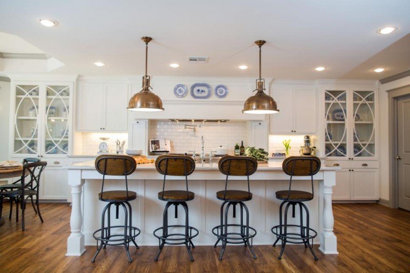
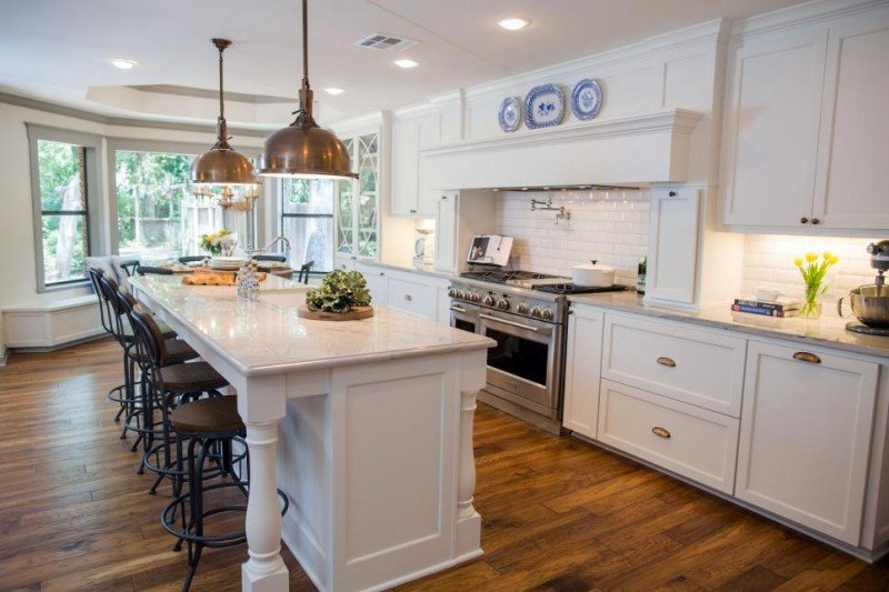
Unreal what they did to transform this 70s style home. I am swooning over this kitchen. I wish I could say the “takeaway” is that we all get to take this kitchen away with us, but not sure I can swing that.
Takeaway #1: Add Rustic Charm
I love those barstools. I have been seeing look alike stools at places like HomeGoods and World Market. Adding some rustic charm to a polished space gives it so much more character.
Similar Bar Stools
Takeaway #2: Add Some Blue and White
The blue and white china pieces have been on trend for quite some time. They add a down home, lived in feel if you ask me. I love them. I added a blue and white garden stool to our living room last year and I really do love what it adds to the space.
By the way, these pendants are so similar and on sale right now.
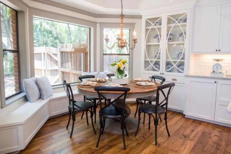
Takeaway #3: Mix Your Finishes
I have always been a fan of mixing finishes when it comes to furniture sets. And adding black to a otherwise neutral space helps ground it and gives it more dimensions. This allows you to shop places like flea markets and discount furniture stores, too. Or maybe someone in your family has a set of chairs they no longer need. My dad has a set of Bentwood chairs that I wouldn’t mind if he wanted to part with (hint, hint . . dad!).
Shop Similar Pieces
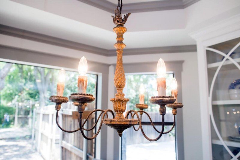
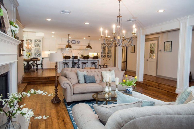
Takeaway #4: Add Unexpected Lighting
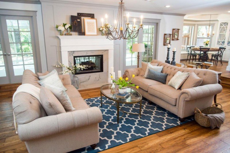
You don’t always think to add a chandelier in the middle of a living room and it can make the space so much cozier. Look how gorgeous. It really defines it and adds amazing light. By the way, Joss and Main is having a light sale right now. A few that caught my eye are below.
Lighting Sale
Takeaway #5: Float the Furniture
Not all of us have the luxury of space. I can relate. But if you do, floating the furniture gives the room so much more character, helps define a space, and allows for fantastic traffic flow. It also can make a very large and long space look more pulled together. You want to avoid putting furniture up against the wall if you have a larger room. I stumbled upon this table. It’s rectangular instead of oval, but so so gorgeous.
Takeaway #6: Anchor Sofas with a Patterned Rug
This rug has a great simple pattern that brings a ton of energy to the space. My sister actually has this exact rug in a different colorway and it has held up beautifully. Great, great choice for a high traffic area.
Shop A Similar Room
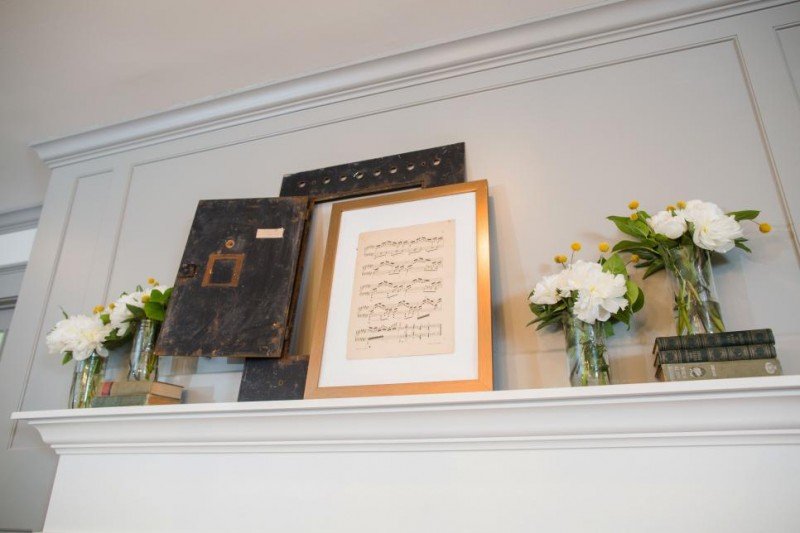
Takeaway #7: Mix Old With New and Fresh
I LOVE using anything that holds special meaning. The husband in this lucky duo is a musician and the music is that much more special. It reminds me of the framed piano music we have near our piano. I framed three pieces of music I played when I was little. First of all it’s free and that’s fantastic. And it evokes memories when you look at it. Win-win. But I love the rustic touches and old books mixed with fresh stems in mason jars. So easy and it really does bring this mantel to life. (And another great example of mixing finishes).
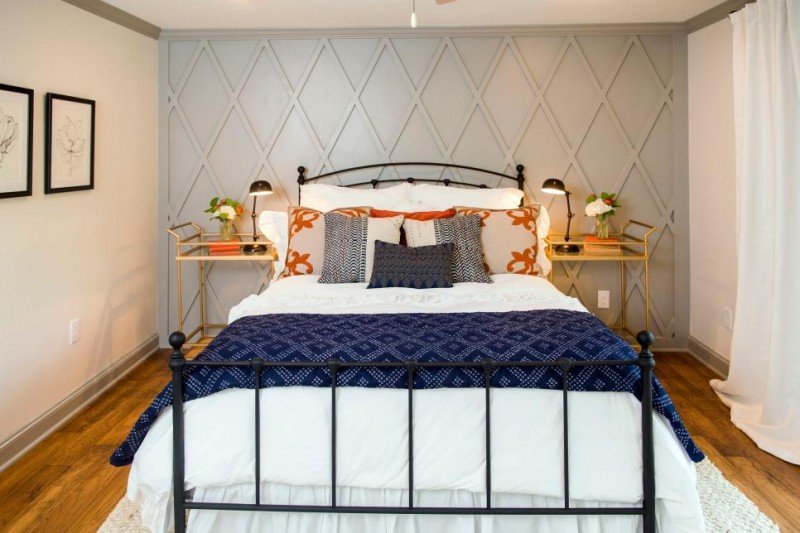
Takeaway #8: Utilize Balance and Symmetry
This was one of the takeaways from the last installment. I really like this idea when you are using a rather busy backdrop (the woodwork on the wall) and when design does not come easily to you. It can simplify the space and the process.
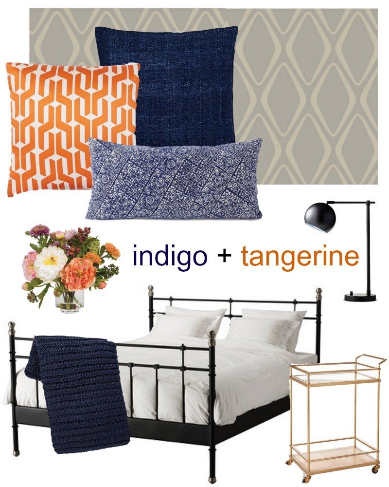
Fixer Upper Hack: Last time I showed you how to create some really darling artwork for children and today I am breaking down this space. The woodwork Chip and Joanna used in this room is stunning. I LOVE it. But it’s not the feasible for all of us so I chose a removable wallpaper that gives the space a similar feel. It has the geometric pattern and a similar neutral color tone. It actually reminds me of the wallpaper I used in my own bedroom. And how fun to use barcarts as bedside tables. Clever, Mr. and Mrs. Gaines. Very clever!
Shop This Room
Takeaway #9: Give an Old Piece New Life
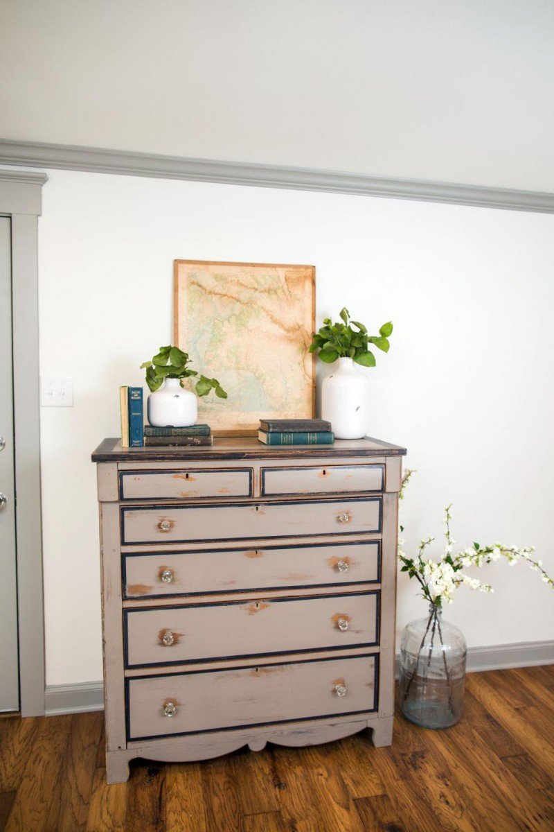
We all seem to have that old dresser floating around from room to room. And if you don’t, chances are a family member or friend may be happy to part with one. I am a huge fan of the Martha Stewart Vintage paint line. I used it on our coffee table. That paired with the wax and you could easily achieve a piece like this to add that vintage charm to a space. And there are the old books and fresh stems again!!!!!
Takeaway #10: Add Spa Like Touches
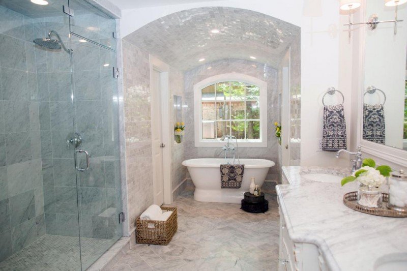
Ok, I know. Most of us do not have a marble oasis. I hear ya. But we can add little spa like touches here and there. The basket with fresh white towels and the pretty silver tray on the counter. I am going to do that in my own bathroom. I’ll show you photos soon. And maybe pick up a fresh new hand towel that makes you smile. What a great print on that one.
photos via HGTV by Rachel Whyte
Shop This Room
This desk is on sale and looks almost identical.
Takeaway #11: Frame Something Special and Unique
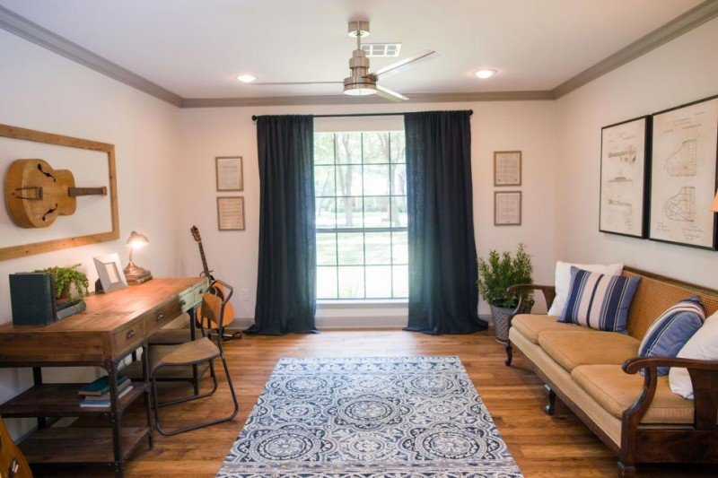
YES to this! I LOVE this. I think using special pieces as art is genius and of course free if it’s something you already own. And if it’s an odd shape, like the guitar, adding a molding around it really frames it nicely and makes it look intentional. Great way to keep a piece in the family.
Takeaway #12: Keep Art Work Symmetrical
While I don’t always do this and gravitate towards more of a gallery style, I did keep my artwork in my family room symmetrical and there is something very calming and easy about it. And once again, if you do not have an eye for hanging artwork, this is the way to go!
Takeaway #13: Textiles Are Key in Groups of Three (Pillows + Rug + Drapes)
I love the navy drapery panels mixed with the printed rug. And when you throw in the striped pillows it’s a perfect combination. If you have a room that really needs some new life, take a look at those three items. Can you switch them up? Add a new color scheme, maybe?
Whew. That was a lot but I hope you can find a takeaway or two to implement in your own home. Adore Chip and Joanna and I can find endless inspiration in not only how they design, but how they live. Such a strong commitment to family and I think it shines through in their sentimental and comfortable designs.
If you missed my first Fixer Upper | The Takeaways post you can get caught up here.
*affiliate links used

I love this series! I get so many ideas from the things you pull from the shows. Thanks!
Hi Tanya,
Thank you!!!! I love hearing that. Knowing it can help somehow is awesome. Enjoy your day. xo
Do you happen to know where Jo gets the long skinny candle sticks that are dark metal? She uses them in so many homes on her mantles, desks, coffee tables etc. I have looked and looked and no luck:(
I absolutely love these posts, Courtney! I’m not good at decorating so having you explain what Jo and Chip do helps me know what to do! 🙂
Oh, thank you so much, Susan. I so appreciate you letting me know it’s helpful. I just adore the work they do and it’s fun to be able to break it down like this. Have a wonderful week.
These posts are some of my favorites! That bathroom made my jaw DROP! I never thought to do a curved arched hallway like that, let alone one that is completely tiled. I think that’s going on my dream home wishlist!!
Xo Melissa
http://cherishandbloomblog.com
Oh, thank you! And YES! jaw dropping is right. Holy smokes. The arch is gorgeous. Such a dream. I agree. It’s going on my wish list as well. Hope you’re off to a great week, Melissa.