Excited to be sharing another installment of Fixer Upper | The Takeaways today. I have so much admiration for Chip and Joanna Gaines. I am endlessly impressed by their talent and devotion to family. This past week they transformed a gorgeous 1919 bungalow for empty nesters. What a beautiful home near the campus where there children attend school. This has me dreaming of doing the same one day. I am sharing the takeaways I spotted that can be adapted for our own homes.
Takeaway #1: Use Exposed Brick
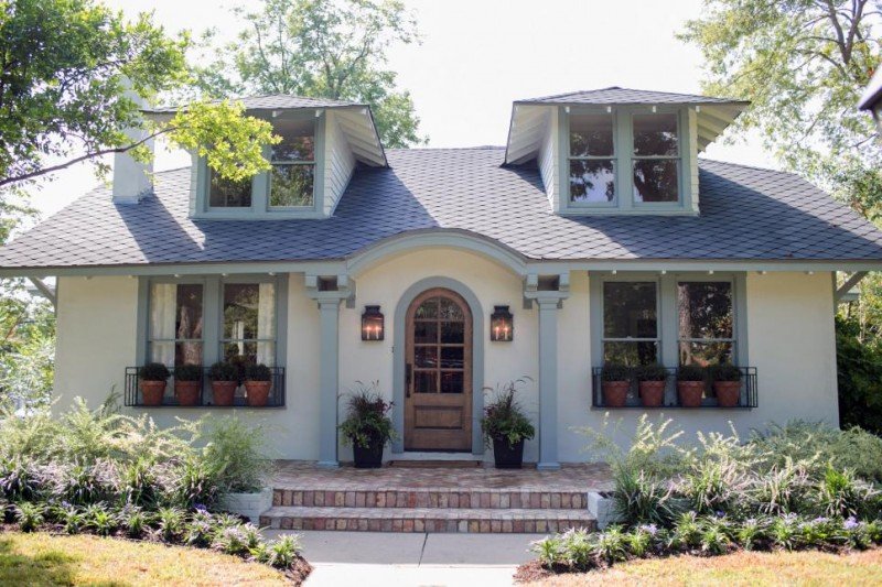
If you are contemplating any work on the outside of your home, I love how the aged brick immediately gives a home character and a lived in feel. It really makes a home feel like it’s been around for years and years.
Takeaway #2: Create Window Boxes with Pots
What a fun idea. Rather than planting actually window boxes, insert the pots. I love this. you can take them out to care for them or move them for the holidays. I think it adds so much charm to this home.
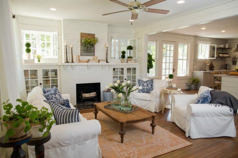
Takeaway #3: Create a Relaxed Vibe with Slipcovered Furniture
Slipcovered furniture really does exude a comfortable and relaxed vibe. And the fact that you can wash them is pretty fantastic. We had a similar white sofa when we first got married and I often wish we hadn’t gotten rid of it.
Takeaway #4: Use Blue and White Textiles for a Fresh Feel
I love the combination of blue and white. Such a beautiful and fresh look. And timeless in my book. This particular pillow is on sale and is a great print.
Takeaway #5: Galvanized Tray + Tulips = Beauty
Here is that galvanized tray again and I love it paired with a vase of tulips. I always count on Trader Joes for my $6 bunch of tulips (so much better than a fancy coffee!).
Takeaway #6: Create Artwork from Flowers
I really love what Joanna hung above the fireplace. And that is a DIY in the making for sure. So beautiful to add fresh flowers or greenery in a space we normally see mirrors or televisions. This caught my eye as a great piece to add to a wall or on either side of a mirror.
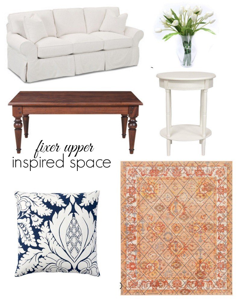
Shop This Room
pillow | sofa | tulips | rug | accent table
Takeaway #7: Consider a Fiddle Leaf Fig
Having just added two of these two our own home, I really do love the look they add to a space. I picked mine up at Home Depot but if you do not have a green thumb, a faux fiddle leaf fig may be the way to go.
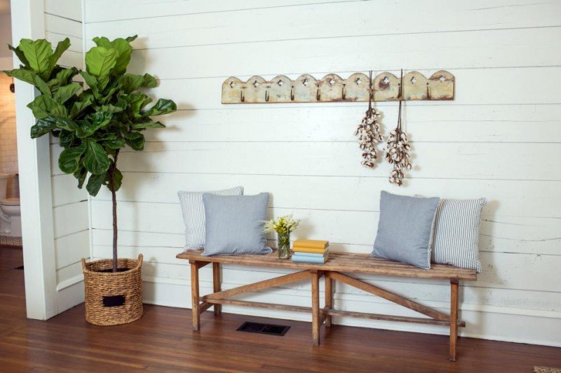
Takeaway #8: Fill a Long Wall With a Bench and Pillow
What a great way to fill a wall. I love the aged look of this bench and these darling blue and white striped pillows. The rack hung above is a nice alternative to artwork and creates more dimension. If this were an entry, you could hang guests handbags or jackets. Love how practical this can be while still looking beautiful.
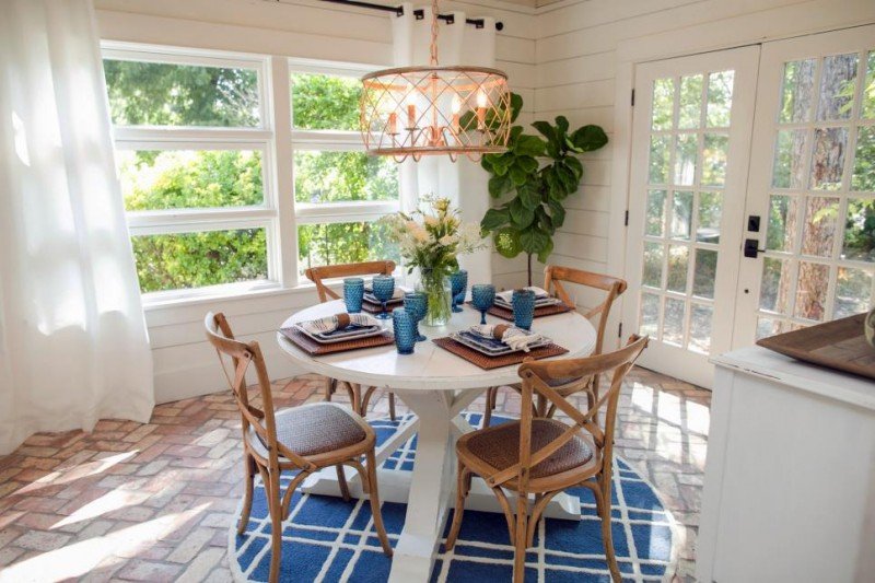
Takeaway #9: In a Tight Space Consider a Round Table
I have always loved a round table. I grew up eating dinners sitting around a round dining table and think they are so inviting. I also think they work so well in a tighter space because it allows for better traffic flow. They brick floor placed in a herringbone pattern is calling my name. I absolutely love it. I would have loved to have seen a slightly larger rug under the table so that the chairs would still be on it when pulled out but the color and pattern is spot on.
Takeaway #10: Choose Contrasting Chairs
I have mentioned this one before but I love how Joanna always uses contrasting colors with her dining sets. It creates so much more interest.
Takeaway #11: Tie Rooms Together with a Common Color
If you notice, the rug and stemware tie in with the blue in the living room as well as the kitchen backsplash. When you have a smaller space (as we do in our home) it’s smart to choose a color to unify the space. And because the large pieces of furniture are all neutral, the owners could easily swap out the rug and throw pillows for a different color during the holidays or when they just crave a change.
Shop This Room
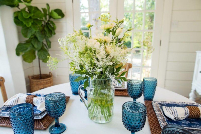
Takeaway #12: Add a Pop of Color with Stemware
We were given similar blue glasses for our wedding and I have always been so surprised how often I pull them out. Such a fun accent color and look great on this white table.
similar tile | similar bar stools
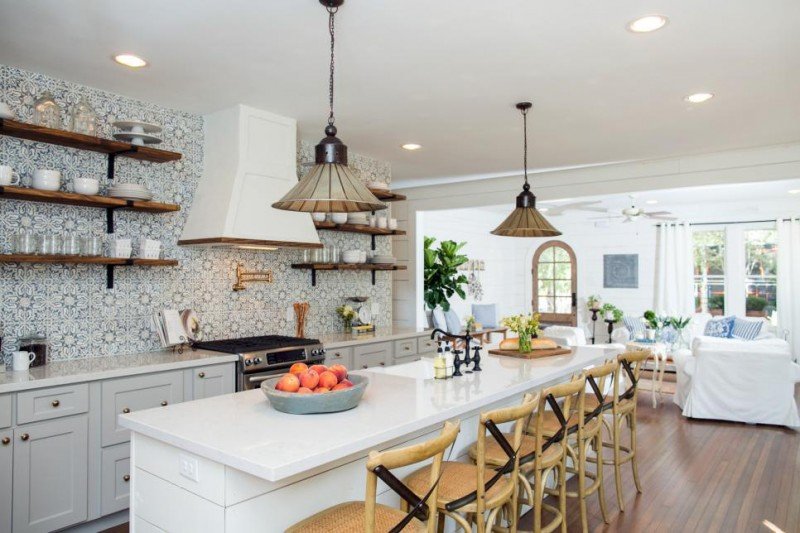
Takeaway #13: Use a Bold Cement Tile in a Neutral Color
The patterned cement tile is very much on trend right now. I love the look paired with the open shelves. I also really like that Joanna used warm wood accents to balance the cooler colors of the tile and cabinets. That keeps the space so warm and cozy.
Takeaway #14: Mix Finishes
I always love when people mix finishes. Notice the pot filler above the stove is gold but the island faucet is dark. Don’t ever worry about everything matching. Far more interest when it does not. Just be sure to use those same tones somewhere else in the space.
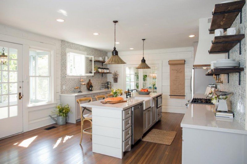
Takeaway #15: Add a Giant Scroll of Paper to the Wall
Don’t think I am not scouring a place in my home for the giant scroll. I love this so much. In my eyes it’s a more current take on the chalkboard and would be so great when entertaining. What a fun spot to write out the menu and welcome guests. I also spy a darling galvanized watering can filled with greens. Simple and beautiful.
Takeaway #16: Use Layered Bedding
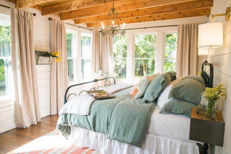
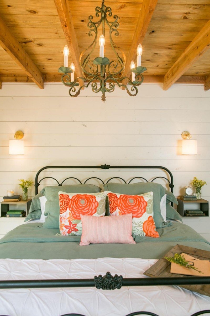
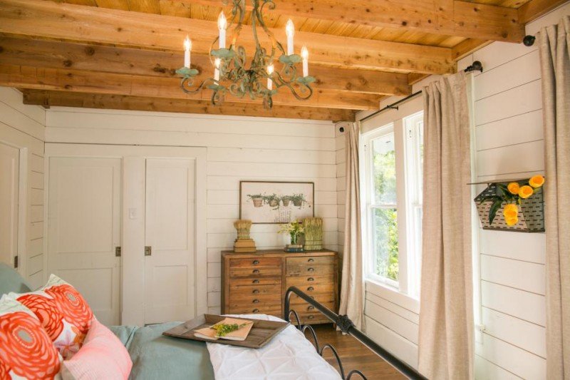
Your bed is supposed to be inviting and welcoming. I think layering a abed with multiple duvets really helps to accomplish that. I love the combination of the green and white in this space. And the pintuck duvet is similar to ours.
Takeaway #17: Add Jewelry to the Space
I am in love with those sconces. Such a beautiful touch. I think a well curated light goes a long way in a space. I really do. They can be pricey, but it’s like adding jewelry to the space. We chose to add a little bit of jewelry to our children’s bathroom and we have never regretted it. I have yet to find the chandelier below but did find some pretty alternates. The same bed can be found here.
Shop This Room
all photos by Rachel Whyte via HGTV
Takeaway #18: Use an Antique Piece for a Vanity
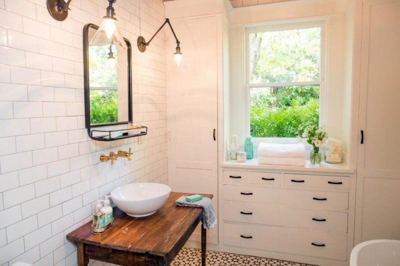
I love everything about this bathroom. This is such a great way to add a special piece in your home. Do you have a desk passed down through the years? Or can you scour a the flea markets. While I am not always a fan of the vessel sink, in this case it works because it is such a classic wash basin on top of a gorgeous piece. It reads much more traditional than modern as a vessel sink sometimes can. And I also love the floor to ceiling subway tile. And those sconces. So so good!! Way to go, Joanna. Beautiful.
While curating this post I found this gorgeous light and thought I should pass it along. So pretty!
Get caught up on past installments below!
The Takeaways #1 | The Takeaways #2 | The Takeaways #3 | The Takeaways #4
*affiliate links used

I love your Fixer Upper posts as much as I love the show itself!
These are my favorite posts!
http://www.kelseymarie.co
Is is just me or do you feel relaxed after looking through one of Joanna’s makeover homes? She always decorates with such a calm and inviting style that makes you feel like you could move right in! I have loved slipcovers forever, especially paired with blue. So many great takeaways from this post!
Shelley
Love your takeaways Courtney. Yes, love the creative window boxes and the art above the fireplace. I have the pillow from PB in green and love it. So fresh!! And, just received my galvanized tray I ordered from Target.
I love your Fixer Upper posts 🙂 I just read that they don’t get to keep the furniture! That makes me so sad for all the homeowners!
Loving these Fixer Upper inspired posts. I am a big fan of both Joanna’s and your style, so this is the best of both worlds. Thank you!
I absolutely love these posts!!
I love Fixer Upper. What a great transformation!!
http://www.maggiealamode.com
Gorgeous! Love Fixer Upper and your takeaways!
I always love these posts! I love d the giant scroll too. Any idea where to get one?
I’m loving the way that kitchen design is going these days. Mixed metals, mixed materials, and other mixed finishes — it’s all about personality and visual interest. Fixer Upper always has great examples of this!