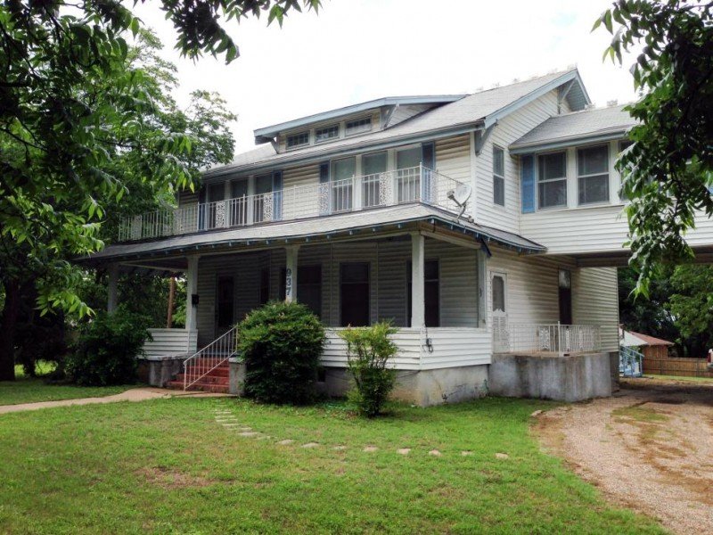
Three cheers for Fixer Upper day! If you are new to my blog, I discovered that most of us love Chip and Joanna Gaines and their addictive show so I like to break down episodes and show you as many takeaways as I can. It’s fun to see things we can all try and implement here and there in our own homes. This installment is all about a home that had been vacant for two years. I love the idea of brining a back a home that had been neglected. And who better to do it than Chip and Joanna! Without further ado here are the Fixer upper Takeaways!
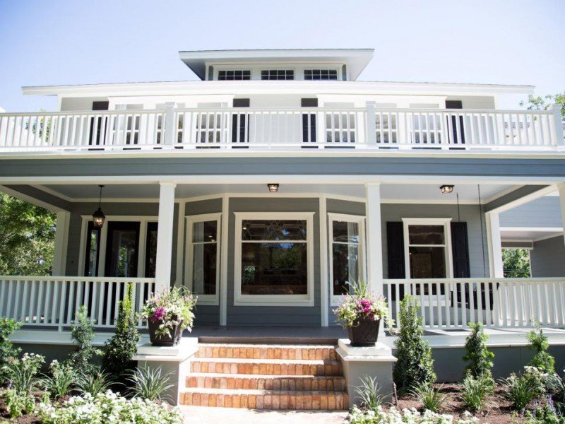
Such a charming facade. I adore any home with a front porch. And to have that pretty balcony on the second floor is just dreamy.
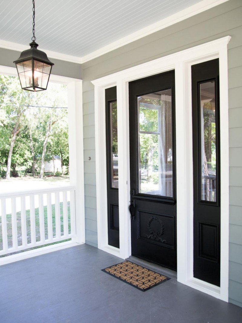
Takeaway #1: Infuse Charm with Paint and Lighting
Can your front entry use a bit of a pick me up? I like the bold black door against the white trim and house color. I also love the pretty lantern hanging from the porch ceiling. It’s not only welcoming but really chic. And the black lantern ties in well with the black front door. Here is another lantern I found at a great price.
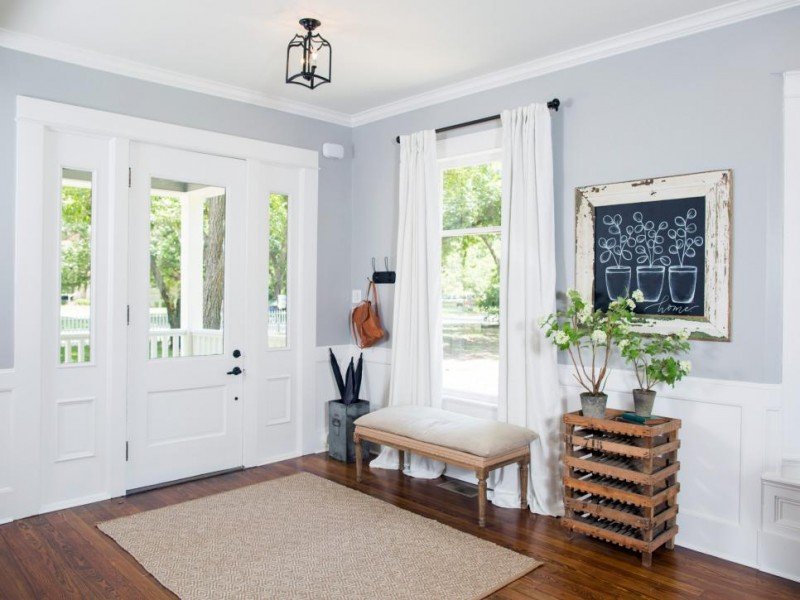
Takeaway #2: Think Outside the Box with Your Entryway
Such a creative way to really make an entryway in the foyer. The bench, plus the chalkboard and crate. . . it’s not only darling but functional.
Stylish Benches
Takeaway #3: Keep Your Needs in Mind
I like the way Joanna hung hooks right by the door. Are you always looking for somewhere to hang your handbag or set your keys? You could have a darling bowl resting on the crate to house your keys or sunglasses. I like when ares are are not only really lovely, but meet the needs of whomever lives there, too. That’s the most important thing. In lieu of the chalkboard art, you could literally have your family calendar there. As long as it’s framed out in a beautiful way, it could be a good way to keep everyone on the same page with the busy schedule. This one is on clearance and there are more cute options below.
Great Chalkboard Ideas
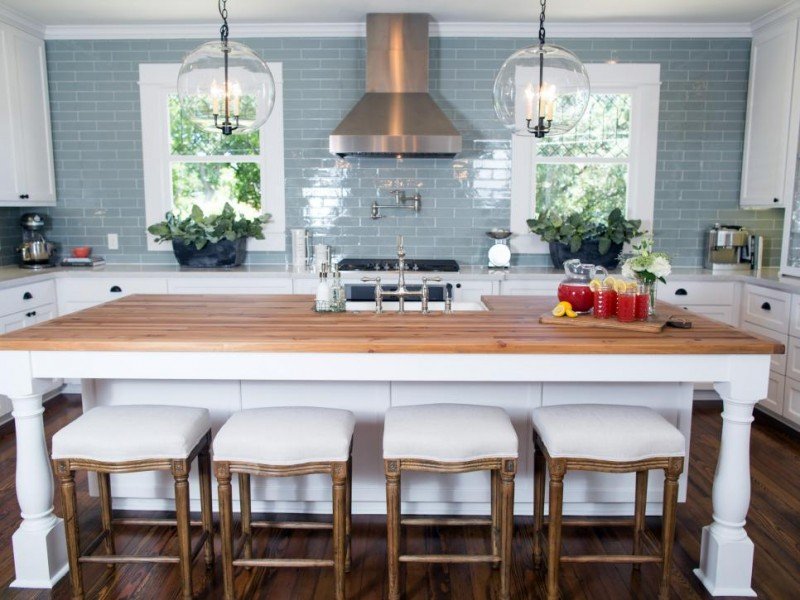
Takeaway #4: Consider Different Surfaces
I like when the island is different than the rest of the countertops. And I especially like the butcher block. I grew up with a butcher block island so it brings back great memories. Such a pretty combination with the white island and pretty barstool (very similar).
Beautiful Barstools
Takeaway #5: Don’t Be Afraid of a Bold Backsplash
First of all, I love when you can go all the way to the ceiling with a backsplash. It creates so much height and drama. And if you aren’t afraid of some color, it’s a great way to add texture and personality. The reflective quality of this subway tile really adds a much needed shimmer to this wall. I like the juxtaposition of the shiny subway tile with the butcher block island.
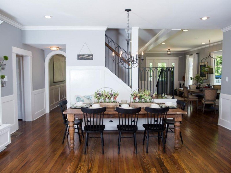
Takeaway #6: Ditch the Matching Chairs
Once again, don’t match! Paint your chairs a contrasting color or swap with a friend! The nice thing about not having the chairs and table match is that you can shop thrift stores or any other spot for chairs and tables separately. So much easier when they don’t need to be a matching set.
By the way, the item I get asked about the most are these chairs. They were from this episode of Takeaways. I found a set of four for only $354 if you have had your eye on them, too.
DEAL ALERT: This table has very similar legs and is on clearance. Amazing price!!!
Shop This Dining Room
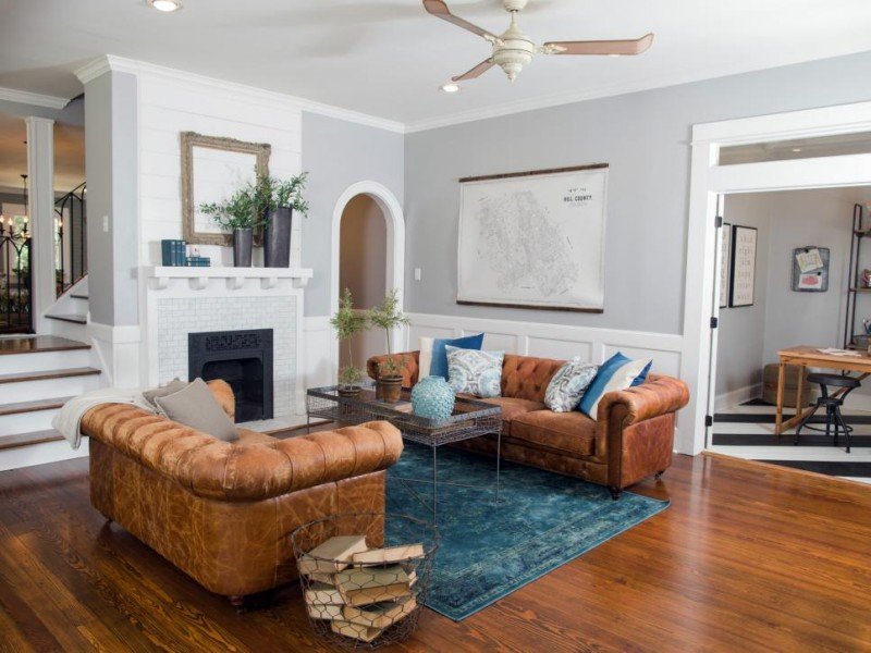
Takeaway #7: Insert a Bold Color with an Area Rug
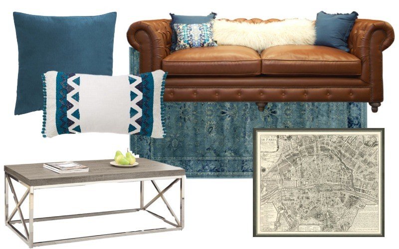
As with most of Joanna’s designs, the overall look of a room can remain quite neutral but you can add a huge amount of life with an area rug and throw pillows. This rug is saturated with color and really takes center stage. But if you ever tire of that color, you are not having to replace the high end items (so don’t go crazy with what you spend on your area rug!).
Takeaway #8: Elevate Your Thinking (and your cocktails)
Did you notice the higher coffee table? I like that. It’s unexpected and different. If you are going to do that, you need to go with something that is airy and not too heavy looking. Notice the thin legs and lightweight aspects of the table.
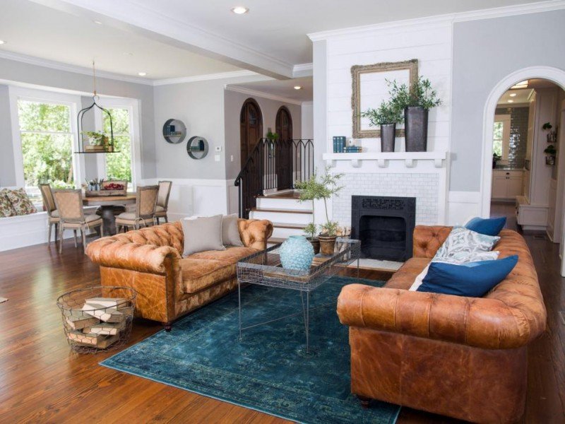
Takeaway #9: Embrace the Empty Frame
That mantel is perfection. I have always embraced the empty frame. We have one in our gallery wall going up our stairs. I have always looked at it as representing what’s to come. Keep an eye out at flea markets or consignment stores for really unique frames. The art doesn’t matter as you will ditch it. It’s a great way to create a pretty mantel. And it allows your beautiful woodwork to show!
Shop Old World Charm
Takeaway #10: Keep it Fun
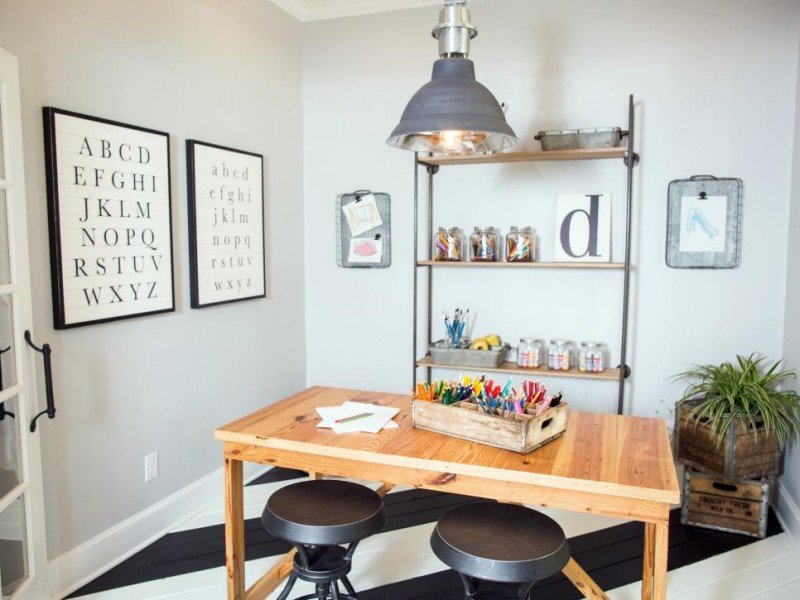
A home needs to be your haven. Don’t shy away from creating really special spaces that are fun and whimsical. There is something about this little craft space that I absolutely adore. What a fun spot for children to do homework or be creative. My kids would LOVE this room. Notice the galvanized trays hung on the wall. They make great magnetic boards for artwork or homework pieces. I also love the stacked crates. Clever and easy. This table was custom made, but I have seen this one which has the bar stools attached. Just so perfect for a room like this.
Takeaway #11: Paint the Floor a Bold Pattern
So it’s definitely bold to paint a floor. Don’t get me wrong. But how good is this? I think it’s pretty amazing. I would only recommend doing it in a small area. Maybe a laundry room, craft room, or office space. Especially great if you have flooring that is less than beautiful! And the diagonal stripe is pretty darn great. Then there is the fact that it’s black and white. Calling my name!
Takeaway #12: Lighting is the Jewelry in a Room
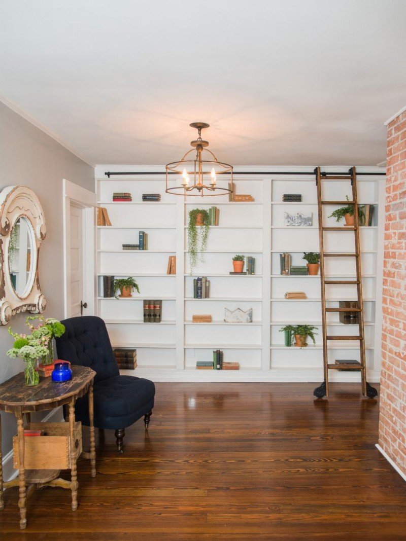
While we may not all have a charming nook to turn into a library, we might all have a spot that could use a pendant light. Sometimes we just don’t realize that the opportunity is there. Maybe it’s a family room, landing, laundry room or playroom. But I do think lighting is transformative and can completely change the way a space appears.
Takeaway #13: Create a Seating Area in a Narrow Walkway
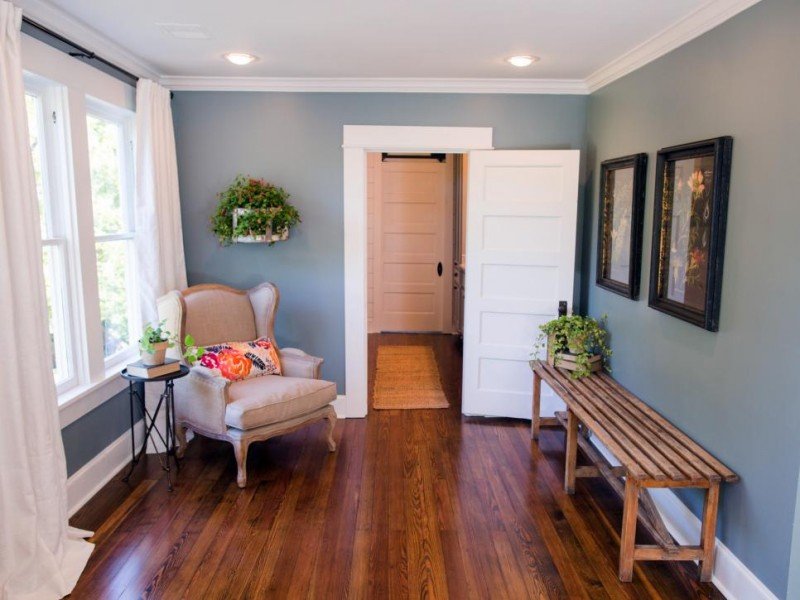
With a wingback chair and a bench, this space is now welcoming and inviting. What a great use of space. I love the neutral drapes and the use of greenery. When in doubt, add plants! And the colorful lumbar pillow on the chair gives the space a little bit of pop and interest.
Wingback Chairs
The color in this room reminds me of the Restoration Hardware color palette. Although you’ll see it appears much liter (like Silver Sage) in the photo below. By the way, if you are looking for a sophisticated green/blue the Silver Sage is one of my all time favorites. I have never seen it look bad in any space.
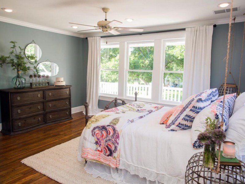
Takeaway #14: Clear the Clutter
Now this may not be for everyone, but how unique to hang the side tables! This might be really great in a small space or a guest room where you don’t need to store very much. It may not be altogether practical, but the idea of being able to vacuum freely under these makes my heart skip a beat! And white drapes are always a good idea.
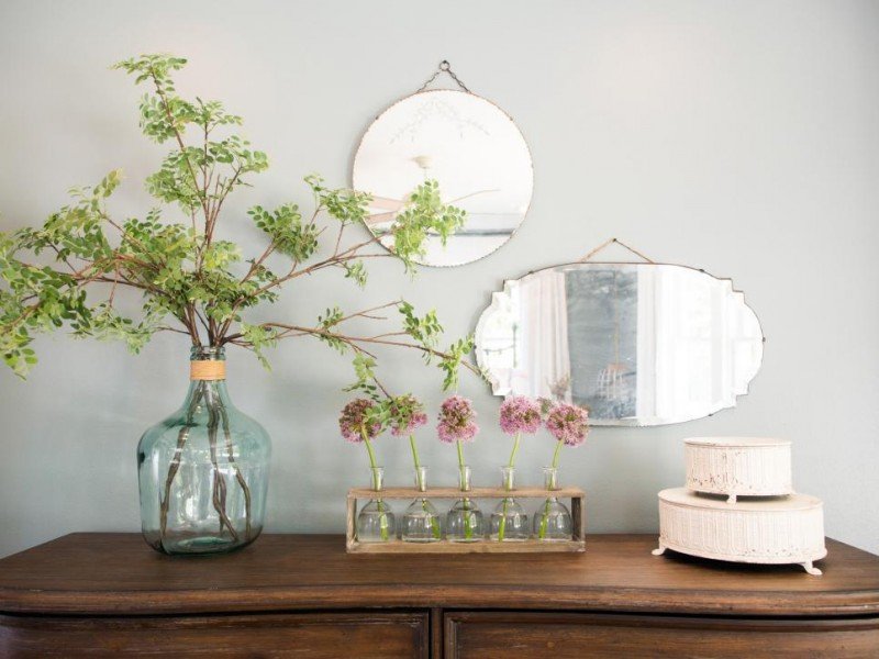
Takeaway #15: Styling a Dresser Can be Simple
While you may need the top of a dresser to actually function, you could easily have jewelry or odds and ends in pretty boxes off to the right. But the pretty vase with faux flowers mixed with the mirrors on the wall is quite easy to recreate and looks beautiful.
Takeaway #16: Use Subtle Color on the Cabinets
Oh I LOVE this bathroom. So much charm in such a small space. The pretty blue cabinets are so beautiful with the all white bathroom. Do you have a set of tired bathroom cabinets? Maybe just a new coat of paint is all you need.
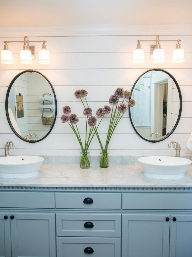
Takeaway #17: Create a Focal Wall in Lieu of the Builder Mirror
So take a look at this space. Do you have a double vanity somewhere in your home with the giant builder grade mirror above it? Can you rethink the space to make it a focal wall? Ditch the large mirror and replace it with either shiplap or tile and then use two smaller oval or round mirrors. We did something similar in our children’s bathroom. It was only a single vanity, but we still created a focal wall and we have never regretted it. It’s one of our favorite rooms to date.
See all of the before and after photos of this transformation over on HGTV. Thank you to Chip and Joanna Gaines for the endless inspiration both as a couple and as designers.
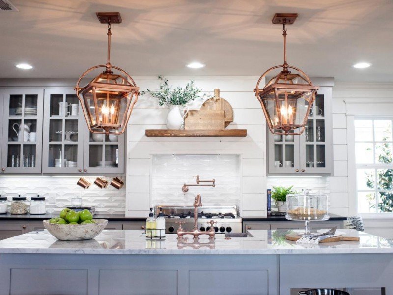
And a quick update! Major sale. Do you remember this beautiful kitchen? Well the pendants are now 75% off! What?!!!! See the Takeaway post here.
Get caught up on all past installments of Fixer Upper | The Takeaways here.
*all photos by Rachel Whyte via HGTV. Affiliate links used.

I always love reading your posts in this series. You point out so many things I might not have noticed. I love the idea of not matching the dining chairs. I have been looking for a new table and chairs and I keep getting stuck when I don’t like one or the other in a set. I really need to think about it differently. Thanks again for a fun and informative post!
Shelley
Thank you, Shelley. You’re so sweet to say that. I love working on these posts. And yes! It’s so freeing when you don’t have to look at the chairs and the table as one set. It even opens up finding thins on consignment or on clearance. Keep me posted on what you find. Oh, and your favorite Target bins are my favorite, too. Love those. Have a great day.
I love that you feature Fixer Upper on your blog. I’m in the UK and I’d never heard of it. A quick search of the cable channels came up with the goods and its currently on everyday in the morning. Its set to record and has fast become a favourite with both myself and my husband (as much as he doesn’t like to admit it!). Chip and Jo seem like such a lovely couple (and family) and the results they create a fabulous! I now follow her blog too! The only downside for us watching is that is makes us realise how small and expensive houses are in the UK!!
I wish housing was as beautiful and inexpensive throughout the U.S. as it is in Waco, TX! It seems they really get so much value there for their money. Not so in Atlanta, GA. By the way, love the U.K.!
I love these post. And I think that blue on the bathroom cabinets is perfect for our tired cabinet. We are currently staining the concrete grey/brown so this pop of color will look striking.
What is the color and brand of paint that is on the outside of the house? The color shown in the picture with the black door.
I’m very curious about the exterior paint color of the home also. Beautiful!
I’m so sorry I don’t have the details on that.
Do you know what they used to seal this butcher block with?