It’s basically the weekend. Don’t you feel that way when we reach Friday? It’s actually one of my very favorite days to get a ton done because then I feel better heading into Saturday & Sunday. I’m excited to share this week’s Friday Eye Candy with you. The theme this week is simplicity. And while the overall look is clean and minimal, there is nothing simple about the talent of these amazing ladies. Beautiful ideas await.
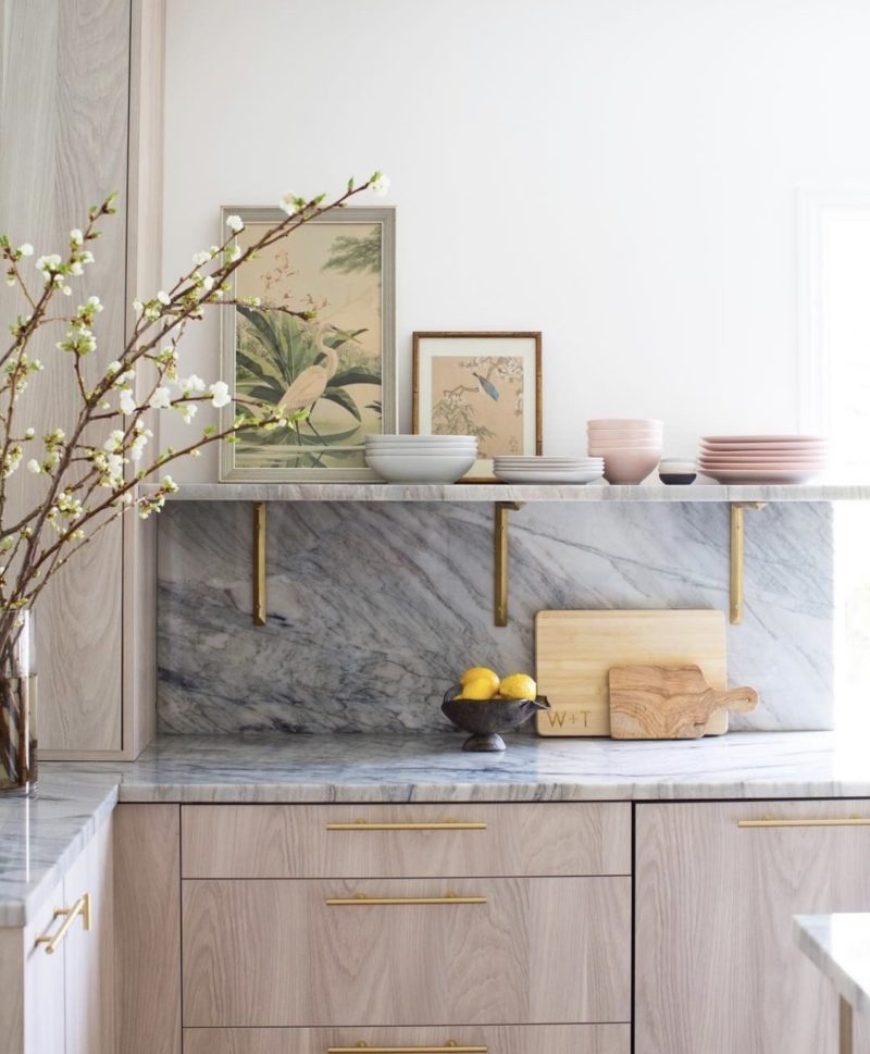
Gasp. Right? There is something about the combination of the beautiful gray marble and the light wood. Add in the brass accents and it’s gorgeous. But What I really want to focus on is the simple styling of the shelf. A couple pieces of art and dishes. So good and so doable if you are stumped on styling your own shelves. Elegant and practical. I love everything about @marieflaniganinteriors.
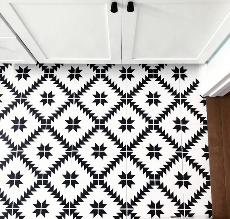
Ok, gals. Start looking around your home for outdated tile. This amazing floor was stenciled. Laura from @helmick_hacienda nailed this. I think this idea is genius. Imagine this with just white tile. A totally different space. You can check out the stencils here.
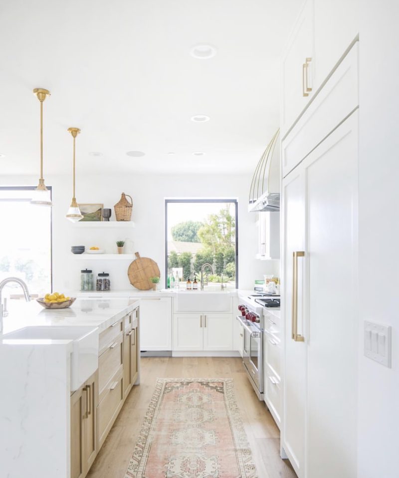
I had the pleasure of meeting the girls from Skout at a luncheon and loved hearing all about their design firm. This kitchen! Oh. My. Goodness. Every inch is so well designed and thought out but once again simplicity wins out. The simple and minimal shelves, the understated pendants and the clean lines of the hardware. All so beautiful. It’s also crazy how one simple runner in a kitchen can change everything. Cover up the rug and the room reads so differently.
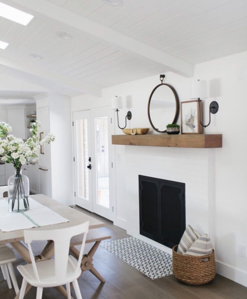
House of Jade Interiors has been a favorite of mine for years. Kirsten Krason was one of the first “blogging” friends I made and I have loved following her career and growing family. This room reveal is so lovely. If you have a long mantel, I thought this was really nice inspiration for how to style it. The tile in front of the fireplace is another place you could try your hand with the stencils, too. It makes such an impact. Mixing finishes is a great way to pull of simplicity. The light wood table paired with the white chairs gives it far more interest than a matching set. Baskets are also a great go-to for adding texture and warmth. I recently picked a couple from here for our front porch (currently on sale)
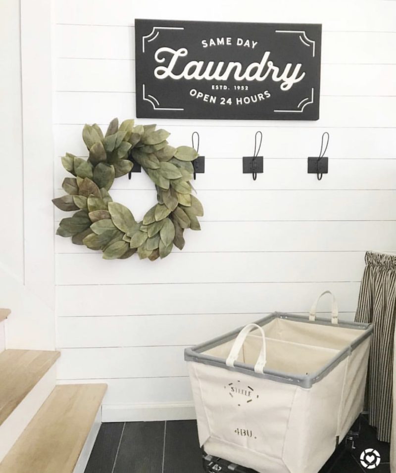
Last but certainly not least, this laundry room that Sarah from @dreamingofhomemaking created is calling my name. A darling sign, interesting hooks and a wreath. So good! I was walking through Hobby Lobby the other day and I bet you could pick up similar items there. This sign is cute as well. Just so warm and inviting. I still need to pull my laundry room together. It’s on the “unfinished project” list we have going. It’s one long list at this point.
MISSED SOMETHING?
Have a great day, friends. Hope it’s a productive one. xo
Leave a Reply