Thank you so much for all of your input on our laundry room makeover. I love hearing ideas and insights from my sweet readers. Last week I had the honor of traveling to Scottsdale, Arizona to view the HGTV Smart Home with Legrand. I shared a little bit of the experience on Instagram but can’t wait to show you the entire house today. On top of it being a great experience, I was able to spend some time with my dear friend, Carmel. Without further ado, here is the 2017 HGTV Smart Home.
HGTV SMART HOME
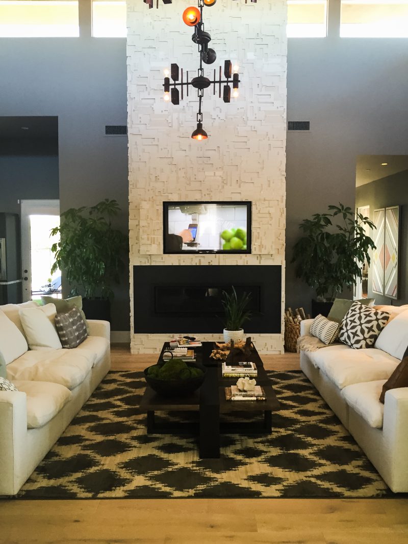
The sprawling ranch style home was designed by Tiffany Brooks and she really outdid herself. I was blown away at how well she and Legrand integrated technology into the Smart Home and still created a warm and welcoming environment. Things have come a long way in the tech world and form and function really do find a way to integrate seamlessly. The light fixtures throughout the home are truly sculptural pieces of artwork. The fireplace was so gorgeous in person. If you look closely, there are doors that close to completely hide the television. That is my dream.
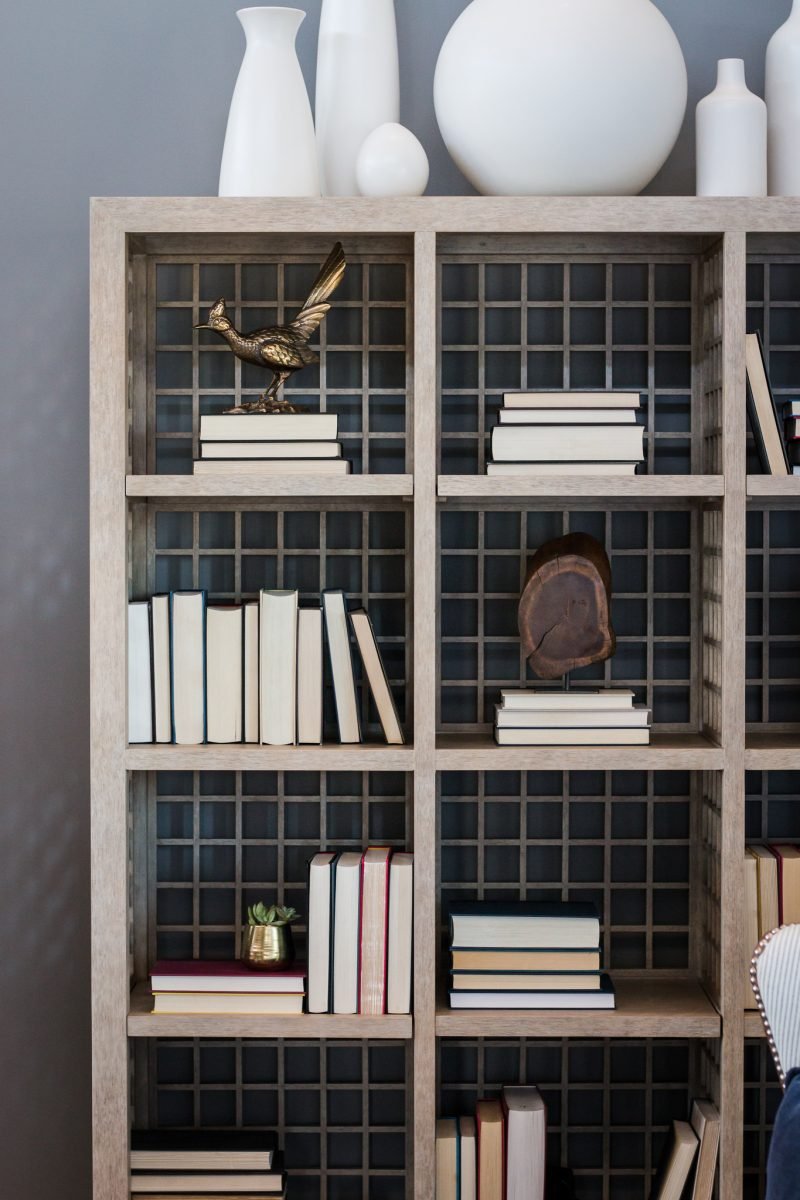
ENTERTAINER’S DREAM
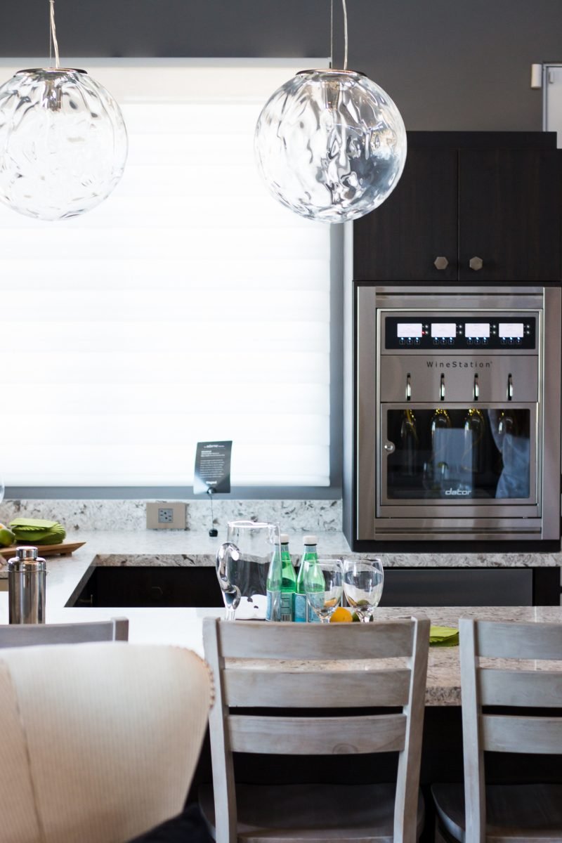
Adjacent to the great room is a gorgeous bar and spot to entertain. Not only does it overlook the beautiful pool and backyard, but it boasts this Dacor Wine Station as well. Where do I sign up for that?
EYE CATCHING KITCHEN
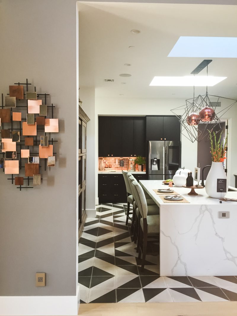
The centerpiece of this home is this gorgeous kitchen. It literally stopped me in my tracks. While the overall feel of the space is modern and chic, it’s warm and inviting thanks to Tiffany’s brilliant use of materials. And that floor!!!
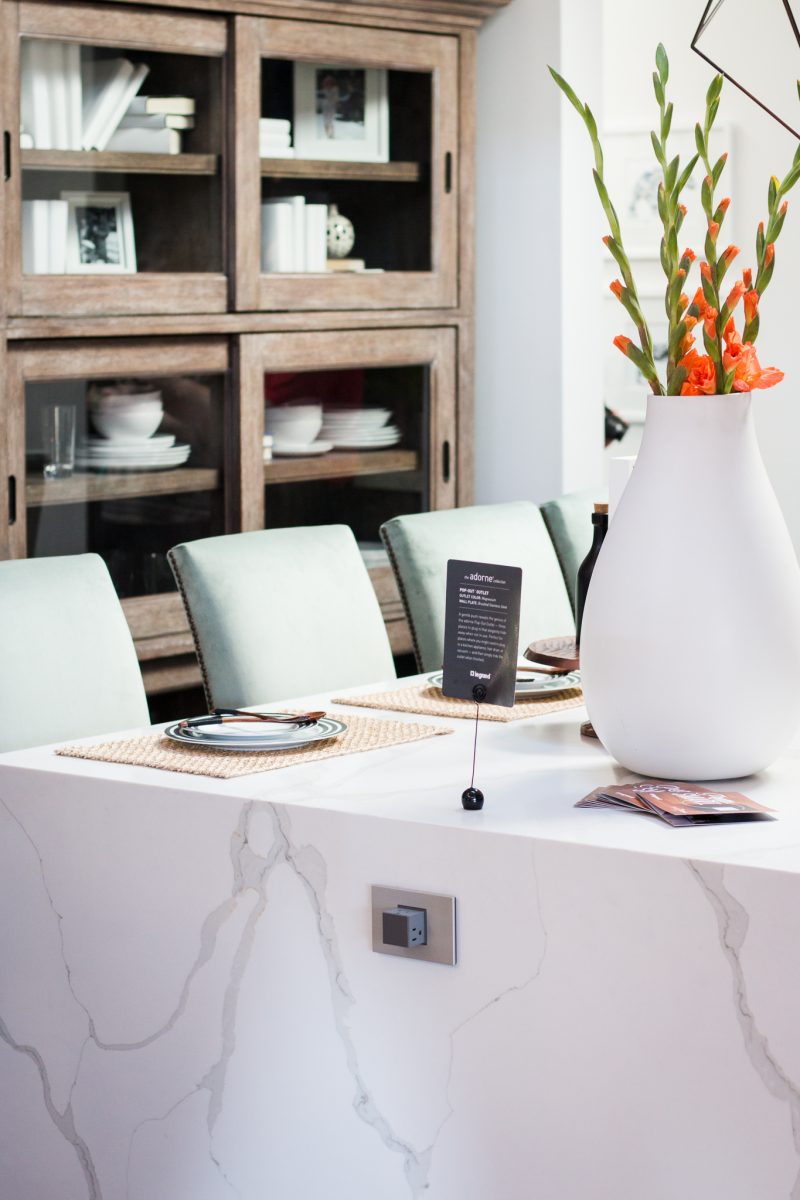
The grand hutch behind the large marble island is a beautiful way to add a traditional element and feel to this space. Do you see that adorne Pop-Out Outlet popping out from the island? Genius. It allows for you to plug-in three separate items and easily hides away when not in use.
BRILLIANT TECH
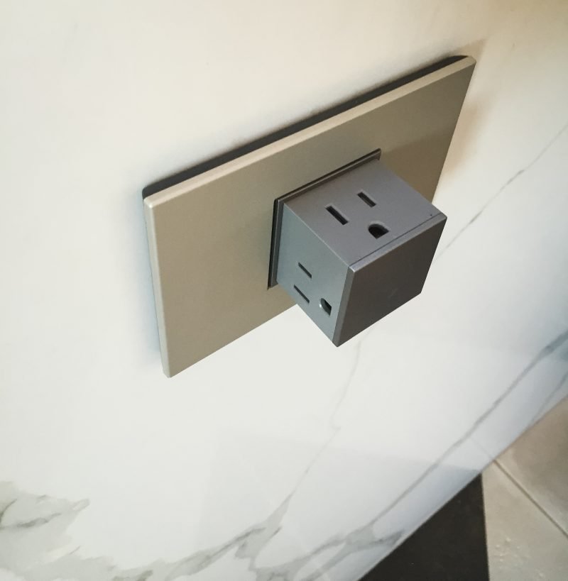
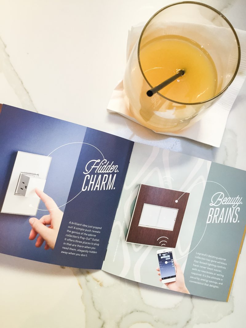
Not only are these outlets throughout the home, but the lights are app-based. Yep! You read that correctly. You can control all of the home’s lighting through an app on your phone.
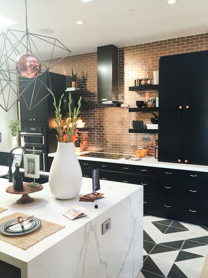
Tiffany’s use of the copper backsplash was just so spot-on. It’s breathtaking in person and so perfectly paired with the black cabinets and the marble waterfall island.
HIDDEN TREASURES
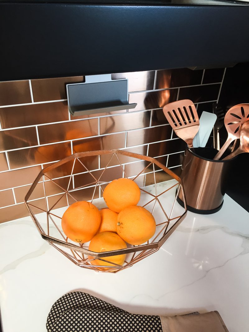
Do you remember my sponge holder that I attached to my kitchen backsplash? Well I have been outdone by the the adorne Under-Cabinet Lighting & Power System. Talk about marrying form and function. This phone cradle is awesome. Under the cabinets, there is an entire system offering ample power, lighting, USB charging, and bluetooth music. It’s completely out of sight and I’m so envious! Things have come a long way, my friends!
DETAIL ORIENTED
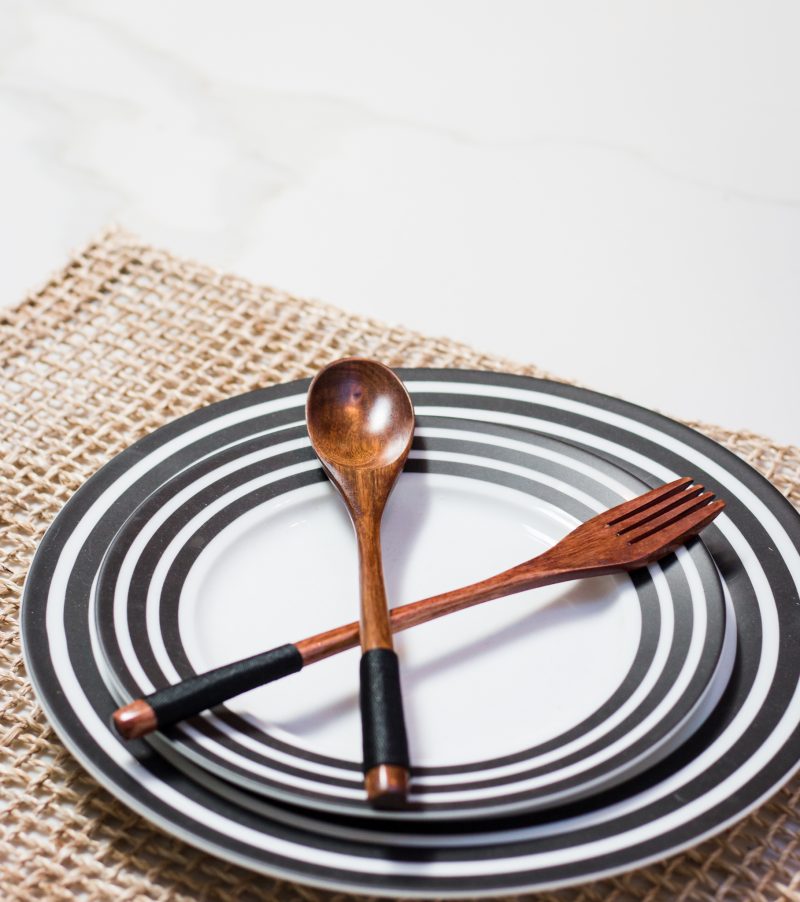
It’s in the details, right? Even this place setting speaks to Tiffany’s use of texture, pattern and sculpture.
CLEVER DESIGN TRICK
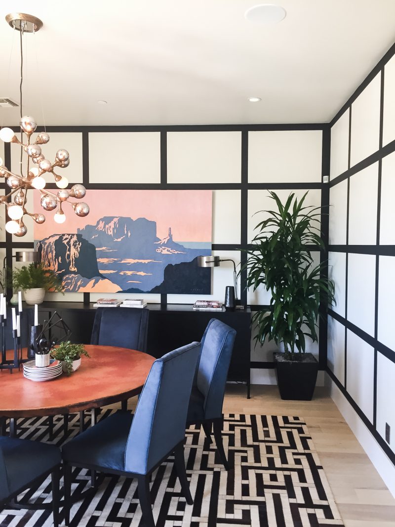
These walls! There was no question in my mind that this pattern was created via trim work. When I found out it was simply black paint I couldn’t believe it. What an inexpensive and gorgeous way to add pattern and interest to a wall. Great idea to stash away.
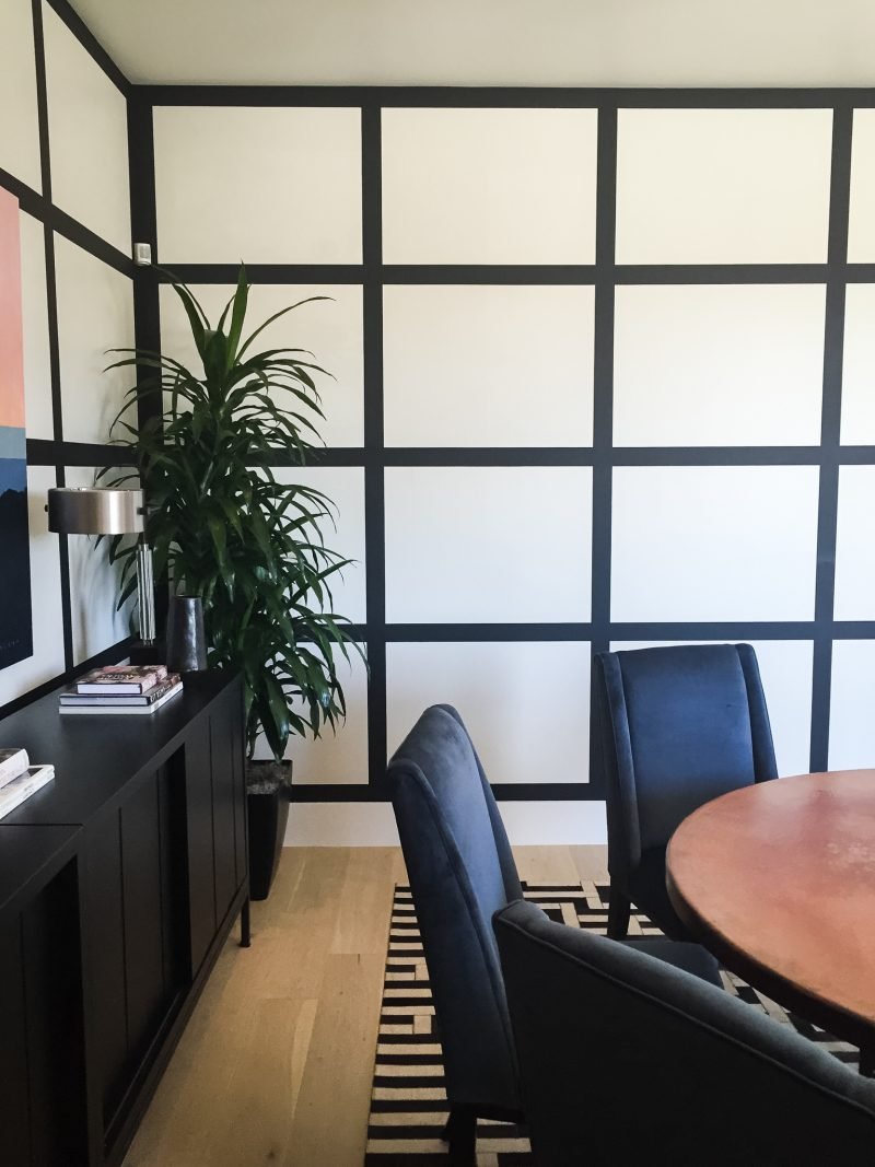
Because the entire home is outfitted with Wi-Fi lighting you can literally dim any light with the touch of a button. Romantic dinners just became a whole lot easier!
PANTRY LOVE
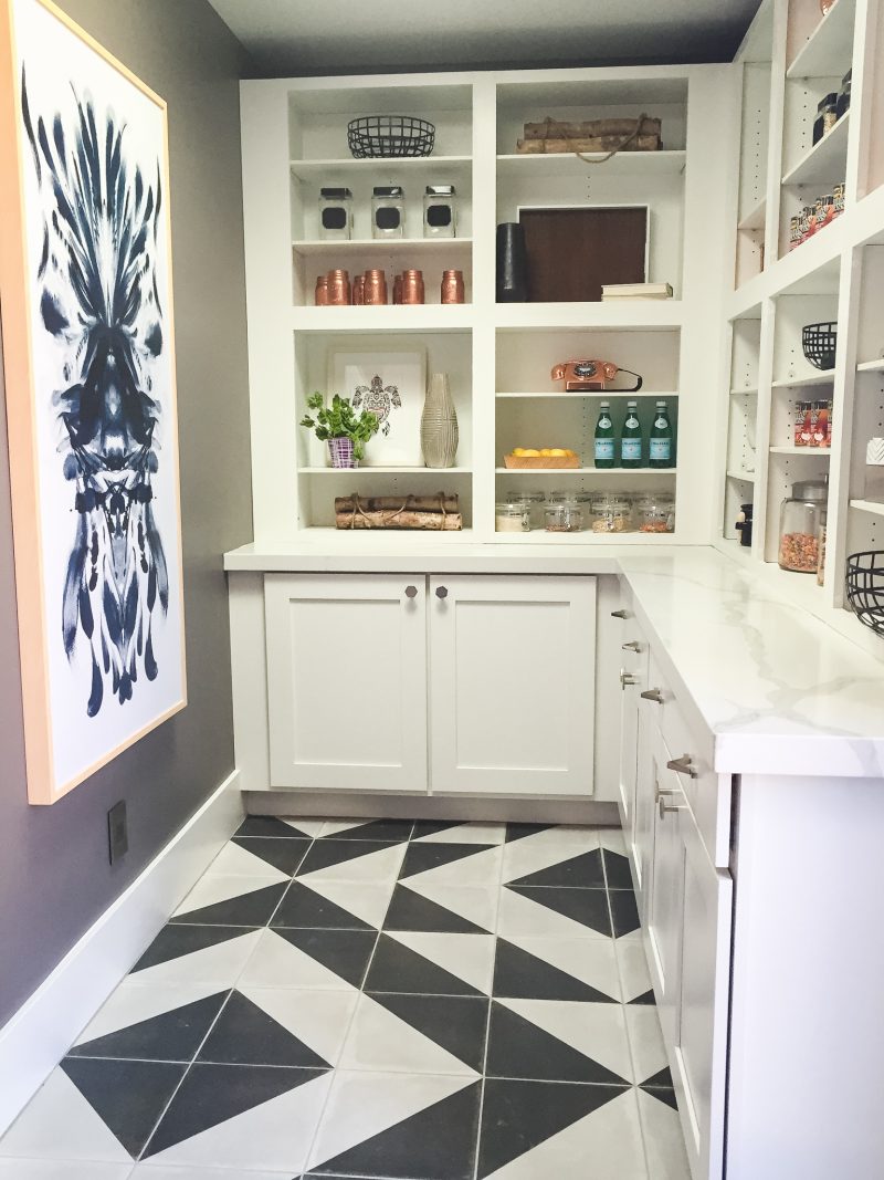
Of course I found myself staring at this walk in pantry for far too long. I mean, really. It’s any homeowner’s dream.
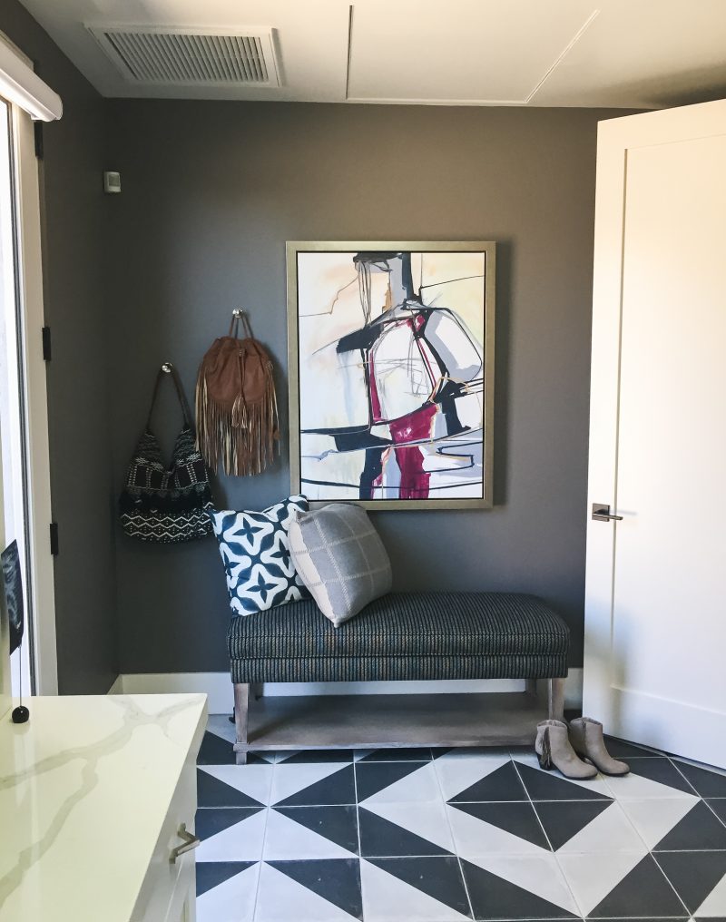
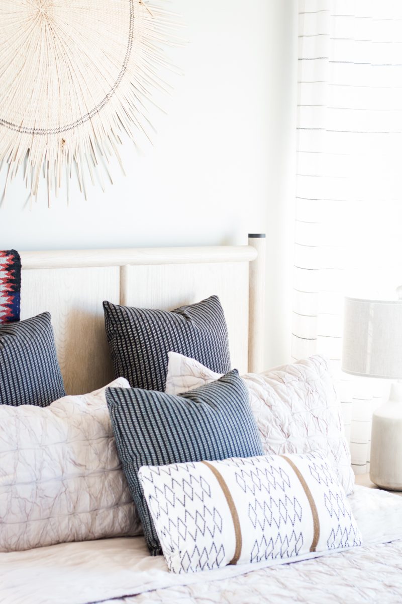
Both guests bedrooms were well-appointed with their own bathrooms. I loved the style and design of both.
MASTER DESIGN
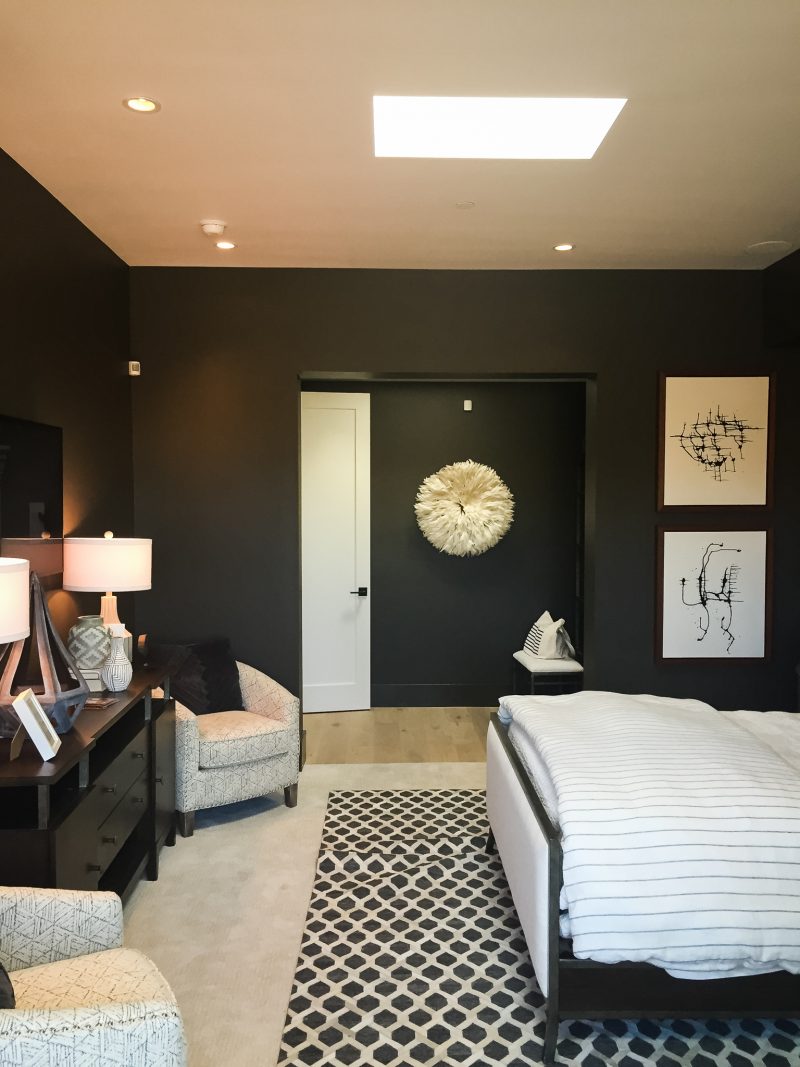
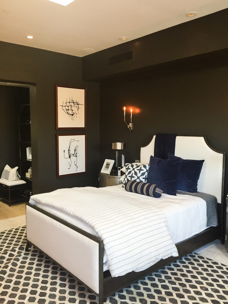
The master bedroom was dramatic and beautiful. The moody dark walls were juxtaposed against the landscape outside and really created a dramatic effect.

The master closet was any girl (or guy’s) dream. Truly. I may have spent an unusual amount of time in this closet just staring.
MY FAVORITE SPACE
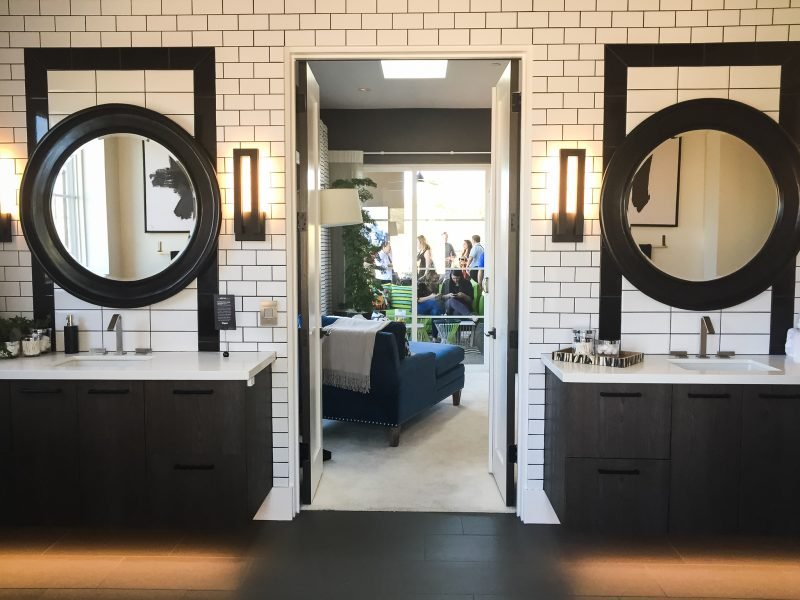
Without question, the master bathroom was my favorite room in the home. From the well-integrated lighting systems by Legrand to the beautiful tile, it just all worked so well together. That under-cabinet lighting was tough to capture but so lovely in person. And how wonderful to have that dimly lit at night. The tile work behind each mirror really caught my eye. Such a beautiful way to add interest and dimension.
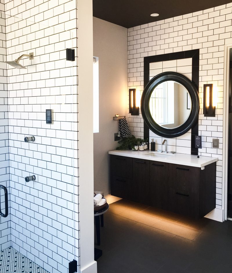
Then there was the shower. Complete with a touch pad to control everything from water pressure to temperature. Yes, yes, yes!
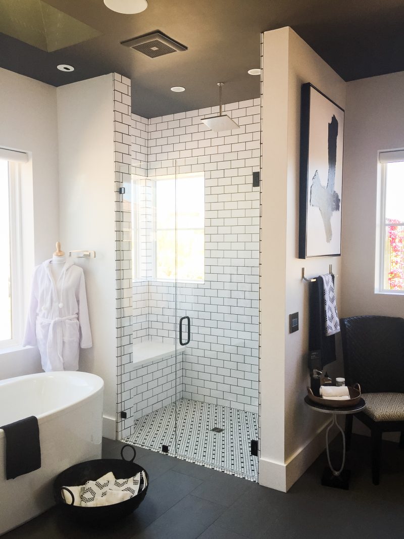
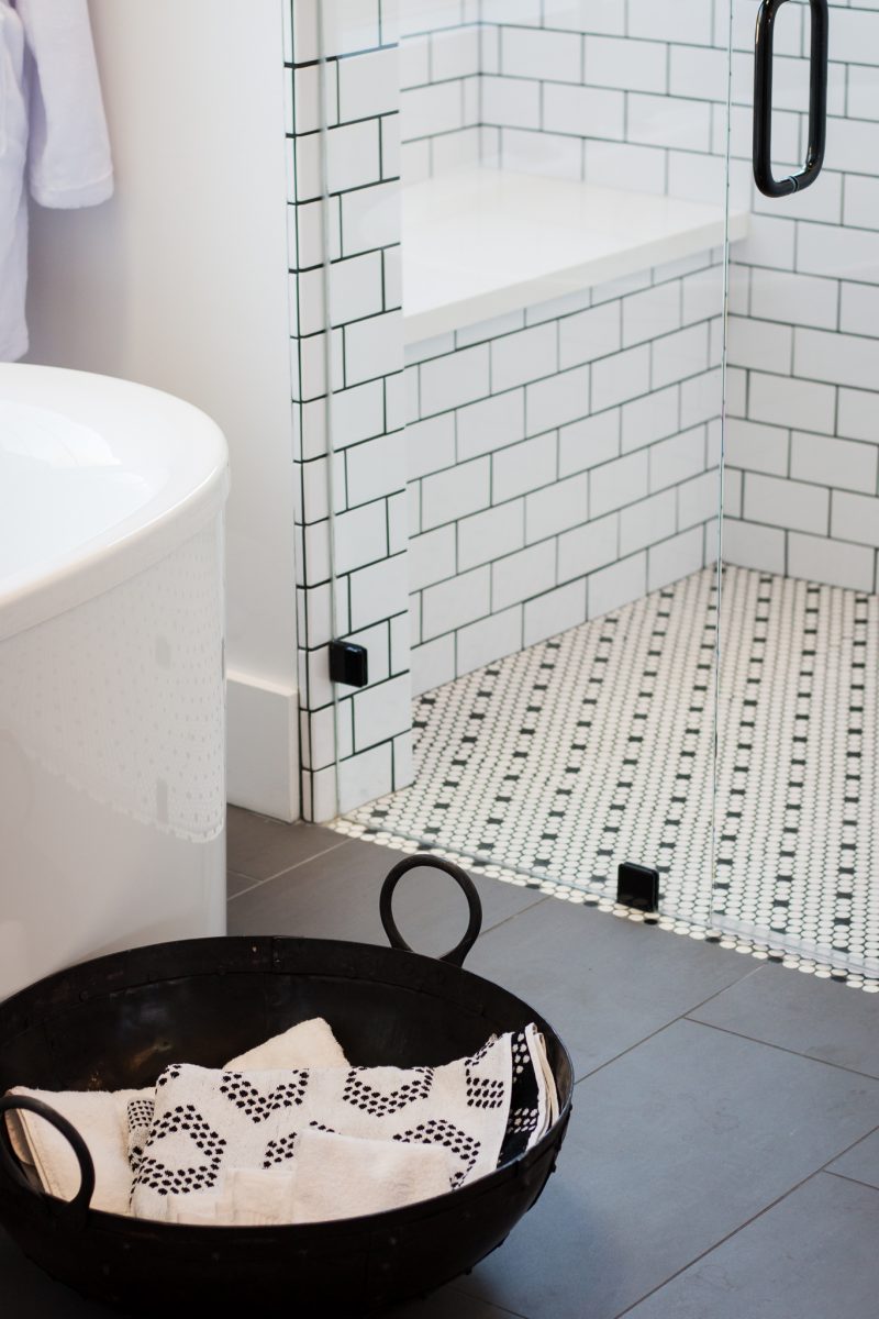
I suddenly want to regrout all of our bathrooms with black grout. Not kidding. I love the tile used here. Classic, modern and clean all wrapped into one.
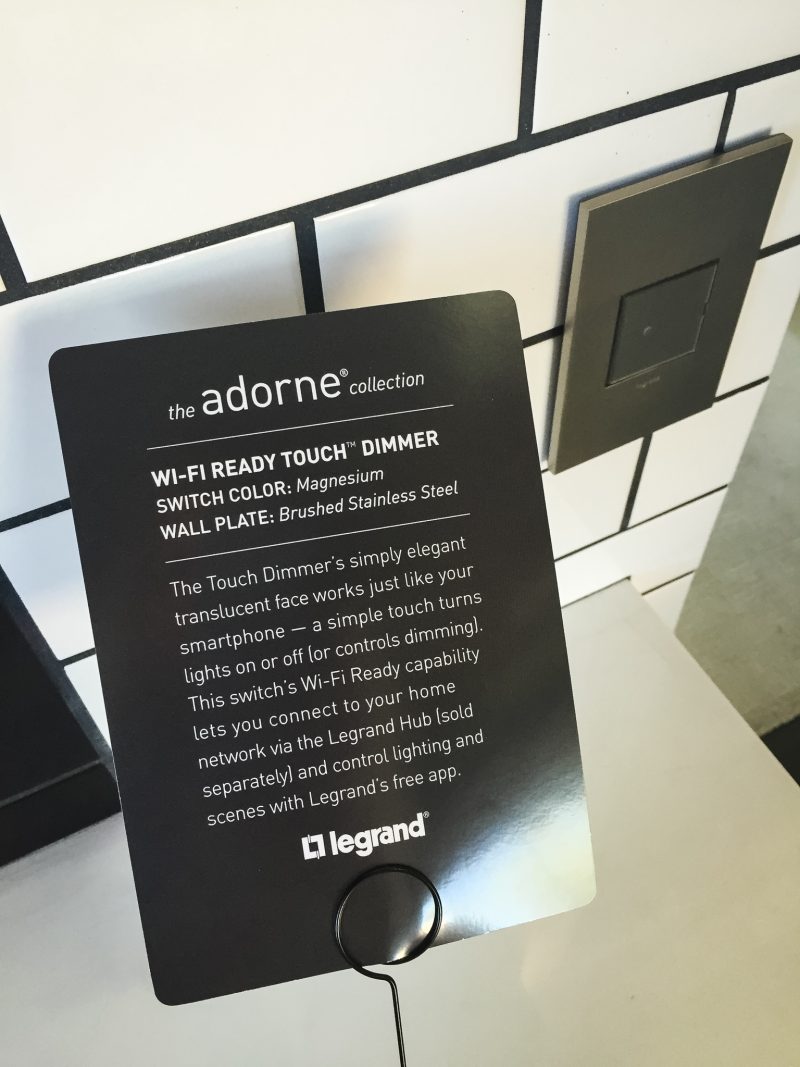
The Touch Dimmer works just like a smart phone and is Wi-Fi Ready. It turns on and off with a touch of the finger. So ridiculously cool.
Touring this home really was such a treat. Thank you, Legrand. I was blown away with their ability to seamlessly integrate technology and still maintain such beauty. Tiffany Brooks infused such personality and excitement into each and every room. This beautiful ranch home can be yours beginning on April 12th. Be on the lookout for the sweepstakes.
It was wonderful experiencing this with Carmel. She has become such a dear friend and recapped the trip over on her blog, too.
Enjoy the day all. Happy Friday!!!! Let’s do this, weekend.
Oh wow! You had me at “wine station”! I, too, love that kitchen and the use of black and white throughout the home. Thanks for sharing!
Right?! I had to pick my jaw up off the floor with both the wine station and the kitchen. Such a beautiful home. Entertaining dream. Hope you have had a great week, Michele. xo
Love everything about this house! Question on the kitchen island…is that really marble or is it one of the newer surfaces that have recently come out that look like marble? We are building and I soooo want marble, but there are some great look a like options out there that are hard to pass up. We cook a lot and entertain quite a bit, and I’m just nervous about real marble. ????