Welcome to the heart of our home. I’m so excited to share our kitchen tour with you today. We poured our hearts into the design of this space and we are so happy with how it turned out. I love walking into it each morning and feel very grateful that we could make this happen. We really wanted the space to feel warm and inviting because it is where we spend most of our time. And while it is a brand new kitchen, we wanted it to feel lived in with a traditional vibe to fit the rest of our home. Welcome in.
OUR KITCHEN
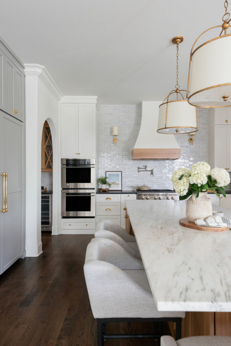
When I was dreaming about this kitchen I wanted it to have an old world feel. We brought in as many natural materials as possible and played with texture and color to give it interest. We were able to complete this project in about 5 weeks because we didn’t change the footprint of the existing kitchen.
COLORS WE CHOSE
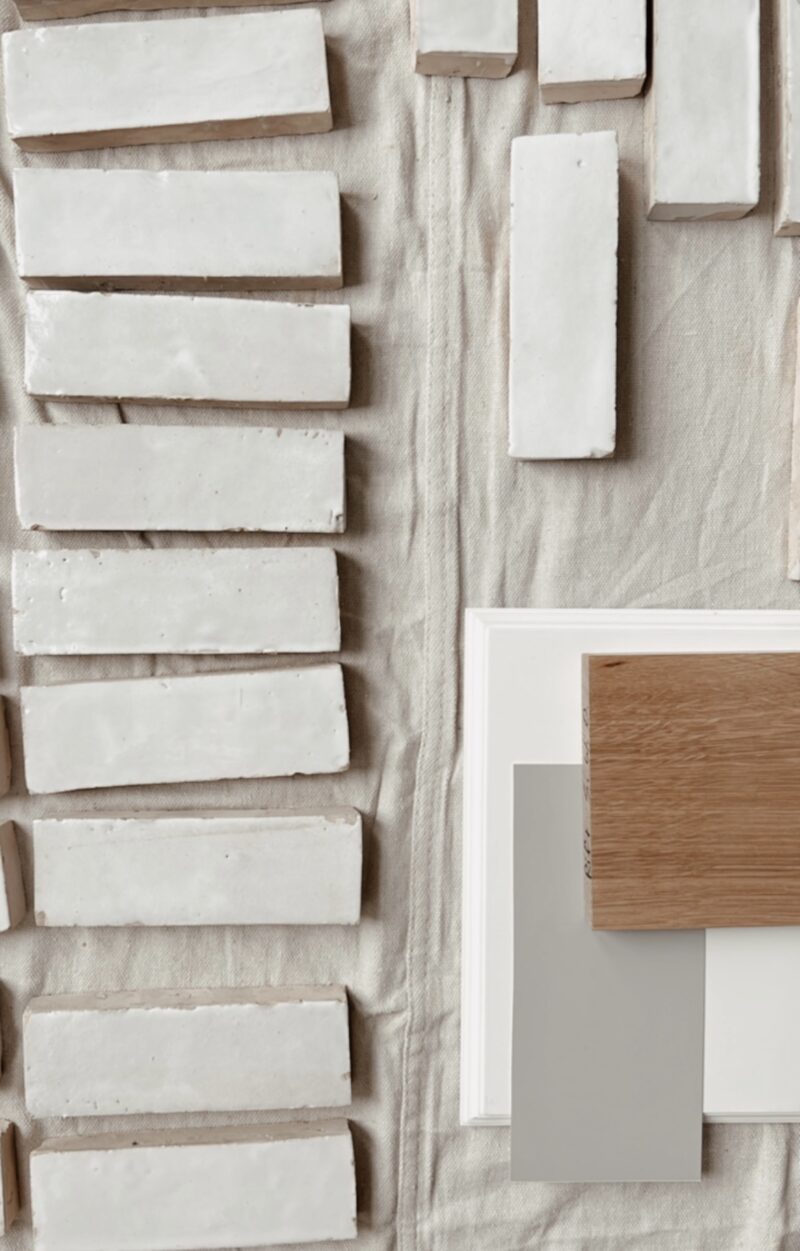
This is where we started. We used Zellige tile by Riad Tile in the color Snow. The grout is Warm Gray. Each one is handmade and perfectly imperfect. I had my heart set on it because of the texture and beauty. In person, it looks like it had been around for years. Our cabinets are White Dove by BM and Greige by Clare Paints. The accent color is a warm gray with undertones that read green or blue depending on the time of day. The island is white oak with a natural stain. Our floors are Red Oak with a Dark Walnut stain. Walls are painted Alabaster by Shewin Williams.
The cabinets, open shelves, and hood were all designed and built locally.
LIGHTING AND HARDWARE
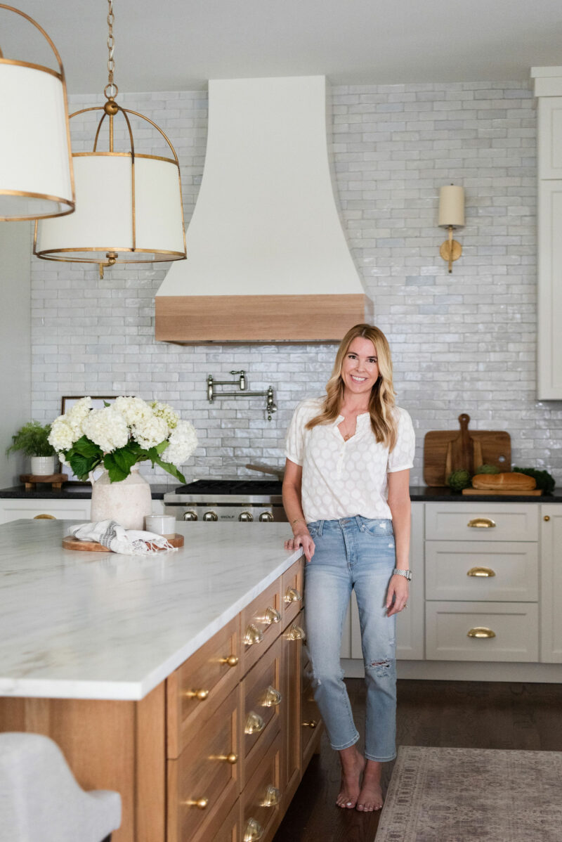
We partnered with Circa Lighting for all for all of the beautiful lights and Emtek for the hardware. We kept these choices very traditional for both to give the space a timeless feel.
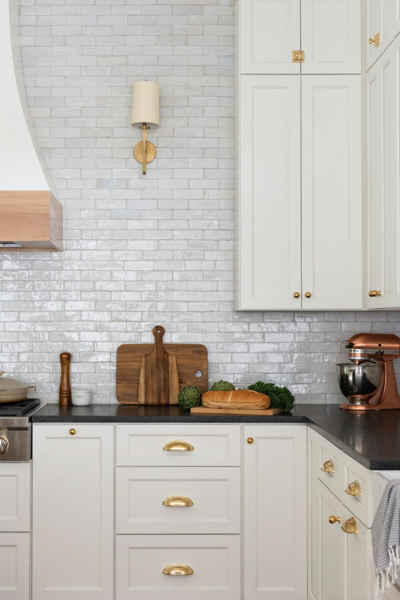
We chose the Edie Sconce for either side of the hood. I really wanted to balance out the beautiful hood and add some drama. They cast a beautiful light on the countertops below if we are cooking but they also had so much warmth in the evening. They are on dimmers so we can adjust them accordingly.
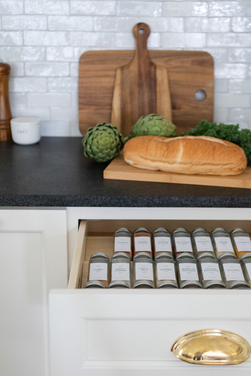
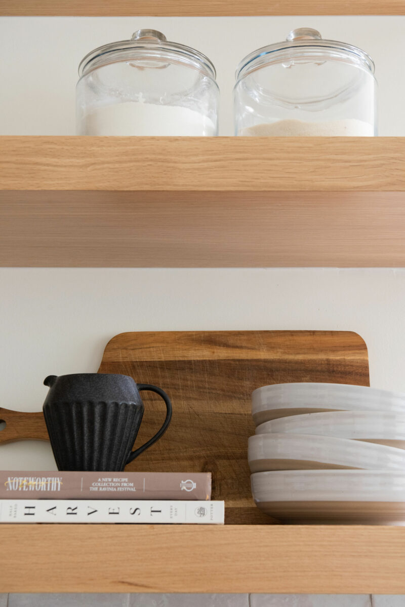
The Emtek hardware is a mix of styles. We used the 18″ Spindle Appliance Pull for the fridge, freezer, and dishwasher. For the cabinets we used a mix of 4″ Cup Pulls, Globe Knobs, and Cabinet Latches. I used drawings of each wall and penciled in a knob or a pull to get and idea of how it would look before we committed to installing them. The unlacquered brass will patina over time which I absolutely love. The spice jars have been a nice addition.
COUNTERTOPS
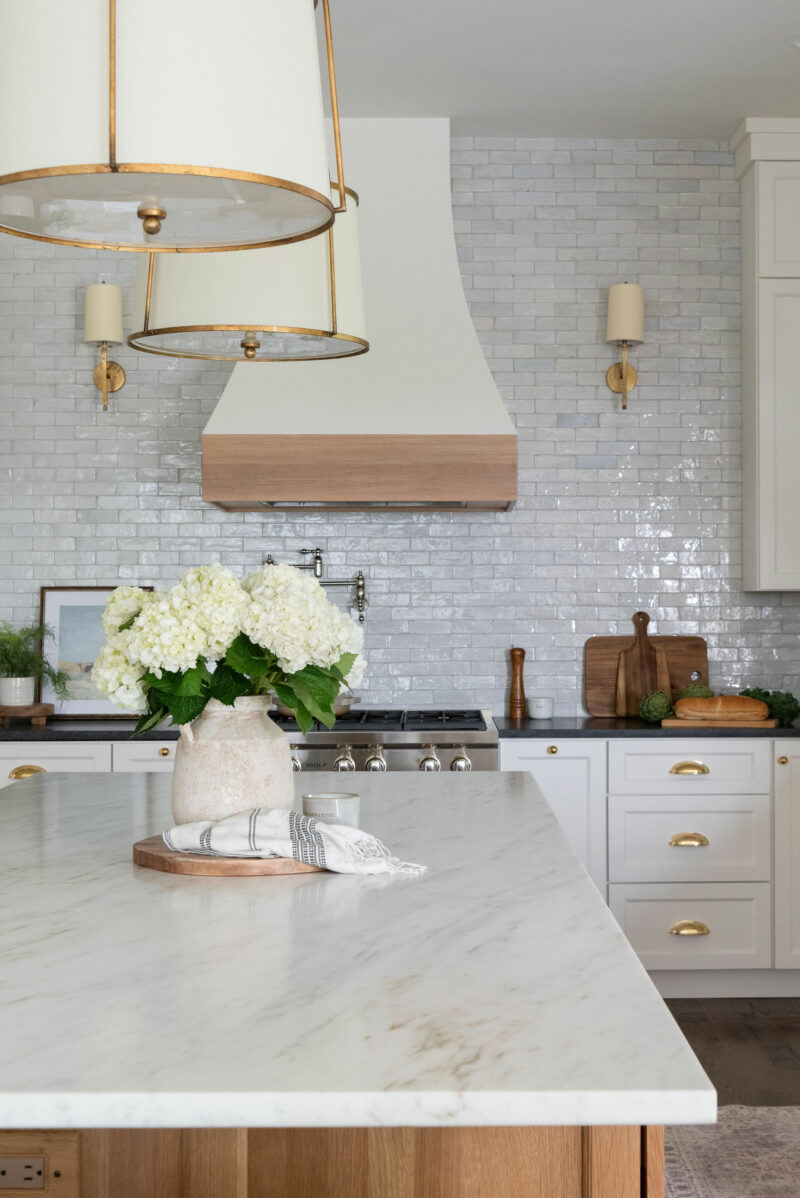
With such a large space, I knew I wanted a mix of countertops. Because I had my heart set on the Zellige tile (which has a really pretty glaze) going with honed countertops was a good contrast. We chose Black Mist honed granite for the perimeter and Danby Marble for the island. We had been thinking Carrera for the island but I didn’t fall in love with any of the slabs. The second I saw this slab I knew it was the one for our kitchen. It has a creamy backdrop with warm veining that pick up on the other colors in the kitchen. It is more durable than Carrera so that is a wonderful perk.
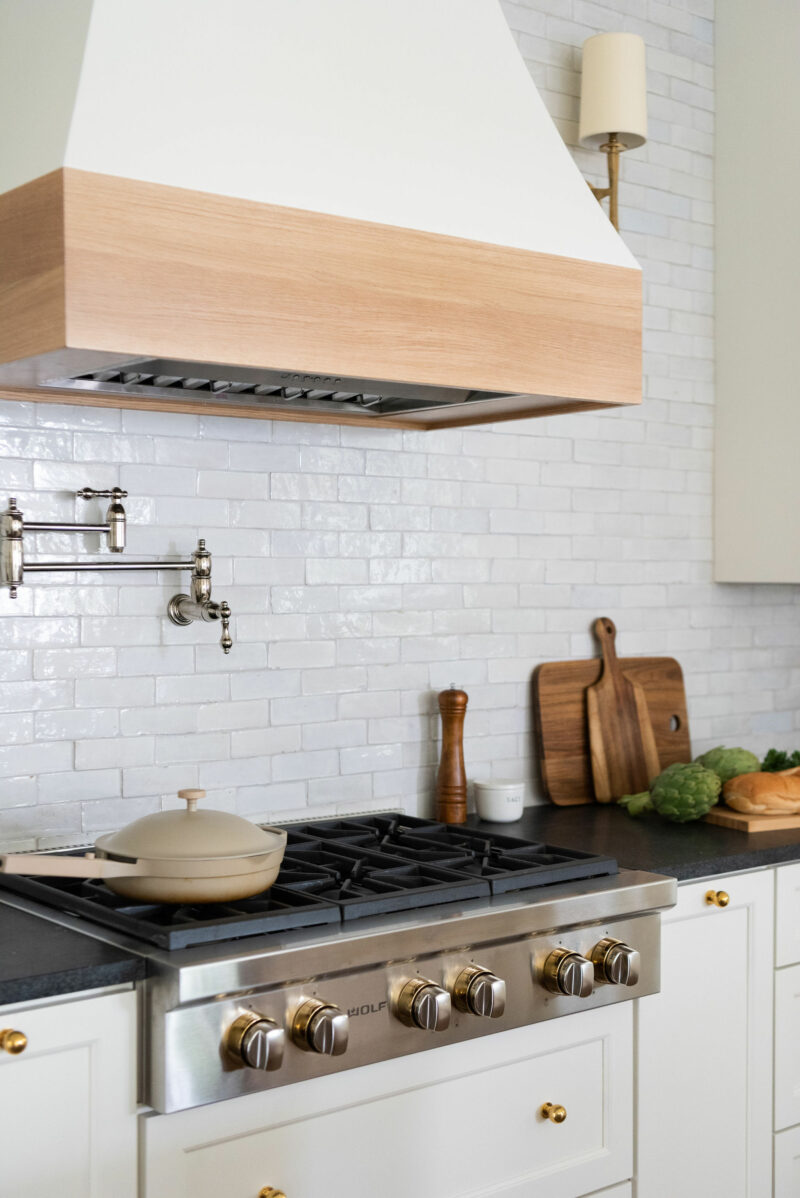
We opted to keep our wall ovens which not only saved money but allowed us to have these two really deep drawers under our cooktop. They are wonderful for all of our pots and pans. The gold bezels around the knobs are a subtle detail that ties in with our hardware.
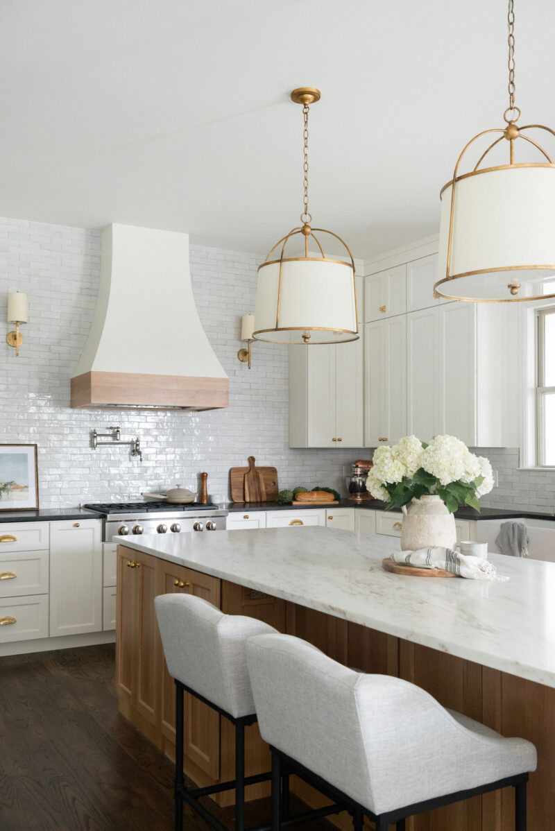
The original island did not have any seating so we knew that was a priority. We were able to reconfigure the shape of the island to allow us to use four stools. We love these stools and they even spot clean really well. The original legs were gray so I sprayed them black to create more of a contrast with the island and tie in the granite countertops.
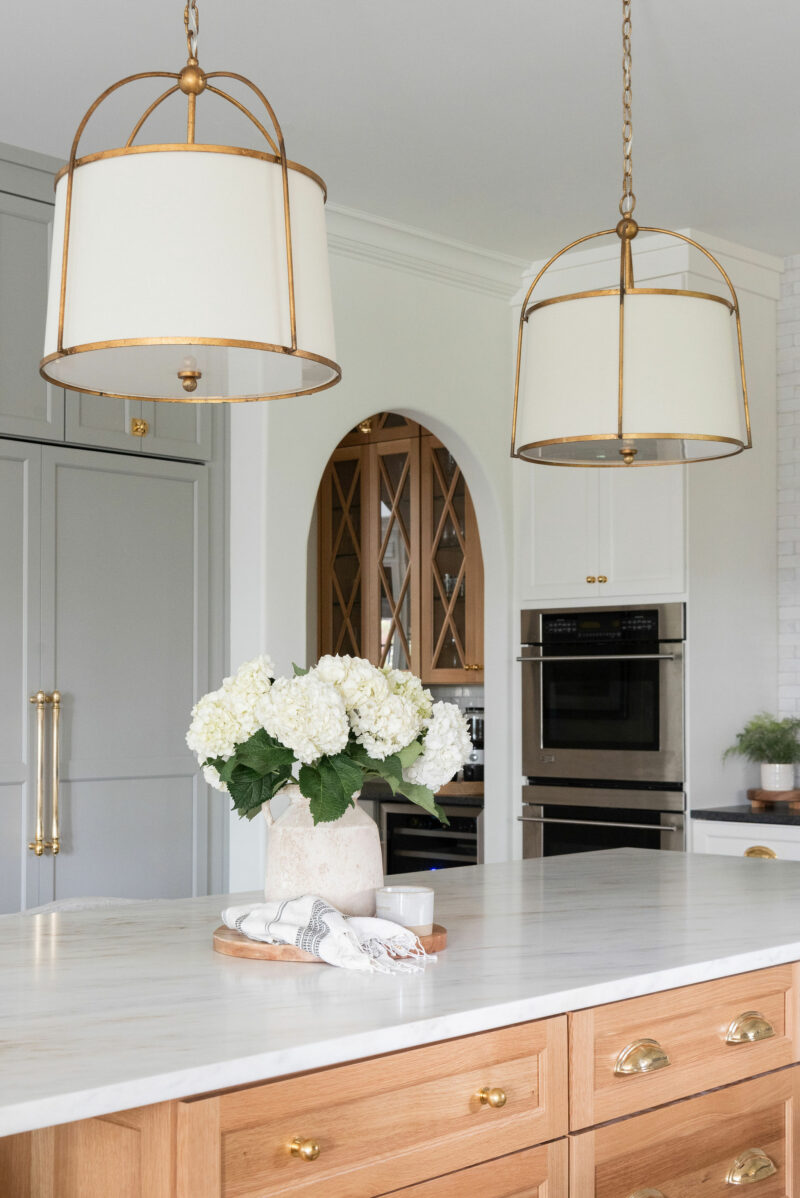
These Stonington pendants might be my favorite part of the kitchen. I love the warmth they add and are so pretty when they are on. All of the lights are on dimmers so that we can easily achieve the look and feel we want depending on if we are cooking or entertaining. Looking through to the coffee bar, we chose a combination of the oak cabinets and the greige color which creates it’s own little moment.
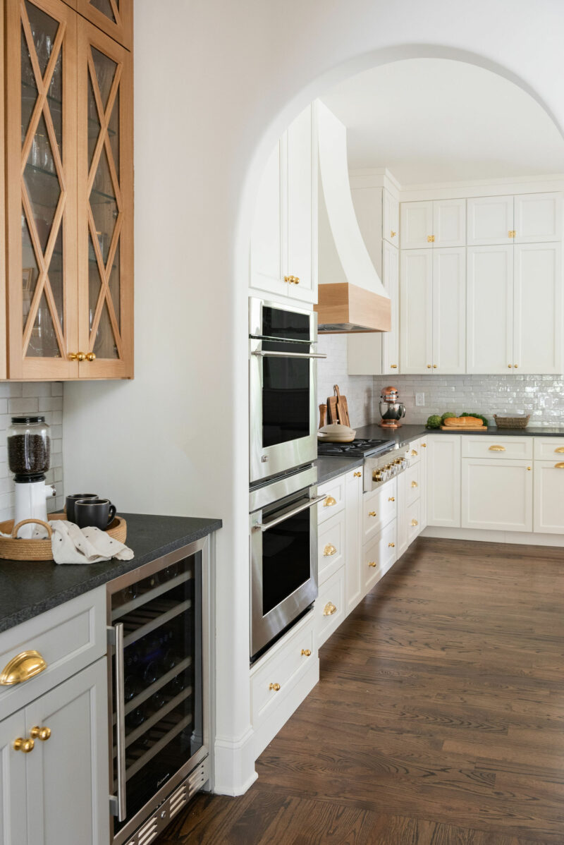
One of the most dramatic changes was simply taking the cabinets to the ceiling. It really took advantage of the height in the kitchen and gives it a custom look. So far we have been really happy with the wine fridge we chose. It’s a great spot to put drinks when we entertain, too.
SMALL CHANGES, BIG IMPACT
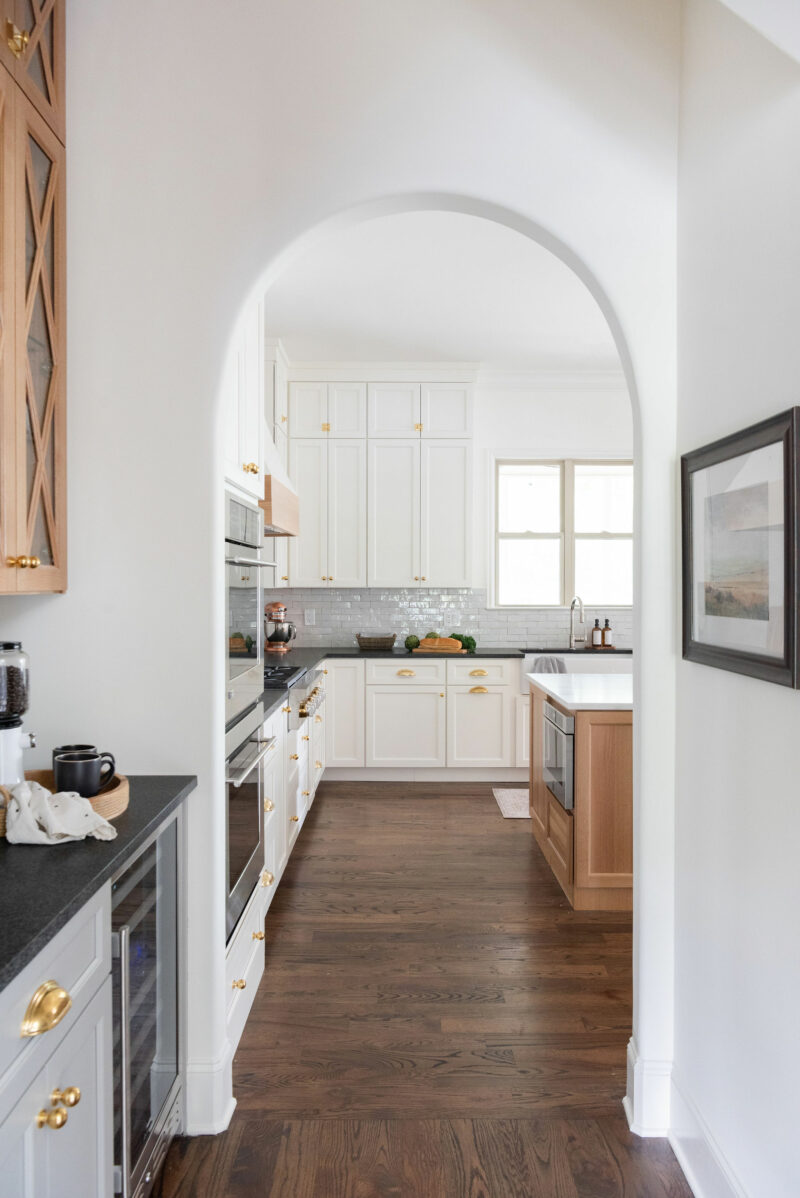
When designing the kitchen, we insisted on increasing the distance between the cooktop wall and the island. It was much too tight before. By making it a full 48″ there is no problem with someone cooking and someone else walking by. We also moved the microwave to this end of the island. A few people tried to talk us out of this but it was the best decision. If you have something on the stove and need to heat something or melt butter you can easily just turn around and do that. Not to mention it’s not the prettiest appliance so no one really sees it.
OPEN SHELVES
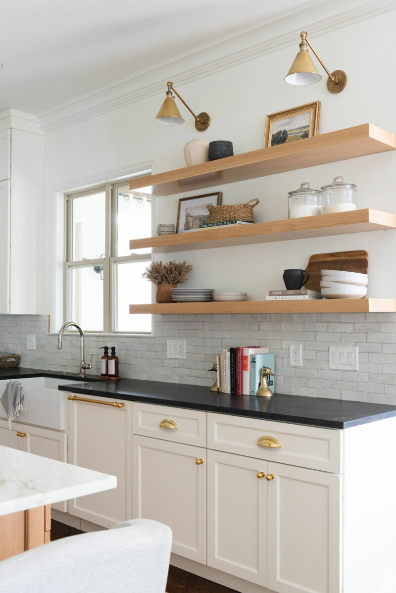
Removing these upper shelves not only increased the light in the space, but also gave us back the convenience we were missing. We loved open shelves in our former home and really missed them. The dishwasher is directly under them because we unload the dishes and bowls and place them on the shelves. Our glasses are in the upper cabinet to the left of the sink. I also really like the casual look it brings to a space. We went with the Boston Library Lights above them for a timeless look. The shelves were custom made by our cabinet maker and stained natural.
We went with a Brizo faucet in polished nickel thanks to the recommendation of a friend and the quality is fantastic. Highly recommend.
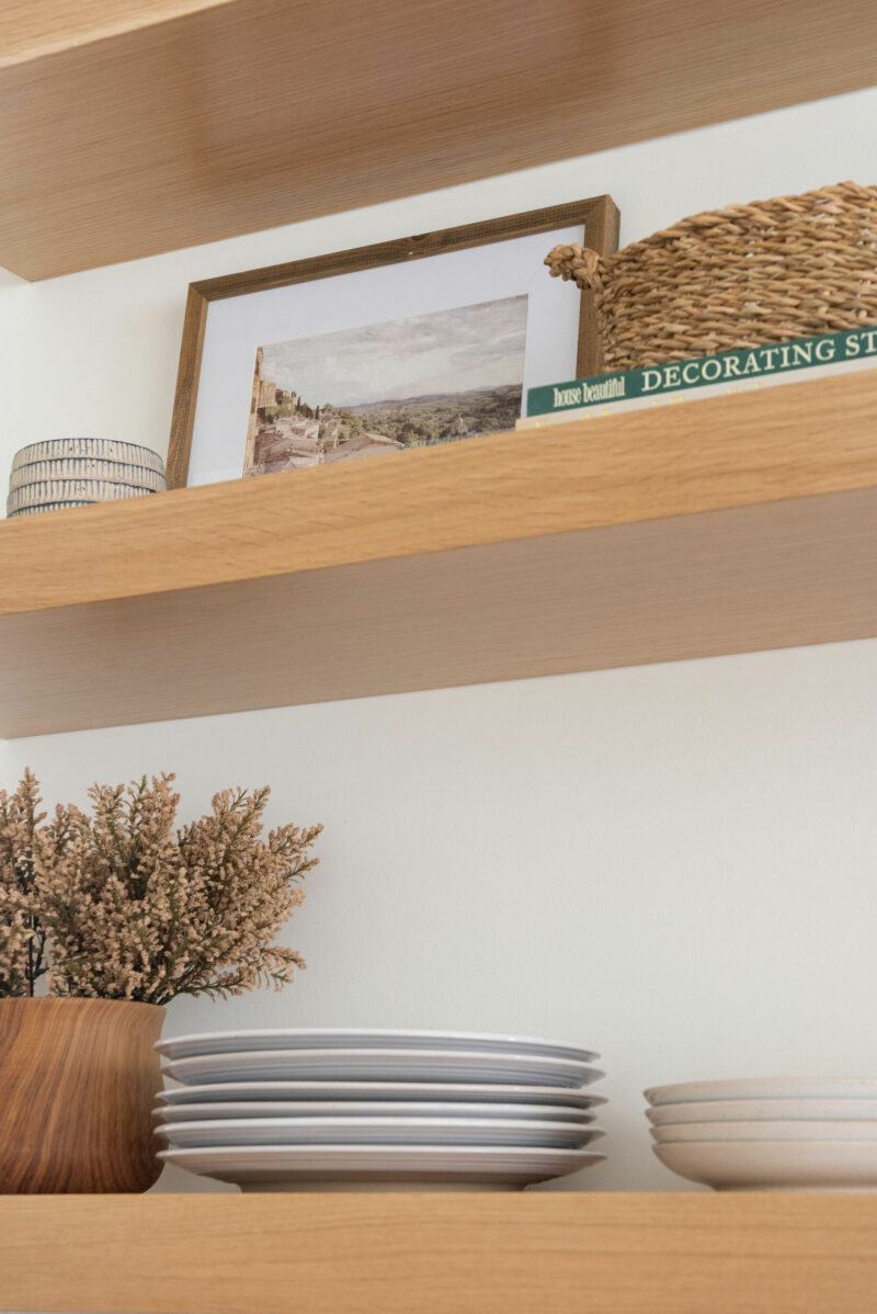
A few of my mom’s books are a nice daily reminder as I work in the kitchen. They also had the duck bookends which bring me so much joy. Every time I look at them I can see them on my parents shelves in their family room.
CABINET READY FRIDGE
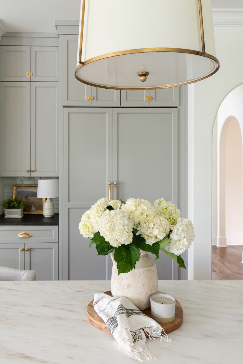
Another change that made a huge difference was going with a cabinet ready fridge. The previous one stuck out past the arch and really cut into the space. I was worried about the counter depth but because it is much taller, it actually provides more room and things don’t get lost in the back. We went with the JennAir and love it so far. This pretty vase is an easy way to bring in that old world feel.
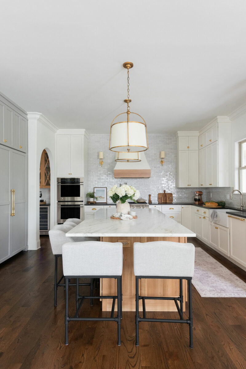
The washable rug in front of the sink has been a great addition as well. It’s incredibly soft underfoot. When we redesigned the island, I moved it down a few inches and increased the amount of space between it and the counters on either side. It was important to me that we have really good traffic flow. I wanted to know that somebody could be sitting comfortably at the island while someone else walked by or opened the fridge door completely. I also think it gives the space a bit more breathing room. The new island is 51″ x 120″.
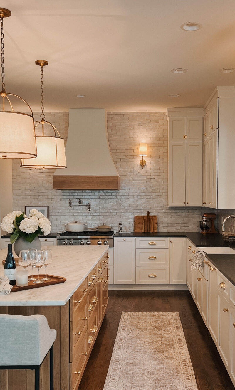
This is just a photo a snapped with my phone but I think it captures the feel of the space when the lights are on.
WHERE WE STARTED
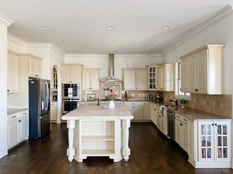
It is always fun to look back at the before. It was a really pretty kitchen and we are thrilled that another family was able to use the cabinets in their home. This also helps you visualize what we did to increase the traffic flow on the left side.
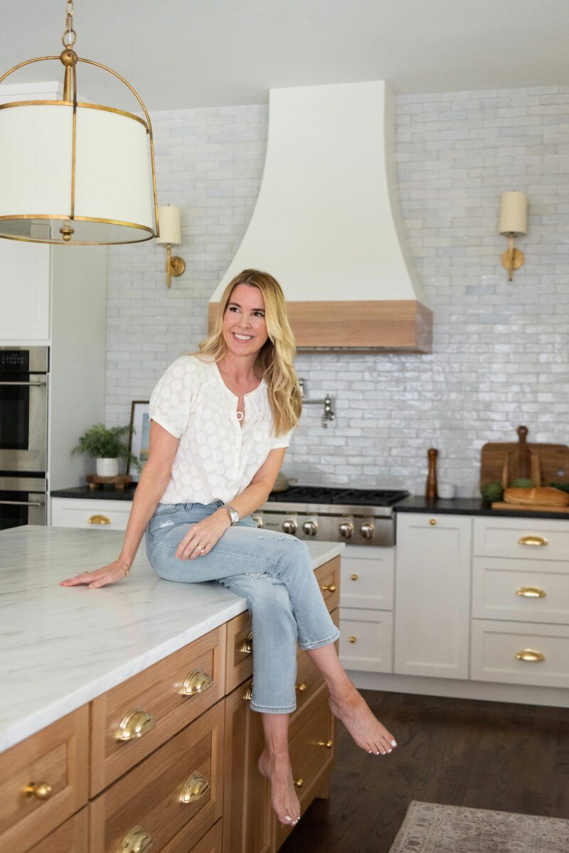
Thank you for touring our new kitchen. If you have been through the process, you know what a sigh of relief the finish line is. I am just thankful my family trusted me. We have already started entertaining in here and I love seeing my kids working on homework at the island like they have for years. Kitchens hold so many memories and we look forward to spending many years in this one.
If you are planning your own renovation anytime soon, we shared our best tips on moving out and creating a makeshift kitchen.
Kitchen measurements provided here.
*Photos by the talented Allison Elefante
Ack! It is dreamy perfection! You absolutely nailed it…we remodeled our kitchen a few years ago and I remember being overwhelmed by all of the decisions. Well done!
Thank you, Shannon. It really is an overwhelming process and I felt like I was holding my breath up until the very end. Thank you for the sweet compliment. Happy Friday.
WOW! Just stunning. I love the mix of materials you used, and how you made it feel so welcoming. Enjoy this beautiful new space with your family!
Could you share a link to the round or oval cutting board on your island?
You did such a fantastic job. Your kitchen is gorgeous, and also looks so warm and inviting. It will stand the test of time because your choices are so classic. One question for you. As someone who has not had the best luck with refrigerators, what does one do when it’s time to replace the fridge and the custom cabinetry is built around it? I wanted to do the same, but chickened out for that reason. I suppose you could try your best to fit a new one and have new custom doors made? Hopefully that’s not a problem for MANY years, but something I have wondered about. I hope you have a great weekend!
Absolutely beautiful ! Enjoy making memories in your new space. We did a kitchen reno 1 yr ago. Love our new open space as well.
Do you find you have ample lighting above the sink to do night time dishes. I love all of it. Such beautiful choices. Dreamy !!
Incredibly beautiful! Well done!
What a difference the counter depth fridge made! I love how you thought through each area and addressed what changes you wanted to make. Truly shows how we should live with a space before making changes.
Your attention to detail on this project really paid off! What a dream kitchen. I’m guessing you are already day dreaming about how you’re going to add holiday touches this December. 🙂
Wow, Courtney! 😍 It’s absolutely gorgeous. I love everything about it, especially that you chose to go with a darker floor to make those gorgeous natural wood cabinets stand out. That entire island is ***chef’s kiss***. Brava!
So very beautiful! It has old world European charm & warmth!
The gorgeous tile adds so much!
LOVE LOVE LOVE! I was so smart to keep with the same footprint, but just modify what needed to be done to make it yours.
Can you share your experience with the Danby marble? I really love it, but am afraid of damaging it with 4 kids!
Hi! So far we love it but it’s still very new. When we had it sealed he said staining should never be an issue but it can definitely etch. You have to be ok with that. We fell in love with the slab and love it so far!
Beautiful kitchen! We are in the process of starting a kitchen renovation.. You mentioned Danby marble. Do you know what color slab that is? We are looking at marble also. I’m thinking all white counters but I love your White Island with the black perimeter.
Thank-you!
Gorgeous kitchen! I love it. Very thorough blog post.
Thank you!
May I please know the height of your ceiling and the cabinet height? Thank you!
Our ceilings are 10′ and which cabinets are you referring to? Happy to measure for you.
Could you share which JennAir fridge you chose?
This looks so gorgeous! Well done! I ha e a question on the open shelves. Is that white oak stained natural? I’m having a hard time achieving this look with my cabinet maker and want to tell him specifically what to use for this look. Thanks!!!
Where did you get the Stove Hood?
Hi Jean. That was custom made for the kitchen.