Good morning. How is your week going? Ours has been eventful considering we have a couple of major home projects happening, someone learning to drive, and a hockey tournament. You may remember that we are giving the guest bathroom a small facelift. It’s been so much fun to make minor changes and see a fairly big impact. Our powder bathroom is an entirely different story. We did in fact tear out pretty much everything and plan to give it a whole new look. Today I wanted to share the before photos as well as the design direction we are headed.
THE BEFORE
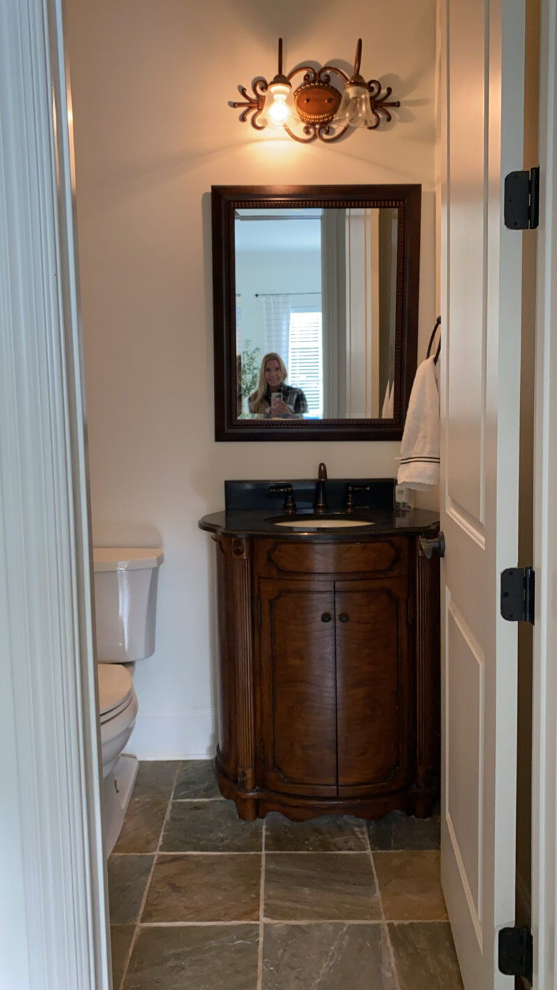
Here she is. Like most powder bathrooms, it’s fairly small and lacks a window. Because of that, it will be a bit tough to photograph but I’ll give it my best shot. It is directly across from the very light and bright guest room. I toyed with keeping the floors and working with them but every design I came up with just didn’t feel right. Ultimately we decided that it would be smart to take it all out so we could really start fresh. Because it’s a small footprint, the cost isn’t crazy to retile.
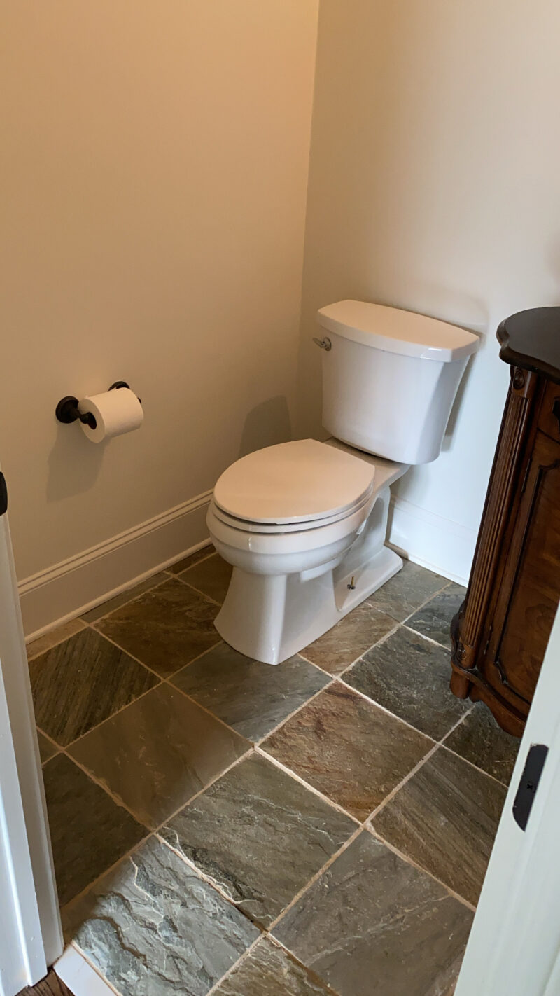
The fun part is letting the imagination run wild with a blank slate. There were a few things that I took into consideration with the design. First and foremost, the space is rather dark to begin with. So I could keep it white and add all light materials or I could go the opposite direction. My daughter (who has an incredible eye) and I figured it might be fun to go with cozy and moody. It lends itself to being dark and different from the adjacent spaces. Having said that, it still ties in with our front music room (the dark gray room). I want it to almost feel like a boutique hotel vibe but still maintain traditional elements. And because it is so small, it’s much easier to take a risk.
THE DESIGN DIRECTION
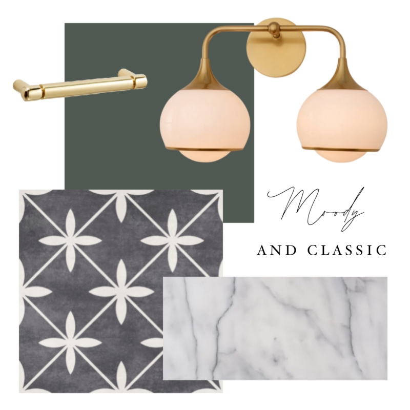
I began the design with the floor tile. I knew I wanted to go dark and bold. Why not? I won’t be placing a rug in here so I want the tile to steal the show. This charcoal and ivory tile would also pair very nicely next to our dark wood floors. It also looks good with the guest room across the way. I plan to bring in warm brass accents and a marble countertop. The hunt is still on for the perfect vanity. If you spot a wood and marble one send it my way. The challenge is finding one that is no larger than 32″ and will arrive before 2025.
CHOOSING THE PERFECT GREEN
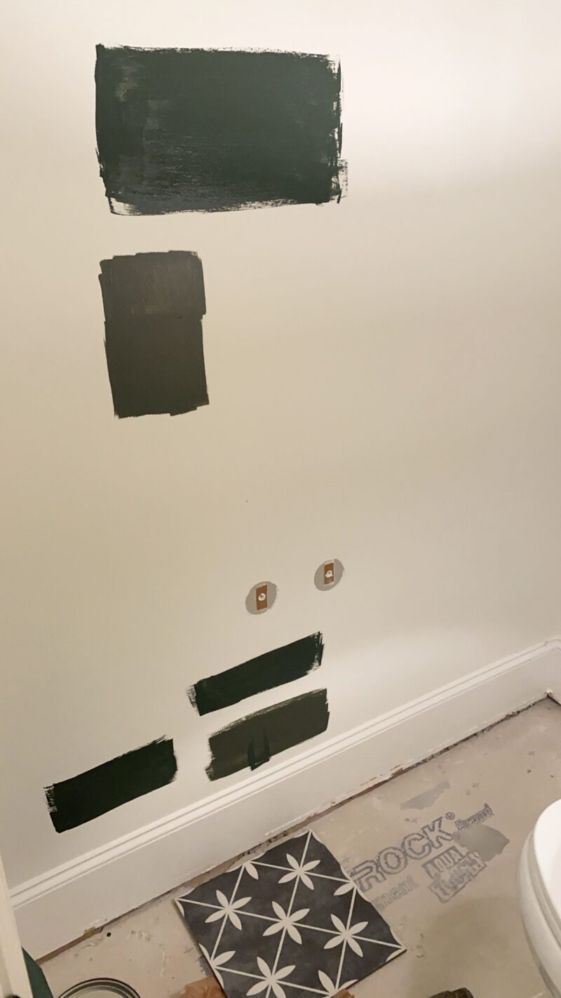
Next up was the paint choice. I toyed with using a dark gray or charcoal to keep it all uniform and still think that would look beautiful. But I have always wanted to use a rich dark green and thought this would be the perfect place to do that. I looked at Vintage Vogue but it read like army green in this space. Ultimately I went with Alpine Trail by Behr and LOVE the color (top swatch in both spots). The plan will be to add picture frame molding on the walls to give it interest.
*If you are local, I have an entire gallon of Vintage Vogue paint in case you need it.
THE INSPIRATION
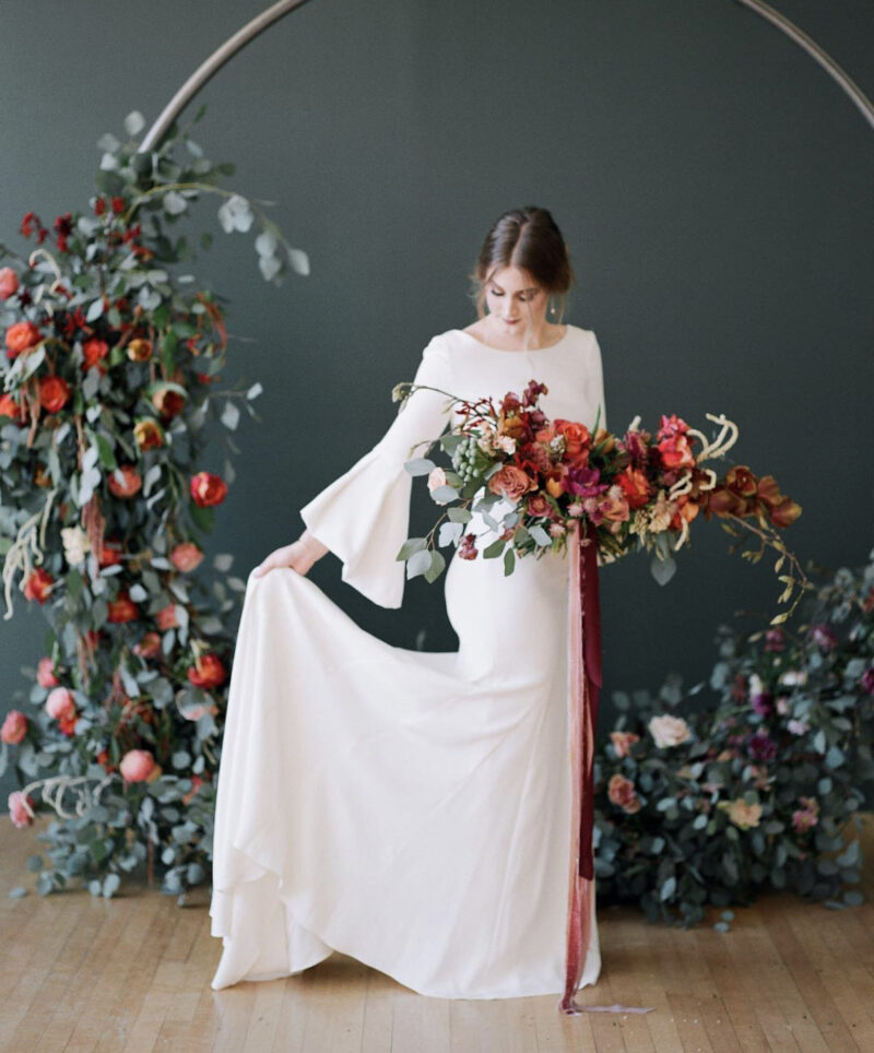
This photo by @travisj_photo is what got me. Not only is the photograph stunning (and those florals) but that green! So I went on a deep dive and discovered it is Alpine Trail. I just love this color so much.
SO MUCH PROGRESS
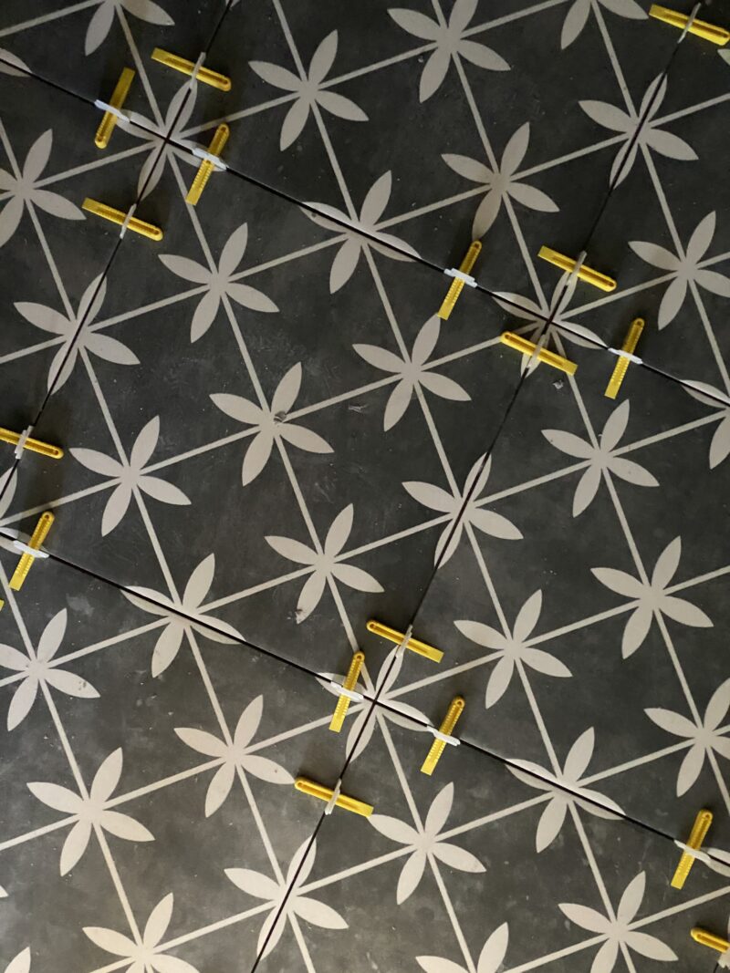
Huge progress has been made as the tile is in! The grout will be finished tomorrow. It’s so much fun to watch it come long. This light will be the jewelry in the room and I can’t wait to show you the walls soon. Thanks for being on this journey with us.
*Tile is Laura Ashely from The Tile Shop.
LIGHT AND BRIGHT POWDER BATHROOM
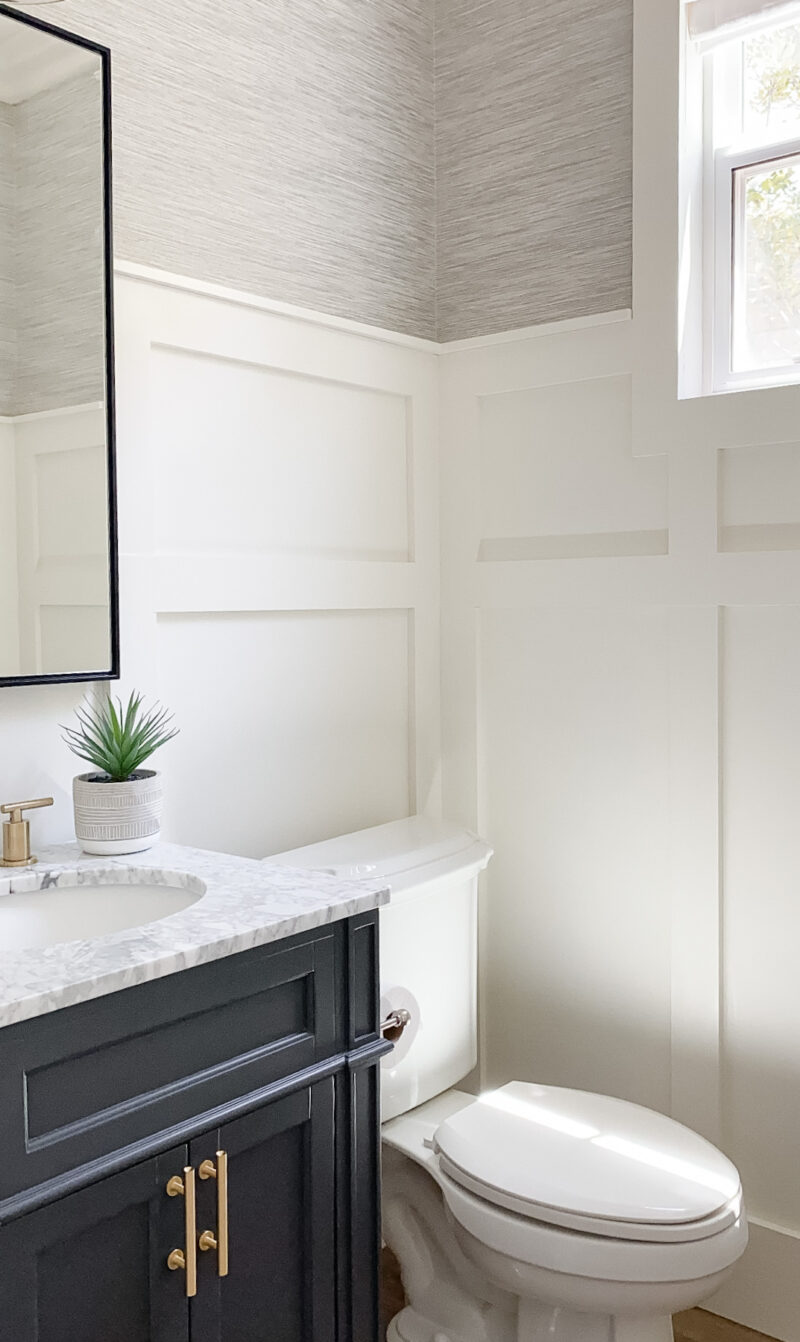
If you are looking for more powder room inspiration, this is the bathroom we designed in our previous home.
Enjoy the day. I’ll be sharing updates of our green walls and tile in my stories.
Hi, those tiles are gorgeous! Wondering where they are from?
Hi Susanne. It’s from the Tile Shop. Brand is Laura Ashley.
So pretty. Wondering if you removed the tile yourself or hired out. I have 3 kids bathroom in my home that all need new floors and was wondering how hard it would be to diy. Gorgeous tile and wall color!
I adore that Alpine Trail color – one of my very favorites.
Wow! It’s going to be stunning. I am enjoying watching your design style change in your new home.
This is going to be so pretty! I adore green in all its iterations, but that Apline Trail colour is sooo good.
I love that green, and the wedding photo is gorgeous. The green and tile and light will read Art Deco together IMO, which is a theme I love.
The green is stunning – and the photo is too.
Yay! Love this color! I recently painted my bedroom BM Cushing Green and could not love it more. I can’t imagine a more restful, soothing color than deep green.