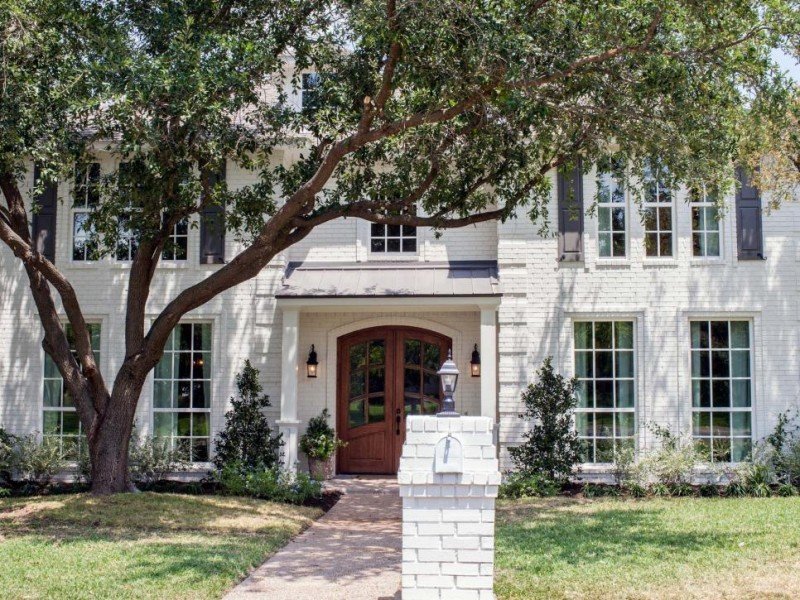
Did you see this week’s Fixer Upper?! Oh my goodness. It was especially fun to watch because they married traditional and rustic like we just did in our son’s “Trustic” room. The transformation with the outside of the house blew me away. I just love the overgrown trees, white exterior and beautiful front door. Wow. In case you haven’t been checking in, I started a new series called Fixer Upper | The Takeaways. I try to spot design ideas that we can all implement. And hopefully source a few fun pieces along the way as well. Since we can’t all have Chip and Joanna stop by for a complete house overhaul, we might as well channel their superpowers in little ways here and there. You can get caught up on any weeks you missed at the end of my post today.
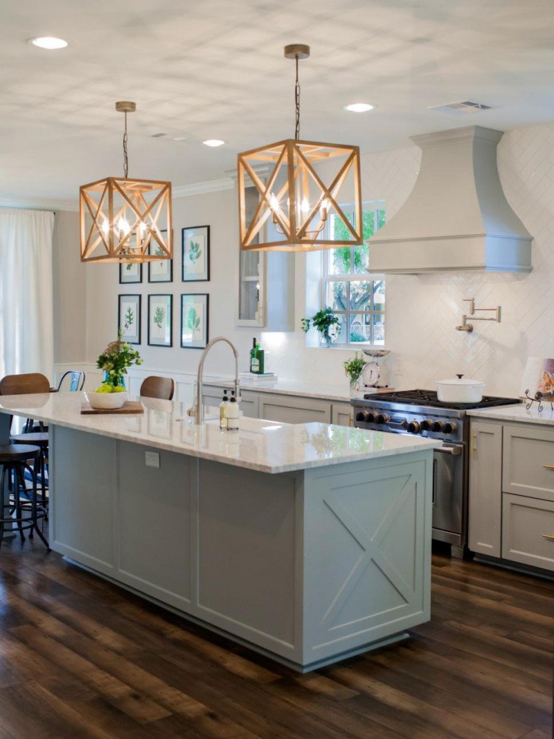
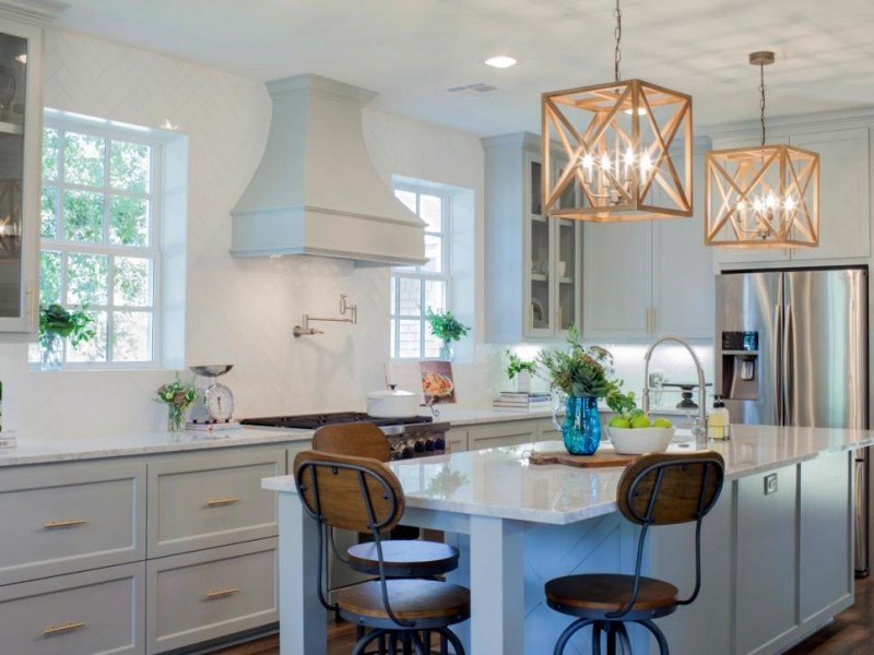
So much to love here. First up, I am swooning over those pendants and that gorgeous white herringbone backsplash. It’s timeless and so so pretty. This kitchen really speaks to me because I love the warm wood tones with black accents on the walls. It’s cool and fresh but still so inviting and warm.
Takeaway #1: Add Wood to Warm up a Cool Room
If you have gone with light tones such as grays and whites, wood elements immediately add warmth. Such a cozy feel in this kitchen despite it being sleek and clean. And quite often our immediate go-to for lighting is silver or gold. I love the wood pendants here. Such a great choice by Joanna.
Similar Lighting and Bar Stools
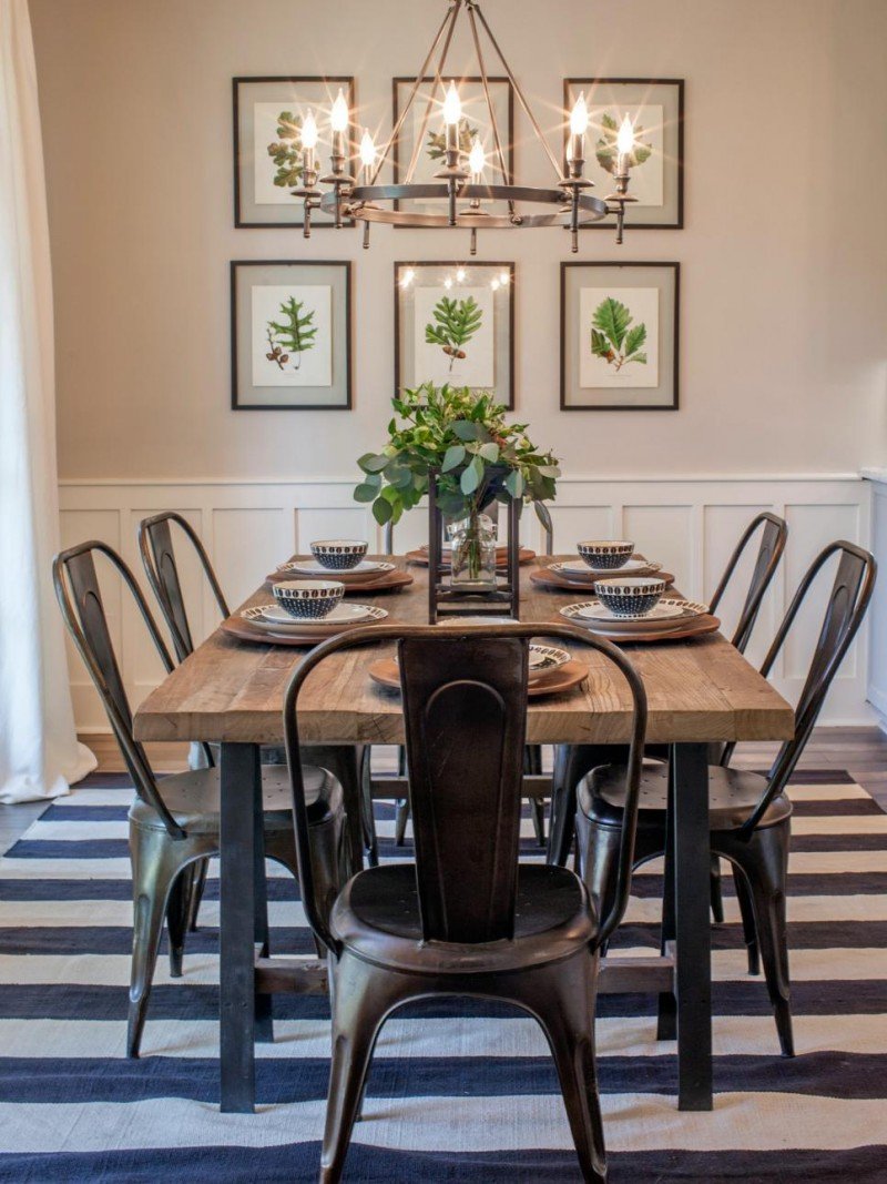
Takeaway #2: Frame Botanical Prints
This one is near and dear to my heart. I am a sucker for botanical prints and think they work in pretty much every home. They bring in that fresh, green vibe (and you don’t have to keep them alive) and look so great framed symmetrically. We have some in our dining room and I printed them for free. Calendars are always a good source for these, too. If you have a blank wall, consider inexpensive Ikea frames and botanical prints! I happened to have stumbled upon this calendar which would be gorgeous in a child’s bedroom.
Takeaway #3: Use a Bold Striped Rug
Well, this one rings true for me, too. I LOVE a bold, striped rug. Notice there is not a whole lot going on in this space and yet it is gorgeous. The stripes are timeless and add such energy to the traditional space. I was lucky to find one at HomeGoods which we put in our living room. Keep an eye out if you ever pop in there. When I watched the episode on TV I thought for sure the rug was black and white, but in this photo it may be navy. Either way, I love a bold stripe!
Takeaway #4: Forget Matchy Matchy
Between the kitchen pendants, the dining room chairs, the table top and the chandelier. . . almost every finish is different. Mixing your wood tones as well as the metals makes a space far more interesting to the eye. And it is fun because it allows you to play with so many styles.
Shop This Room
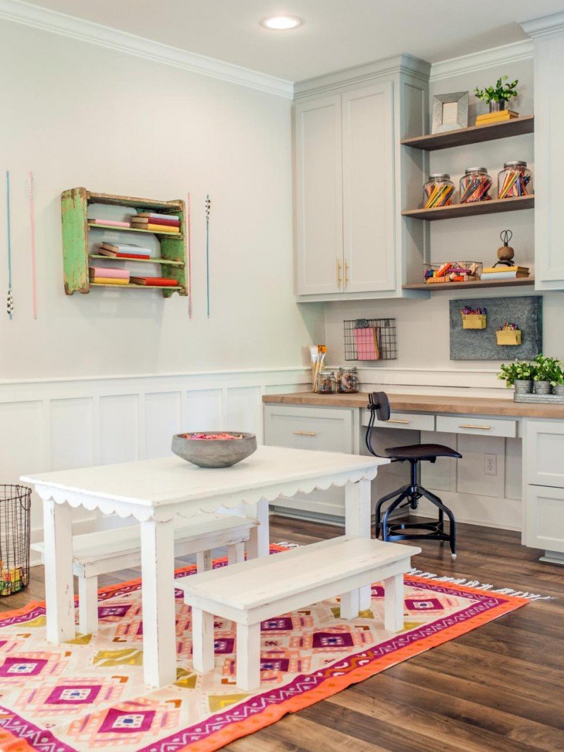
Takeaway #5: Make Your Space Work for You
This family needed to have a play space for their little one while the mom works out of the home. This space may have been a formal dining room or something more typical. Instead they kept it open to the kitchen allowing the little ones to be underfoot while mom works away at the desk. I love this. Do you have a room that you typically walk right by? Do you have any wasted space. Sometimes turning a room into a kid/family zone for at least a short period of time can be life changing. It can always evolve over the years. Maybe make a list of things that aren’t working for you and see if you can actually create it with space you already have.
Takeaway #6: Add Pops of Color to a Neutral Space
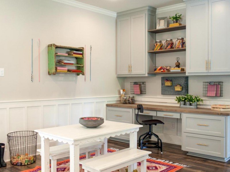
If you take away all of the accessories in this space, it’s a neutral room void of all color. Nice because the homeowners could easily swap out the pinks and oranges at any time. But what this space reads so clean and fresh because of those pops of color. The rug against the white table makes such a great statement. Do you have a room that could use a neutral makeover. Then bring in color with accessories.
This scalloped table. Too darn cute. I LOVE it. And I love the wooden bowl with crayons. We did that for a long time when the kids were young and it worked out so well. Notice the same hardware is used on the office cabinets as in the kitchen for continuity.
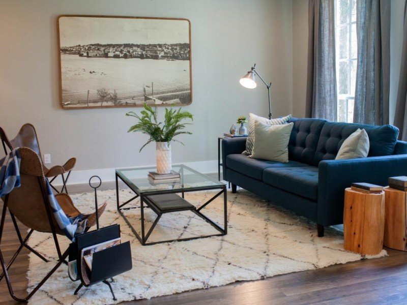
Takeaway #7: Hang Oversized Artwork
Forget getting bogged down by the ever popular gallery wall (I do love me a good gallery wall) and go with one large piece. Snap a photo yourself. Get out and walk the neighborhood and see if there is a pretty shot you can take. Or maybe scour your travel photos for something special. The aged black and white print makes it looks old and meaningful, doesn’t it. We used a large scale print above our son’s bed and I love the way it looks. Minted is one of my favorite sources if you don’t want to DIY something like this.
Takeaway #8: Add a Touch of Leather
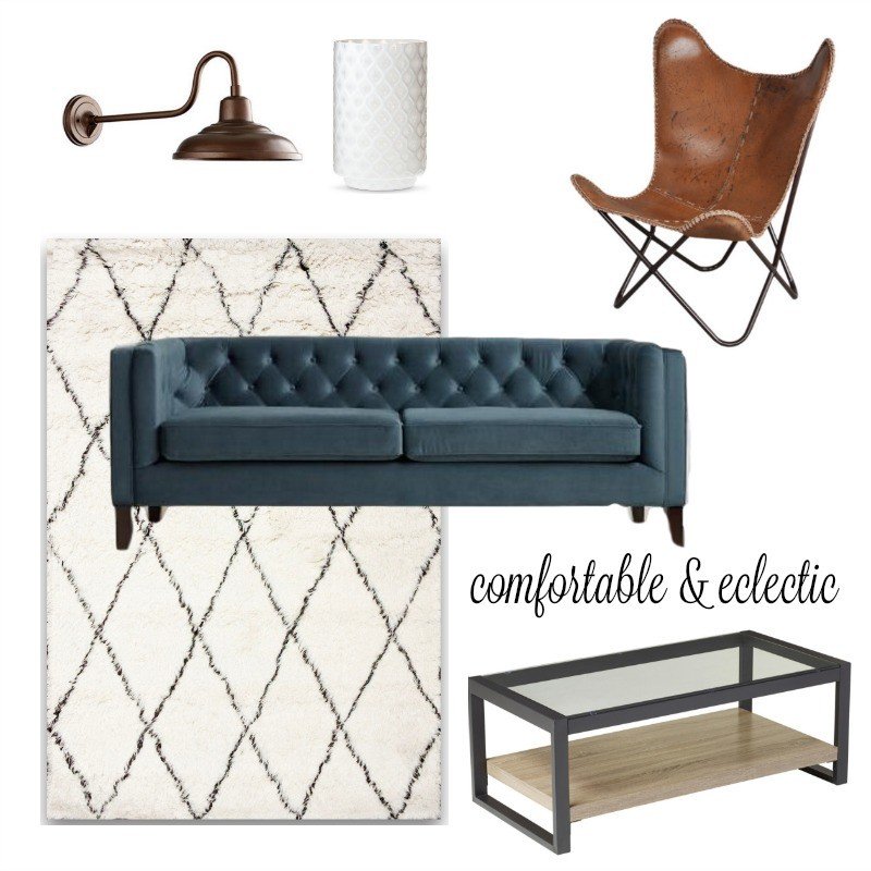
I dream of having a Chesterfield sofa one day. But these leather butterfly chairs add much of that same warmth and dimension. They work so well because they are minimalist and small in scale. They do not take over the room and tie in nicely with the rustic elements. I really love the elements in this room and put some of them together for you below.
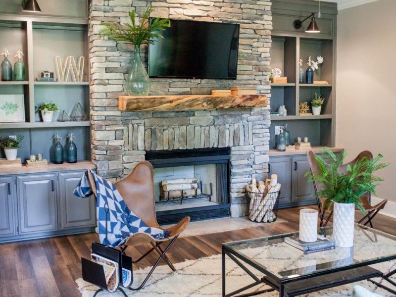
Takeaway #9: Pick a Color Scheme to Accessorize and Stick to It
These built ins are so goood!!! Ahhh! I love how Joanna styled them. And if you look really closely, she stuck to a fairly strict color scheme of tans, whites and green and blue. It’s for that reason that it all works so well. Most shelves have groupings of three and varied heights. If you use a large item like the “W” then you want to pair it with something smaller in scale like the book grouping next to it.
Takeaway #10: Include Books, White Vases & Greens
Are you seeing a common thread from week to week? Fresh greens in pretty, simple vases. You can’t go wrong. I love the white vases and how she kept one empty. And the stack of books always adds that lived in feel. I keep a similar white vase on my coffee table all of the time.
Shop a Similar Space
Takeaway #11: Mix Rustic with Modern
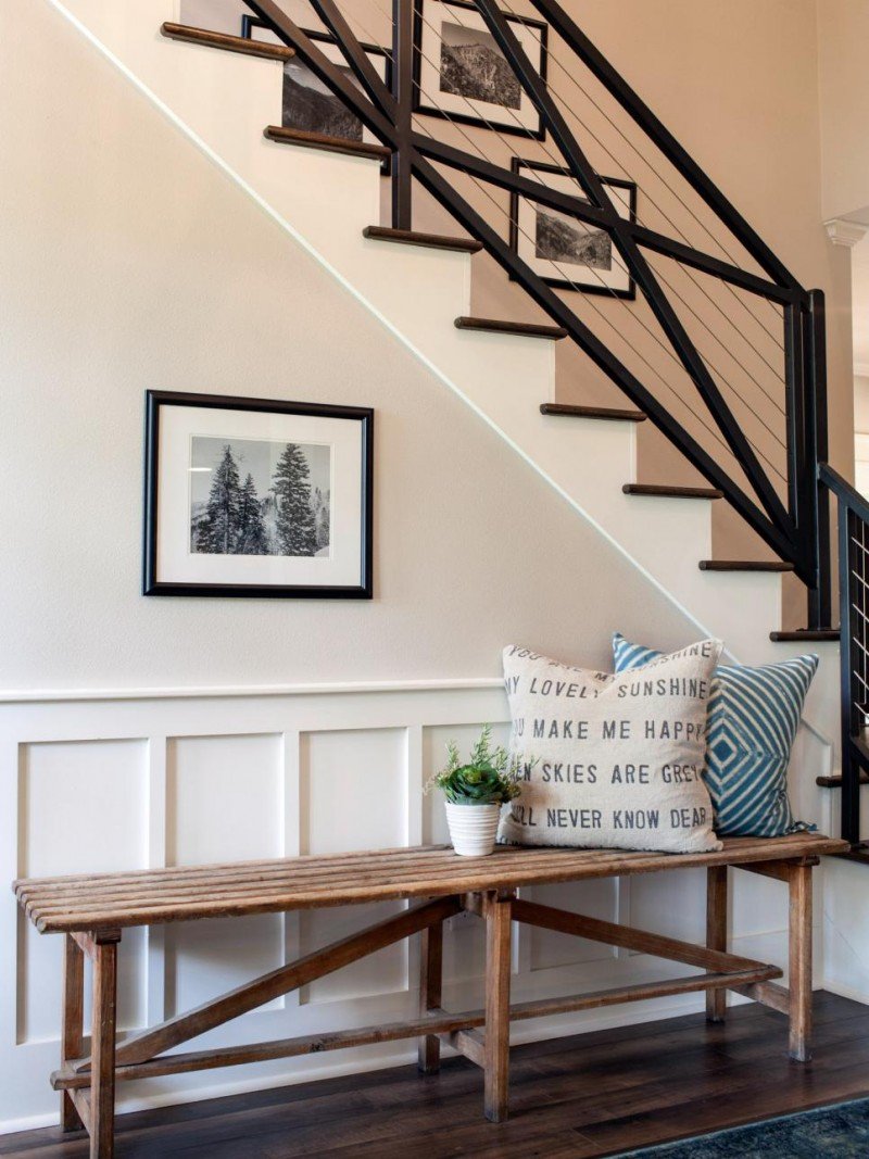
Sooooo much to love about this. We can’t ignore the beautiful mill work going on. That is always the most bang for your buck if you are going to add something to your space. But look how great the modern banister pairs with the rustic bench and traditional mill work. And I love the sleek modern black frames juxtaposed with that awesome bench. (Similar pillow)
Takeaway #12: Hang Black and White Photography
Takeaway #13: Consider a New Banister
Ok. So this is not inexpensive and is a major change. But wow does this have an impact. We have friends that bought a new home. They went in and painted everything and swapped out the banister. It looks like a new home. Sometimes this can really date a house and is often overlooked by homeowners. Or can you stain the one you have? My sister stained just the railing a beautiful dark color and it pops off of her pale gray walls. Something to think about.
Takeaway #14: Symmetry (Surprise!)
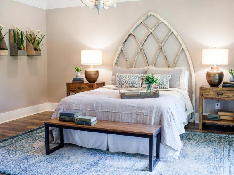
No surprise that we have a master bedroom with symmetry going on. It’s beautiful and simple. And I love the weathered look of the wood paired with the hammered metal lamps. And I love the idea of a weathered bench like this.
Takeaway #15: Dip Dyed Rug
These rugs have been on trend for quite some time but I do think they are classic. I love the texture and dimension they add to a room. The faded quality gives it such a beautiful and lived-in feel.
Takeaway #16: Think Outside the Box for a Headboard
Headboards can serve as artwork. This one certainly does. While this is not my favorite choice as a headboard (just not my style) it really makes a statement. I love something like this with a similar feel.
Shop a Similar Room
Takeaway #17: Sticks in a Vase
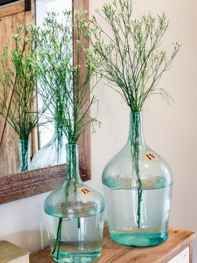
This is sort of an inside joke with my family. My sister is has always said when in doubt, put sticks in a vase! Simplicity is beautiful. Of course these are fresh greens, not sticks, but think tall and natural and stick them in a vase.
all photos by Jennifer Boomer/Getty Images via HGTV
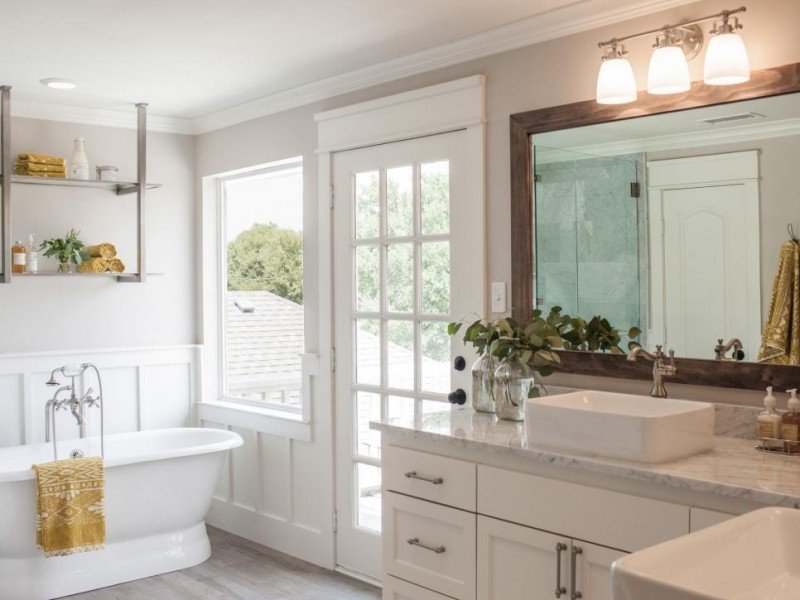
The final takeaway. . . ummmm. . . I want to take this bathroom away and stick it in my house. Mmmkay? Wow. Just, wow. Once again I am won over by the all white, neutral palette that is graced with fresh greens and a warm wood tone on that mirror. So good, Chip and Joanna. Hats off to you both. As always.
I’ll be back next week with more Fixer Upper Takeaways. To get caught up you can click on links below. Have a great day. Off to spend time with my sister.
The Takeaways #1 | The Takeaways #2
*affiliate links used

Hello! I linked to your sons room…where did you get his desk chair? I’ve been looking for one like that. Thanks!
Hi Hilary,
That is actually quite old from Ikea. We ordered an industrial stool that didn’t come in time for photos. But I did end up loving the white chair in there. I think they still carry something quite similar. Hope that helps.
Wow! I think this may have been my favorite episode, and I’m dying over the outside transformation and that master bathroom. So, so good!
Could not agree more, Michele. Both my husband and I were floored with the outside. WOW! The whole thing was really well done. Happy almost Friday!
Loved the outside transformation and the new banister both were huge game changers. Only thing I didn’t care for are the laminate floors but you have to make price concessions somewhere!
I agree. And overall I think the look was so pretty. That banister really was a game changer! Holy cow.
Wow what a post! So much to takeaway from this. Thank you.
May I pick your brain over the dark banister rail thing? When we moved into our house our banister was a dark mahogany it really sucked all the light out of the hall. So we painted it white. All of it. The whole thing. Stupid! I think it looks cheap now and wish we had just painted the posts and balustrades white and just restrained the wooden rail. So, to get to my question, do think I could paint the rail a dark charcoal or black? I really wouldn’t be capable of sanding back to the bare wood but could manage painting. How do you think it would look? Our hall gets lots of light and the walls are pale grey. I’d love your opinion. Thanks!
Ps I’ve just discovered that we can watch Fixer Upper over here in Ireland and I’m hooked!
Ireland is one of my favorite places on this planet! I love that you can watch Fixer Upper now! YES!!!
So I do think you can paint it. I would paint it in a high gloss. You don’t want it to read flat. I think it sounds like it would be really pretty against the walls. Love that idea.
Thanks for commenting and following along. Sending hugs to Ireland ( I am Irish and love that!)
Thanks so much for your opinion. Now just to get the hubs on board. (We are currently in a bit of a stand off over the moving of some bookcases! Poor man!)
California is one of my favourite places. We toured it in 2009 pre-kids and had a ball! Your coastline is breathtaking! We would love to go back with our girls some day. Ha! Maybe we could do a house swap!
Great post. I love everything they do, Such an inspirational show.
Thank you, Marty. I agree. Always so inspired by it and love their relationship, too. Hope you are doing great! xo
Loved this house! The husband is the brother of one of my daughters friends from BU! They are the sweetest!!
Get out of town. Really!!! That is so cool. They seem like they are just the sweetest and boy do they have a gorgeous home now. I just loved this one so much. The outside blew me away. Happy almost weekend, Lauren.
xo
First time commenting but long time reader (stalker). Love this series and live your style. I enjoy reading your blog! Thanks.
Awe! Jennifer! So happy you are commenting. Thank you so much for following along with the blog. That means a lot to me. And I LOVE hearing from readers so feel free to chime in any time. So happy to hear you like the series. Rather obsessed with Chip and Joanna and their talent so it’s a fun one to work on. And thank you for the kind complement about the blog. I really appreciate it. Wishing you a wonderful weekend.
I just discovered Fixer Upper since we have been cable free for a while. I heard of the show, but never took the time to catch a live episode on my iPad (probably do to my 3 year old!). I finally just watched it and I’m obsessed.
This blog series is fabulous! I love how you break it down so that I can easily spot items in Homegoods to put in my house. I’m sure it takes a lot of time so thank you!
Kelly! You’re the best. Thank you for such a nice compliment. And it makes me so happy to know it’s useful. I love the idea of you hunting HomeGoods with new ideas in mind. Goodness knows you’re busy with a three year old so thank you for taking a moment out to comment. Enjoy the weekend with your family.
Thanks for sharing. I just loved this house especially the front doors. Looking forward to more posts.
Those front doors! Unreal. We were drooling over them. And you’re so welcome. Thank you for taking the time to comment. Have a great weekend. xo
The pendants in the kitchen were hands down my favorites of this week. I have this issue with loving too many light fixtures, I can never pick which way I want to go but this… this is something I can commit to!
Xo Melissa
http://cherishandbloomblog.com
YES!!! So funny you say that because I couldn’t agree more. If I needed them, these would be such an easy choice. Something about them that I absolutely love. Maybe it’s not having to commit to a finish or something too trendy. Love. Thanks for popping in for the series. xo
Do you know the color of the kitchen island?
That bathroom. Joanna please come to my house. plz.
http://www.kelseymarie.co
I really love that you started this series! I look forward to your recap as much as I look forward to the actual show. I loved this makeover but was so devastated that they got rid of the arched windows! I’ve never commented here before but I’ve been reading your blog for a while and I think you are so likable and make your creative ideas so accessible and practical for a real family.
Could not agree more. This episode was amazing!!! I am now even more obsessed with this show than ever!
I love the rug under the kids table, do you know where to buy it.
I love that kitchen!!! Do you have any idea what color paint they used for the kitchen cabinets? It is such a soft and relaxing color. Thank you.
Absolutely LOVE this series you have been doing! I have them all bookmarked. 🙂 I would love to see your best guess at her paint colors. I’m about to redo my entire kitchen and choosing paint is the hardest decision ever!
I would love to know the color of the cabinets if you know!!!
Would love to know what that photo is printed on and how it is framed. Love the rounded corners. Takeaway 7
What are the counter tops in the kitchen? Marble or a quartz look alike?
I love the neutral wall color! I’m looking for a color like that for my open concept downstairs (foyer, living, dining, and kitchen). What is it called?
Beautiful! Where did you find the circular light over the dining table in photo #3?
Thanks!
I would love to know the color of the kitchen cabinets. Beautiful!
Me too!!!
Could you tell me which specific botanical prints from the link you selected for the art in the dining room? What size did you print them in? Also, could you tell me where you got the glass frames for the art? I am obsessed with that dining room! Thanks so much! -Susie
Hi! I was wondering if you could tell me where you got the dining room chandelier? Love it!
Thanks
What color are the kitchen cabinets and the wall color in the dining room?
What are the colors your used for the kitchen island and cabinets?