I’m excited to be back with part 2 of our before & after photos. Over the last two years, we have worked on many of the spaces in this home to make it our own. The home was beautiful to begin with and we are simply adding our touch to make it fit our style. Some of our projects have required a great deal of planning and a larger investment, and some have been accomplished in one weekend with very little money. I hope these projects inspire you to look at your spaces in a new way.
Before & After | The Kitchen
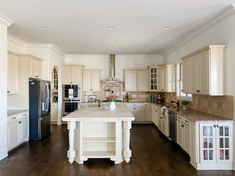
This kitchen was beautiful to begin with. It’s a large footprint and had tons of storage. When we decided to redo it, it was an opportunity to customize every inch of it to fit our family’s needs and I am so grateful we were able to do it. Without question, the biggest changes were to the island (including the size) and to the wall with the fridge. Choosing to have a built in refrigerator and seating around the island made a huge difference in not only the flow of the kitchen, but how we use it.
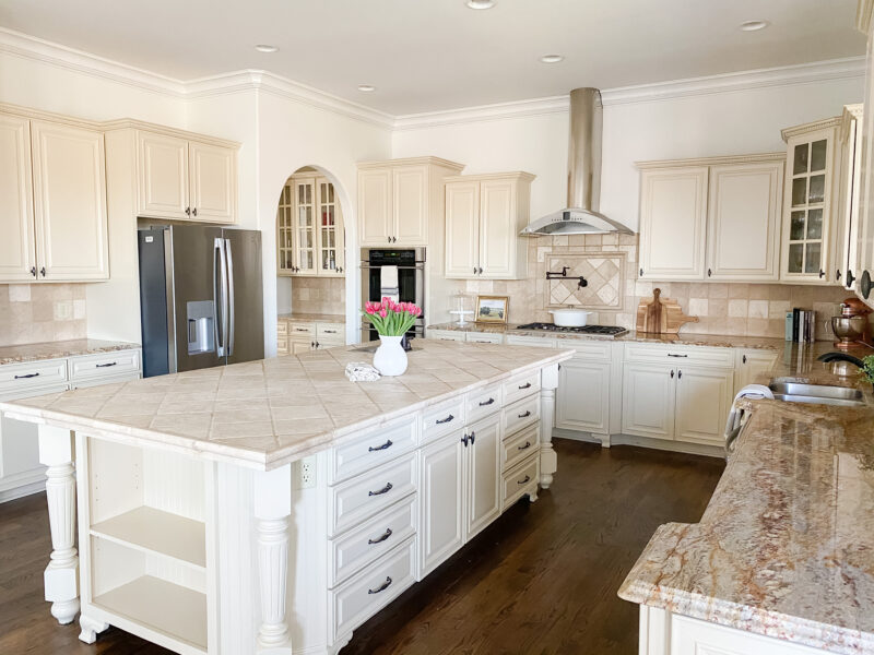
I actually love a bookshelf in an island. If you have the room to do it, I think it’s fantastic. We sacrificed that to accommodate four counter stools. We were also able to eliminate most of the upper cabinets because of the ample storage elsewhere. These cabinets were all reused by a couple building a home which was wonderful.
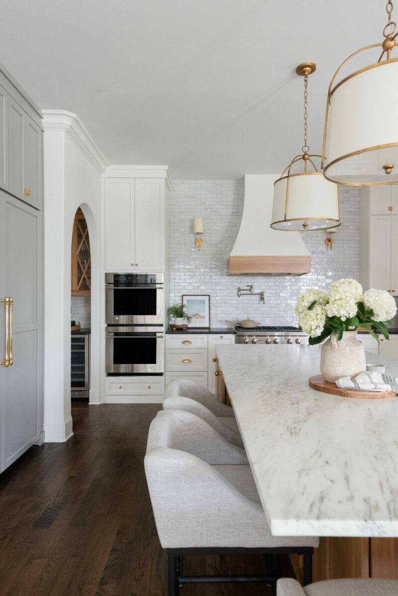
We made the island more narrow (still plenty big) so that there was plenty of space for people to open the fridge and walk behind them. It’s been great when we entertain. Adding seating was transformative as well. And open shelves allow us to quickly grab our daily dishes. Plus they are directly above the dishwasher which makes it easy to unload. If you are interested in any of the measurements, they can all be found here.
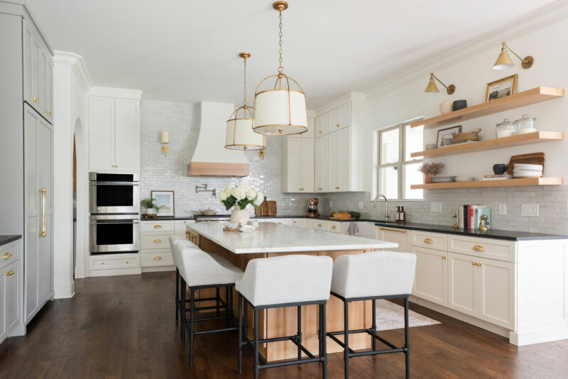
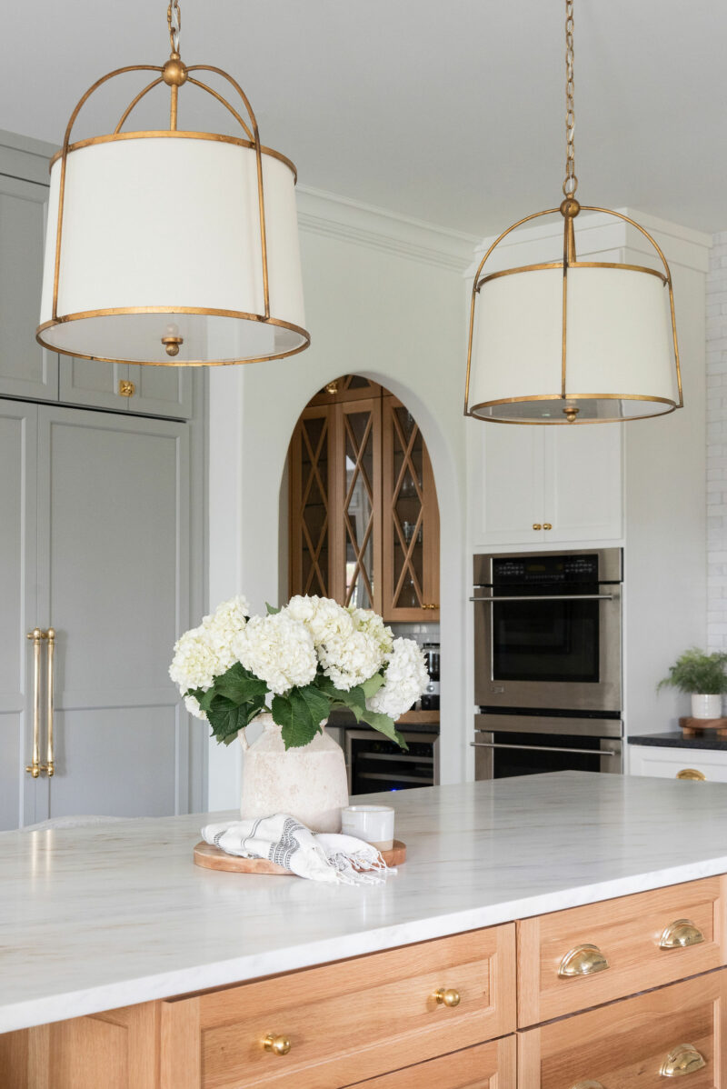
You can see more before and after photos in the kitchen post (plus all of the sources).
THE POWDER ROOM
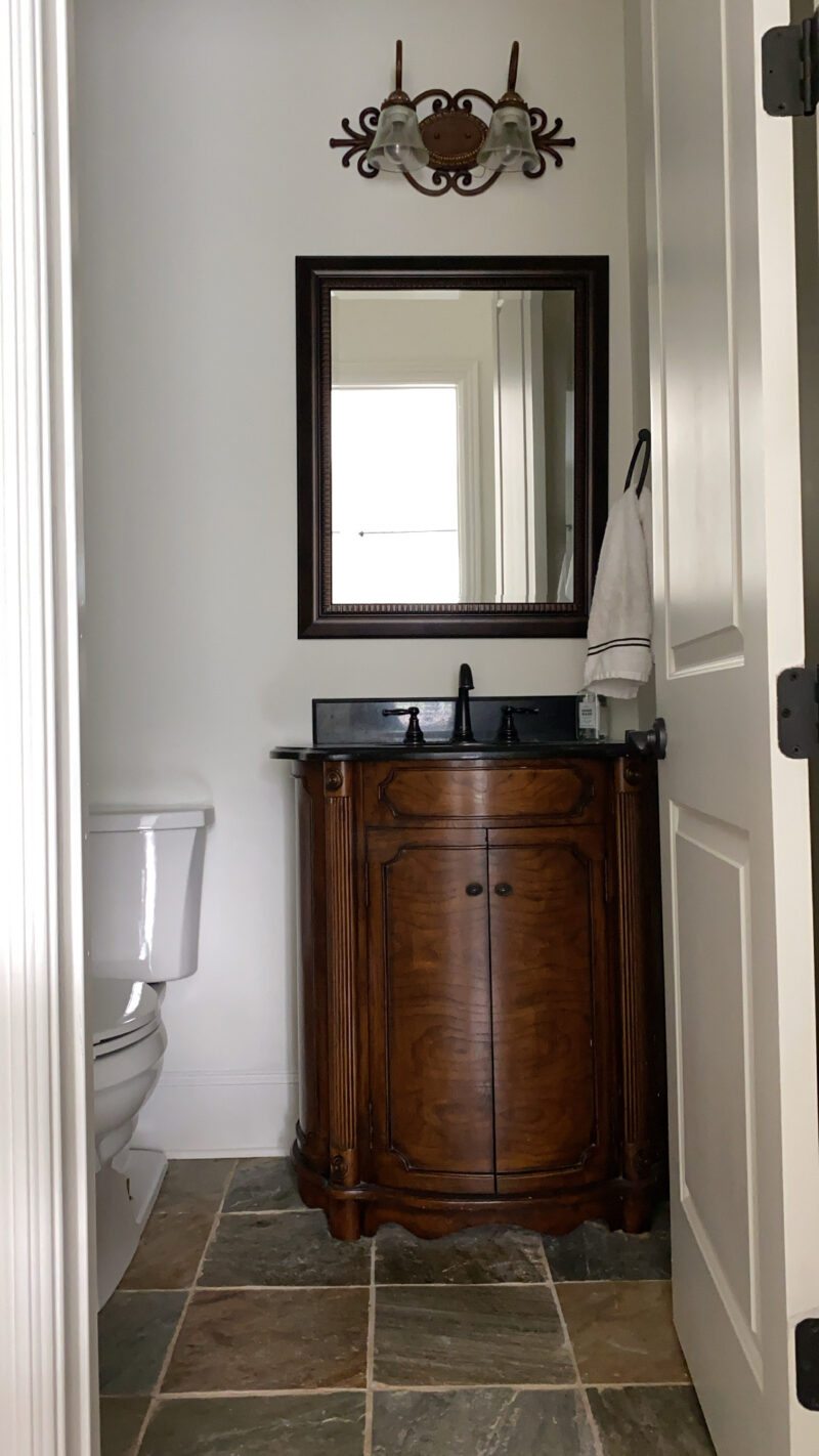
This was such a fun space to makeover. I knew I wanted something moody and fun and I love how this one turned out.
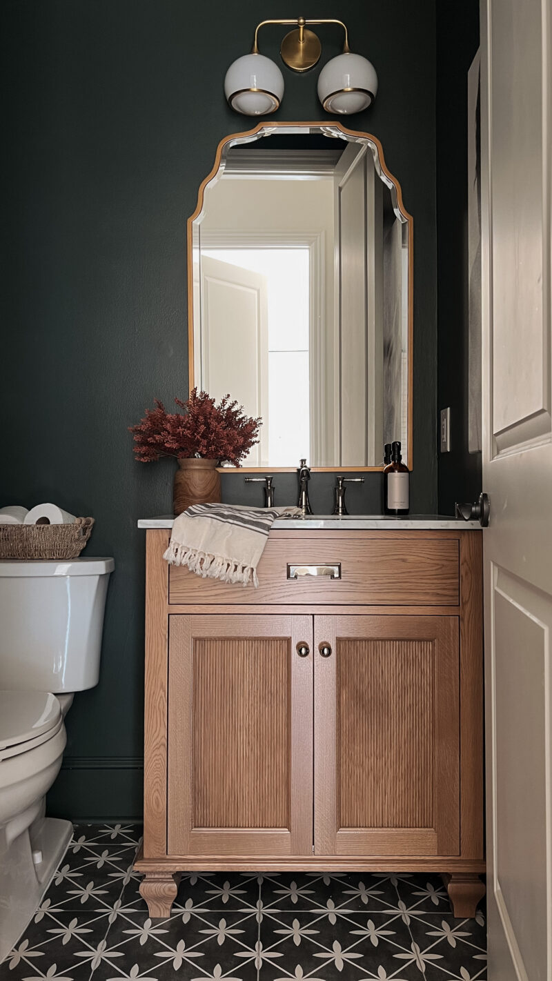
With such a small space, it was an easy decision to go bold on the floor and dark on the walls. One day I might get around to adding picture frame molding in here. I’ve bought all of the supplies, but life gets in the way.
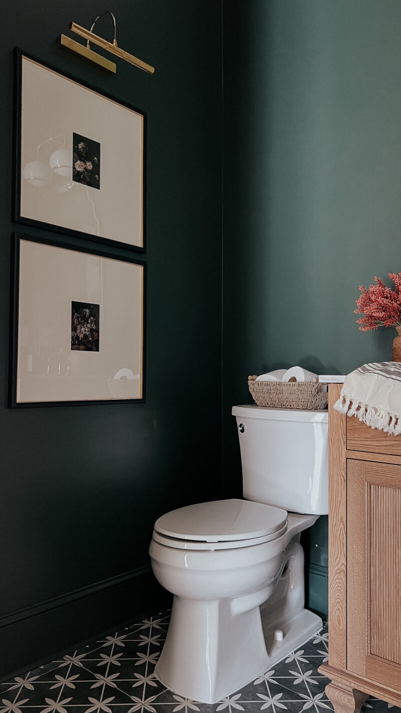
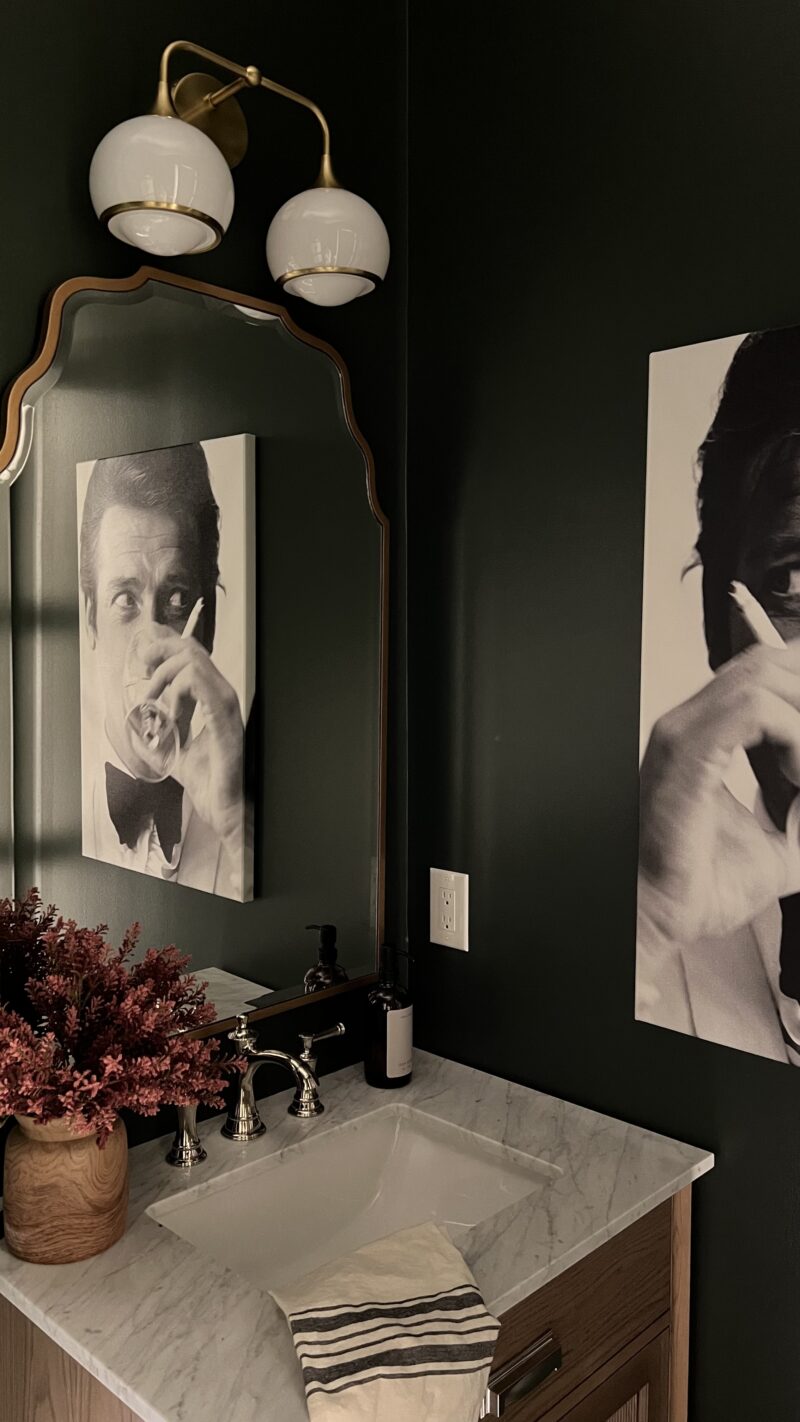
You can check more photos of our moody powder room in the reveal post (plus all of the sources).
OUR BATHROOM
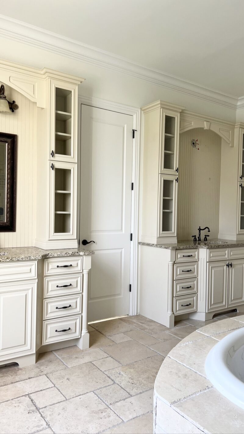
There’s no question that kitchens and bathrooms are extremely expensive to redo. We knew the kitchen was our top priority and while we flirted with overhauling this space, the reality was that it wasn’t in the budget and it didn’t make sense to us to spend the money here.
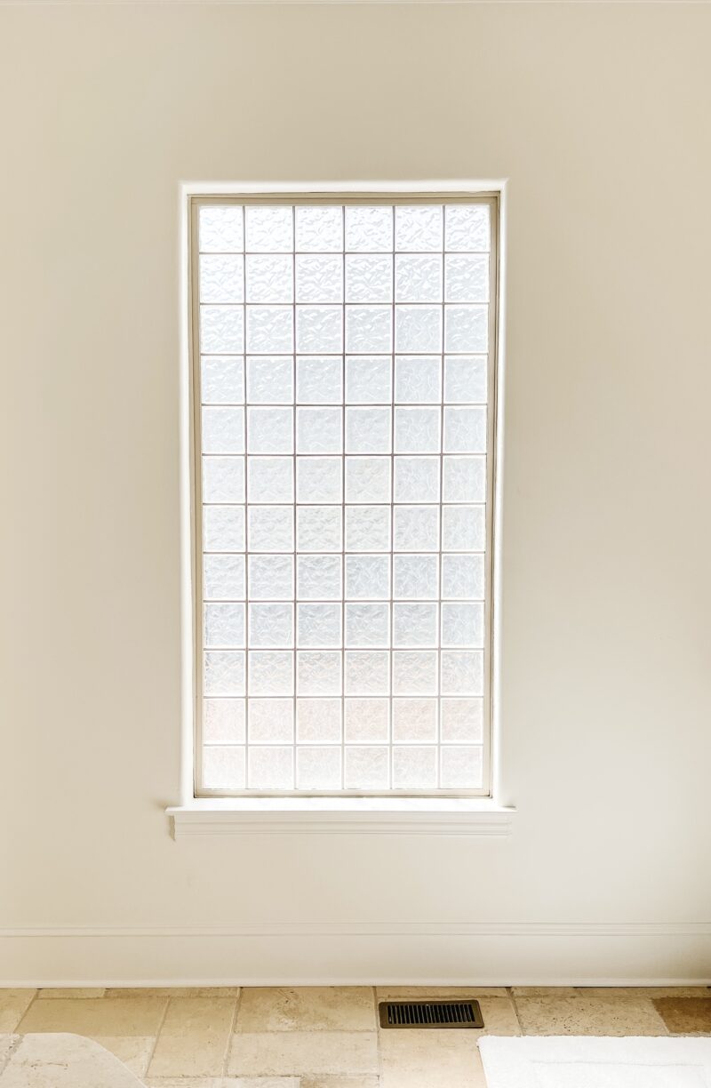
The big pain points for me included the glass block window and the way the cabinet paint color played off the rest of the tile. It just needed to be refreshed up.
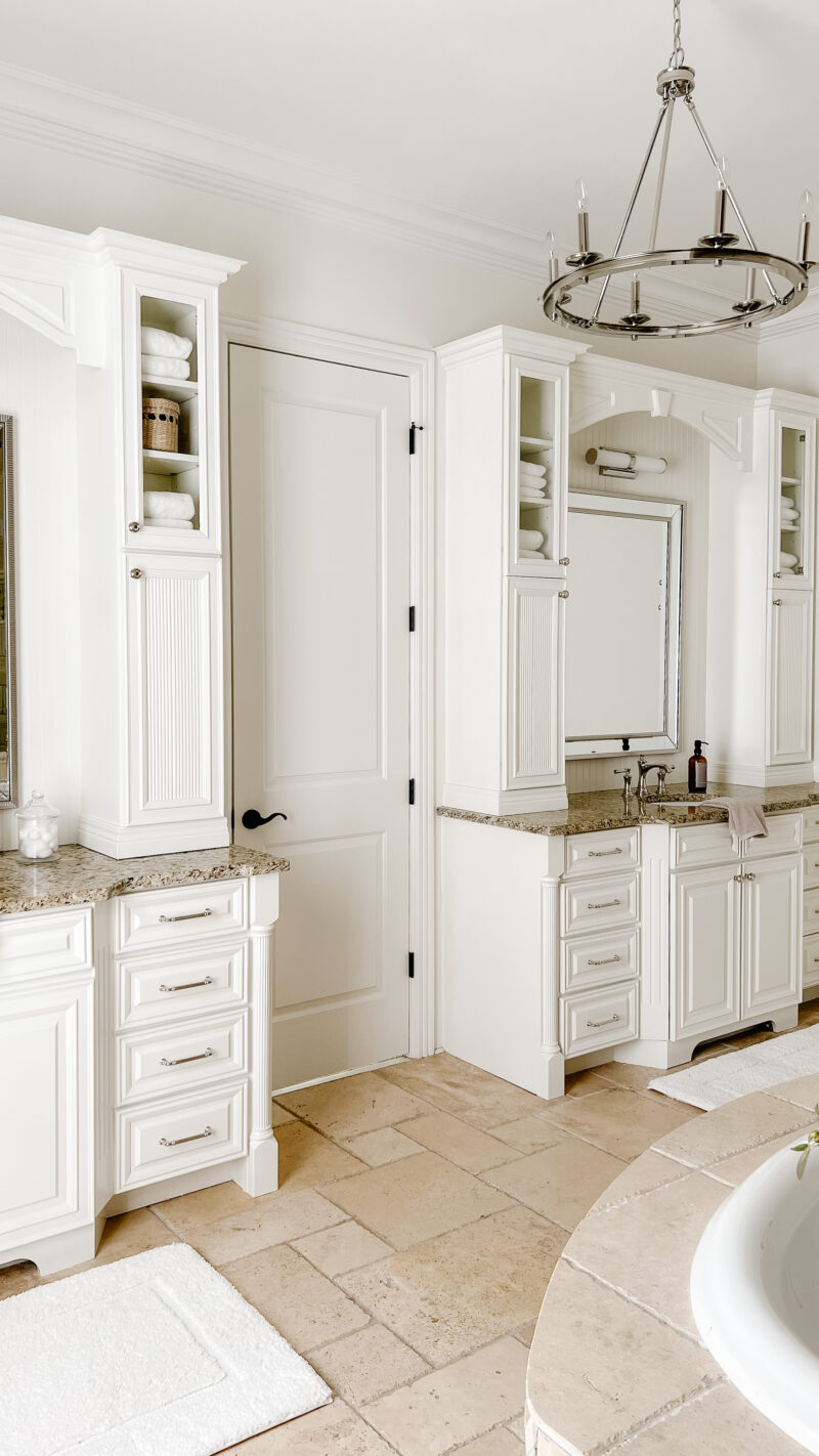
So with a little bit of creativity, paint and some cosmetic changes we created a bathroom we honestly love. Is it exactly what I would have chosen, no. But it feels fresh and welcoming and I am very appreciative of this space. Even more appreciative that we didn’t spend a ton of money in here.
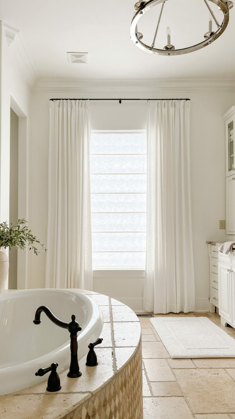
What a difference a window treatment can make (what we used here). I feel like this took 15 years off the look of the space.
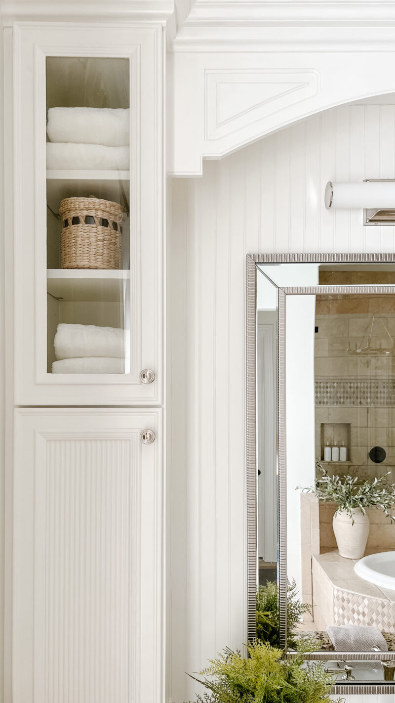
Adding fluted panels to the lower cabinets allowed us to hide the storage and was a fairly simple project. Keeping the top portion glass adds a reflective quality and interest. Add in new lighting, mirrors, and faucets and it feels entirely different. Wish you could see it in person (this space is a tough one to photograph). Details and sources here.
GUEST BATHROOM
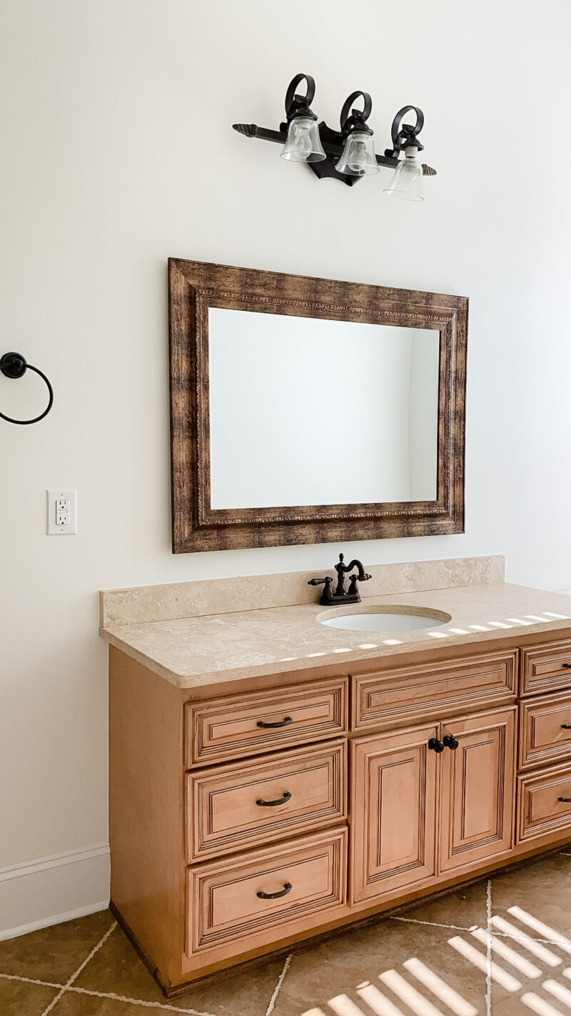
This glow up was done over the course of one weekend. We knew this wasn’t a bathroom we would rip out so it was all about making it work for our style. The quality of the materials are great so a few cosmetic changes were all we needed.
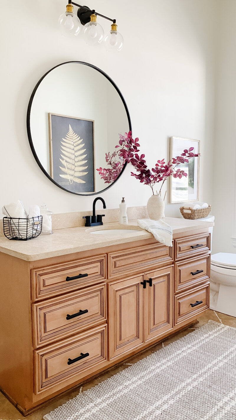
Hardware, lighting and mirror swaps can certainly go a long way when updating a space. I love the feel of this bathroom and don’t regret choosing to simplify the makeover. Sources and more info here.
MORE BEFORE & AFTER PHOTOS
In case you missed it, we shared the before & after photos of our family room, music room and formal living room in Part 1. Thank you for being on this home renovation journey with us.
So good! Thank you for sharing!
I love it all. Classic, wonderful, and yet so fresh.