Help! Ok, friends. I need your input. We have been in this home for nine months and I still haven’t figured out what light to hang above our breakfast table. It’s not that I am uncomfortable with waiting. In fact, I have promised to take my time with decisions. That would explain why our coffee table is still too small for family room. I am waiting until I find what I love. To be honest, I had forgotten about the missing chandelier until my son asked why it was so dark above the table. Hmmm. Valid point. Choosing the right chandelier has become more challenging than I thought.
THE BEFORE
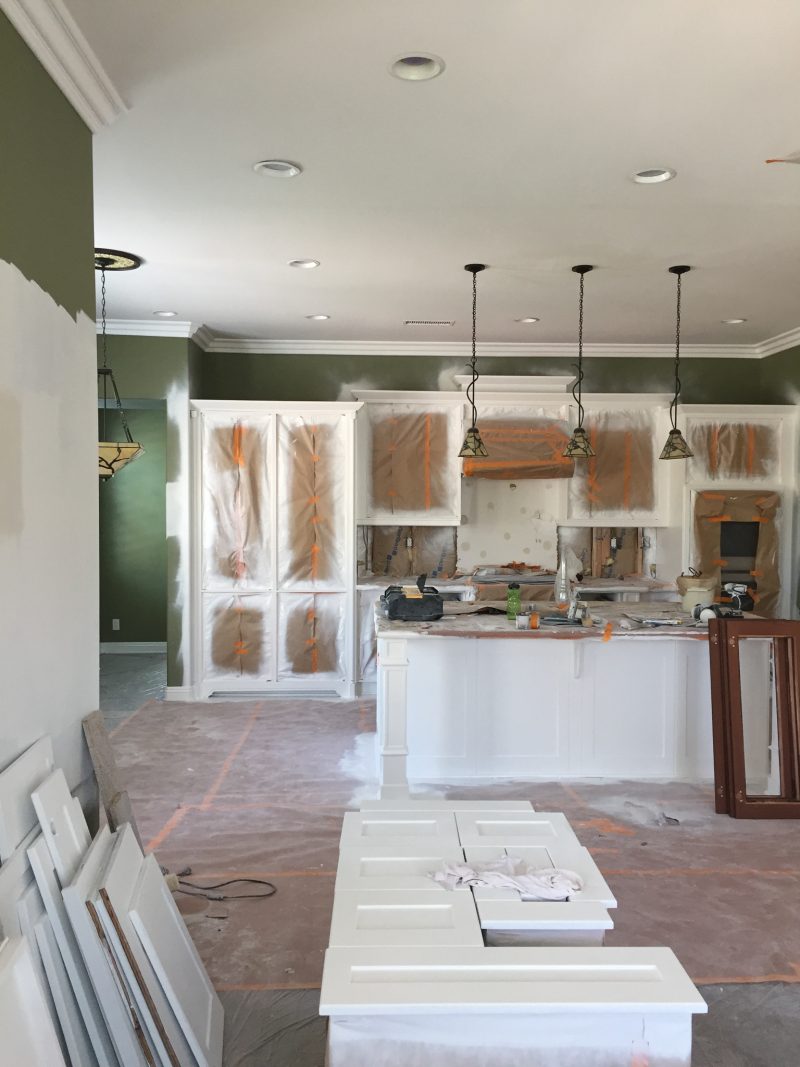
We removed the three pendants above the island and replaced them with two gold lanterns. That is as far as we have gotten.
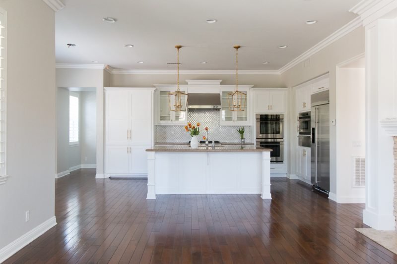
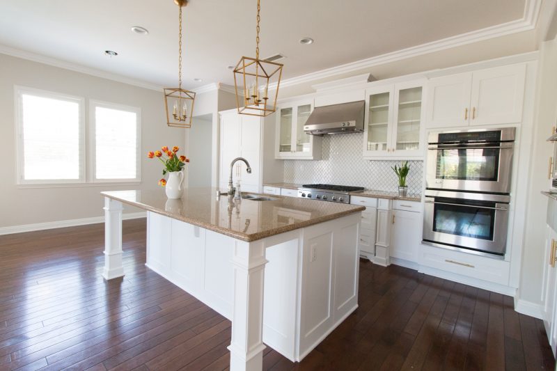
CURRENT LIGHTING
You see the hole in the ceiling is still there and I have looked high and low. I thought I would “just know” and yet here we are.
I realized I have very few wide shots of the space so I am including this one taken before we moved in so you can see where the chandelier is in relation to the pendants.
COLORFUL GREATROOM
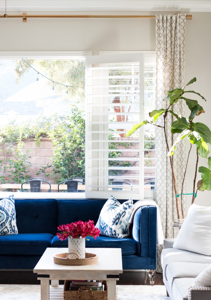
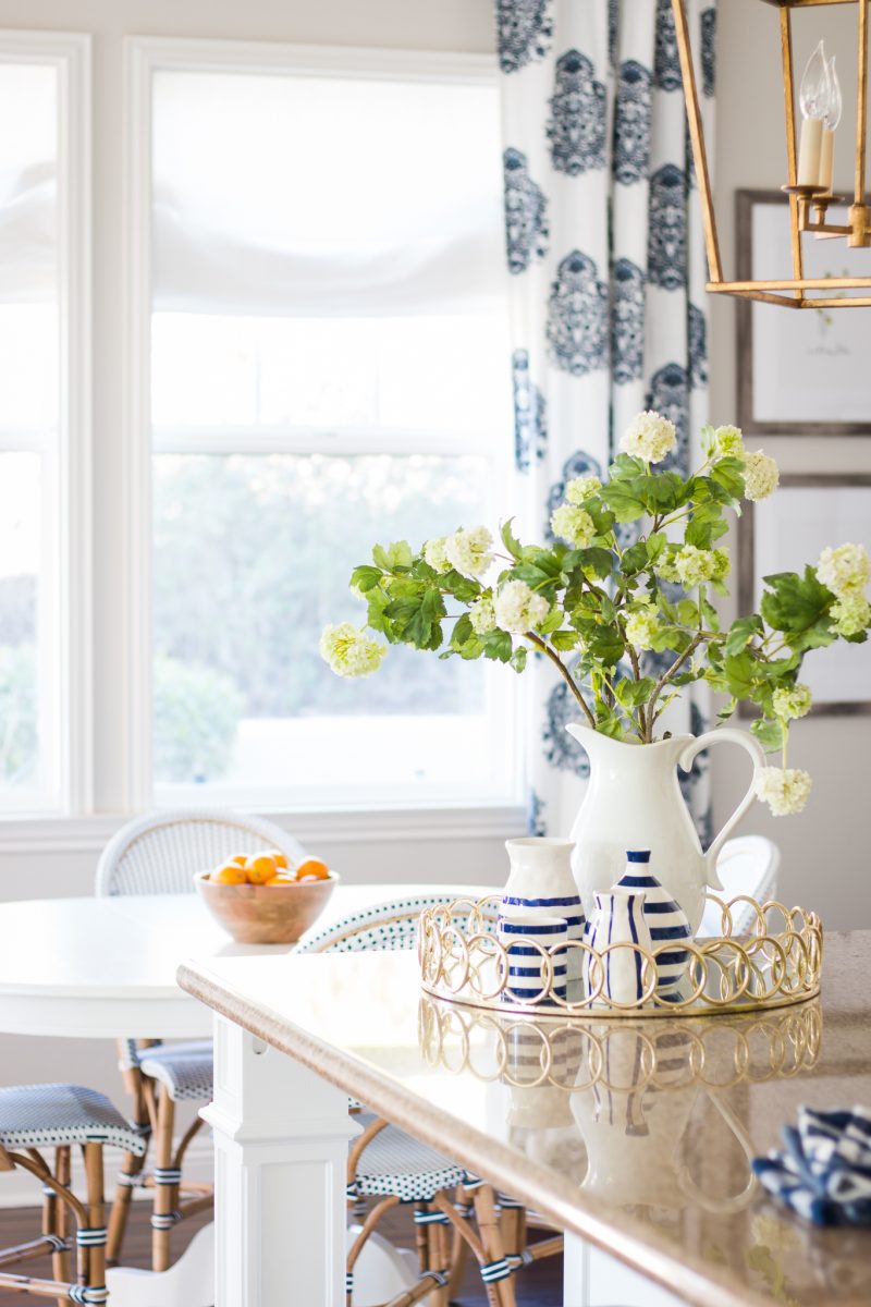
Here is a glance into the greatroom so you get a feel for the color and style. Yes, that would be the coffee table from our previous living room that is far too small for this space. Something else I am working on. Thinking the new one will be a darker, aged wood. Something to give the space texture and warmth. I want it to feel a bit rustic and weathered so it’s juxtaposed with the sleek lines of the sofas. Keep you posted on the search. I receive so many questions about our gold drapery rods. We love them and I have used them throughout the downstairs.
BREAKFAST NOOK
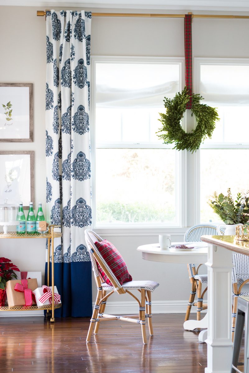
Don’t mind the Christmas tour photo! Apparently I have very few shots of this room and they all cut off the ceiling because of the hole and wiring hanging down! But the new light will hang in front of that wreath. Hopefully you can picture that.
Here is a detailed shot of the colors we have going on as well as the chairs. I am just as in love with these chairs a the day I received them. (More Spring decor tips here).
HELP ME CHOOSE
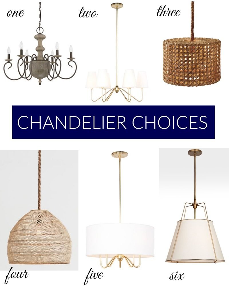
one | two | three | four | five | six
So here are my thoughts. We have two gold pendants above the island so my gut says go with something that either has shades or something with a ton of texture. I think I should veer away from anything that resembles the lantern style. I would like for the lighting to work well together but not match. My husband and I are on two different pages with this one so it’s making it even more difficult. Do you like any of these? Let me know in the comments. Or if you know of one that I have missed I am all ears. This really has been much more challenging than I thought.
UPDATE: Five comes in multiple sizes which is nice if you are looking for your own space. The same store has 20% off of outdoor items right now. I have my eyes on the house numbers.
Can’t wait to hear from you!
3 or 4 !
2 or 5
I agree with Allison- 2 or 5! And I think #5 is perfect for my dining room… I’ve been searching forever! So thank for inadvertently helping me 🙂
I think 6 is my preference, but 2 & 5 are nice as well.
2 or 5!
I love 6! It’s such a great take on a shaded chandelier. It adds warmth and texture, and it seems like the space gets a lot of natural light so the shade shape won’t affect the amount of light overall.
I like 2 and 5 as well, and am drawn to the simplicity of 5.
I like 6 the best! It ties in with your pendants, but has some texture.
4 or 3!
2 or 5
I’ve never commented before but what about something more like this : http://www.potterybarn.com/products/leila-wood-bead-pendant/?cm_src=AutoRelk
This particular one may not work due to the smaller size of it in relation to your table, but looking at your pictures it seems that the lanterns above the island make such a strong statement that anything else above the table may “compete” with it. The beaded round pendant lends a complimentary shape to the table and helps to balance the hard lines of the lanterns. Also the beaded pendant adds an element of texture that is more subtle , but doesn’t overpower the table and all the items around it. Just a thought . I love the idea of the textured ones you linked but I feel they would work better on their own somewhere not competing with the beautiful lanterns above your island.
2 or 6
5 relates to the gold tones of the lanterns but is definitely unique in its own right.
2 or 5 but I’m leaning more towards 5 ! Not too busy , it’s clean and classic with all of your surrounding decor.
I like 2 & 5! Good luck!
Try Visual Comfort’s Etoile chandelier!
I almost put that one on here. Love it, too. xo
5 is my favorite
I will be the lone wolf and say #1. I love its size, the warmth & texture its wood center will add to the space and its truly juxtaposed feel. Of course they’re all stunning-still one gives the feel I would love added 😉
Great choices Courtney. I’m with the others, 2 or 5. 5 has a slight edge for me. Good luck! I know whatever you decide will look great!
You can’t go wrong with 2, 5, or 6. I’d definitely eliminate the other three options so you’re at least halfway there! 🙂
6. I think it’s unique and would fit style-wise.. 2 and five are lovely but seem like a more common and traditional style. 3 and 4 look like DIY basket pendants.
I like 2 or 6, but I am sure that whatever you choose will look great!
I think 5 would look really great in your space!
Either 2 or 5 would work beautifully! They don’t match in that they are different shapes and have the white shades but the gold ties them together. The others don’t look remotely as sophisticated or beautiful. Really blends well with the classy style of your other room.
I agree 100% with this! All are beautiful, but 2 or 5 compliment your decor and style in each room, keeping it tied together, not sticking out. 5 is my fav!!
#5 is my favorite
in this order, 6, 2 then 5
My vote would be #2 or #5. Looking forward to seeing what you choose : )
I love 6! Second place is 5.
I think #1 is too gothic. Not sure if that is the right word to explain it, but I don’t think it fits. All I think about when I see #s 3 & 4 is all of the dust they will collect. 5 & 6 are my favorite.
I think 2, 5 or 6. : ) Good luck!
4 or 5
They’re all beautiful lights, but #3 and #4 really give that space some texture and depth. Exactly what I was envisioning before I even saw the options. Good luck choosing!
2 or 5
I’m in the minority here, but I like something wood, like 1, or very textured, like 3 and 4. The rest of your kitchen is so lovely and bright and sleek (and I love it, btw), it would be great to get some contrasting rusticness (is that a word?) in there. Good luck with your decision!
I have the same lanterns over my island but in iron color. I had the hardest time choosing too but I went with a Pottery Barn shaded chandelier (which they no longer carry). With your choices, I would go with #2 or #5 leaning more towards #5.
Shelley
3… texture, not gold (you have a lot already), and it will bring out some of the other wood texture you have in the chairs.
I agree!!!
Texture all the way!!! Maybe 3 isn’t THE one…but it’s along the correct lines IMO!
#5 is my favorite. It would look beautiful with the rest of the decor. Thanks for the post. Now I want 5 in my house too!!
Love number 5!!
6
#5 would be my choice.
My first thought was gold with a white drum shade, even before I saw your picks. I vote 5! And btw, your kitchen is gorgeous!
5! Love your home! It’s gorgeous 🙂
I really love 3, but 5 is so beautiful and classy. I feel 5 is the perfect choice!
I would go with 2 or 5. 🙂
At first I thought 5 or 6 but then I went back and looked at the kitchen again and the breakfast nook and thought 5 would be best. While 5 and 6 are similar in color and both incorporate the gold, you have a lot of straight lines in your kitchen and your pendants work well with them. #5 would add some contrast to those straight lines while complementing the round table and curve in the back of the chairs in the breakfast nook.
I agree – 5 fits! Contemporary with Traditional nod. The basket lights would compete with your chairs and look heavy compared to the airy lanterns, so they’d draw / stall the eye rather than illuminate the conversation (& people around the table).
My favorite is 4 but I think for your space 6 would would look great. Ties in with the gold but is not too matchy with the lanterns. I must be the black sheep here because I do not like 2 or 5 at all.
5 all the way!!!
I would choose 2–gives you the option of changing out the shades seasonally also gives a good base to add decor to for the holidays.
Definitely #5. It would complement the lanterns but not be matchy matchy at all! Also I love that it has 5 sockets to bring plenty of wattage to the table versus #6 that only has 1 socket.
5
While 1 does go with the frames nearby, it’s a bit too heavy and fights with the chair legs. The textures of 3 and 4 compete with your pretty chairs. I would go with either 5 or 6, single larger shade.
I’m a fan of 2 or 6. I feel they match your existing pendents and would make the room look more cohesive!
I think 3 or 4 would tie into the chairs and not conflict with the rest o f your lighting or decor.
I think 5 is perfect in that it’s not fussy and very streamlined. I think with the wow factor of the lanterns, a simple look is needed.
Looking at the photos, I originally felt you needed more texture at eye level and above so I loved #4. With that being said, I don’t think it is the right fit for that space and will not put out enough light. I love the look of #1 but I think it is too heavy for the space. #5 is my choice – love the drum shade and it is not competing with your chairs and would look fabulous with the lights above the island.
Definitely #2 #love
I’m going to stir the pot a bit here, but I was drawn to #4 right away. I love its casual vibe against the backdrop of the more formal, tailored drapes. It adds an textural element as well against the gold drapery hardware and lanterns that will also be at eye level with it. Not sure of the price/have yet to click on it, but if it doesn’t break the bank, then you aren’t mad if the “basket look” is a trend you tire of down the road. #5 is also beautiful, albeit the “safer” option!
Love, love, love #5
2 but 5 is a close second.
5
5.
I love #5- you have such a beautiful home!
Definitely #5
Number 5!
Number 5!
#5 for sure!!!
6 is my favorite for that space. It goes without being too matchy and is a little unexpected. It’s perfect for a breakfast nook.
I vote for 2 or 5 with 5 being my favorite. I agree with a previous comment about how the rattan/basket look chandeliers compete with your chairs. I don’t think they should match your pendants but I think they should be similar. 2 and 5 just look like they would compliment your pendants.
I love #5 for your space!
Five! But two is my second choice
6 🙂 but I’ll throw in another option for fun. I have your same island pendants. This is the light we got for our dining room nearby. http://www.lightingcommerce.com/Visual-Comfort-Thomas-OBrien-Vendome-Large-Chandelier-in-Hand-Rubbed-Antique-Brass-with-Natural-Paper-Shades-TOB5008HAB-NP_p_2198.html?gclid=COWp_My_kdMCFQx7fgodZbkAJw
Good luck!
5, then 6, then 2- for similar reasons that others gave- the gold ties in with the lanterns, and I like the rounded soft shape of the drum shade, it’s not as busy as 2.
I like 3 & 4 for that area. They are more relaxed/causal & I love earthy textural objects. My eye was drawn to 3 first then 4.
5, for sure.
Three 4 or 5 would all look good. Since you have them as pic put them on your phone and hold them up from a distance to see how they look. Out of those three I like number 3 the best!
5! It is fresh and the gold ties in beautifully. 4 is fun and would add a lot of texture. Your house is coming together wonderfully. I enjoy all your posts, thank you!
I like 2 and 5 also but the reason 2 edges out 5 is due to versatility. It can be casual or formal and if you tire of the white shades you can change them to a different pattern or color.
I love your style and I know you will make the right choice for you and your family. From your picks, I would choose number 4 or 6. I know they are unrelated from each other but I really like the texture of 4 but I like that 6 mimicks the shape of your lanterns.
I did just find this while I was browsing though. It ties in with the gold yet has texture in its own right. (And the price point is amazing!) Just a thought. https://www.worldmarket.com/product/feathered-antique-brass-drum-pendant-shade.do?sortby=ourPicks&from=fn
Happy decision making! You’ll do great!
#5 is your style (which I love) and I think it would be the best choice. The basket designs take away from the chair texture and #6 looks like you tried to match but missed. A common mistake. Order #5 now!
#5 looks just like you and your style… classic, clean and beautiful! I think it’s a great choice!
2 – to mix it up . You already havre several pendant or drum lights in your beautiful home. I think this will be a nice addition and stand out more.
In your space #6, for sure. It is not as traditional as 2 or 5, and compliments your pendants without stealing the show. But my personal fav is 4- love the earthy texture and simplicity.
I agree with Amy. 5, then 6 and 2???? hope that helps.
I say 1 or 4, and I know I’m in the minority with these choices. The lighting you have above your island is very angular and structured. 2, 5 and 6- they are very pretty, but they are also the most…. well. Safe. They will look nice, but I would go for something unique, something that has more of a statement. Number 1 looks very French countryside to me- kind of antique, and I like the shape. Number 4 looks Anthro(my favorite of the two). Curious to know what you decide.
Great choices!! I love #6!!
I vote for 4 – I think it would add a little dimension to the room! You guys have done a great job!