Pop the champagne and cue the confetti drop. Our kitchen is finally complete and I couldn’t be more excited to share it all with you. In reality I’d actually be inviting you over for coffee and avocado toast which is more my speed lately. More than anything I hope that sharing our space serves as inspiration to really look at how you can make your own space work for you. With just a few changes we have a new white and bright kitchen that fits us perfectly.
OUR NEW KITCHEN
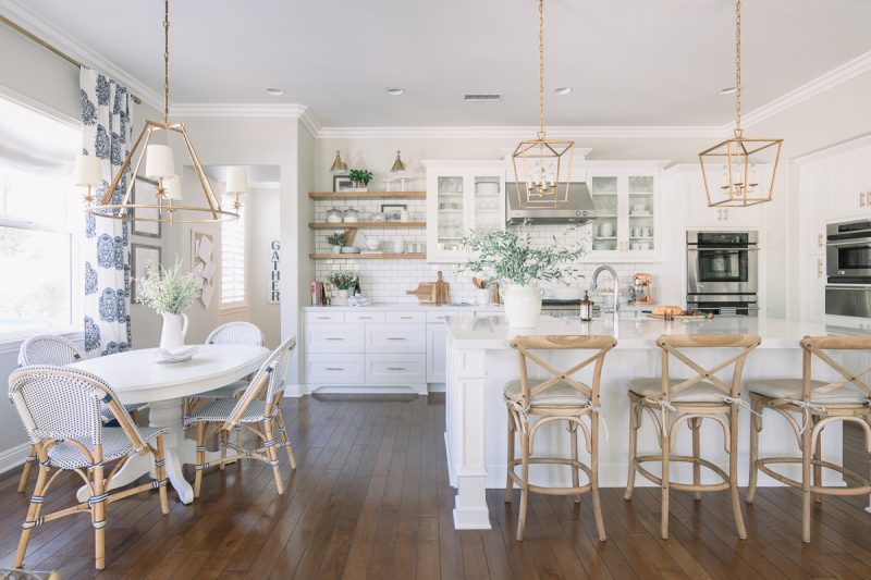
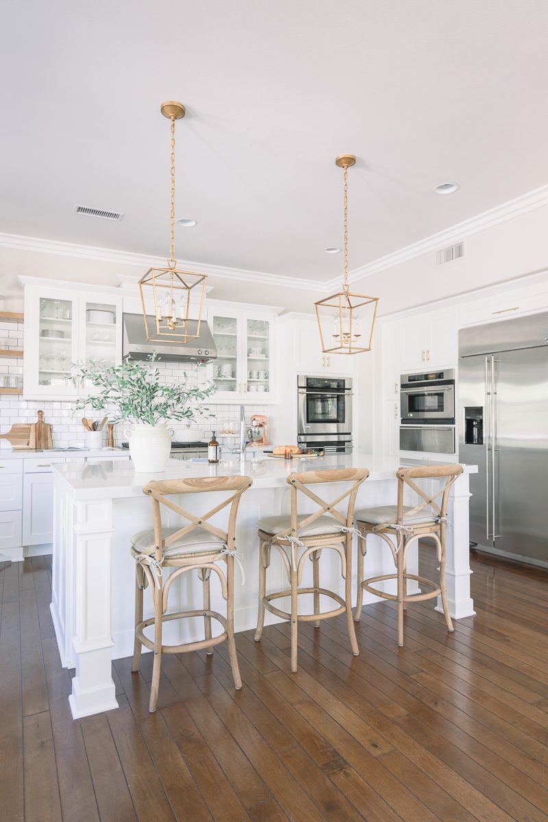
Welcome. Like most families, this is the hub of our home. This is where we cook, dance, sing, bicker, debate, gather and love. When we are home, the majority of our time is spent here and I wouldn’t have it any other way.
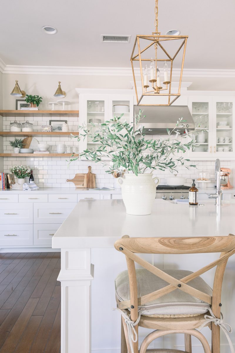
From the onset of this makeover (you can see our plans here) we wanted to keep the kitchen light and bright and infuse warmth with lighting and accessories. Using natural elements such as the greens and the wood tones helps to do just that. It also maintains a neutral color palette which we are drawn to for a kitchen. The breakfast area and family room both have bold color so the calm kitchen works well with those adjoining spaces.
RETHINKING THE SPACE
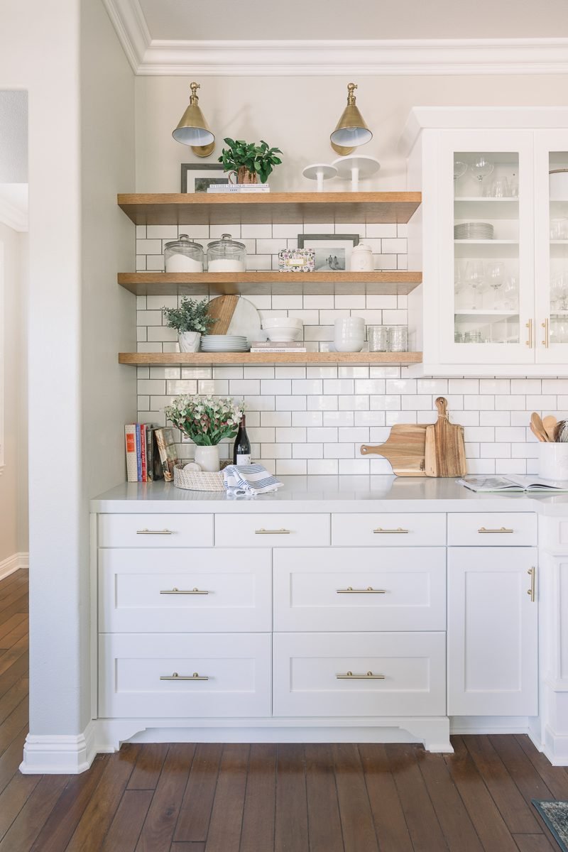
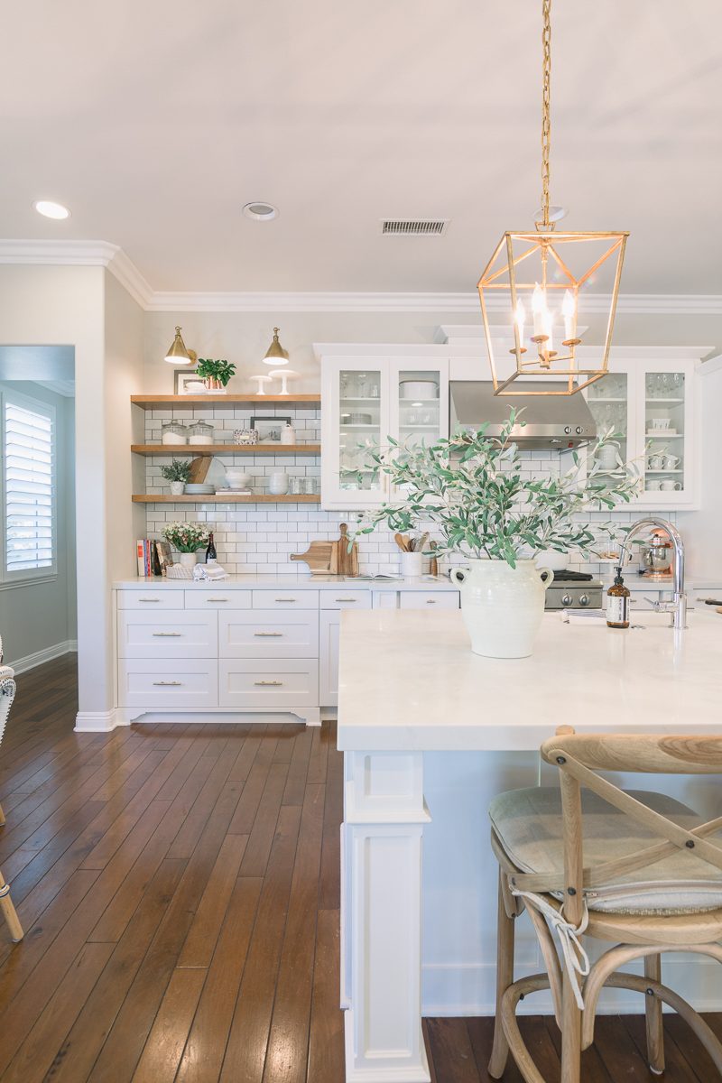
Prior to the makeover, this entire space was one large pantry cabinet. Functionally it did not work well for our family and we ended up borrowing space from our garage to build out a butler’s pantry directly behind this spot. In doing that, we gained counter space and seven large drawers. Plus the open shelving up top. We love the warmth and casual vibe they add and I can’t wait to style them during the holidays.
LUNCH PREP
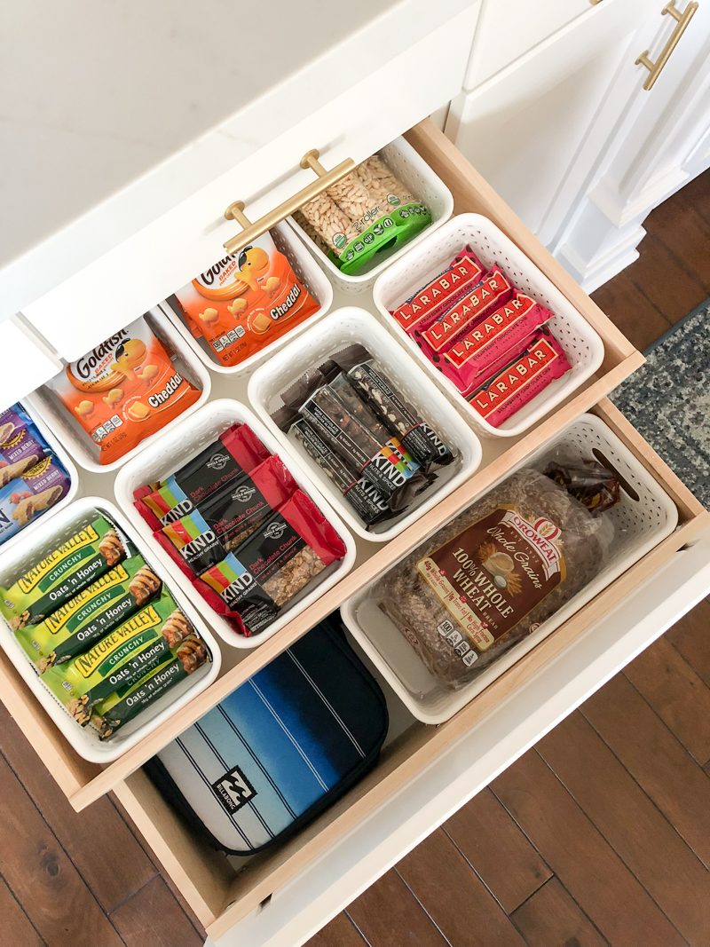
We gave a lot of thought to the drawers that were custom-built for this space. For instance, two of them are double-decker. This particular drawer is used for a lunch packing station. This might be one of my very favorite parts of our kitchen. It has been life changing for our mornings.
THE DETAILS
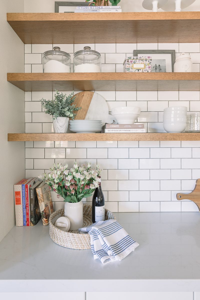
I have always loved subway tile. I love the classic and comfortable feel it has. The medium gray grout gives it more of a subtle pattern without going nuts. We use the dishes, bowls, salad bowl, and mason jars on the first shelf every day. The recipe box, sugar, and flour also get used on the regular. The top shelf is too high to be grabbing things daily, but it holds some of my favorite cake stands and a photo from a recent trip we took to Coeur d’Alene, Idaho. A couple of the cookbooks on the counter belonged to my mom. I love knowing that she would open those up and make something delicious for our family. Her hand written notes and bookmarks are still in them.
WARM GLOW
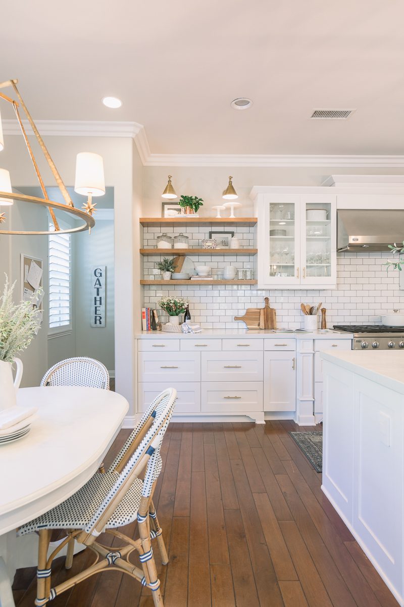
We ended up going with brass sconces over the shelves and I am so happy we did. (lighting dilemma here) They tie in nicely with our other lighting choices and add such a warm glow. I wish you all could come in and see this space in the evening.
COUNTER TOPS
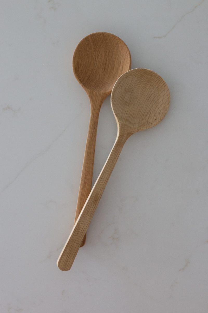
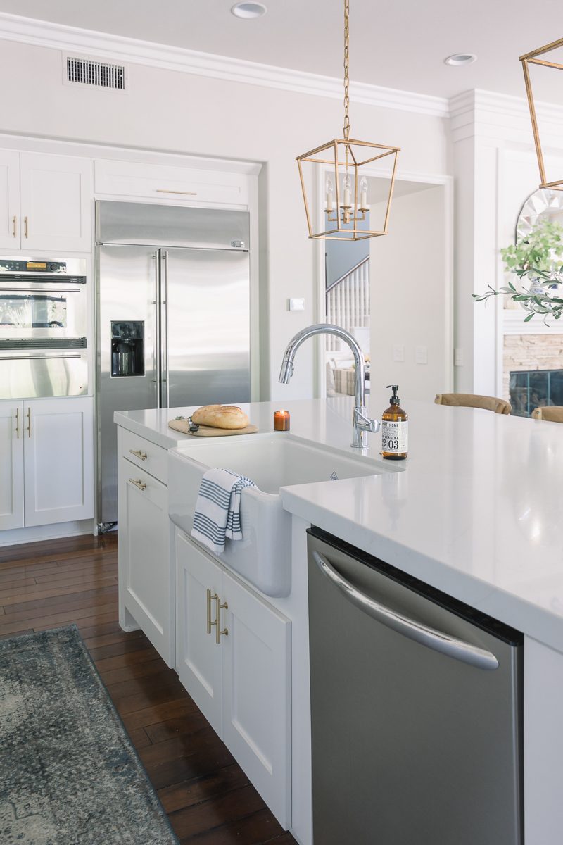
These counter tops are impossible to photograph but we are absolutely in love with them. To be honest, I had been looking for replacement counters for over two years. Yep. No joke. While marble is beautiful, it’s not for us and our lifestyle. We love letting the children do not only their homework but any kind of project that can dream up on the island. It gets messy on a daily basis and I knew quartz was the right choice for us. When I found the Aurea Stone I was sold. There is a beautiful layering effect which allows the veining to appear deeper in the stone. We went with Epitome because of its subtle warm veins. They tie in beautifully with the other warm elements in the room. I don’t think the photos do it justice so if you are searching you may want to check out a sample. I never wanted the small slab to leave my house which is how I knew it was the one for us.
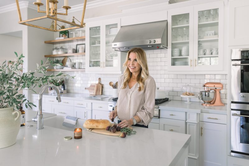
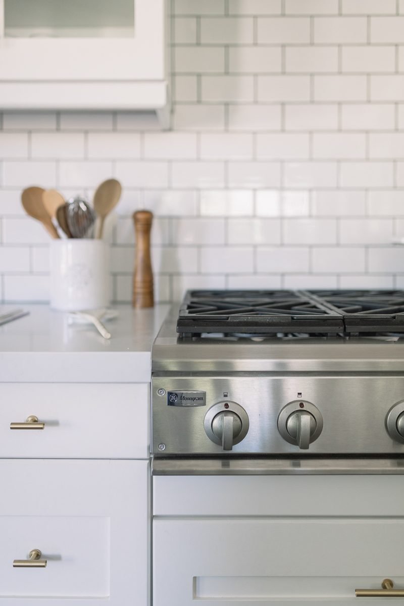
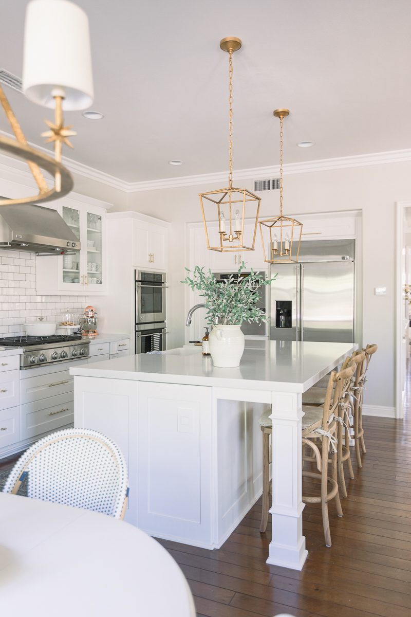
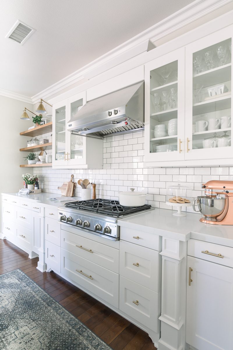
Having the extra counter space is remarkable. It really did make a huge difference in not only the appearance but in function, too.
FARMHOUSE SINK
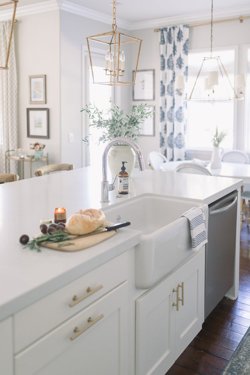
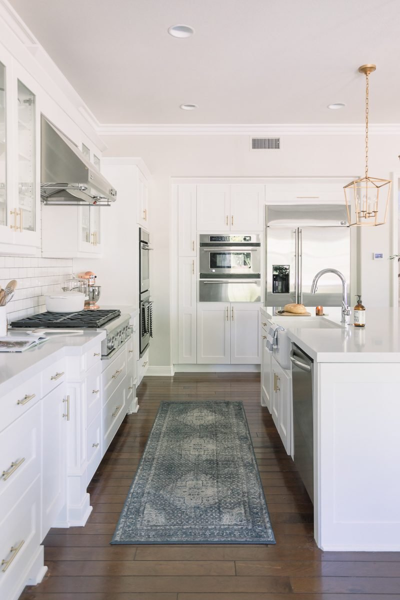
I’ve always wanted a farmhouse sink and I think it works so well with the design of this kitchen. We moved our garbage disposal button to the top of our counter (it had previously been under the sink) and kept the faucet sleek and simple. It has a magnetic feature that we love. It also cleans up so nicely which is fantastic.
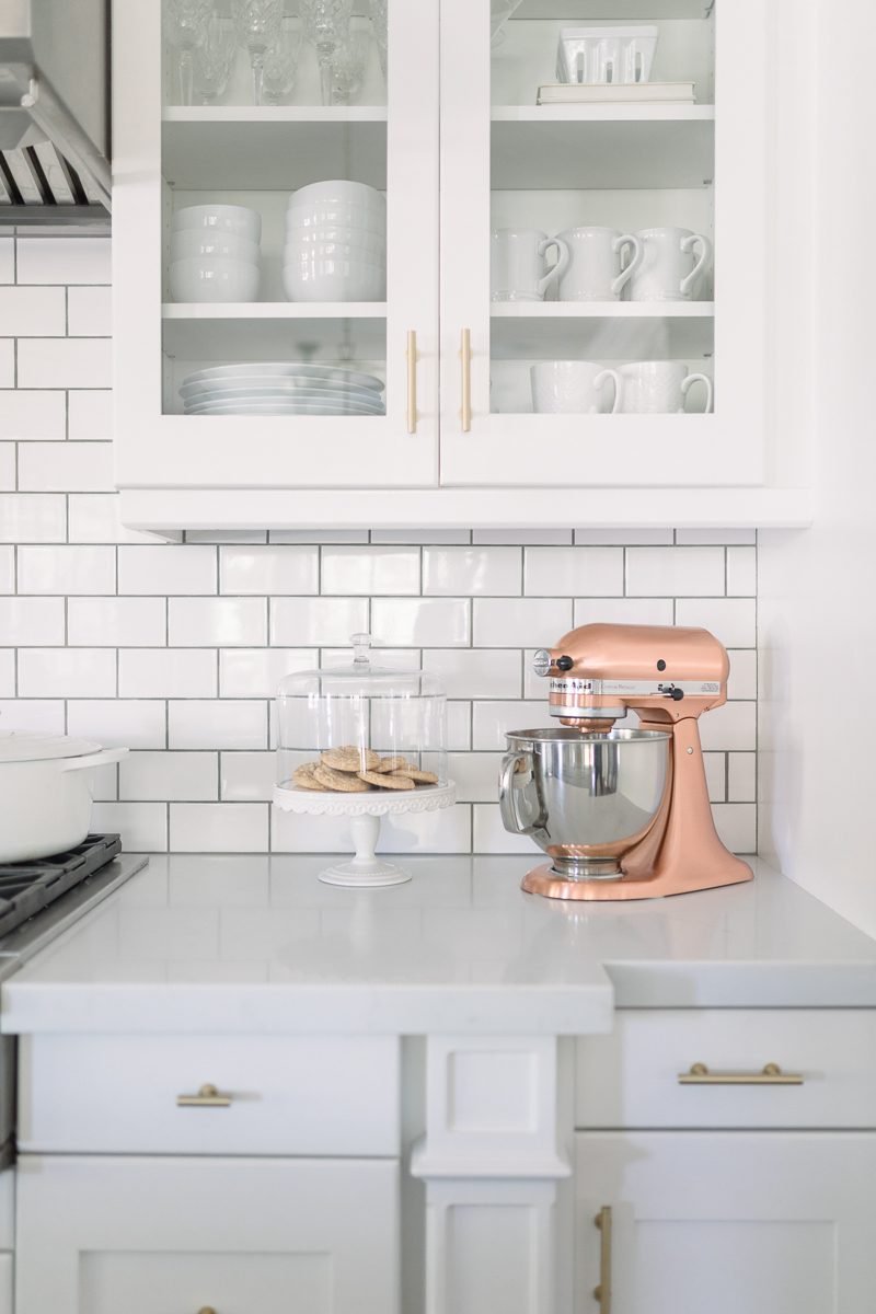
We installed the glass doors when we first moved in and like how they contribute to the open and airy feeling. The first two shelves in each cabinet house our every day glasses, dishes, mugs and bowls. We are minimalist when it comes to what we choose to have in our kitchen so glass front cabinets and open shelving work really well for us. In fact we still have four empty drawers beneath the shelves. Rather than fill them with “stuff” we are waiting for those ah-ha moments when you realize it would be convenient to have something there.
HOW IT FUNCTIONS
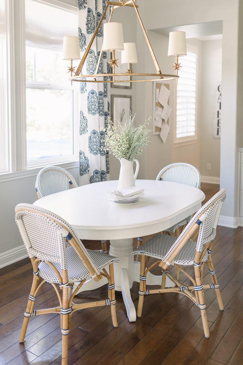
The bulletin board you can see is our go-to spot for hanging important school papers or the map for the current fifth grade state test. Whatever we need to be able to keep safe and handy for the week gets pinned right up there. The wall across from that bulletin board has our family calendar.
THE BEFORE
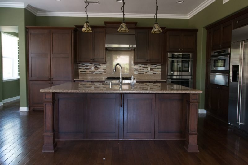
Everyone loves a good before and after shot, right? The very sweet owners of our home embraced the darker colors that are often tied to the craftsman style. While warm and cozy, we craved something lighter and brighter. This allows you to see the large pantry that once stood where the new open shelves are. Hats off to our woodworker. Not an easy task to remove an existing portion of a kitchen and create a seamless new addition. We are very grateful.
THE AFTER
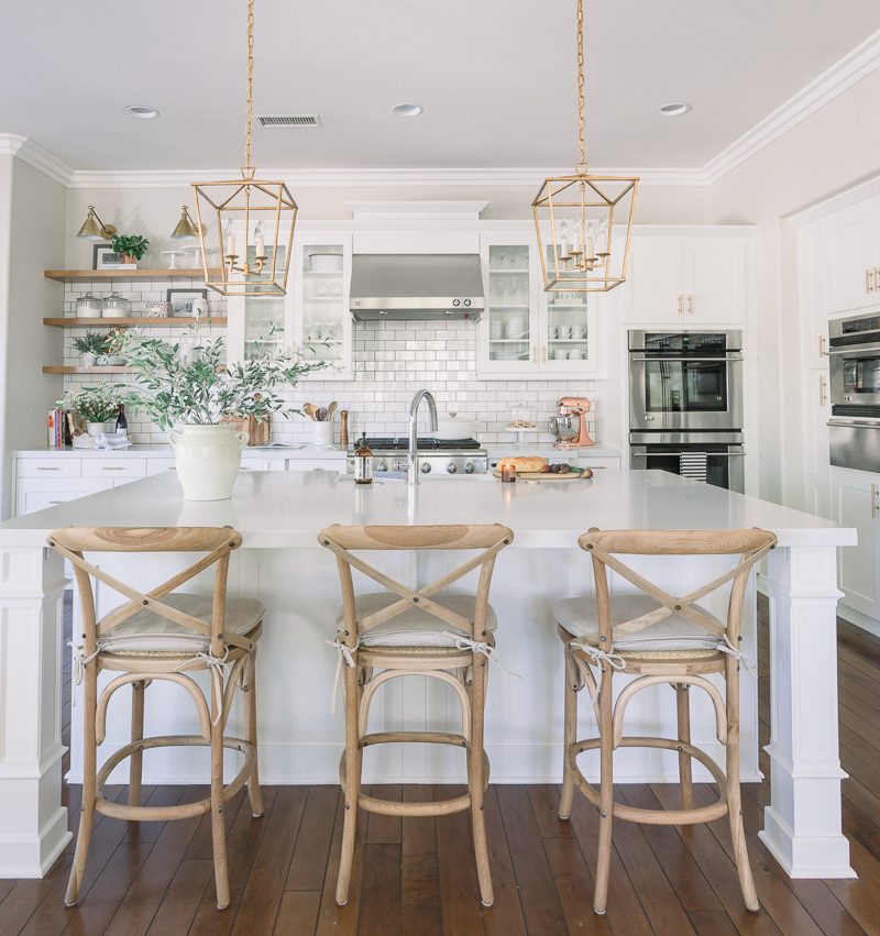
When I would pour over magazines and Instagram images it was always the white and welcoming kitchens that drew me in. I feel really fortunate to have this space and we do not take it for granted. I’m already picturing small Christmas wreaths on the backs of those chairs.
THE NEW PANTRY
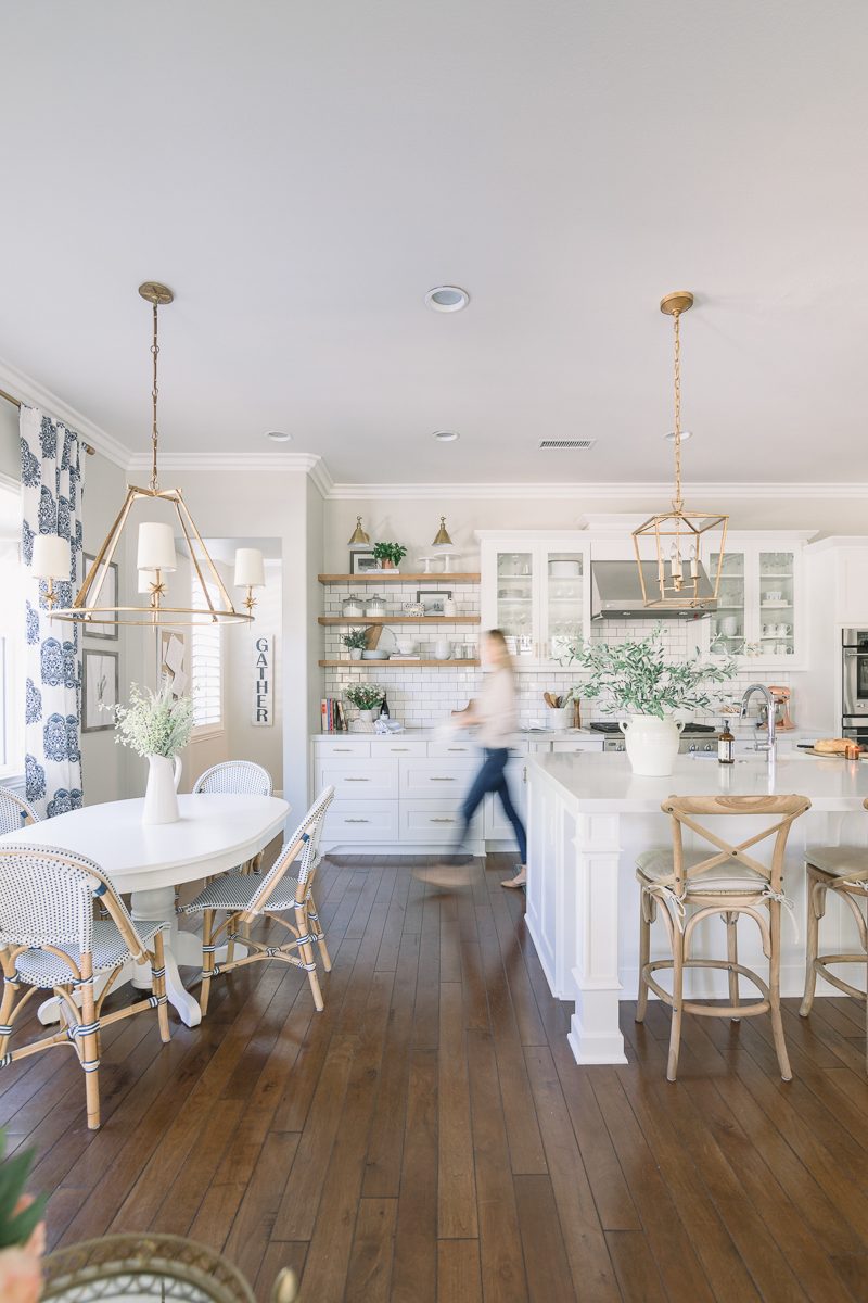
This shot lets you see how the space works together. If I were to keep walking and turn the corner I would find our new pantry.
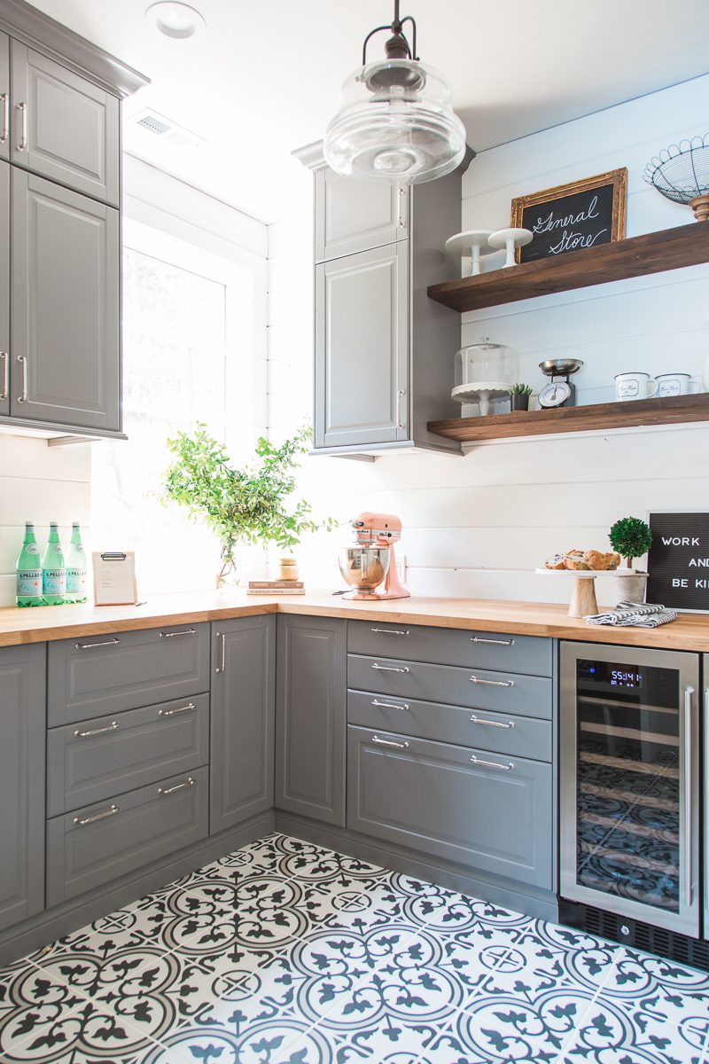
Because this room is on its own we could have fun with finishes and patterns. But the warm counter tops tie in with our new open shelving in the kitchen. The subway tile backsplash compliments this floor tile.
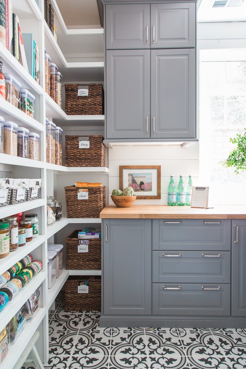
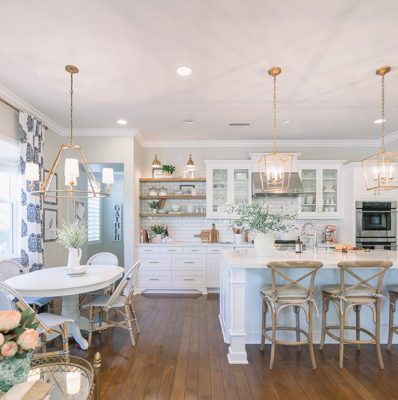
Whew. That was a long tour. Thank you for coming along on this journey with us. It’s been really exiting to put our own stamp on this home and create a kitchen we love. I will list sources below.
Paint Color: Pale Oak by Benjamin Moore
Cabinet Color: White Laquer no tint
White Table: Antique | similar
Bistro Chairs: Serena and Lily
Bar Stools: Ballard Designs | similar
Stool Cushions: Restoration Hardware
Sconces: McGee & Co.
Chandelier: McGee & Co.
Pendants: Restoration Hardware 12″ | similar
Mixer: Williams-Sonoma
Counter Tops: Aurea Stone – Epitome
Photos by Vanessa Lentine

This is BEYOND.
Love, love, love everything.
Must come see in person.
xo
Ahhh! Thank you, Catherine. Yes. You have to get your beautiful self back to CA.
Love absolutely everything, but especially the farmhouse sink!
Thanks, Sue. I love it, too.
Gorgeous results! I love it! You have awesome taste!
Thank you so much, Dianna. Such a nice compliment. Two yeas in the making but we got there. Have a great day.
Beautiful! The before and after is incredible. You are so talented. Would you please share the source for the cabinet/drawer hardware?
Gosh, thank you, Amanda. So nice. Yes! I accidentally forgot that and will look up the website. I’ll add that to the source list. Thank you for asking.
Can you please provide a link to your beautiful good hardware on the cabinets.
I would never leave that space. So beautiful and thought put into every touch. LOVE!
Would love to see a night time photo !!!
Such a nice thing to say. Thank you. I do find myself wanting to be in here all the time. xo I will try and snap a photo soon.
Wowza, that is one gorgeous kitchen. Well done!
Awe. Thank you, Jamie. Appreciate that.
It’s beautiful! You gained such valuable storage and some prime decorating space!
Thank you, Melanie. That’s definitely what we were trying to accomplish. Makes such a difference when the storage works and is valuable. We struggled to make the previous situation work for us.
Love love this Courtney! This is my dream kitchen!
Thank you, Kathy. So sweet.
Beautiful! Lovely classic finishes that will last a lifetime!
Thank you so much, Holly. I really appreciate that. Thanks for taking a moment to comment.
This is so beautiful!!! I love everything about it. You have such great style. On another note, I purchased your chandelier from Wayfair that you purchased for your master bedroom. It was such a great price! Thanks. I was wondering what color rub-n-buff you were going to use on it?
Joy
Gosh, than you, Joy. I really appreciate that.
So funny as I am sick in bed with the flu and yet I had my hubby bring the chandelier up so I could paint it! It only took about 30 minutes to do the whole thing. If that. I used Gold Leaf. Not even a third of the tube. I just used my finger and it turned out awesome! It looks like the same finish as all of my lighting in the kitchen now. I think you’ll love. I am also planning to add shades. I’ll blog it soon. xo
Wow! What a lovely bright special place! You’ve done an amazing job. It looks perfect. Your folks would be so proud. Congrats and hope you have many happy memories there! Nancy xo
Awe. Thank you, Nancy. I would give anything to have my dad stand in his “spot” against the island enjoying a cocktail doting on mom. If only. xo
I was so excited to get your email update this morning and learn that it was kitchen reveal day! You have been sharing some sneak peeks on instagram and I was waiting for this post as I knew it was going to be so.darn.good. Which it is. Absolutely stunning space! Well spaces really, the family room and pantry are just gorgeous as well, love how you have tied everything together. You are one talented lady with a great eye for design. All the gold stars for you!
Beautiful! I love the white with gold. It lends an elegant feeling, while the wood keeps it warm and homey.
I love your farmhouse sink. I had one in my last house but it got horribly marked, mainly by guests helping out. How will you protect your sink? Is it a better product than those made fifteen years ago?
Joanna, we’ve had our farmhouse sink for almost 5 years now and it gets marked up all the time – usually from pots and pans. A little Barkeepers Friend cleans it right up.
Courtney, you’ve done a beautiful job with the kitchen. All of the elements combine together to make a space that it light and bright and warm and welcoming.
Everything looks lovely. We just redid our kitchen and I’m so glad we added a few open shelves. It just breaks up all of the white cabinetry and adds some contrast.
Do you happen to remember where you got the runner in your kitchen?
Your kitchen is remarkably beautiful. Can I ask where you purchased your drapes??
I love your kitchen very much . Would you mind giving me the source for your rug? Thank you!
Love, love, love it!
Fabulous!!
Looks gorgeous, Courtney! I really like the wooden shelves to add contrast to the white. I’m also glad that you decided on the brass sconces.
The difference between the kitchen when you purchased the home and the kitchen today is incredible.
Courtney – your kitchen is just lovely!!! Wow – great job.
I love it!!!!
The kitchen is beautiful. Do you have a source for the shelves?
I love your kitchen! Your design was executed flawlessly. I appreciate the inspiration you have provided in you latest reveal. As time progresses, I am interested in hearing how the farm house sink holds up as we are interested in one as well. By the way, I found your blog via honey were home, love both blogs!
The kitchen looks amazing Courtney! So happy for you and so happy it all came together so perfectly! Question- the branches in the vase on your island, where did you find them? Or are they real?
Simply beautiful, but I would not have expected anything other than that from you and your exquisite design sense!! What a lovely space you have created, and I’m sure you feel blessed to be there every day!
You did a wonderful job! Beautiful! Can you please share the rug source. It’s perfect for a space I am thinking of.
I cannot even believe that the before and after are the same room! Everything about your new kitchen is gorgeous! I love how bright and open it feels and all of the elegant touches!
This is so absolutely gorgeous. You have such talent! Couldn’t possibly be any more beautiful!
Very pretty! Just wondering if you could share the color/brand of the subway tile and grout color you used with your countertops? Thank you! Just love it!
I love your kitchen! I’m in the process of remodeling mine and love those gold cabinet handles, where did you get them at?
Wow, your kitchen is stunning. Love all the details.
Thanks for sharing your beautiful space.
Beautiful! I have to ask, do you feel pale oak goes with beige furnishings? Iwe are building a home and I’m leaning towards this paint but want rethought a on if you see tan in it?
I love your open shelving. Was it custom?
Gorgeous choices! It all works so well together. Thank you for sharing your sources. Would you mind also sharing info about the cabinet hardware?
Where are the wood open shelves from?
Those were custom made by our cabinet maker.
LOVE! Where did you get your hardware from?!?!
Beautiful! Would you mind sharing the thickness of your counter tops? The thickest we have seen quartz available is 3cm but yours appear slightly thicker. Maybe it’s an optical illusion. Either way – beautiful update and thank you for sharing it!