At long last, our breakfast nook is complete. As most of you know I was on the hunt for a chandelier for over a year. I am never a fan of rushing into anything when it’s a significant piece in your home. Lighting can act as the jewelry for a space and I think it’s worth waiting for. This spot brings us so much joy. While we call it our breakfast nook, it also were we gather for family dinner every night so we spend a significant amount of time here. A complete source list for our breakfast nook reveal is also included.
THE SEATING
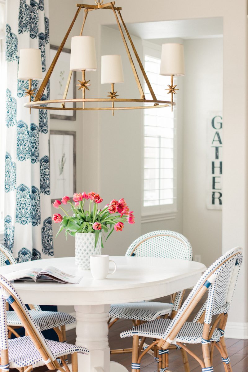
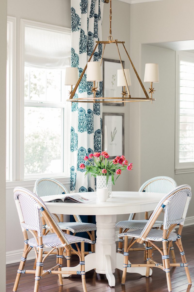
The navy and white still makes me smile every time I walk into this room. There is something very refreshing about it. To keep it from looking too cool, I added the gold and warm wood tones. The Serena & Lily chairs were my very first purchase for this home. I have always wanted them and so it was truly a no brainer when it came to designing this space. I never have to worry when the kids and their friends are over. They are so easy to keep clean and really comfy, too. I highly recommend them. Our galvanized bar stools were a purchase I made until we found something better. Truth be told, I love them. Eventually when we decide to swap out our countertops for something lighter, I will choose different stools. But for now, I like the casual vibe and they are a piece of cake to clean.
FRESH FLOWERS
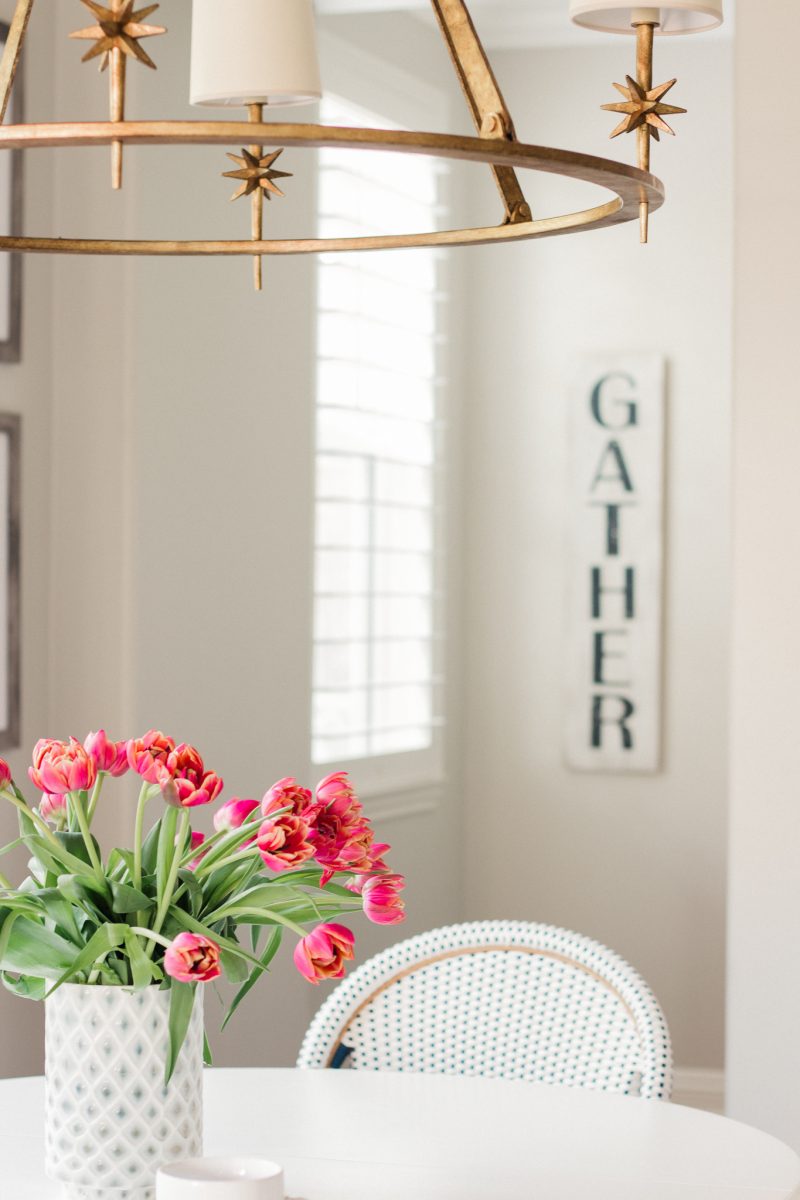
Does anyone else find tulips to be the most amazing of flowers? I could sit and stare at them all day long. There is something about their simplicity that is beautiful to me. They instantly brighten up any space. The vase was a candle holder from the Better Homes & Gardens shoot that we did in our previous home. The stylist let me keep it so it’s been a really nice memento.
LIGHTING
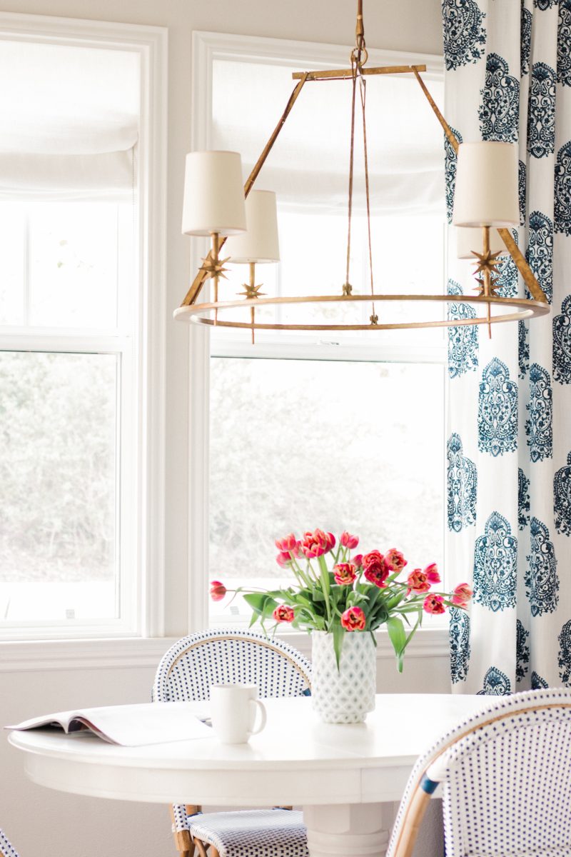
As I mentioned, we waited a long time for this chandelier and lived with a huge hole in our ceiling for quite a while. So many of you weighed in when I was trying to decide. I had gotten so used to eating in the dark that I didn’t really think about it. For a long time, I was leaning heavily towards something with more texture. Even casual. But the more I pictured the space, the more I realized I wanted to balance out the casual chairs and wicker chairs I have in the great room. I also realized that with this being so close to the island pendants, I really did want to marry the two spaces without being matchy matchy. If I can offer any advice, it’s to really live in a space for quite some time before making major decisions. That was advice my dad gave me and he was so right! Thanks, dad!
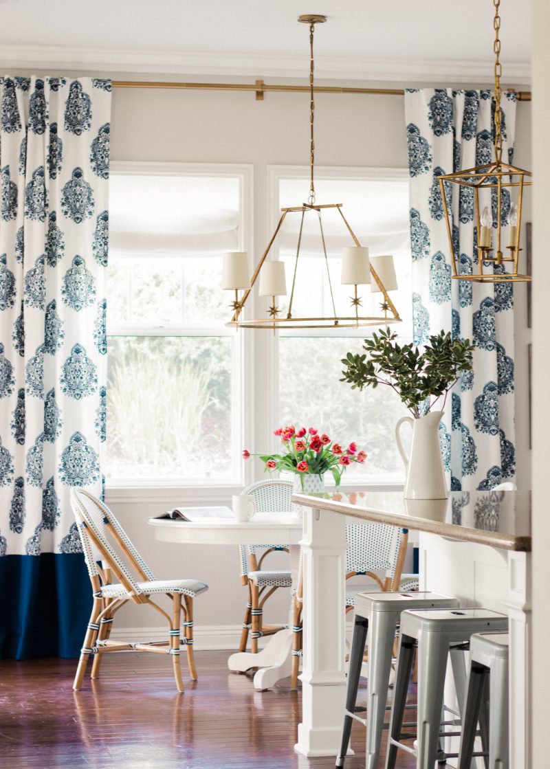
From the moment I saw this Etoille chandelier I loved it. You can’t tell from this photo, but the ivory shades are an exact match to the ivory candles on my pendants. The antique brass finish is also the same. The round shape is just different enough to create interest. I am convinced that lighting is one of those items you really need to love. Take your time and make sure it’s something you are crazy about. Let’s be honest. It’s not every day you swap out you light fixtures. If ever! So choose wisely. My pendants are from Restoration Hardware (12″) but these pendants are quite similar. This is another great option.
THE TABLE
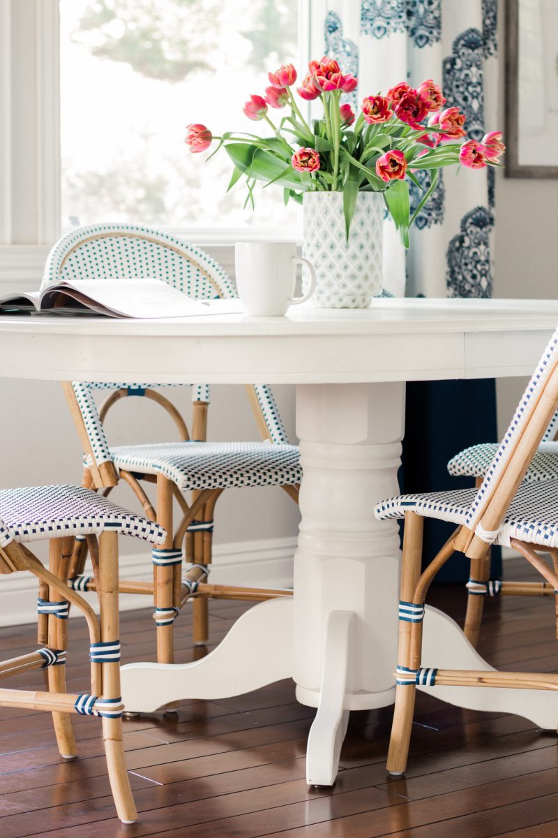
This table brings back so many great memories. When my husband and I were first married we couldn’t afford furniture for our first place. We shopped thrift stores and consignment stores in hopes of finding treasures. We picked up this table for about $30 and it has been one of our very favorite pieces. Not only is it well made, but it has been the gathering spot of countless family dinners and holiday celebrations. When we purchased it, it was natural wood and I painted the base, keeping the top brown. Before we moved to this house, I painted it all white and am so happy that I did. It’s held up really nicely. While this space could handle a larger table, I really like the intimacy that this one allows. And I am a sucker for a piece that tells a story. I found this table and it has the exact same base!!
Pedestal Tables
WINDOW TREATMENTS
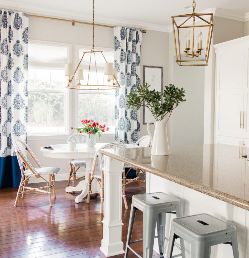
I get asked about these window treatments all the time. When we first moved in, the kitchen windows had shutters on them. While it seems crazy to remove shutters, I knew I wanted to let in as much natural light as possible in this space. I really appreciate having an unubstructed view and don’t regret the decision at all. The roman shades allow us to pull them down at night but enjoy all of the sunshine during the day. The drapery panels were a very lucky find from HomeGoods. I stumbled upon them and fell in love. Alas they were too short so I added a navy blue panel to the bottom of each one. Our ceilings are quite high so I think that the navy bands give the drapes the weight they need for this space. These panels are very similar. I also love these and they come in lengths up to 120″ which is fantastic. The gold drapery rod is from here. We have used them throughout our entire downstairs to create a uniform look.
THE BIG PICTURE
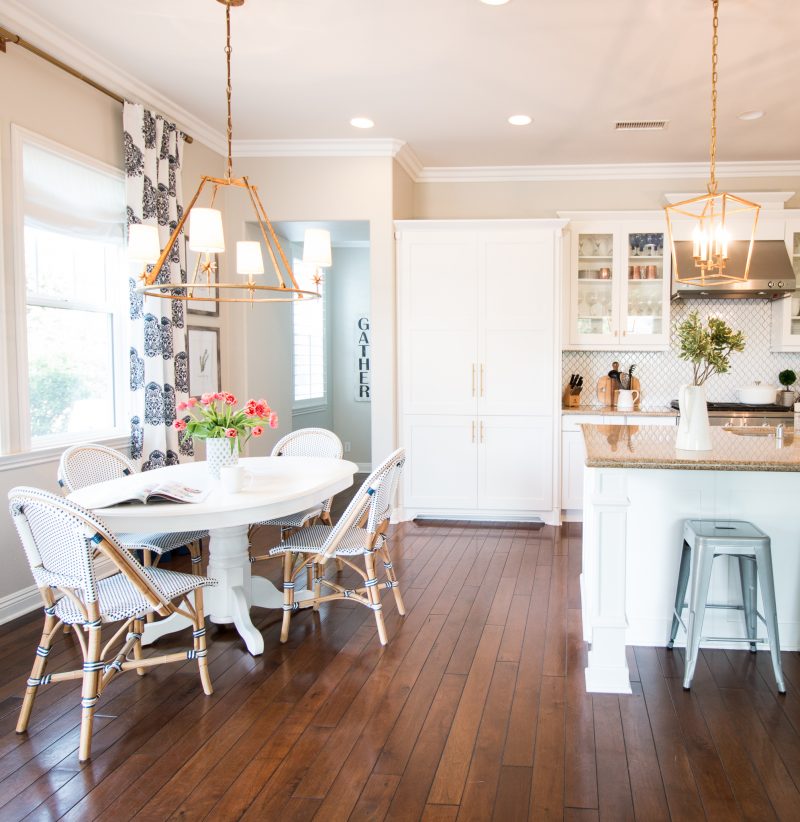
While it breaks all of the “rules” for interior photography, I thought I would show you a photo with the lights on. Despite all of the white, this space still feels very warm and cozy to me. And it’s where 90% of our life happens so it conjures up the memories of the laughter, shouting, chasing, cooking, eating, teasing, bickering, learning and love that happen here. The “Gather” sign is extra special as I found it shopping with my mom on one of our Friday shopping trips. A home is all about gathering together with people you love. Our new pantry is to the right of the sign. More to come on our pantry very soon.
PAINT COLOR
The paint is Pale Oak by Benjamin Moore. We’ve used it throughout our entire house. You can see the before and after to see more of the color. It is considered a white but definitely reads as a pale gray. It’s one that looks good in every light. But as with any paint, be sure you test in out in your own home on many different walls.
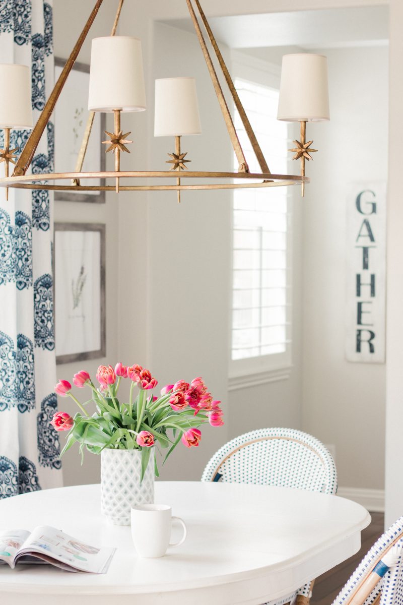
Thank you for taking the tour of our breakfast nook. It might be one of my very favorite spots in our home. You can shop the look below.

Have a great day, sweet friends!
*affiliate links used
UPDATE
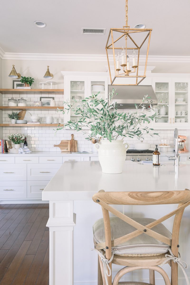
Our kitchen underwent some fun changes. To see the full post and how it looks now, check out the White & Bright Kitchen Reveal.

Simple and elegant! Love everything about the room and tulips are always a good thing. 😉
Design by Sydnee ????
Thank you, Sydnee. I agree. Tulips always work! They brighten my day for sure.
Simply beautiful Courtney! May I please ask what is paint color on the walls?
Thank you! 🙂
Thank you so much. Of course! I meant to add that so I just updated it above. It is Pale Oak by Benjamin Moore.
what white trim have you been using with the pale oak?
Gorgeous my friend. This space is exactly why I love your eye for design. Clean, classic, understated, yet so warm and cozy. Well done as always. I plan to use Pale Oak throughout our home when we paint (most likely sometime this year). Did you paint your ceilings Pale Oak as well? We have beautiful crown molding throughout our home and it gets lost with white on the ceiling, so ours are currently painted the same as the wall color in each room. I love the color. It is similar to the lightest color we currently have in our room, but with a bit more gray tones. We are replacing our laundry room floors in the next week or so, and it will be the first room to get the new color on the wall. Can’t wait!
Beautiful..
I didn’t see if you shared where the roman shades were from.. they would be perfect for my new office.
Thanks.. I love following you 🙂
You are so sweet. Thank you! I will add that above. They are from Barn & Willow. I recommend them if you need inside mounted shades.
You can read more about my experience here https://athoughtfulplaceblog.com/our-breakfast-nook-roman-shades/ I hope that helps a bit.
You were my inspiration to paint much of our house Pale Oak; it is THE most gorgeous, chameleon color. Can go a bit purple, oddly, in certain lights though! Love any home update you do; just beautiful 🙂 (and since we share the paint color, gives me great ideas too!)
Oh I am so happy you tried it and liked it. That’s awesome. And thank you for the kind compliment. We love working on the house. I haven’t seen it go purple in this home but the lighting in every space is so different. It’s really kind of crazy.
Absolutely gorgeous!
Absolutely adore this space!
Simply stunning x
Absolutely beautiful! It’s timeless, warm and inviting!
Such a cheerful and wonderful space! I love following your blog! Have a wonderful weekend.
Courtney I just LOVE your blue and white bistro chairs! They are my favorite. As always your home looks beautiful!!!
: )
Stunning-it all came together perfectly! Your dad is so right! I am never one to rush design and even lived without counter tops in our basement until we saved for the granite we wanted. And still had parties and served food in the top drawers pushed in since we had drawers/cabinets but no counter, and i don’t regret it (and our friends don’t judge, ha!)
It looks bright and inviting! I love anything blue and white, too!
Hi Courtney,
Love your breakfast nook especially the draperies with the navy extender. Do you remember where you purchased the fabric? Your home is stunning.
Loving this space! Those curtains… swoon! Do you happen to remember whether they were Nicole Miller curtains?